Adding on to this another idea is a drop down with options like “past month, past 6 months, all time,” etc. Since if someone has large gaps/breaks in their studies they can just focus on the most recent months but still have the other data available if they want to see
A way to flash our badges on the forum would be a nice to have. 

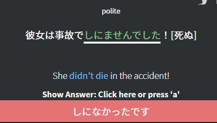
Is there a reason why when I get an answer wrong, it only shows me one possible correct answer and not all the possible correct answers? Kinda annoying when I guess something and I’m on the correct path toward one answer, but the correct answer it shows me afterwards is completely different and I have to open up the “Details” to see the correct answer I was most close to. Example I just ran into

Why doesn’t it show me that 死ななかったです is also a correct answer?
i think i requested this years ago already.
2 new cram mode options:
- cram the last (number) recently learned grammar points.
- cram the last (number) wrong answered grammar points.
it would help so much.
The option to Cram Ghosts specifically would also be cool.
I’d love if if there were different types of questions like in the JLPT. So you don’t just have to fill in a blank that you translate back from english but maybe also filling in a blank by choosing from 4 different but similar grammar points or sentence composition.
I absolutely second this!
I’d like to be able to create my own semi-permanent decks for quick cramming. I think this would be especially interesting for learning to discriminate between similar grammar points that I often mix up. One example would be そう, みたい, らしい, にみえる, etc. That way, if I learned a new grammar point that is similar to those in one of my decks, I would be able to add it and cram later. Bunpro is great for spaced repetition, but if the space between similar items is too big, it is hard to learn to discriminate between them. That’s when I believe that focused interleaved (but not spaced) practice wins.
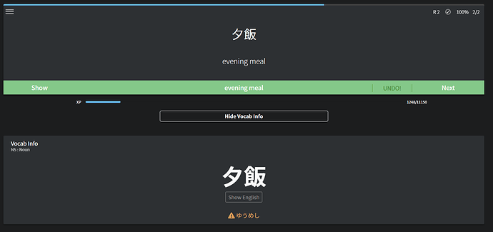
In vocab reviews, it would be nice to have the option to show the orange text from vocab info instantly after answering the question. This text often contains additional writing or spellings of a word and just seeing it on every review could be very helpful. This is similar to the nuance option (or something) in grammar reviews, but instead of showing at the start (which would spoil the review) it would show after the answer.
Another useful and similar feature would be an option to show the furigana after answering, so that we wouldn’t have to click the word each time to check if we guessed correctly. It would save us time and generally make the reviews better, I think.
I found that male audio is never played, even if female audio isn’t available for a given sentence. Is there an option to always play an audio if available?
I know creating your own decks is on the roadmap for the future. I’m getting to the point where I want to start sentence mining and obviously bunpro is the #1 resource there due to all your amazing sentences. It would be really awesome if every sentence in bunpro could have a button to add it to my own sentence deck, as well as the ability to add my own sentences to a deck. Is something like that maybe possibly already in the plans? tyyyy 
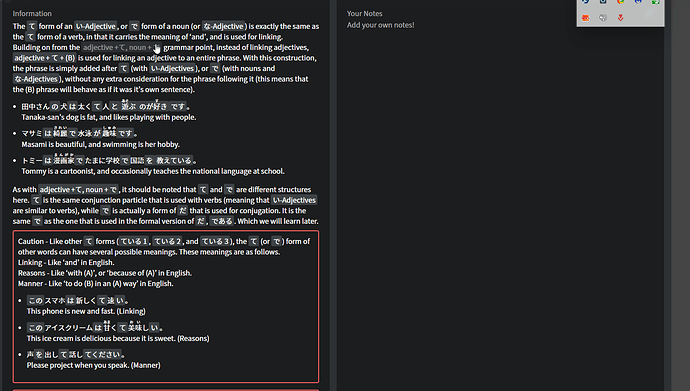
Hi, I’m finding a huge problem when trying to check grammar references in bunpro. The image I have here shows a grammar explanation from one of my lessons, but the text is so scrunched up?
This is not good since I have a disability where it’s harder for me to read stuff like this and makes for a dissatisfying learning experience. I’ve tried to change the text size on the site, but this still doesn’t help most of the time.
Please find a way to make the readability of the texts here better for those of us who struggle…
Another suggestion for readability: In example sentences in the grammar explanations some parts are highlighted. I presume this is to make it easy to understand all the different old grammar parts in the sentence/make it clear you can click on them to see their explanation.
I find it also makes the sentence a tiny bit more difficult to read, since it’s all ‘broken up’ into pieces, if that makes sense? It’s not too bad, since the grey highlight is very sublte.  Having the option to turn it off (or only show on hover) would be lovely though.
Original:

Suggestion (plus also removing the larger spaces between the words):

Edit: On a completely different note, not a suggestion, but feedback:
Not sure if it’s a new(ish) feature or if I just hadn’t gotten to them before, but I really like the sentences that give context as to who’s talking. Eg, a parent to a child etc. Thanks a lot for those! 
Following up on this. I want to still review the grammar points that I have “Mastered” (12 Corrects)
I’ve set my Anki to 1 year max. Wish we have some options here since my motivation is weirdly dropping because of this
Additionally when reviewing, we can add option to what we prefer to come first - Ghosts, Low Corrects, High Corrects, etc.
Waiting and Hoping for Bunpro Korean /Mandarin
You might be waiting a while, considering they’re not even done with Japanese yet 
Can we please have the ability to see alternate grammar when we get a card wrong? When you get the correct answer, you can hit A to see alternate grammar. When you get it wrong and then click to see the correct answer, you can only see one version.
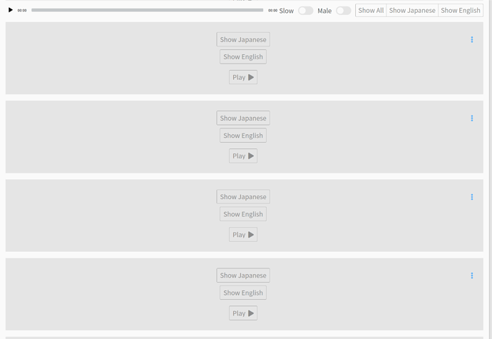
When reading examples of each lesson, the audio bar is on top, It would be better if each example had it’s own player.
And for vocabulary examples, as for grammar it should have a translation and an audio. I understand that having an audio for each example it would take too much resources, but not for the translation
Penguins?


