Oh, didn’t realize that. Thank you!
When you get a question wrong, I should be able to take notes in the solution box because sometimes when you get the question wrong, the answer automatically generated for that specific question is incorrect. Better yet. Have the community provide the solution to the question then the auto-generated one.
Also I would like a button to make it easier to go back the card that I just review like in anki
If that is the case, you can use the report+ button to report an error with the answer. That is how the community provides feedback.
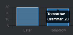
Can we get a “Total” added to the review forecast? As it is now doesn’t help much. 
It would be nice to see that tomorrow I’ll have a total of 58 (30 later today plus 28 tomorrow). The current way you have to sum it up in your head.
Would it be possible to have anki style daily scheduling? I’d much prefer to be able to do all my reviews in one sitting in the morning along side anki.
Good suggestion!
We’ve got a card internally for this change and we plan on rolling it sometime soon 
Good suggestion!
I’ll add this as a ticket internally. There is quite a bit of work that needs to be done with how the browser focuses during reviews for sure.
Small suggestion. Like really small.
When you open the grammar list ( Content → Grammar) you get your usual list of all the grammar points. On the right ist the scrolling bar. But you are only able to click on a small portion of the big grammar box. If you either click too far on the right or on the symbol on the left the grammar point won’t open.
So for me, who often wants to check on various grammar points and open them in a new tab, keeps clicking on a dead space. Then wonder why it didn’t open and click again to keep scrolling to the next grammar point to make that same mistake again.
Especially annoying when working on a notebook.
Can this be widened to the full bar size ?
I’ve sent you a DM!
Unsure if this is the proper place to put this. Please edit as you see fit if I’m wrong.
Discovered an incorrect translation:
と particle (first occurrence in N5 grammar)
Incorrect translation
- コーヒーを彼女と飲む。
I drink coffee with my wife. (I ‘and’ my wife drink coffee)
In this instance 彼女 was incorrectly translated to wife instead of girlfriend.
vertical reviews would be a great addition
like a way to train the brain at reading manga.
Only thing I could think of is maybe having bookmarked grammar show up in cram. Would just make it easier to bookmark what I feel I really need to work on and cram it if I need to.
On the vocabulary deck page(s) it would be neat to be able to sort the vocabulary words alphabetically and by SRS level.
It would be good if a setting is implemented that allowed the user to change the speed of the audio playback.
I use the iOS kana keyboard for inputting the kana for answers and it would be great if at least some of the keyboard shortcuts could be implemented for that, such as the “space” equivalent of 空白 working similar to the space bar
is there anyway to save custom cram sessions? its frustrating going through selecting the grammar points i want to review and it would be good to havethe ability to save and edit different custom cram sessions?
As a Bunpro user studying N2+ grammar, I would like Resource links and textbook information to be located in the Explanations tab in order to eliminate the extra click needed for additional information.
This would be especially helpful for N2+ because the Bunpro-provided explanations are currently not as detailed as <N2, and detailed N2+ explanations are a lower priority on the roadmap.
When reviewing vocab decks, it would be nice to have distinctions between kanji that are being used in different ways with different pronunciations. For example, I just came across 人 (ひと, person), 人 (じん, suffix), and 人 (にん, counter) in the N5 deck.
The only current distinction between these vocab items during a review is the reading, which is hidden by default. However, since I am also quizzing myself on the reading as I go through the reviews, I would rather not have to check the reading to know which meaning is the correct one.
Although any solution to this would be great, a simple one would be to mark vocab items with their usage. For instance, in the case of 人, the vocab items could be changed to 人 (a regular word), ~人 (a suffix), #人 (a counter).
In the grammar points for ここ, そこ, and あそこ, the similar words こっち, そっち, and あっち are differentiated, which I quite like, because I had come across them elsewhere and I had never really understood how they differ from ここ, そこ, and あそこ. However, I also noticed that こっち, そっち, and あっち are not grammar points on their own. It might be a good idea to add them as their own grammar points to study and differentiate from the more common ここ, そこ, and あそこ.
I like that you have all the example sentences for each grammar point and like to go through them, but I was wondering if there was a way to randomize those sentences to provide more reading practice for the grammar points I have learned. Basically same as the cram function, but with the answer already there.
