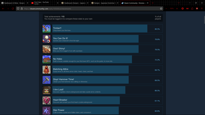
include somewhere on the badges page statistics on what percentage of bunpro users have achieved each badge, similar to the steam achievements page for a page
Small request that would improve my quality of life a lot.
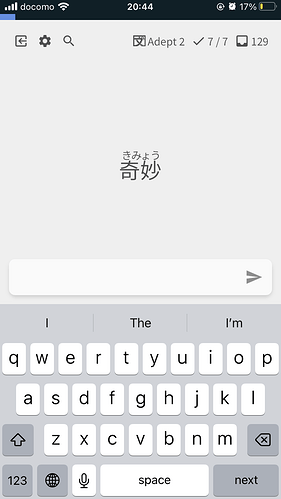
On the app, if you are already on the search page, pressing search again brings up the keyboard.
I’ve got a book in one hand, my phone propped up on the arm of the sofa, I’m flicking between yomichan, BP and ChatGPT to help me translate. On yomichan, if you’re searching and you press search again, it brings up the keyboard.
Lost count of the number of times, I’ve then gone onto BP and wonder why the keyboard doesn’t appear when I press search.
Do it if it’s a quick win, don’t worry if it’s complicated.
Sorry if this is the wrong place to post, I never spend any time on the forum…
I really like the new dashboard, but I dislike the “encouragement” that it gives underneath your correct percentage result at the top. It feels weird to get different words based on whether your percentage is low, and I find the messages when I do poorly to be discouraging. So maybe just the percentage, and the same message regardless might be better?
Good ideas! Will add some of these in
I halfway agree with you. I don’t really like getting a positive message when I got half of my review wrong or something. But I do myself like the variety, I just don’t know why the decided to make it all (of them) in english instead of…there has to be a different language they could have used.
We had the system you mentioned, andwe got feedback about it, and now we’ve changed it and are getting feedback about it still 
Might be time to finally make this a personalized setting on the Summary page 
I honestly had no idea how important this sort of stuff was to people until I started working here, it’s kind of eye opening
And you said you’re gonna add a community made setting when you make it to?
I mostly just wanna have a chance to see “Awesome Possum” for a 100%
Yeah, it honestly seems pretty personal, I can understand people feeling different ways about it. For me, it really depends on how thin skinned I’m feeling during my reviews
Hey!
I have added this to the app, it will be released with upcoming update.
Cheers!
Just updated and used. Thanks so much, will seem like a little thing to most but it a great QoL change for me.
Some feedback about the app; I think the it would be better if the vocabulary word was a bit bigger, I made the font size bigger in the settings but it only changed the English size instead and not the Japanese word. It’s a bit small for my small phone and bad eyesight haha
@I-k-d
Hey,
For the time being you can try increasing the font size in phone settings, it will also increase the font size in the app. I would also advice to use “large furigana mode” in settings which will increase the furigana size so it will be easier to spot. You can also use pinch to zoom functionality to zoom wods you have hard time reading.
Cheers!
@Superpnut
Hmmm I could maybe make a thread and get user suggestions for it TBH.
Create a few different types of feedback, and then start building a table with the texts based on the percentage correct or something.
Could we please get more accent colors? Pretty please.
 I would love purple or green for the dark themes.
for the stats page reviews per day, could you make it so that rather than having the colors be strictly decided on whether you did something like >20 reviews for the brightest or <5 for the darkest, it is more responsive to you specifically. right now, my heatmap has all the same color for every single day even though the number of reviews ive done has varied drastically
a way to improve this could be something like this.
- You look at the maximum number of reviews that you have ever done, which in my case is 265 reviews
- Divide it by 5. 265/5 = 53
- my idea of how this could work would be that any days with less than or equal to 53 would be the darkest color, than 54 through 106 would be the second darkest, 107-159 would be the middle color, 160-212 would be the second brightest color, and 213-265 would be the brightest color.
thats just my idea to make the review heatmap a little less samey though you guys can do whatever you want if you want to change it
some way to keep track of total time spent (in hours/minutes) would be nice. if there was also a graph/heatmap of time spent daily that would be nice too
sorry for spam but some way to undo reviews right after you finish them and move to the next question, i often do a review and force of habit move to the next review, but a second later i wish i could read the info about the grammar point i just reviewed
Please improve how slow the site is lately! It takes 2-3 minutes to load the dashboard page for me, and even then not all of the little things load properly!
Reviews are hit or miss, sometimes they just turn right on sometimes I wait a long time!
Why must you keep me waiting? I just want to get my reviews wrong 
would it be possible to create our own decks or simply study items we have bookmarked? I have a ton of reviews after taking a sanity break. (trip to japan, book release, kiddo graduation, and much more) I think being able to create my own deck to control how much I am reviewing at a time would really help!
We have a huge update coming in the next few days, after that we’re going to take a serious step back and evaluate some of the performance issues with the site.
This comes after the outage that happened a few days ago.


