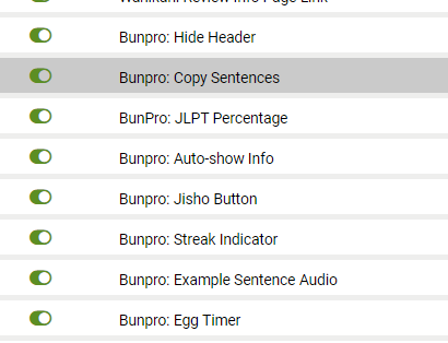
List of Scripts

Regarding the audio script with google TTS: recently Bunpro added a function to choose autoplay for sentences with audio. But that seems to interfere with you audio script.
For sentences with Bunpro audio, not the review sentence is autoplayed but always the first of the twelve example sentence. And not with Bunpro audio but with Google TTS.
And sentences without Bunpro audio are not autoplayed at all.

I don’t know if it’s just a problem with my mobile browser or a problem with your script

1 Like

Hmm, I suspect this is an issue with how they select the audio element when they play the audio. For now I’m not interested in getting into setting up my own autoplay function for the items which don’t have audio, but maybe in the future.

@Jake May I inquire as to how I might avoid your native autoplay script from selecting the audio elements I put on the example sentences?

1 Like

Fixed as of 0.2.5.

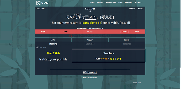
One of the reasons I chose to move the button was that there is no simple way to change the label of the English button. I would have to set up listeners for when you click the button, when you use the hotkey, when you click the English sentence, and so on, just to change the label each time it’s set to “English”. It’s a lot to do for such a small change. Aside from that it would also require a lot of fiddling to make everything fit nicely on mobile.

I know it was you who requested this script, but I can’t justify doing all that for just a button. For now I think it’s fine where it is. Out of the way of things but still in a relevant position next to the sentence in question.

1 Like

I will change how the js works for autoplay during reviews so that it uses a class (“native-audio”) to select it rather than by audio element.

2 Likes

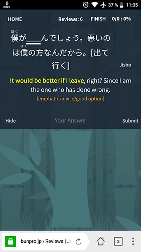
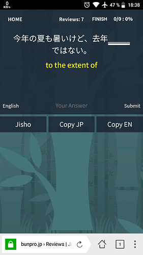
That’s totally fine. I like your scripts as they are. Just to show one mobile screenshot:

There is always more than enough space between the answer input field and the orange special hint text (without that hint text even more space). So you could easily place several buttons centered under the hint text. You already have that sentence copy script, so you could even place the buttons “copy en”, “copy jp” and “jisho” there.
(I don’t know if that space under the hint already is reserved for other Bunpro messages like explanations)

1 Like

Thanks!

Saw in someone else’s screenshot that there is not always space.
chrome_2018-07-04_09-45-36

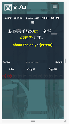
However, I suppose I could add a row for buttons underneath. Like this, below. Would that be better?

or maybe with backgrounds to make them look more like buttons

Looks like this on mobile

1 Like

Oh, you’re right, I just tested it, there is no more space when submitting a wrong answer.

Yes, an additional line is the best idea. Maybe there is a demand for more buttons in the future.

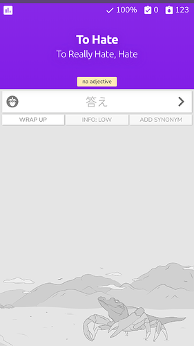
A good example of how to manage a lot of buttons and information is the KaniWani website:

On top the progress bar. A “back to statistics” button in the top left, then accuracy, upcoming reviews and correct answers in the right.
In the middle two lines for the vocabulary and one line for additional information. Left of the input field the streak level and right just an arrow to submit. Below that three clearly labeled buttons. Perfect. Compact. Beautiful.

Hopefully Bunpro will “steal” some of these ideas for a future design overhaul.

2 Likes

I think this should work just fine. You can add as many buttons to it as you please.

Update available → https://greasyfork.org/en/scripts/369927-bunpro-jisho-button

Also for copying script → https://greasyfork.org/en/scripts/369995-bunpro-copy-sentences

@seanblue If you want some buttons I updated the script

3 Likes

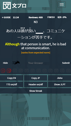
Wonderful! Looks and works great on mobile:

You should consider to combine all scripts into one big script and name it “Bunpro improved” :wink: That script would have the following buttons:
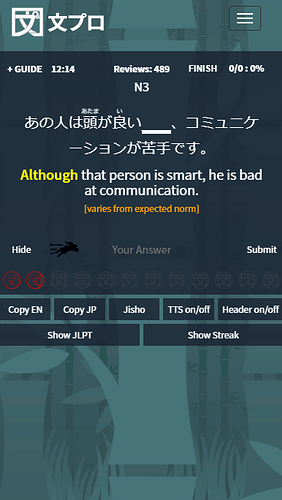
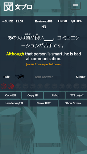
| Copy EN | Copy JP | Jisho | TTS on/off | Header on/off | Show JLPT | Show Streak |

That script could then also be implemented in the Android app since that app uses the webview of the Bunpro site.

One small thing: can you reduce the height of the buttons and the font size a bit so that it matches with the “english” and “submit” buttons?

1 Like

Not a bad idea, however don’t you think that would get a bit cluttered?
Mockups for mobile:

Oh, oops, forgot to put that piece of code back. It’s fixed!

1 Like

Hehe, and you can add the “Show Timer” button as well. Right, that’s too much. But you could just use a three dot menu or an “arrow down” symbol to show/hide this button menu.

Or if the buttons have symbols instead of text it would look less cluttered, as in Wanikani:

But I think that goes too far.

Anyway: there is still one small issue with the copy script: when clicking on a kanji to toggle furigana the script copies the whole sentence. I think it’s enough to have the button, no need to trigger the script when clicking on the sentence itself

1 Like

I’ll leave them as separate scripts for now. In the future I might just put them together and create a menu where you can choose which features you want.

Sure, I suppose I could remove that feature at this point. I’ll leave it for example sentences though.

Done.

2 Likes

I have installed most scripts
image
however, none of them actually show up in my tampermonkey. Not during lessons, or reviews :thinking:

any idea what could cause this?

Edit: Ok i feel silly, but I figured it out :stuck_out_tongue: i had bookmarked www.bunpro.jp and in the scripts it is bunpro.jp without the www.
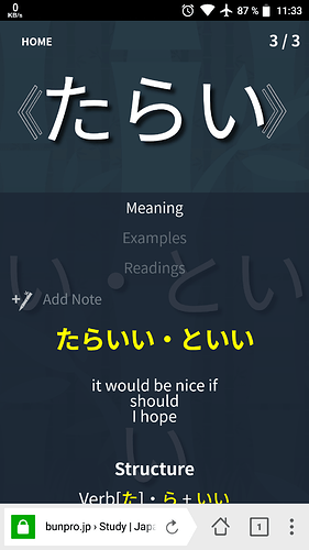
Good to know if others have that issue, or they can just add another url to the scripts to include both
:man_shrugging:

3 Likes

Your scripts are really a huge benefit for the site, I use the copy and jisho buttons all the time. However, today the copy buttons didn’t appear in the button menu, I just see the jisho button.

And a funny thing, the font size of the grammar point in study mode becomes huge when using the header script. It fills the whole screen:

Can you deactivate it during learning sessions? It is only useful in reviews when users have to type something and the keyboard is on.

1 Like

Will fix asap!


edit: done!

3 Likes

Sure, no problem.


edit: done!

2 Likes

I should probably start making new posts for scripts at some point, but for now I’ll keep posting here.

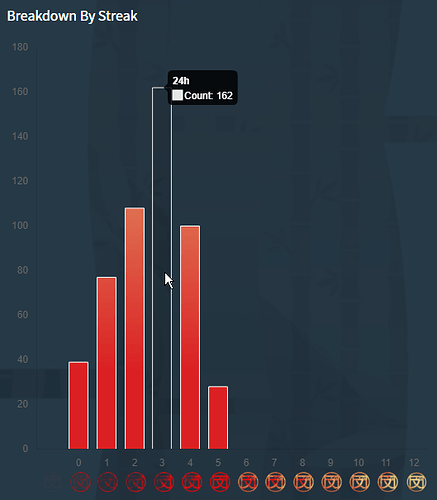
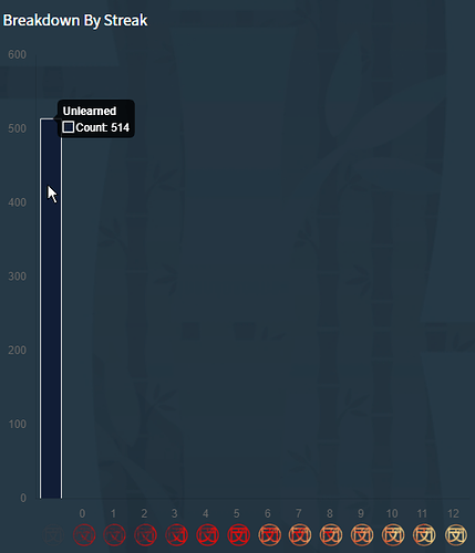
Added Streak Chart Additions. This scripts adds two new bars; one for unlearned items and one for items with streak 0. It also adds interval info to the hover tooltip, and changes out “Streak” for “Count”.

Example:

And this is from my test account, to show the unlearned bar.


edit: removed color box in tooltip label
image

2 Likes

You’re my new favorite person, yesterday and the day before i got most of your wanikani scripts, and now here too. thanks for the effort you put in and sharing them with us!

2 Likes

(✪ ᴗ ✪ )

4 Likes

Took a nap, came back to pc and a bunch of tabs had magically appeared…

image

Someone has been busy:P

1 Like