List of Scripts

I wanted somewhere to post the scripts I’m making for myself, in case someone else could make use of them. So here we go. If you know of a script I could add to the list please post it below.


Userscripts

Review and Lesson additions

  • Anki Mode by @ezhmd: Allows you to answer reviews by pressing buttons instead of typing the answer. Very useful for mobile where input is slow.

  • Auto-show Info by @Kumi: Automatically expands the full grammar info when you get a review wrong.

  • Autocommit 2.0 by @Kumi: Automatically submits the answer once your input is correct. Save time by not pressing enter.

  • Bunpro Toolbox by @Ambo100: Adds various search options to grammar pages from Japanese resources. Replaces broken links from Jgram and Tanos. Can be set up to automatically add page links for textbooks.

  • Copy Sentences by @Kumi: Allows you to click Japanese sentences and their translations to copy them into your clipboard.

  • Disable Backspace by @Kumi: Disables the use of backspace as an UNDO and OOPS shortcut. The buttons still work.

  • Disable Undo on SRS 11 by @Kumi: Removes the undo button and disables the backspace hotkey for the last SRS level. This is a safety measure in case you are a bit liberal with the undo button.

  • Egg Timer by @Kumi: Adds a stopwatch to your review and lesson session.

  • Example Sentence Audio by @Kumi: Adds Google Translate TTS audio to example sentences which do not yet have associated audio. Works on item pages too.

  • JLPT Level Indicator by @Kumi: Displays the JLPT level of each item while reviewing. USE WITH CAUTION.

  • Jisho Button by @Kumi: Adds a button which opens up a Jisho search with the sentence so you can easily look up its words.

  • Mistake Delay by @Kumi: Stops you from continuing to the next item for two seconds after submitting the wrong answer, to avoid accidental double clicks.

  • Remove Undo Button by @Kumi: Completely removes the undo button and disables the backspace hotkey.

  • Toggle Tense Tip by @yndajas: Automatically hides the tense tip in the missing answer space within the phrase. The space key will then toggle it on and off.

Other

  • JLPT Percentage by @Kumi: Adds percentages to the progress bars. Also adds a total progress bar.

  • Streak Chart Additions by @Kumi: Adds a new bar for unlearned items and changes out the hover tooltip for the actual interval times. Unlearned bar can be disabled if needed.

  • Planner by @pcontrabass: Inspired by Wanikani Ultimate Timeline this script adds a timeline chart to your profile page displaying the upcoming reviews in the next 24h interval.


Outdated Scripts
  • Hide Header by @Kumi: Primarily for mobile users. Hides the header and changes the GUIDE button to a HOME button taking you to your profile page. This is done to save space.
    Retired since this function was made native for mobile devices.

  • Auto-refocus input field on furigana toggle by @Kumi: Automatically refocuses the input field after you click a kanji to toggle the furigana.
    Retired since this was implemented natively by BunPro.

  • Streak Indicator by @Kumi: Displays the streak for the current item.
    Retired since this was implemented natively by BunPro.

  • Stack Exchange Search by @Ambo100: Adds a button next to the item being reviewed to search the Japanese Stack Exchange for related posts.
    Functionality replaced by Bunpro Toolbox

  • BunPro++ by @xgc1986: A progress panel for the dashboard in the style of Wanikani’s apprentice - burn intervals.
    Retired since this was implemented natively by BunPro.

71 Likes

Maybe make it a wiki like the one on wanikani

2 Likes

I would, but only regulars and moderators can do that

2 Likes

Nice work! How difficult is it to write a script that adds a button to copy a sentence and look it up on Jisho.org? Starting with N3 a while ago it seems that I spend more time on doing copy/paste to jisho instead of doing reviews, since the vocab is really hard. Such a button would save users a lot of time.

2 Likes

Sure, I could do that. In what context are you thinking? In reviews after submitting an answer? It would be a fairly simple script, so just be a bit more specific and I should be able to get it done quickly.

1 Like

The button should be there already before submitting an answer. I want to fully understand the sentence first before I decide for an answer.
The furigana are the most annoying part when copying a sentence to jisho, so please try to find a way to copy the sentence without furigana.
BTW: another benefit of that copy function would be to be able to determine the JLPT level of all words through jisho.org very quickly. Many sentences use uncommon words without any JLPT level, so users can find them more easily and report them to Bunpro (though I think Bunpro could easily write a script that lists all non-JLPT words in all sentences)

1 Like

Try this and see if it’s what you wanted.

https://greasyfork.org/en/scripts/369927-bunpro-jisho-button

6 Likes

Wow, that was quick! Thanks a lot! It works perfect in normal reviews on chrome desktop.
In study and cram reviews it just opens a new empty tab with the browser startpage.
I’ll try it later on android as well when I have new reviews. I’m using Yandex browser which supports chrome addons (Tampermonkey+userscripts). The button is too big on mobile but it seems to work as well. Really nice work. Thanks again!

2 Likes

Ah, I only tested it on normal reviews, since that’s the only ones I’ve used so far, haha. I’ll have a look at it.


edit: @Anthropos888

Okay, I think it should be better now. Not sure if it works on the study page, since I don’t have anything to study to test it on, but I think it should.

https://greasyfork.org/en/scripts/369927-bunpro-jisho-button


edit2: Bound J as a shortcut once you get the item wrong.

1 Like

Added streak indicator script

5 Likes

Shouldn’t you add it to the list?
Also, it shows up under the play button so it’s very hard to press it

1 Like

Awesome, it works indeed in reviews on my android phone in Yandex browser. Your script is the first one that’s working for me! You’re a hero :wink:

Still not working in cram and study mode, but normal reviews are so much more comfortable now! Thank again for your effort. Now I realize what great possibilities users have with userscripts. They can remove everthing they don’t like and add everything they are missing.

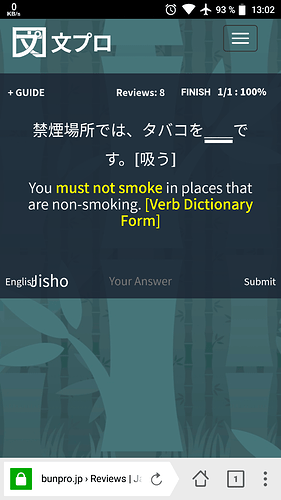
One small thing: the font size for “english” and “submit” is smaller than the Jisho button font size on phones:

And just out of curiosity, is it possible to hide/remove that top menu box with the Bunpro logo and menu button completely during reviews? It’s just way too big and I always need to scroll when the keyboard is open.

Edit: and what do you mean with “I have nothing to study at the moment”? Did you study all Bunpro material already? :open_mouth:

1 Like

I’ll add it once it’s finished :wink:

Which play button? Is there a play button in lessons? If there is I might have to create a new account to test the script with.

Did you go to the script page and update? Because it’s showing up for me in cram.

image

The font issue should have been taken care of as well with the last update

image

Indeed. Went through all the items in the first three days.


edit: missed answering this

Yes, this would be very easy. I’ll do it after I get home from the JLPT in some… 6 hours or so

2 Likes

2 Likes

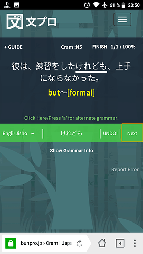
Works in cram now and the font size is perfect:

The “english” button got a few pixel cut and the play button is slightly overlapping, but that’s no problem. Really nice work.

If you consider to write a script that removes the top menu bar during reviews, you would solve one of the biggest problems for mobile users: you always need to scroll up and down all the time in order to read the sentence and type in the anser when the keyboard is open, cause the top menu bar is too fat to see the whole screen on phones. Bunpro should fix this by themselves but I don’t think they’ll do it in a short term. So if you can do that, it would be amazing. With that script you can also remove the annoying “guide” button in the upper left. I think users who install your script don’t need that guide anymore :wink:

Edit:

Are you human or a bot? That’s amazing. I startet September last year with studying Japanese using WK and Bunpro. Now 9 months later I started my first N3 lessons on bunpro.

2 Likes

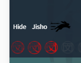
@nitzi OHHH, thank you! I’m always in bunny mode, so I had no idea that was there. I’ll see what I can do.


I’ll see if I can fix it, but I might just change it to “En” if there isn’t enough space.

I was going to do this yesterday, but I realised that if I just removed it then you wouldn’t have any way to go to the other pages. Instead I change the GUIDE button to a HOME button.

You can try this out here: https://greasyfork.org/en/scripts/369991-bunpro-hide-header

I was just procrastinating, haha. After I did all the lessons I didn’t have time to do reviews due to exams, so I’m only now getting back to Bunpro, as you see in my history.


Writing this some time after the above. Ended up just moving the button so make things simpler. Update and see if this is ok : https://greasyfork.org/en/scripts/369927-bunpro-jisho-button

2 Likes

The new script is perfect! Without the top bar it is way more fun on phones now. Thank you for that!

For the home button: I can’t long click it to get the menu for opening the url in a new tab (for example to search for grammar without leaving the reviews). And can you change the url to the user account summary instead of the bunpro start page? When this start page with the bunpro SRS advertisement opens I always think I got logged out.

Regarding the Jisho button: I’m still using your second version cause I like it being placed next to the english button.

1 Like

Heh, that’s because I was being lazy and just slapped a redirect on the existing button instead of making it a link. I did it properly now though.

Done. → https://greasyfork.org/en/scripts/369991-bunpro-hide-header

Hmm, ok. I thought it was fitting to put it next to the sentence itself though. There really isn’t much space there on mobile. I don’t see how it would fit, now that I know there’s a play button there.

2 Likes

The header script with home button is perfect now! Great.
Regarding the Jisho script: I updated to the new script. Sometimes the Sentence is too long and overlapping the button. Could you place the button to it’s original position next to the English button? If you rename the English button to “Eng.” there should be enough space.

Thanks again for all your effort!

1 Like

Thanks for making all of these useful scripts!

2 Likes