
I took a fake vote and everyone voted for possum theme [lying]. Will the will of the people be denied?!
If they didn’t want possum theme then I wouldn’t have decided that they do. You cannot deny my logic
11 Likes
I noticed instantly when I loaded Bunpro today so it definitely is noticeable!
4 Likes
Here’s my vote for how the colors should be adjusted for purple and green. I think this solves the difficulty in distinguishing the colors apart.
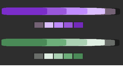
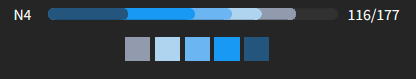
Also, I’d like to point out that the colors seem to be reversed from the old design where darker was the closer to beginner and brighter hues were closer to master.
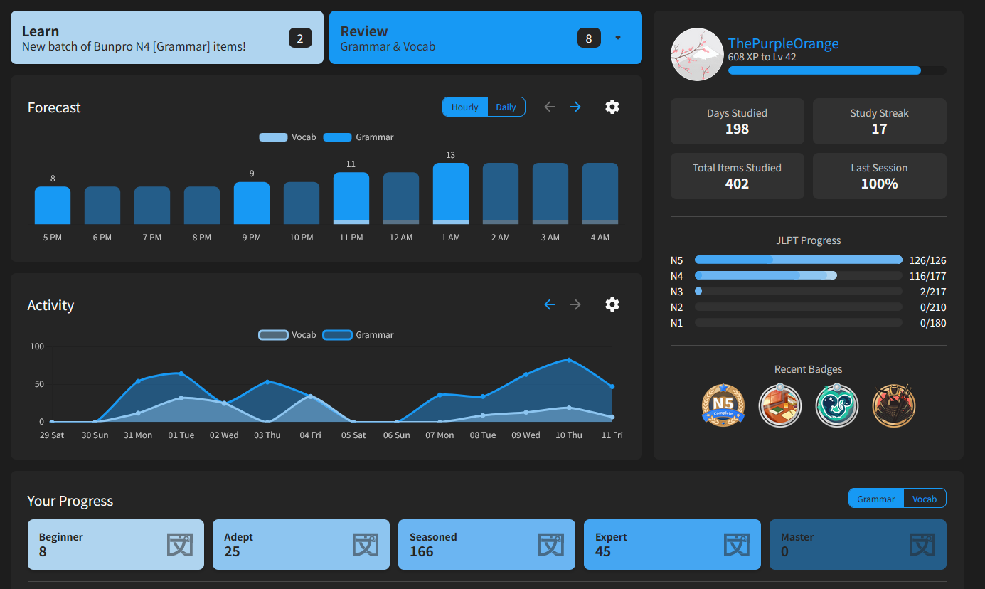
Summary
Old version:

Just to show what’s going on. Beginner, Adept, and Seasoned (as is) are all too close in shade too easily tell apart.
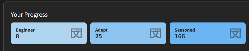
Summary
Original:

I think the blue one would look better like this for comparison.
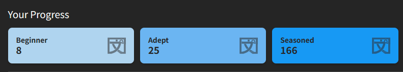
Summary
My version:

EDIT:
I got bored so here’s my updated version for light version blue as well.
Summary
My version:

Original:

Here’s a broken up version too: For maximum contrast using my color scheme.

PS: Sorry I kept editing it. I just got way into this tonight. 
7 Likes
Excuse me, but the people clearly voted for fox theme. Please look at the results of the vote again. 
13 Likes
No update is perfect. Thanks for pointing that out, we’ll get it fixed!
7 Likes

Thank you for the update!
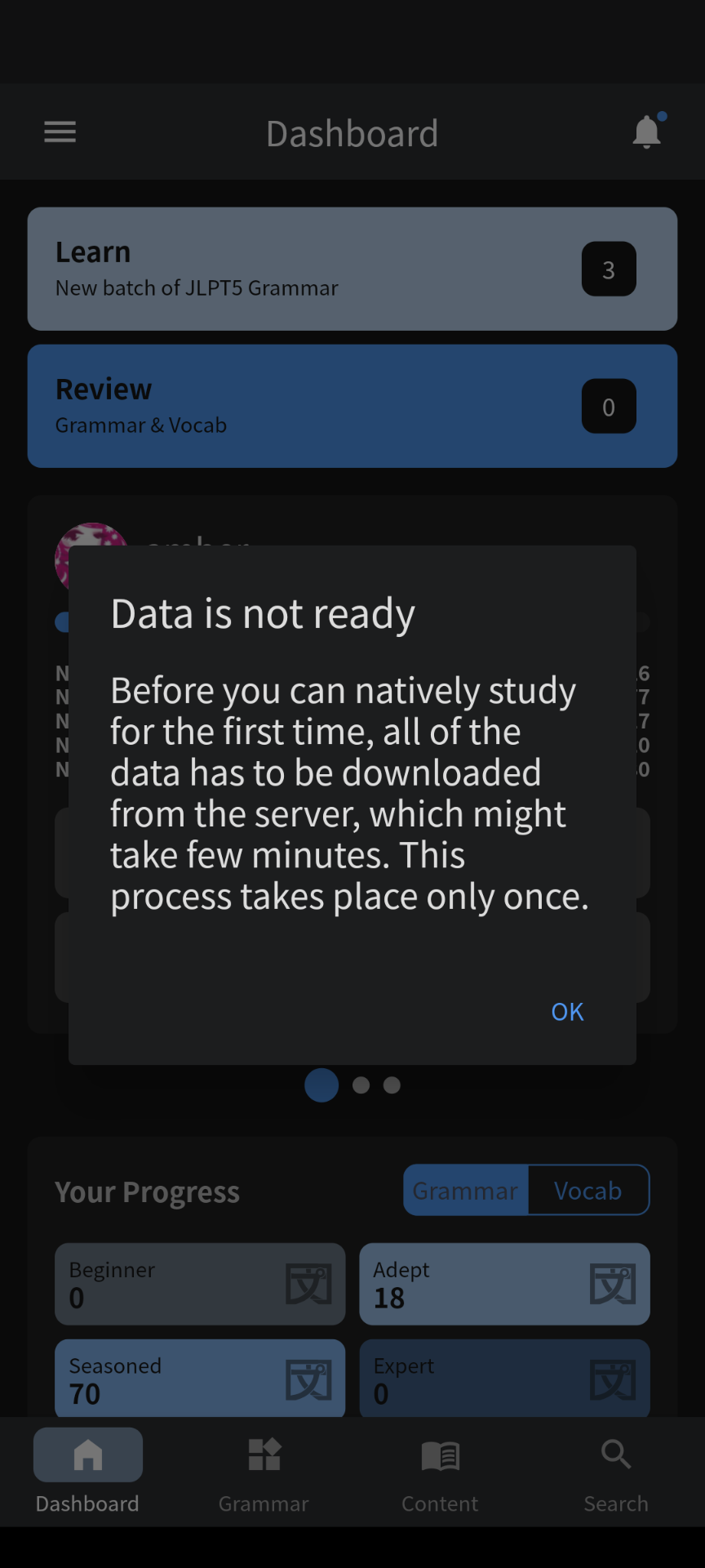
What can we do about this big red notification popping up, every time we return to the dashboard though? There is no way to turn it off, no matter how many times I click it away on the X. I don’t mind having friendly reminders or the possibility for notifications, but it’s the same message, big red, clutters the landing page and wants my attention even after I already understood what it tried to tell me.
Please help. 
5 Likes
I’ve got a warm piece of printer paper right here that says 166% voted for an orange dragon theme.
9 Likes
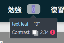
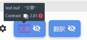
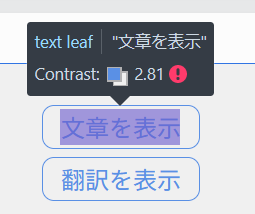
Would y’all consider having high-contrast (current) and low-contrast (like the old color scheme) options for the accents? With the old one, I had dark + red and that was perfect, and I was looking forward to having that but purple, but with the update, the red was lightened (and made more saturated?) and is too bright, the purple’s too bright, the blue’s too bright, and they hurt my eyes. The green is most bearable so I’m using that, but the super-bright almost-white of that big ol’ 勉強 button sticks out like a sore thumb and is very uncomfortable to look at. (Strangely it’s not that bad on the SRS stage buttons, but maybe that’s because they’re smaller.)
I tried switching back to light mode, but even though the accent colors look nicer with that, the almost-white has just been switched out for black on the big ol’ 勉強 and SRS stage buttons, and it’s still not nice to look at.
Update: With dark mode, when things open in a new tab, there’s also sometimes (though not always) a flash of white before it turns grey and loads the content. It happened consistently with opening vocab items and only occasionally with opening grammar items.
5 Likes
Very nice, thank you for the work !
Two feedbacks:
- In dark mode, I preferred the review page darker like it used to be (the same dark gray as the rest of the site)
- I feel like the gray borders on every box is a bit too much (the color difference between the background and those boxes is already enough contrast)
3 Likes
Hey,
Thanks for the update, I find the “light” version really nice.
But as a “dark” version user, I have to admit I prefered the old version.
First as other said, the colors for each SRS levels are too close from each other, it’s hard to distinguish the difference, for this point I can’t understand the “improved contrast” point.
Also, I find the color on the review button and drop down menu too bright/too agressive for the screen surface it occupies (Maybe also that white text here should be more readable)
On the rest of the website these news colors are fine.
4 Likes
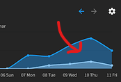
Here is the difference with and without the border in case anyone is interested in the side-by-side:
Generally I like the redesign, but as others have said I think for Dark Mode the contrast between the different SRS levels is too low. It almost feels like if you kept the beginner colour then the colour for adept would have to be at least what the current one for seasoned is.
So going up two stops of contrast/colour per SRS level if what we currently have is considered to be one stop per level.
Then an additional two colours would be needed for Expert and Master. Similar to your suggestion I think? @pgooss
9 Likes
The steps in color difference you did look really nice. I think they’ll still have to include some kind of dark-gray-blue since they use it as the secondary color for their graph and without it, they might not be able to keep the contrast they like.
Summary
I still like the idea of gray being the starting color just because, it feels like you’ve encountered this grammar point but you haven’t truly learned it yet.
Here’s my next iteration playing off of @ThePurpleOrange 
Summary
8 Likes
Same here.
Until yesterday I used it on a highend IPS panel HDR screen and had no problems. Now I’m visiting my parents where I have only a cheap TN panel screen and I can’t barely see where the color changes, it looks like a gradient. Contrast is terrible. The old scheme worked much better on that monitor.
A color scheme with more contrast would be nice for not so great monitors.
2 Likes
Just updated the app and it works now!
2 Likes
Since trying out new colors I’m unable to do new reviews. Very frustrating for a service I’m paying for. Hope someone will respond to my email and fix it soon.
5 Likes
Hey,
I am looking into it 
Cheers!
2 Likes
Love the new colors, especially on dark theme red accent
4 Likes
Update on the update!
Apparently it’s now the age of Purple Bunpro, many users have switched to Purple as their accent!
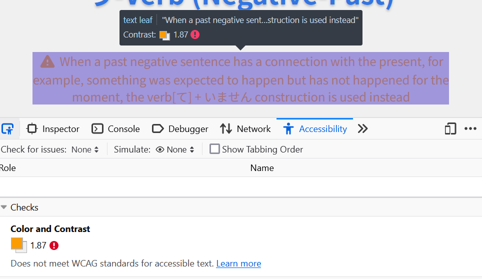
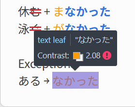
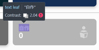
In the name of transparency, I want to disclose that the part about WCAG Compliance has been updated to state we’re not WCAG Compliant yet. This change comes from @HotAirGun’s help bringing our attention to this. We’re working on making our former statement true!
Continuing, the feedback received so far seems to fall into one of these 3 points:
- New Dark Mode is too stark in some places. @Lysquid
- SRS color levels have poor contrast between them, particularly Dark Mode’s. Specially true for Purple. @pgooss @ThePurpleOrange
- Being able to go back to the old themes, or low-contrast variants of the current ones. @FilthyBlasphemer @enbyboiwonder @Inounx
(Only tagging the people from this thread right now, but we’ve received feedback too through our other channels/posts.)
My guess is that the first and last points will sort themselves out once we make good adjustments to the Dark Mode.
I also see lots of requests for a yellow/orange theme. Yellow being the bright color that it is makes it very hard to work with on Light Mode, but Dark Mode is a great candidate for it.
That said though, we’re considering it.  Perhaps an ocher theme that’s leaning more into orange on Light and more into Yellow on dark is a solution?
Also, some of you really want animals inside of Bunpro. Fox, Dragon and Possum themes are definitely more tricky.
Color takes a bit more to get right (as evidenced by, well, me) so this update will be a slower than usual. That said though, we’re working on fixing it. Thank you everyone for your feedback, and please keep it coming!
22 Likes
A yellow/orange theme would be so based. 
Our available color schemes would basically be the 5 main colors of the Ninja Turtles. And if that’s not exciting I don’t know what is.
11 Likes