Massive Color Update 8/10: Better Contrast, Readability and New Accents!

Hey everyone!

Hope you’re all having an awesome summer, or whatever season it may be in your part of the world. :palm_tree:

We’re super pleased to announce that we’ve finally released the new and improved colors for Bunpro that fix a lot of the Contrast issues we had, along with two new accents: Green and Purple! :green_circle: :purple_circle:

You don’t need to do anything to access it, the update should already be live for you.


Contrast Improvements

Getting closer to WCAG Compliancy

A lot of work has gone under the hood to make sure that Bunpro’s colors are closer to be compliant with the Web Content Accessibility Guidelines (or WCAG for short). Some color combinations still result in invalid combinations with lower numbers than the required standard, but they’re still higher overall when compared to the old colors.

What this means for you is less eye strain/fatigue through increased readability, making content consumption, reviewing, etc much easier.

  • A lot of components site-wide were updated to make sure good contrast rules were being respected.

  • Background colors are now more unified, working in tandem with higher contrast foreground colors to make a good reading experience.

If you spot something that looks out of place though, let us know and we’ll fix it as soon as possible! :muscle: These colors aren’t final, and we’re working hard to bring true WCAG compliance to the site.

A more unified look

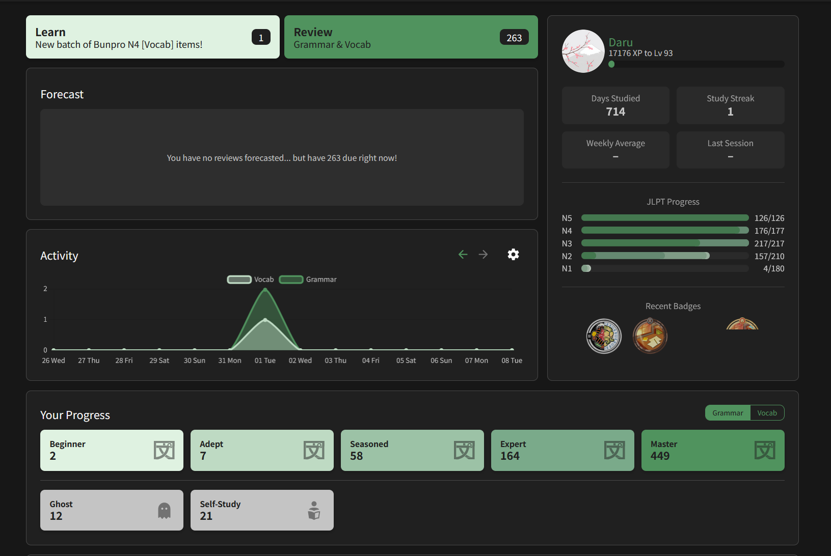
Together with this, we’ve also updated the visual style site-wide! This much needed fresh coat of paint will probably be the most noticeable for older parts of the site. That said, this is just the start of a slew of visual updates we have in the works.

Nothing has been changed or moved out of place, this is 100% a visual update!
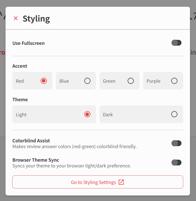

New Accents!

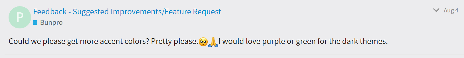
With all of that color work behind us, it felt right to celebrate by making more customization options available to everyone. Which is why we’re adding Green and Purple accents into the mix!

Both are available in Dark and Light variants, bringing the total possible combinations for customization to 8. We hope they make your Japanese journey with us that much more personal and enjoyable for you.

We’re also considering releasing special themes in the future, so if you have an idea for a colorway, let us know in the comments below!

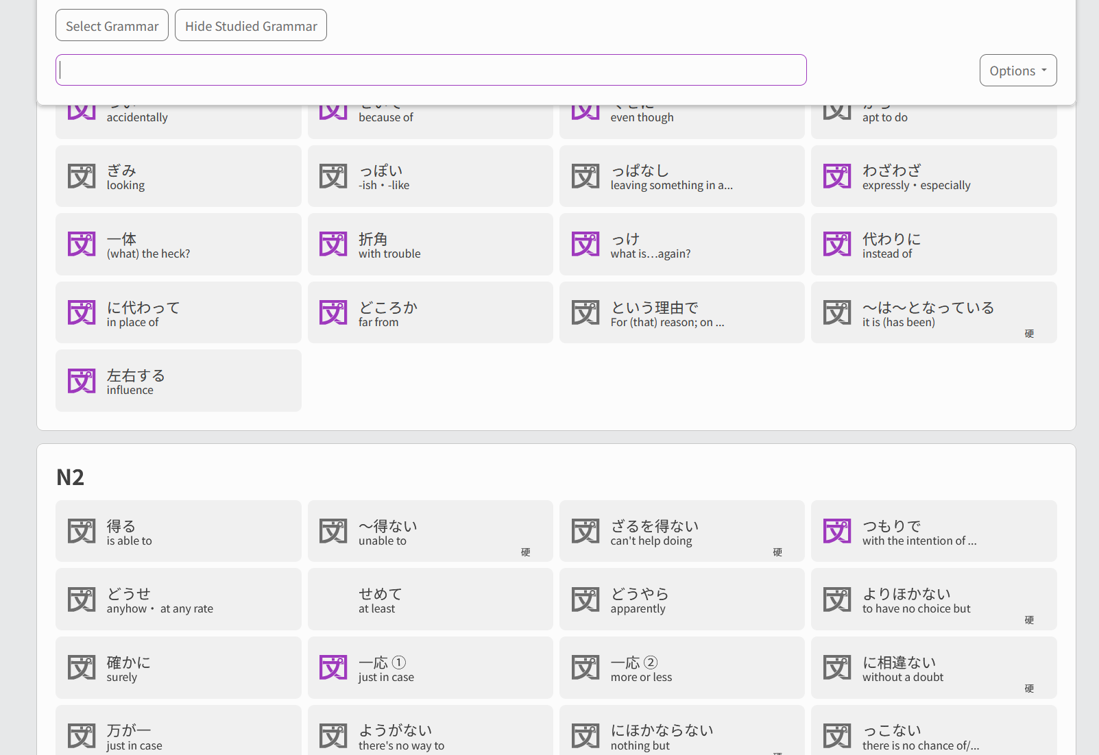
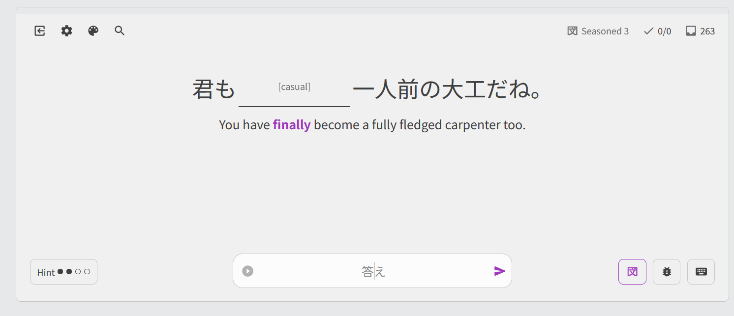
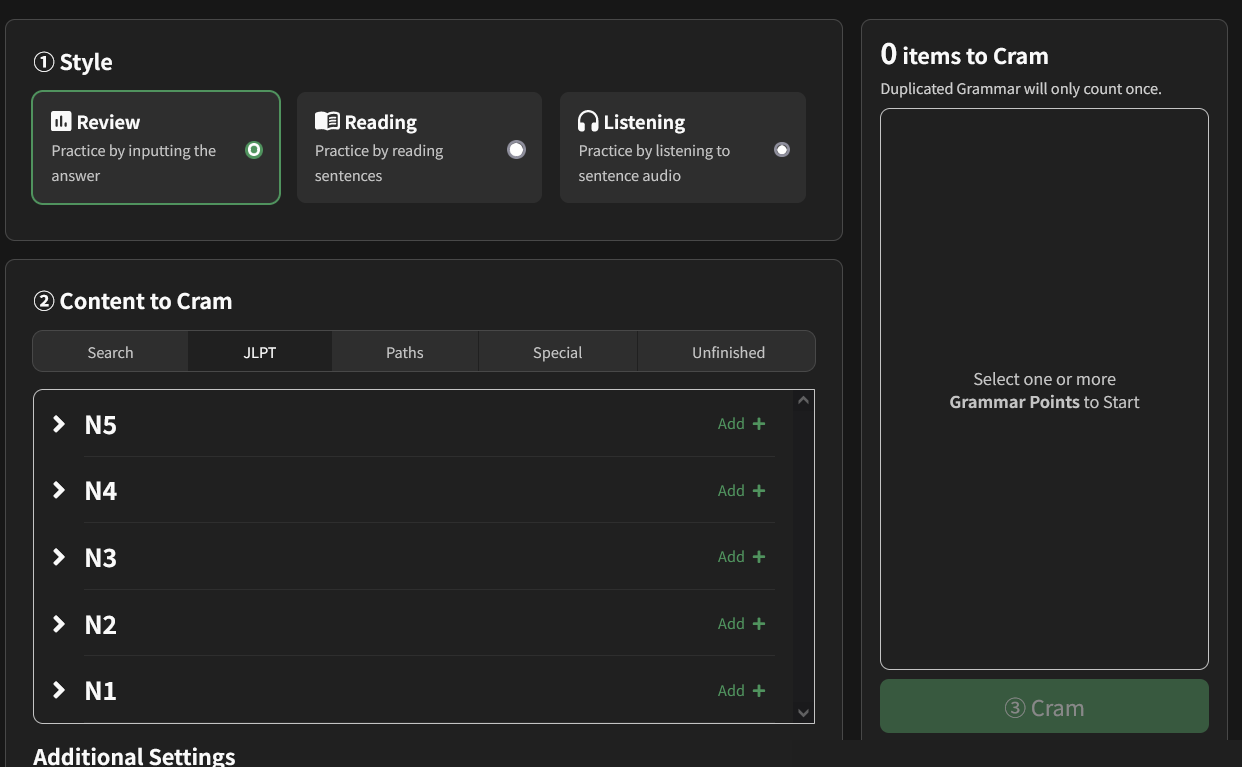
How do I access the new Accents?

Just go into your Styling Settings, there you’ll see a dropdown that will allow you to chose whatever combination you might want.

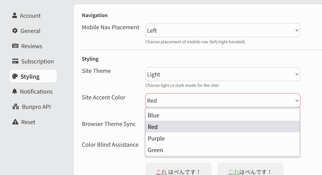
This is also available inside of the Style menu inside of Reviews!


Final Words

This new Color Update allowed us to formalize a lot of our internal Design System, setting us up to keep improving and updating the entire site to get Bunpro to be the most polished version of itself we can make. You’ll be seeing more and more improvements to the site as we go on!

I also want to thank @tomtomtom, @veritas_nz and @Jake for their hard work on this. :bowing_man:

None of this would have been possible without everyone’s feedback.
We really do read and discuss every single comment thrown our way, so we appreciate everyone reaching out!

If you see anything that looks goofed up, let us know and we’ll get on it right away!

Keep enjoying your summer, and do your reviews!
Until next time everyone!

42 Likes

I like it a lot, however I switched the accent to purple and now the android app won’t load (I get a blank screen). Should I wait for an update?

4 Likes

Ah that explains why I thought the reviews background looked different.
Shame you guys forget once again to make the possum themed accent that everyone in the world has been asking for :confused:
Perhaps in another million years

7 Likes

It will be on the play store a little later today for internal testers, later this week for full release as it needs to go through review.

5 Likes

I mean, as long as enough people ask for it :man_shrugging: :wink:

3 Likes

Really like the new colour scheme and accents! Noticed almost immediately that there was less straining.

Switched over to green for now, but if a yellow accent came out, I would switch in a heartbeat.

I feel that yellow is often an under appreciated colour! :triumph:

4 Likes

Same, I thought my dark reader (chrome extension) somehow activated and was messing with the colours lol

Definitely looks really weird, but I think I like it? I need to get used to it first but I’ll give it two thumbs up :+1: :+1:

2 Likes

I voted for a cookies and cream color scheme. I didn’t win the vote :sob:. Now I will forever be dark mode purple accent :ok_hand:.

7 Likes

Thank you guys for your efforts!

Sorry to be a killjoy (again :rofl: ), but this :arrow_down: statement isn’t actually true.

3:1 contrast ratio requires text to be at least 18pt or 14pt if it’s bold. So this contrast basically can be applied for headings, not for regular text. Any other text should have at least 4.5:1 contrast ratio.


I still wish the hint text would have increased contrast ratio or font size.

8 Likes

まずずっとありがとうございます!

半分冗談で, is there a Japanese traditional set of colours that could make up a theme? 浮世絵 typical colour palette, if there is any, to give a woodblock print sensation?

5 Likes

Hey! Thanks for pointing that out. This side of the update just focuses on color, no font sizes are being handled right now. We used to have combinations that would render a ratio of 1.5 or even lower at times before the update.

Perfectly adhering to the guidelines through color only was very limiting to us to be able to make a good, comprehensive update. Right now, color-wise, no color combination is below 3 which seemed like a fair minimum that still allowed some flexibility in the design.

That said though and as you’ve pointed out, the text sizes are next in the improvements list. Contrast, after all, is not just color. Thanks for your feedback!

8 Likes

The new color update made my layout (red) way too bright. Is there anyway to get the former maroon-ish colors for the red color scheme?

For now I will have to stick to the phone app since it has the red color scheme that doesn’t hurt my eyes.

5 Likes

Nice! Switched to the purple accent as soon as I saw the update.

4 Likes

You guys are so awesome, I’m so glad that you care about things like contrast and good color design on top of all the other amazing things you guys do. You must have an amazing and diverse team!

5 Likes

Thank you for continuing to improve Bunpro’s accessibility and customization! I’m going to stick to red for now but I love the new colors!

I know yellow can be hard to make accessible, especially with a light theme, but since it’s my favorite color I’d love for that to be an option (maybe group with orange?)

7 Likes

Purple Bunpro, best update ever :purple_heart:

7 Likes

Bunpro now has a better accent than my Japanese

13 Likes

Maybe just me, but for some reason I think the readability of the jlpt progress bars is better on the old dashboard. (What do I mean by readability? How easy it is to discern where the colors meet and change.) On the new dashboard I can’t tell with just a quick glance like on the old one.

New:
image

Old:
image

Gotta say I’m a big fan of dark + purple accent :purple_heart: (Even tho I’m part of the red accent gang, haha)

18 Likes


Oh my gosh! I’m the one who asked for this. Seeing them implement this makes me want to cry. :sob: I’m so happy!

16 Likes

You’ve no idea! This was months in the works and to see you ask for exactly green and purple was pretty crazy. :grinning_face_with_smiling_eyes: 
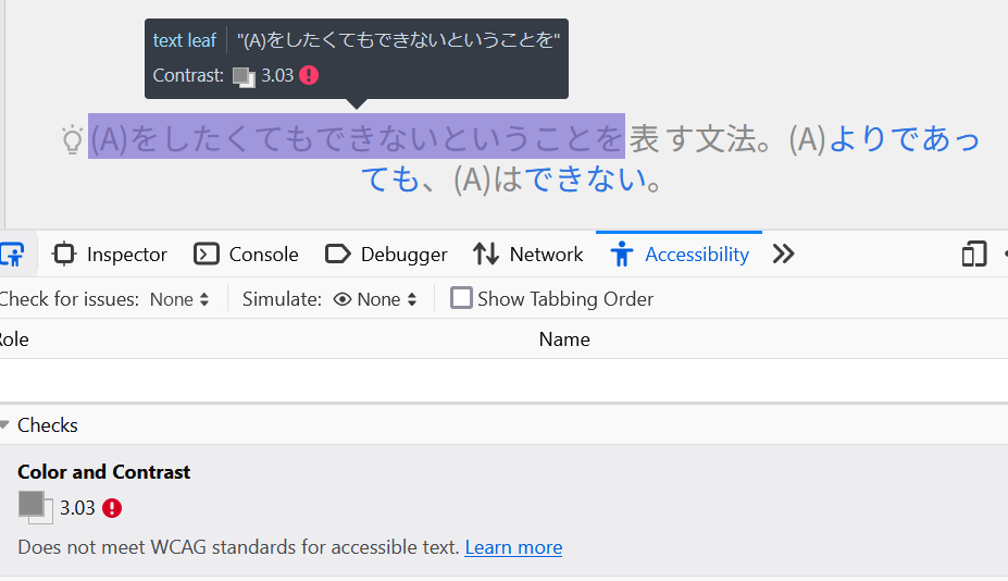
Glad to see you’re enjoying the update!

8 Likes