A yellow/orange theme would be so based. 
Our available color schemes would basically be the 5 main colors of the Ninja Turtles. And if that’s not exciting I don’t know what is.

A yellow/orange theme would be so based. 
Our available color schemes would basically be the 5 main colors of the Ninja Turtles. And if that’s not exciting I don’t know what is.
This reply convinced me to upgrade to lifetime. Thank you.
Definitely agree with this one. Currently trying out Dark+Purple and I would be vibing with it, but not so much in love yet for this exact reason.
Other than that, it’s looking pretty okay contrast-wise for me. Site uses the screen space better now, and the layout is extremely clean and effective IMO.
Props 
PS
I kinda miss the recent mistakes from WK, because you have to go through cram selection to do that, but that’s for another topic I guess.
I set my preferences to immediately create a ghost after the first mistake, this way I know that any error will come back to… haunt me.
These updates are not live yet, for this specific update we thought it might be better to gather more feedback before making a change to the live version.
Please take a vote on the proposed solutions!
More screenshots on the change:
Do you think this helps reduce how stark the Dark Themes feel?
0 voters
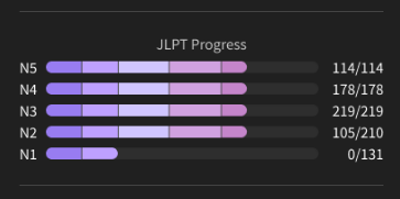
We’ve added slices between the levels to make it easier to discern between them and boost contrast further.
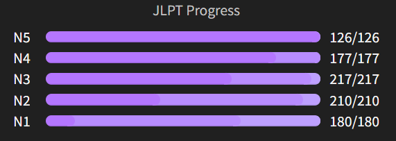
We added a shift in hue to make contrast clearer between the levels.
Now, in order to have better contrast for the SRS levels we needed a bigger shift in tone/hue for the contrast to be good enough, we’re calling these Duotone Themes.
This makes the contrast way better across the board, but its very different from what we originally made available.

More screenshots on the change:
Do you think this makes it easier to differentiate between SRS levels?
0 voters
–
Should Duotone replace the current themes or be offered alongside?
0 voters
We believe that both the solutions are above are enough to warrant not going back to the old themes, or offering a way to do so.
What are your thoughts on this?
0 voters
That concludes the first wave of changes! After we work out the colors, better WCAG compliance is next. If you feel like the polls don’t reflect your thoughts please just comment below.
And, as always, thank you for your feedback! 
@Lysquid @pgooss @ThePurpleOrange @FilthyBlasphemer @enbyboiwonder @Inounx @Yumari-1 @Alpacat @HotAirGun @Redglare @Buntebunpou
For the first one I commented Other
My comment is
I didn’t see a problem with contrast to begin with. BUT that being said either of those colour formats shown here are both completely fine by me
More screenshots on the change:
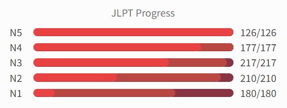
I’m a little split. My enjoyment of the things depends a lot on the colour. For example, the low contrast red I think looks pretty great, but the purple is a bit ‘eh’ for me. I might be the wrong person to ask though since I like looking at bright colours for fun lol.
As for the duotone, I think it works a lot better than the low contrast. Again though, I think it really depends on the colour. Purple looks outstanding and I wouldn’t mind if that was released today, but the Blue Duotone doesn’t really make sense to me? It goes from a greenish-blue, to a more greenish colour, and then back to blue? And the change in brightness doesn’t make as much sense to me like purple does, as it goes to a light blue, to a semi-light blue, and then back down to a darker blue.
Personally I would probably swap the hues for the ‘Beginner’ and ‘Adept’ stages in the Blue Duotone (but keep the brightness so it’s still “ascending”, kind of like the Purple Duotone) and make the “Master” stage brighter.
I think it does need a bit more workshopping, but I’m really liking how some of these are turning out. Maybe if you really wanted to, you could implement a ‘high contrast’ and ‘low contrast’ modes like Visual Studio Code does. Good work guys 
For me the biggest issue lies with the JLPT Progress bars not being easy to read with the “MonoTone” purple, but I get the impression that the split bars might be enough to solve the issue even without DuoTone themes. Hard to say decisively before trying it out for myself first, though.
And I agree with @Alpacat on the DuoTone looking best in purple. The other colors I’d personally keep mono.
I’m curious how the split bars is going look like in cases where there’s just a few left before mastering a whole jlpt level. The details don’t show in normal zoom.
Here the two Expert is not visible and it looks like I got N5 all mastered.


Hey,
Just some more feedback regarding these changes:
Do you think this helps reduce how stark the Dark Themes feel?
Yes definitely !
Do you think this makes it easier to differentiate between SRS levels?
My first impression on Duotone, is that it is promising ! It brings a completely different feeling by adding new colors. I really like the fact that there is more than one accent color ! The difference between the SRS level is now clearly visible. Compared to the high contrast version, there is no more ascending “brightness” (sorry if this is not the good word) order: the seasonned level becomes the lighter one, and it seems like a fade out from the first color (beginner level one) and then the minimum is reached at seasonned and fade in, up to the accent color.
I am sure I can get used to it, but it breaks the logic you had until now.
Maybe it is possible to keep the ascending tone / brightness but using the duotone color logic ?
About the colors in particular, I like the purple and red duotone version, blue is okay, but I have to admit I am not a huge fan of the greenish color, and green duotone, I don’t have an opinion as I don’t like green color in general.
Globally, in my opinion this is already a really good improvement !