New Header
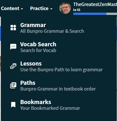
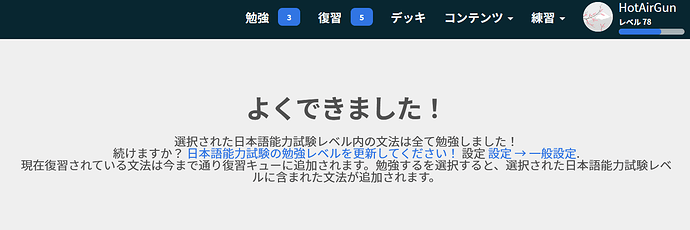
As you might have noticed when you logged in, we have made a change to the navigation header.
We also made adjustments to the dropdown menus.

Here is a list of the changes:
-
Cram and Reading Practice were moved under Practice.
- This change will give us a place to put other tools/practice content we release in 2023 and beyond (conjugation tool anyone?).
-
Paths was moved under Content
- We realize this change will impact users who browse a path before studying and apologize for the introduction of an extra click to get to the Paths page.
- With the changes we made this year and plans for improvements to decks in 2023, ultimately we plan to phase out paths when we have a superior version of them accessible via their respective deck.
-
A search icon was added that will take you to the grammar point search.
- On mobile this is available in the header as well, making it easier to quickly open a search.
-
The style of the Study and Review buttons were changed.
- Your batch size for main decks will be reflected in the number next to Study.
-
Summary was removed in the profile dropdown
- This was a change we were on the fence about but after doing research and ideating, we opted to implement it. If you often use the summary button, please don’t hesitate to reach out and let us know how this changes impacts you.
Ultimately, this change, while visually quite stark comparted to the white header before, was a necessary adjustment as we work to implement a new Bunpro UI. Stay tuned for a big update about that in the near future!
Accessibility Changes
@tomtomtom added a bunch of accessibility features to help bring Bunpro up to Web Content Accessibility Guidelines (WCAG) international standard. Most of what has been added will be invisible to you unless you use assistive technology, but it’s important that we provide a tool that can be used by everyone as easily as possible.
To that end, we’ve added the following:
- coded labels for links which have no text (only an icon, like an arrow)
- coded descriptions of images, so they’re interactive for a screen reader or in case the image fails to load
- defined roles for our buttons - this will make site navigation easier for those using screen readers
- clearer labels for our forms - from a visible perspective, our forms are easily navigable, but from a screen reader, things needed to be labeled more clearly
While Bunpro isn’t perfect according to WCAG guidelines, we’re working towards it, and will continue to improve things as much as we’re able.
As always, we would love any feedback you have about these changes 

 ).
).


