Mobile App - UI refactor

We have completely overhauled the mobile apps!
This update includes a UI that matches the website better, new features, and other stuff! Check it out:

Purpose

Following the “Reviews 2.0” update on the website, we have decided to change the mobile app UI to match the new Review 2.0 and include similar functionality.

The new mobile reviews are faster, more ergonomic, and more elegant than what we used before.


Update Overview

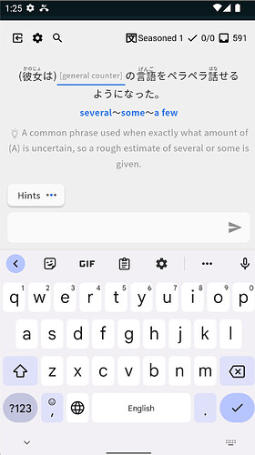
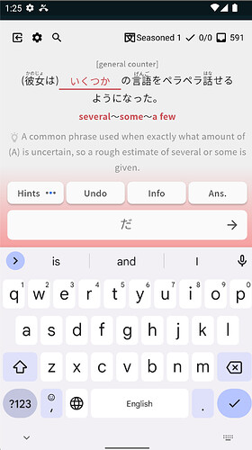
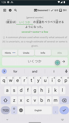
Reviews Page


With the new approach, reviews can be done more efficiently.

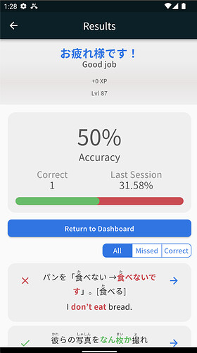
Review Summary Page

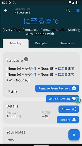
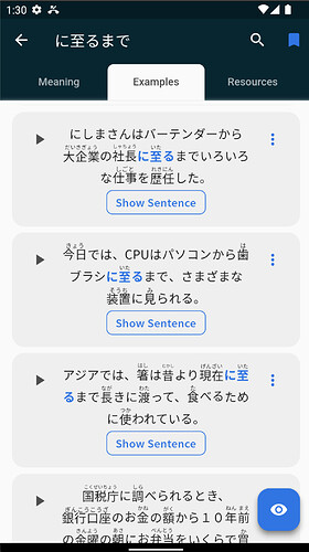
New Grammar / Vocab pages


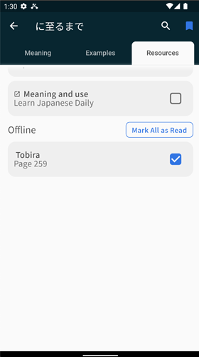
As you can see, it is now possible to mark all the readings at once as read.

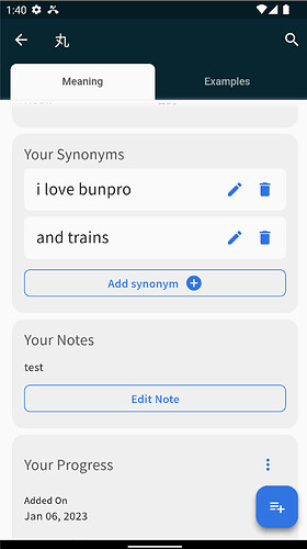
For the vocab screen, it is now finally possible to add users’ synonyms in the app.

Additionally, cloze-style reviews for vocab are available!

The new grammar/vocab screen is much more modern, we have added the Floating Action Button so that access to some features is easier (and eliminates the need to scroll the whole thing to add to review).


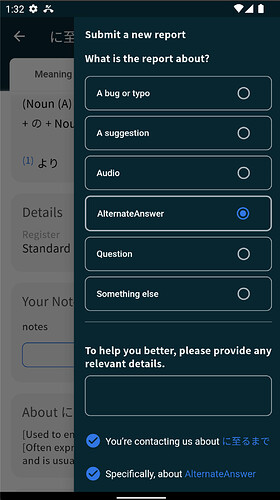
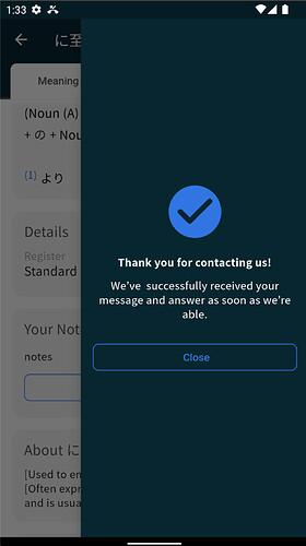
Bug Reporting Functionality


We have added bug report functionality, that is accessible from almost everywhere in the app. It makes reporting content-related bugs much easier than before.


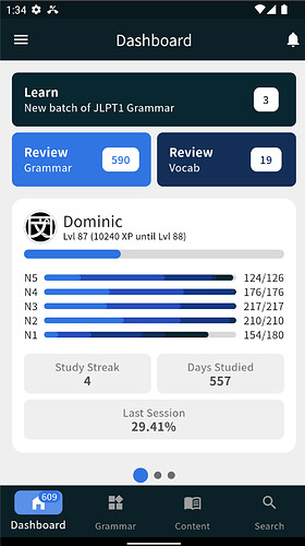
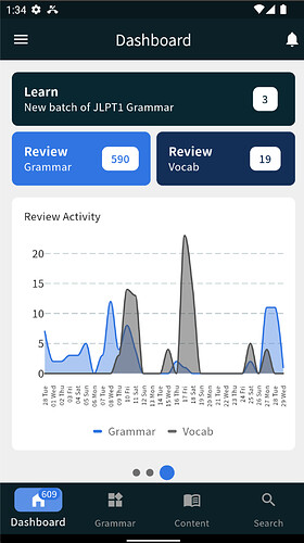
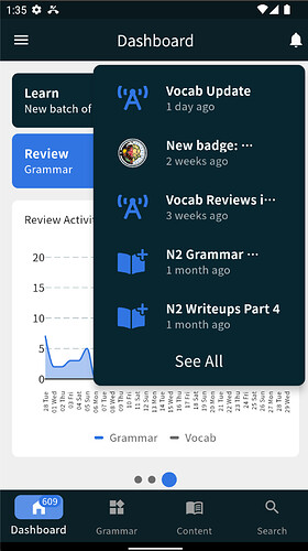
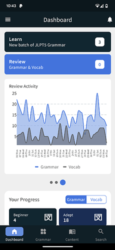
Dashboard Screen


The dashboard screen has gotten prettier :flushed:
The number of reviews due is now displayed over the dashboard icon at the bottom bar.
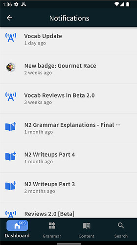
It also gives you access to the new notifications screen.


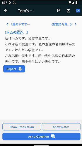
Reading practice screen

Looks a bit leaner, it is now possible to slide sideways between texts.

Caveats / Known Bugs

While we have done extensive testing internally, there are bound to be some edge cases we didn’t catch. Please don’t hesitate to send us logs, or an email or reach out here on the forums if you have any questions or issues!


Feedback

We have put a lot of effort into this design and implementation, and we want to hear Your opinion!

Feel free to DM me directly with any feedback, or reply directly in this thread. As always, thank you for all the feedback and suggestions you make. :bowing_man:
It helps us make the best possible version of Bunpro so that everyone benefits:heart:

36 Likes

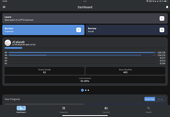
I just submitted some feedback through TestFlight, but I figured I’d share here too. I’m using the app on an iPad and the new UI is rather unpleasant when thinking about the two main buttons, Learn and Review. The length of the bars is far too long and the distance between the numbers and the words produces an annoying travel from one side of the screen to the other. It’s not functionally hurtful, but my first impression was of brief confusion and continued unpleasantness, though this may be because I do use the app quite a bit so I wasn’t expecting such an overhaul. Is there any way you could make those buttons more compact in future releases so that the information is more condensed in specific parts of the screen? I do like the desktop experience, with more parallel blocks when there’s more space, but even on the iPad the website displays the buttons in a more compact way:

Vs

Anyway, thank you for working hard on the app! I do like the new look on the iPhone app, though I wish the learn and review buttons were below the user xp box. That’s is because the way I grab my phone, whenever I want to click on Review, I do it with my right hand’s thumb and the new location for Review is a bit too high for it to feel natural. I do have to move my whole hand to reach the button or use my other hand. It may sound like a minor thing, but muscle memory can be a real pita, haha.

Thanks!

7 Likes

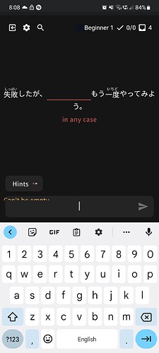
The “Can’t Be Empty” prompt on samsung is cut off during vocab reviews.

5 Likes

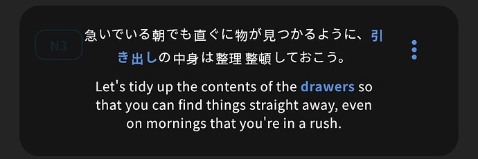
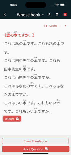
On my iPhone, text that has furigana available and text without furigana doesn’t have the same baseline. During review the input field seems to have its own baseline as well:

In the summary (and some other places):

Reading material (actually really annoying to read on a phone because of the high density together with the baseline differences… it doesn’t look that bad in the screenshot, but on the phone it’s really irritating):

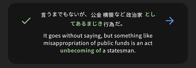
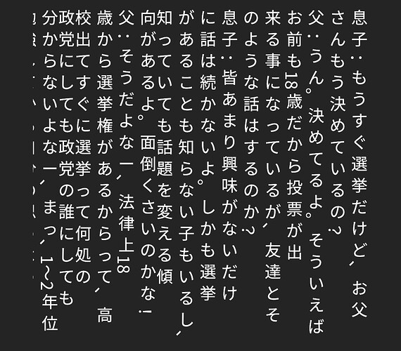
Speaking of reading material, the vertical layout doesn’t have color and is even more difficult to read because of the high density and no particular spacing between columns. Also, it looks like you bought your tategaki on wish with the comma on the wrong side and rotated, the full stop in the wrong position, the ー in the wrong orientation, the small kana in the wrong positions, the numbers and the colon slightly out of position, and the ? and ! should not be rotated either…

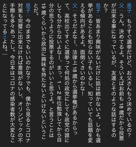
For comparison, this is what it looks like when I paste the text into egword:

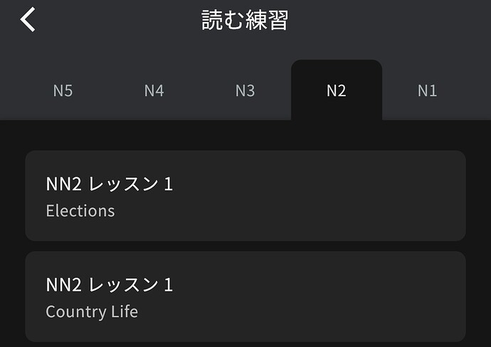
In some places, the title has a double N, e.g. “JLPT NN1” on a grammar point page:

Or just “NN2” in the reading section:

But in this button it doesn’t have an N at all (and I’d really like to be able to hide this button, it’s really big and there isn’t any other level I can switch to that’s not complete):

In this vocabulary item, the N tag is very hard to read (at least in dark mode):

8 Likes

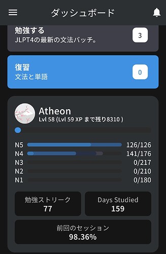
On the Dashboard some things caught my eye

Days Studied in English while the app is set to JP

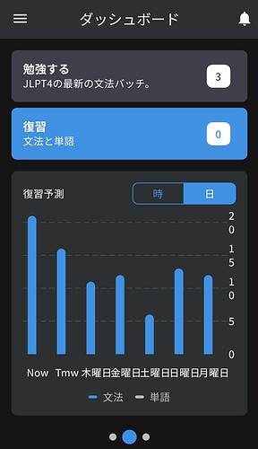
and if the Review Forecast is set to daily Now and Tomorrow are displayed in English

Edit: On Android using a Samsung phone

Thank you very much for the update!
Keep up the good work

5 Likes

Love the review activity graph.

Are all the stats available through the app? Maybe I just haven’t found the button.

5 Likes

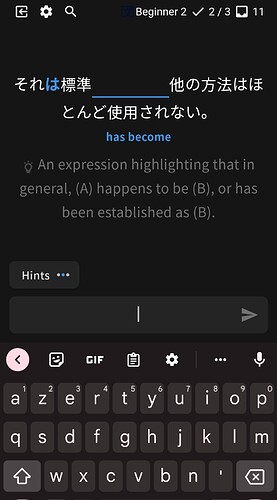
So this is great and all, I noticed it yesterday, very slick! But…first the nuance hints completely disappeared from new items, and today it seems like they’ve disappeared entirely from reviews as well? (On Android, using the beta, in case that matters for weird interactions). Like there’s a translation and then there’s the whole sentence translated and no nuance at all, like vocab was (actually was vocab supposed to have nuance? No, right?) Even the hints counter thing at the bottom, which used to be five dots, is now two. That’s a bug right?

EDIT: Yeah okay if I try in-browser, I still get the nuance hints. I’ll submit a report!

DOUBLE EDIT: …except now when I go back to the app the nuance hints are back?? I suppose it’s one of those things, 17% of the time merely telling someone something is broken will fix it…my bad, thank you!

5 Likes

This. Looks. AWESOME. And one more time: THIS. LOOKS. AWESOME.

4 Likes

Device : iPad too

Overall, i really love the new interface :smiley:

I agree, that’s weird if we study only grammar + vocab in the same deck. If we choose the split review, it’s seems okay (still a little weird, but still better than 2 lines for 2 big buttons)

For me, the only things I find difficult to understand is what is called the “Content” section. It’s not homogeneous (the content changes, and the name of the reading section also changes).

  • On the menu on the left, Content = Grammar + Vocab + Reading Passages
  • On the menu at the bottom, Content = Vocab + Reading Practice + Bookmarks
2 Likes

This looks AWESOME!
I just tested it for both grammar and vocab reviews. And when you put your answer, the answer doesn’t turn into kanji or katakana like it does on the website.
And on vocab reviews, if you hit the “hint” button, it shows the hint in both english and japanese instead of just showing the japanese one first.

1 Like

@Atheon
Thanks for the feedback!
All fixed and will be released with the update.

@cjhey @JCalandr
Thanks for the feedback, we will change the UI for the tablets so it is more ergonomic in the (near) future :slight_smile:

@apaul
Thanks for the feedback, I have fixed it.

@lupine
At the moment, we only have those charts, but we will add more in the future :slight_smile:

@chickymcface
Hey, if the problem reappears, feel free to PM me, or even better - send the report from the app.

@eclipse77x
Thanks :heart:
5 Likes

I’m very pleased by this upgrade. I find it a lot nicer looking and the general flow makes a lot more sense (to me at least).

The only oddity (that I now see has been reported by @nekoyama above):
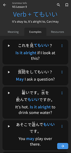
Notice that the kana and kanji don’t line up, perhaps because of the optional furigana on the kanji that increases the div's height? It’s a bit jarring, especially here in 旅行に行く at the end of the sentence. Almost looks like the kana is superscripted.

5 Likes

you are mistaken, it’s just 行 to the power of く

14 Likes

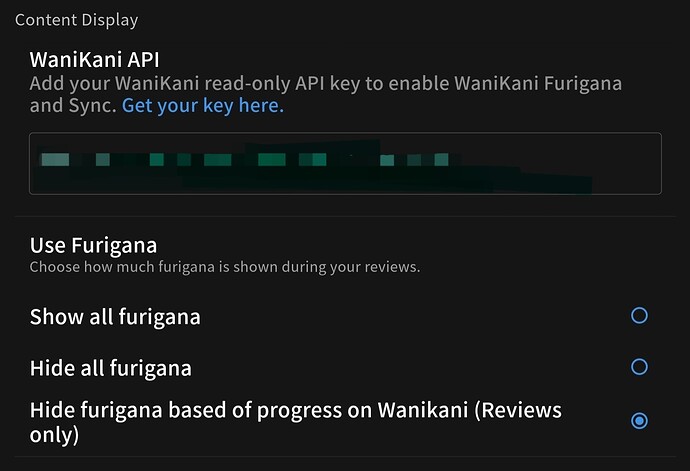
hide furigana base on wanikani still not working
always show all furigana

6 Likes

Loving the update! The UI is really pleasant and since everything seems to be running natively now it’s a lot smoother too.

One problem I’ve found:

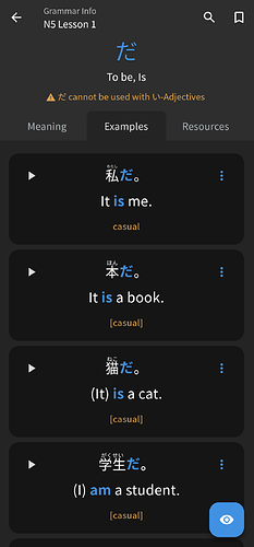
When learning new grammar on PC, I like to hide the translation in the Example sentences tab. This currently seems to not be possible on mobile, because the action button at the bottom right is replaced by an arrow. If I open a grammar point manually, the action button to hide translations is there.


Also, is there any way to add multiple vocab words to my vocab reviews? For example adding all of N5 at once instead of one by one?

Have a nice day! :slight_smile:

3 Likes

Looking good overall, I didn’t try lessons yet, though.

I think I prefer the new font size.

Unsure about the new buttons, might need some getting used to.

Only thing I think should be changed is to be more obvious with the correct/wrong colors, it’s a bit too subtle, changing the background of the input like before would make it more obvious.

Great work.

3 Likes

As if kanji wasn’t complicated enough, we’re now entering the complex plane!

1 Like

@nekoyama @simias
I am pleased to tell that baseline issue has been fixed and will be available with the update:

The furigana will be also slightly bigger.

:bowing_man:

3 Likes

Thank you!

After a couple of days using the new app I confirm that it’s a game changer for me. I used to avoid the app and open bunpro in Firefox mobile because I kept having issues and the UI was clunky but now I have no reasons to do that. Of course there are still some corners that feel unfinished but the core SRS loop works perfectly as far as I can tell.

Very well done!

I much prefer the new buttons, they’re cleaner looking and more explicit so it’s a win in both form and function IMO. Of course if you got used to the old ones it may be a bit jarring but I think for newcomers it’ll be better (I remember being a bit confused with the UI when I first started bunpro, partly because it wasn’t clear what the buttons did). I took me a while to understand what “Oops!” was for instance… “Undo” is a vastly better label.

2 Likes

Hello, thanks for the big update.
I just have one comment on the font size, it might just be me but even with it set to “Big” I don’t really see that well, it seems more like “normal” font size

3 Likes