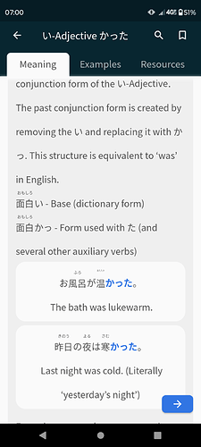
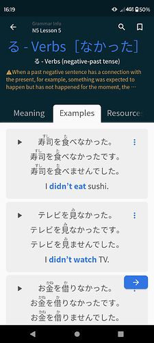
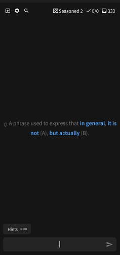
The refresh is AMAZING, reviews work much much better now! I would agree with Asriel’s point above though - as it stands, the hint font is often larger than the questions themselves, even at the largest settings. If it’s at all possible to address this (perhaps by offering a larger max setting, resizing smaller sentences/vocab to a larger “max size”, and/or letting the longer sentences break to more lines?) that would make an already great experience even better. Thanks as always for the team’s work on Bunpro!
Hello, mobile design is nice (although I started using bunpro only a few days before this came out, so can’t compare that well.)
There’s one thing that’s been frustrating me a lot since the redesign, and I could see it getting fixed in two ways, ideally both.
The button to submit my answer on my keyboard should not turn into the button to go to the next question. There have been many times where I got the point right but made a typo, or I more or less know the point but am just trying to understand how I got it wrong, or I even got the point right but want to review the point further, but then I accidentally double tap submit and it moves on. With beginner cards it’s not a big deal, but incorrectly marking an advanced card as wrong can be very frustrating.
The button to go to the next point should be separate from the button to submit my answer. Would help with this issue a lot.
Also, there should be a way to go back to the previous card even after you’ve moved on and redo the card. I’m kind of annoyed rn cause I got a card wrong after a long interval even though I knew it, and there was no way to go back and correct it. If I could go back to the previous question, issue would be immediately resolved. (This might be already be a feature, I just couldn’t figure out how.)
@machinaeZER0 @Asriel
We are working on this, and it is mostly done, the furigana and the font will get bigger, and also it will be possible to zoom the screen.

Ahh, that’s awesome to hear! Thanks for the reply 
Is there a way you can add the ability to select text? I use this while taking nots for my Japanese class. And sometimes I like to copy paste example sentences into my notes. Or I like to copy a kanji for the description of the grammar point, etc. However, text selection seems not to work. As a note, I am working off of an ipad. Not sure if that is related.
Also, just want to say, loving the app changes.
@entropyofchaos
Hey!
It is now possible to copy sentence, you have to simply tap on the three dot button next to the sentence, which will open the menu with copy option:
I stumbled on the forums searching for anything about why the app had changed. I made an extensive comment about it in another thread, which I will link here for your convenience:
In short, I don’t like it.
In addition, the font size option seems to have barely any effect at all, and none whatsoever on furigana. Look at the absolutely tiny size of it above atatakakatta here, even with “big” text enabled:
There is just no way a regular human being could read that, and for some reason (even though it’s probably mostly a web browser shell) the app doesn’t allow zooming, so I couldn’t even do that. I actually did not recognize the word and the only way I knew what it was supposed to be was by zooming on the screenshot I took.
That’s awesome news.
Is there any plans to add the ability to select text? Like if I want to copy a single word to look it up or to copy part of the grammar description to my own notes.
I love the new update’s design but there are a few things that I wish were different. Firstly the font size, the “small, medium, big” isn’t cutting it when “big” is so tiny that I can hardly read the furigana. font size slider would be great and maybe separate font scaling for furigana would be great too. Secondly, the “return” button seems like a step backwards. Previously if you pressed the back button, it’d take you to the dashboard immediately mid review, now there are at least 3 more key presses until you get there.
Update released:
- we have increased furigana font size
- we have increased size of the Japanese text in reviews
- we have added pinch to zoom function in review, readings and vocab/grammar screens
Woo, furigana is readable now!
Update released:
- we have added large furigana mode in settings (Settings → Display → Large furigana mode)
- we have added pinch to zoom function in review, readings and vocab/grammar screens
- we have added improvements to result screen
- some other bug fixes
Thank you for increasing the font size 
New update released: Version 4.0 build 80
We’re excited to announce the latest update for Bunpro! Here are the key updates:
- Bug fixes:
- Fixed audio-related bugs that caused audio players to stop playing music when Bunpro sentences were played, and audio not playing when trying to play a sentence for the second time.
- Fixed the chart’s tooltip overflowing issue.
- Fixed the wrong title being displayed in reading passages.
- Improved error prompts by providing more detailed information.
- New feature: Some English grammar terms that are underlined are now tappable.
We hope these updates make your learning experience even better. As always, we welcome your feedback and suggestions for future updates.
It’s me again.
Apparently sometimes the grammar notes are so big they don’t fit on the screen:
There doesn’t seem to be any way to see the whole thing on the app. I just checked and this isn’t a problem on the mobile site.
Hey @adamdschneider
Thanks for the report, I have found the issue and fixed it.
The fix will be released with the next update 
Cheers!
Version: 4.0 Build 80
Device: Samsung Galaxy A71
OS: Android 13
Grammar reviews don’t display the sentence being reviewed. Nuance hints work as expected, but no translation hints. I don’t think I’m using any unusual settings. Tried with different font sizes. Tried light theme and dark theme. Screenshot should be attached. Should I report a bug anywhere else?
Hey @vounwzn
When you get the same issue next time, could you try sending report by tapping on the gear?
Or going back to dashboard screen and tapping on the hamburger menu at the top left, and then selecting “send feedback/report bug”?
For the time being, you can also try resetting data in settings.
Cheers
Done.
Resetting app data fixed the issue. Thanks!
Oh, uh. I guess next time I’ll do the feedback thing instead of posting here.
I didn’t notice it.


