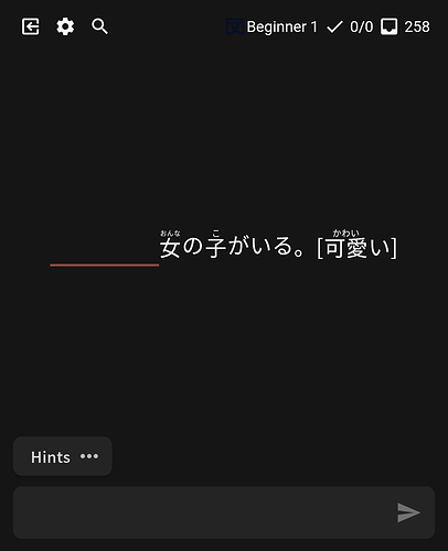
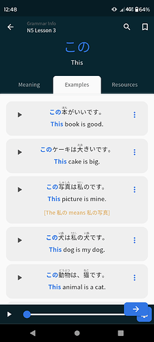
Same here on Android.
I’ve tried everything, resetting data, completely removing the app and deleting app data, then reinstall it. But I keep getting this.
Could we please add something to the native reviews where you can just click and show the translated sentence after answering. It can be bothersome having to cycle through the various levels of prompts.
Haven’t noticed any major issues on iOS! One minor thing:
Could we have the keyboard match the current bunpro theme (or the iOS system setting) for native reviews? My phone (and Bunpro) are in dark mode, but I always get a white keyboard (instead of the black one I have when using the webview). Thanks!
This please! It’s rather glaring when doing reviews at night, when I’m in dark mode and I get almost half the screen popping up white.
I know I asked before and was told you were working on it, but could we get native system matching for dark mode in the app, please?
Hey! I’ve been trying to use the app and it’s great. But I do have some problems.
Firstly, how can I access decks in the app? I can’t find the new lessons anywhere, but the vocab reviews show up in the dashboard.
When I study grammar points, I always prefer to read atleast 3 or 4 articles/videos’ mentioned in the resources section. However, after reading the article, Bunpro takes me back to the dashboard (if I click back, or the back arrow button) instead of the grammar point I was currently studying.
I’ve stopped using the app for now due to this reason because it’s quite a chore to keep going back and forth. Please let me know if I’m doing something wrong.
Thank you!
Is this still the right place to report issues with the mobile apps? I just got back into Bunpro after a long break and while the recent updates look good, the text in reviews in the Android app is too small for me to easily read, especially the furigana. The text was much larger before these updates. Example of what it looks like currently:
I’ve gone into the style settings and increased the font to “Big” but it didn’t change the size at all.
Thanks!
@algebro
Hey,
If you increase the font size in the android settings, it should also increase the furigana size and font size in the app.
Cheers 
Thanks for the workaround, but is there any way you would consider increasing the scaling so users who can’t read the small characters don’t have to globally change the font size on their phone? Or at least add a “biggest” option to allow further increasing the size without breaking the existing scaling? It doesn’t show well in the screenshot but there is a lot of empty space on the screen and the text is far tinier than it used to be
@algebro
Of course it will be implemented, the font setting will be functional again 
It is on my priority list since I have a bad eyesight myself.
Cheers
Awesome, thanks a lot! I just wanted to make sure it wasn’t “working as intended, wontfix” 
Bunpro just gets so much better every time I come back. Thanks for your hard work.
I usually come here to report a bug or to talk about something I didn’t like about the app, but this time I just want to praise and thank you for this new update. The app is perfect on the iPhone, and I love that I can now do vocabulary review with Bunpro cloze from the app itself. I loved!
“Learn” function for grammar points on the homepage of the app is broken. Choosing “quiz me” just takes to a blank screen after learning them. On Android.
@crunchsixfoe Hey!
When you encounter the grey screen, could you try going back to the dashboard, opening menu at the top left and sending a bug report?
With logs I might be able to fix it faster 
Cheers!
Done!
The new version of the app is a step backwards in at least a couple of respects. It used to be easy to hide or unhide English in the example sentences with a tap, and per example. Now this has been moved to a menu inaccessible without leaving the lesson and is either on or off for all examples. Why?
The male voice and speed controls used to be handily right there in front of the example screen, too. Now this has also been moved to a distant menu and is no longer useful for quick comparisons. Why?
These changes make no sense from a usability perspective and should be reverted.
Edit: actually I see that the male voice is down in that little gear menu, but for me at least that is significantly overlapped by the new “next lesson” arrow that used to be more sensibly located at the top:
All in all I don’t think there’s a single thing about the new app I prefer over the old. The changes all seem neutral or negative to me.
One thing I would like to see is the option to display nuance notes without the full English translation. I’d like those pointers, but I would prefer to not have the translation staring me in the face while I puzzle it out. Previously this wasn’t a problem as I could just hide them all and tap them to display when I was ready. As noted above, however, this is annoyingly no longer possible.
What does the casual/formal register radio button in the settings do? I have tapped it back and forth but all of the examples in the lesson I am looking at remain in formal register.
Hello! Thanks for the update!
On the quiz after learning new items (Android) , it seems i don’t need to give a correct answer for each item anymore. I’ve seen each item once, give an incorrect answer for one of them, and then session just finished.
Previously I had to answer correctly for each of the points. Sometimes I struggle and can’t answer correctly several times in a row. This feature allowed me to practice a bit, get a better understanding and some confidence, that i can really come up with a correct answer.
Can we have that feature back please (・・;)ゞ
It’d be great to have an option to enable device-specific settings. I prefer to use a regular font size when using my PC, but I prefer a larger font size when using my cellphone. It’s kind of annoying to have to switch the font size settings every time I switch devices. Also, it’d be helpful to have an automatic theme feature. And I can understand if these features are not currently a priority.
I like the update. Thank you especially for the making the hint level reset when moving to the next review.
Am I right in thinking that there used to be 4 hint levels and now there are 3? The level I was using appears to have been replaced.
Grammar points that I’ve reset and removed from the reviews are included in the beginner section under progress on the main page in the app as “beginner 0”, but they are correctly excluded on the website.
Hello! I’m coming back to Japanese and Bunpro after a few years.
I’ve just downloaded the android app and wanted to login with the same details I use to login on the website.
But that doesn’t seem to work.
Do I need to make a new account for the app?
And if so, can I use my bunpro lifetime subscription somehow also on the app?
Thanks in advance!


