Hello, mobile design is nice (although I started using bunpro only a few days before this came out, so can’t compare that well.)
There’s one thing that’s been frustrating me a lot since the redesign, and I could see it getting fixed in two ways, ideally both.
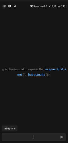
The button to submit my answer on my keyboard should not turn into the button to go to the next question. There have been many times where I got the point right but made a typo, or I more or less know the point but am just trying to understand how I got it wrong, or I even got the point right but want to review the point further, but then I accidentally double tap submit and it moves on. With beginner cards it’s not a big deal, but incorrectly marking an advanced card as wrong can be very frustrating.
The button to go to the next point should be separate from the button to submit my answer. Would help with this issue a lot.
Also, there should be a way to go back to the previous card even after you’ve moved on and redo the card. I’m kind of annoyed rn cause I got a card wrong after a long interval even though I knew it, and there was no way to go back and correct it. If I could go back to the previous question, issue would be immediately resolved. (This might be already be a feature, I just couldn’t figure out how.)


