I’m a new bunpro user who created an account on the website today but was unable to use that email address / password to log into the Android app - the error message says ‘wrong username or password’. I am guessing this could be a syncing situation and I might have to wait.
You have to click one of the links at the start.
Then it might take a few hours before it works
Excited about the new android build. My email is the same as my Bunpro account on Google Play @Jake . Thank you!
I thought the web app already worked pretty darn good on mobile? Maybe it’s just my phone
What extra does this provide? Does it at least cache sound data so I don’t need to hot-load it during reviews?
On all phone + tablets, the website is probably working amazing.
The mobile version is just a first version. For now, the added feature is mostly the notification system (message on the phone + number of reviews due), but it’s a good base for future mobile-only functions (like offline mode …).
Oh yes finally ! It’s what has been missing to complete the Wanikani app I was using ^^
Later on would it be possible to post the app on f-droid?
so it would cease, I guess, concerns about privacy and stuff.
My Feedback (v0.2.0+10)
( I sorted them based on subjective importance  )
)
Apologies if any of these are already suggested/known/planned
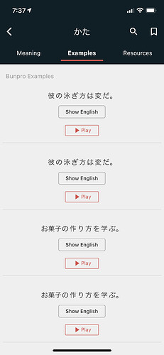
[BUG] - There are several grammar points where the same example sentence is repeated, not sure if it’s something i somehow triggered or if it’s like that for everyone else, but it’s consistent even when i close and re-open the app.
[UI] - Swapping between dashboard/grammar/search is a bit jarring because the whole screen changes; i think it would be smoother if the bottom bar remained stable (and possibly the top bar too) and just the contents of the page reloaded/changed.
[UI] - On the main dashboard screen, i would like if there’s a bit more contrast to differentiate the section for studying vs the section for community discussion, maybe blocks or outlines. I guess it might be a work in progress given its version 0.2.0 but wanted to call it out just in case
[UI] - While I like the color schemes used in the app, i think it would also be nice to have a dark mode option like the website.
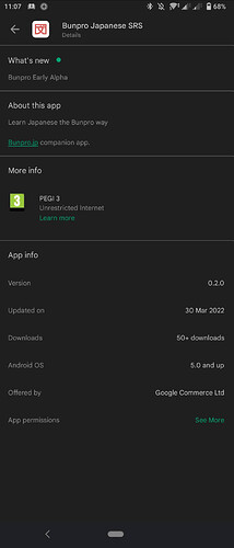
How do you get to version 0.2.0+10? Im still on +8
I haven’t managed to update to the +10 release either.
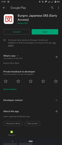
Google play on the website lists an update from the 7th of April, but on the phone only the 30 of March shows up. I tried reinstalling but nothing.
Not sure, i never had the +8 version i just followed the link for testflight and it was +10
I am on Android. Maybe it isn’t out there yet.
Android here too. Maybe @Jake or @Daru can take a look and see why is not being pushed to everyone on android?
I think it’s been enough time to get it past review, at least last time it didn’t take this long I think.
For Android, did you try uninstalling and then reinstalling?
Yes, but it is still the older version.
Maybe it has something to do with how the versions numbers are being used?
The +8, +10 might not trigger cache updates or something?
It doesn’t show the number after the + in Google Play.
Just speculating though… Maybe try naming next one 0.2.1 instead?
It might get fixed by clearing the Google Play cache on the phone but I don’t want to do that for every update.
I also only got 0.2.0+8, installing it for the first time on Android 12 about 6 hours ago.
Issues I noticed so far:
-
Logging in with an e-mail address that has an extra space at the end (e.g. from the stock Android 12 keyboard auto-complete) seems to trigger a generic “An error occurred” message. Let me know if you can’t reproduce this, but I’m pretty sure the lack of whitespace trimming together with a bad error message is what’s going on – I triple-checked the password, so that wasn’t it.
-
On initial launch – EU, though maybe it’s enabled globally –, pressing the main landing page “Reviews” button took me to a data and marketing email consent page rather than the actual reviews. More importantly, though, submitting that page dumped me onto some generic profile page (
https://bunpro.jp/user/profile, by the looks of it) rather than the actual reviews page. This was quite confusing, especially as the title bar did display “Reviews”.
Are others who are using the iOS TestFlight version actually getting notifications without manually refreshing inside the app (or at least opening the app)? I still am not, and I’d like to know if it’s just me. Getting notifications would be the most useful thing from the app at this stage, so this is a frustrating issue. I checked and background refresh is switched on for the app…
Update:
At some point it showed up in the app store but I was getting a “Google play purchases are not available in your country” error message when trying to install.
As a work around I used an american vpn on my phone during install~ but native Japanese region support would be nice


