Popout & Furigana Changes + New Landing Page

明けましておめでとうございます!

Furigana Changes

Furigana is now visible on hover rather than just on click.

  • This will only impact desktop users for now.
  • We are experimenting with a click to toggle furigana → second click to open modal option for mobile.
  • The click functionality to either show a popout when applicable or to hide/show all instances of a specific kanji still works on both desktop and mobile.
  • To hide/show furigana when the modal is opened, you can click on the word in the header. This will record it as a known kanji or remove it from your known kanji list.

Grammar/Vocab Popout Changes

When clicking on a grammar point or vocab word inside of a popout, your progress down that specific rabbit hole is preserved. You can go as deep as you like and still be able to work your way back to where you first started. Simply use the back arrow in the upper left corner of the popout to move one layer back.
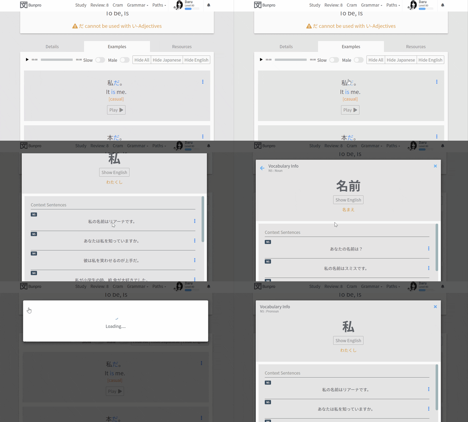
NestedPopup

Landing Page Changes

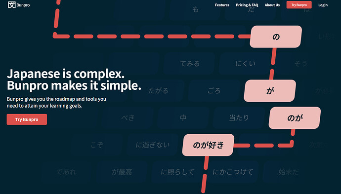
We have updated the Bunpro landing page, completely revamping it and also adding About Us and Features pages. Here is a preview:

Ultimately this change doesn’t impact you if you already have an account beyond seeing something different if you need to log back. However, we do feel that the new landing pages help better define the look and feel we want the platform to have going forward.

We would love to hear any suggestions you might have for ways we can improve it to better convey exactly what Bunpro is and how it can help others learn Japanese. :grinning_face_with_smiling_eyes:

Bonus: Wallpapers
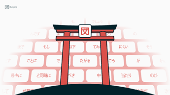
The landing page images of the grammar tiles as well as the Bunpro Torii are available to download here → Bunpro Wallpaper Drive

Here is a quick preview of the two styles:


As always, we would love to hear any thoughts or feedback you have about these changes.

今年もよろしくお願いします :bowing_man:

45 Likes

I just noticed the new landing page after I had earlier logged out and later went back to bunpro.jp. Brilliant looking update to the previous bland, albeit functional, design. First impressions matter and this redesign represents a significant improvement–well done!

14 Likes

Designing the new website/landing page had been a goal ever since I joined Bunpro (during my interview I even mentioned it should be redesigned, and look where that got me :stuck_out_tongue:) being one of the first projects I worked on and kept on working throughout the months.
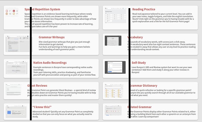
It helped us define what Bunpro should look and feel like moving forward, cementing a new identity in the process and modernizing Bunpro without disregarding the legacy behind. The community helped a lot with it, user feedback really helped us make the landing go from good to amazing!

The Features page for example was a community suggestion. The wording was also changed a lot based on community feedback. Can’t thank you guys enough!

22 Likes

Finally the sneak peak some of us got, gets to see the light!
Great job @Daru and team!

Awesome to see some of the suggestions to be placed there.

If I’d have to nitpick, I’d align the images with the text somehow here:

14 Likes

The hover is so simple and beautiful. Thank you for adding it!

10 Likes

Thank you, it works great! (And I’ve upgraded to lifetime :clinking_glasses:.)

9 Likes

The home page looks great and being able to go back on the vocab is very helpful! Love all of the updates the bunpro team is doing


Im fairly sure ‘away’ is supposed to be ‘a way’ but its almost 3am so I maybe I just cant read properly right now :sleeping:

6 Likes

Will our Japanese grammar knowledge increase if we use the Bunpro backgrounds? :thinking:

8 Likes

Does the racing stripe on my car make it go faster? Obviously yes! So change it at least twice a day for optimal retention.

9 Likes

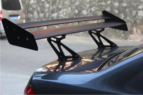
I hear that retention increases even further if you add a spoiler to your monitor with ‘Bunpro’ printed on it.

images

10 Likes

Don’t forget the speed holes to your motherboard! I can’t remember a thing without 'em.

4 Likes

OMG the new homepage! I was waiting for this announcement when I saw it earlier today. It looks SO much better :heart_eyes:

7 Likes

The Furigana Hover is great, because it makes you look at a new / forgotten vocab reading and then actually commit it at least to short term memory if you read the whole sentence again. I realized just now that i always clicked the Furigana away again for that reason, so this feature is much appreciated!

Also love the redesign - way more memorable! I mean, I almost never logged out but i do in fact not quite remember how it looked before (which also means it wasn’t bad enough that it stuck out though!) :sweat_smile:

I’m a very bad student and often have big long breaks from learning japanese but coming back to all the new Bunpro features and fixes is always a treat!

6 Likes

When copying words to translate on another page it would be nice if furigana wasn’t captured as well.

For example, 話している turns into 話はなしている when pasted. Fortunately a lot of the time jisho.org gives the right answer anyway, but sometimes you have to clean it up.

10 Likes

I logged out just to see the new landing page and it looks great! I also love the new hover over for the furigana, rather than having to click it. Agree with @GalYurr that it would be great if the furigana was not captured during copy/paste.

5 Likes

I really like the new landing page; it looks a lot more helpful than before. I would like to be able to turn off the Furigana on Hover feature, because I often hover over words to track where I am with the mouse but might still want to remember the reading on my own.

5 Likes

I like the furigana change, makes it a lot easier to check if you have it right.

One bit of confusion I had, tho, is that when you click the word, since you’re still hovering, the furigana does not disappear. I was a bit puzzled since I clicked a few more times and nothing seemingly happened, then I moved the mouse away and realized what was going on.

Pointing it out from a UX standpoint, doesn’t affect me using the feature. Thanks!

EDIT: How do you turn off furigana for words which have a grammar info modal, but don’t have a vocab page on that modal? (Ex.: 各, 風)

4 Likes

Very nice update. I am very delighted that the wallpaper is available in 3440x1440. I am already using the dark one. :3

5 Likes

I wonder if that’s related to something I’ve noticed recently. I’ve setup up Furigana to follow Wanikani, but just now while checking out the new click to toggle I’ve noticed that I seem to be getting all the Furigana all the time. Did something break there?

2 Likes

Ultrawide Monitor Crew ftw!

3 Likes