@ianegg
Were the reviews in your queue all Ghosts?
yes, they were all ghosts. I switched back to the old review system and was able to do them, like ianegg
Third time lucky!
This Ghost issue should now be Ghostbusted 
Sorry again for the inconvenience
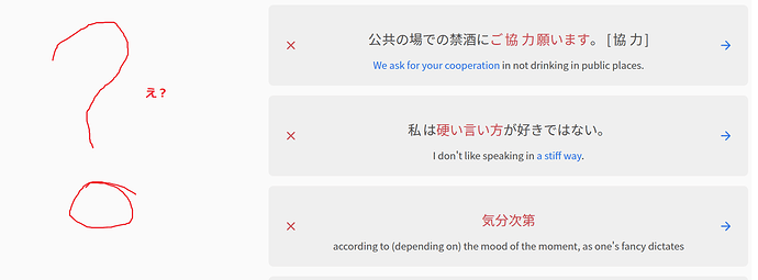
I think the colors are being reused too much and hurting messaging.
Red being used for highlight, progress bar, and incorrect is confusing.
I would recommend something like:
Green for correct
Red for incorrent
Yellow for highlight
Yellow for progress bar
Not sure if this is the case, but just wondering if you’re using one of the red themes?
I have some of those things appearing in blue instead of red and have never had any problems, I guess because of a different theme 
The Site Theme didn’t help but the Site Accent Color did. The blue works. I’d recommend not making red the default then. Thanks for the tip.
All great ideas! Sorry for the super late response.
Pressing ‘f’ should toggle the grammar info view
You mean it should close the info again on press? We could definitely do this.
In the meantime, to go back to the top of the page + focus the input, you can use the I hotkey.
There should be an option to disable animations
I’ve created a ticket for this to make sure we obey the browser’s default
The scroll bar keeps popping in and out changing the width of the viewport slightly.
What OS / browser are you using, and which scrollbar are you referring to?
Hi there. Thanks for the feedback!
As @bunnypro mentioned, you can change the accent color.
Might have to rethink what the default should be though
You mean it should close the info again on press? We could definitely do this.
Yes.
I’ve created a ticket for this to make sure we obey the browser’s default
It would be good to make it a setting so I wouldn’t have to enable/disable that setting OS-wide every time for reviews.
What OS / browser are you using, and which scrollbar are you referring to?
Latest Firefox on MacOS. The scrollbar appears when I make an in/correct answer and disappear when I move to the next review card.
Vocab is now in Reviews 2.0!
As the title suggests, Vocab can now be studied through the Reviews 2.0 system.
So if you’re a fan of both the new interface and Vocab, this is the update for you!
You can now practice with all 3 question types:
-
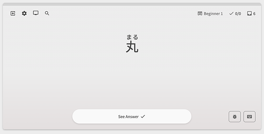
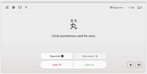
Reveal & Grade (previously Flashcard)
- We’ve preserved the
1&2hotkeys for answering No/Yes
- We’ve preserved the
-
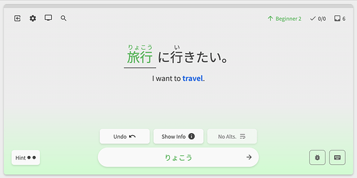
Fill-in /w Manual input (previously Cloze)
-
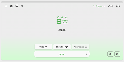
Translate /w Manual input (previously Manual Input)
-
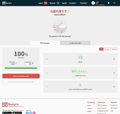
Answered questions will show up in your Summary like so:
Misc fixes/polishes
- Changed the related-grammar section (Synonyms/Antonyms) buttons to open in a new tab
Relevant info from previous updates:
How to access Reviews 2.0
For those of you that don’t have Reviews 2.0 activated, you can activate it like so:
- Go to your settings.
- If you haven’t already, Opt In under “Bunpro Beta” settings.
- Enable “Reviews 2.0” Beta.
Changing Review Types
-
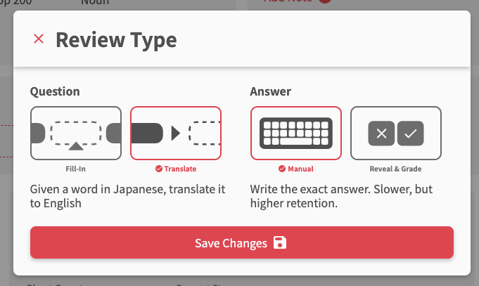
You can change the Review Type (previously called Manual Input/Cloze/Flashcard) inside of the Reviews 2.0 pages’ footer (or mass-update the Review Type in the Deck Settings)
-
Choose the Question and Answer type separately. The options are:
- Question
- Fill-In
- Translate
- Answer
- Manual (text based)
- Reveal & Grade (flashcard)
- Question
-
NOTE: Fill-in (Cloze) style questions only exist for N5 and N4 Vocab currently! We will add them for N3/N4/N1 over the coming months
With this, the majority of planned changes for Reviews 2.0 have been completed.
There will of course be lots to fix and improve on, so as always, we look forward to hearing your feedback!
Where can I find vocab studies? my lessons only include grammar learning, not vocabulary learning.
I can only see vocab search menu, not vocab reviews 
Hi there and welcome to the forums!
Vocab is heavily tied in with the Decks feature.
By setting a Deck that has Vocab as your Main Deck, you can use it learn Vocab, which will add Vocab to your Review queue.
Like Grammar Points, you can also click “Add to Reviews” at the bottom of each Vocab’s page.
Hope that answers your question!
Let me know if you have any more 
Still waiting to be able to add vocab to reviews from the furigana popup 
This is an awesome update, so happy when I noticed it yesterday! Couple of things I’d like to point out:
-
Seems like flashcard reviews are continuously in lightning mode (even though it’s disabled). Meaning, if I press “2” indicating that I know it, it advances to the next question without revealing the actual answer. I always wonder if I was indeed correct. Previously I was able to press “space” to reveal the answer and then press “2” for correctly thinking.
-
I noticed I can press “a” to reveal (I guess it’s meant to show alternatives, bur for me serves as a reveal button). However, it does not show the furigana. I have most kanji marked as known as I am at the end of my Wanikani journey. However, I still make mistakes. It would be great that revealing the meaning of vocab (i.e. showing the answer) would also reveal the furigana. As it is right now, I always have to hover over the vocab to see if I read it correctly.
Thanks for the amazing work as always, I love how far BunPro has come in the past year!! I’ve gotten plenty of my friends hooked on it too 
Again I’d like to request a toggle somewhere in the settings to keep the old fun graphic elements that are not quite 2020s-correct-and-serious-ux-design-friendly. The grammar points detail view will probably become boring before I hit my first full gold 12/12 hanko mark 
(I’m the guy who posted this some time ago https://community.bunpro.jp/uploads/default/optimized/3X/c/5/c5723c74cd53438c3083c095a29c74e758e56cb8_2_690x215.jpeg)
The functionality of Reviews 2.0 is entirely great, though!
Thanks for pointing these out!
- I’m embarrassed to admit it, but I didn’t even realize there was a post-attempt phase to the old Flashcard system!

- Another thing that the old system did
Will add these next week (Friday night here, babyyyyy)
Yeah there are definitely a few die-hard fans of the old design-style of Bunpro!
We get it, and ya’ll have not gone unnoticed 
In the Reviews 2.0 only the first English meaning is displayed. It’s really inconvenient, many Japanese words don’t map 1-to-1 to English ones. This way, feeling of the actual word meaning can be distorted by viewing only the first English meaning.
Also “Your answer” placeholder in English, despite I’ve selected Japanese as the site language.
The tip “あなたの答え…” disappears really fast, I have no chance to read it completely.
There’s no checking if I entered an answer in English. Probably there should be a regexp like [A-Za-z- ] rejecting anything entered in a wrong keyboard layout.
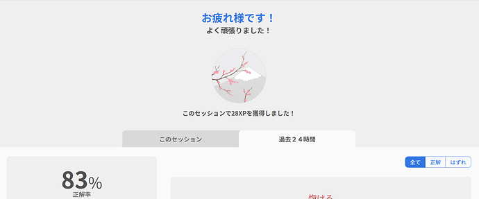
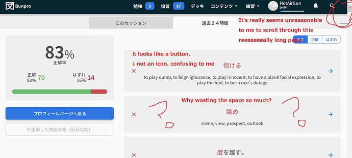
I’d get rid of this heading block completely, it takes too much space (except total XP gained for this session, that’s cool).
Sorry, could you post a link or explain this part?
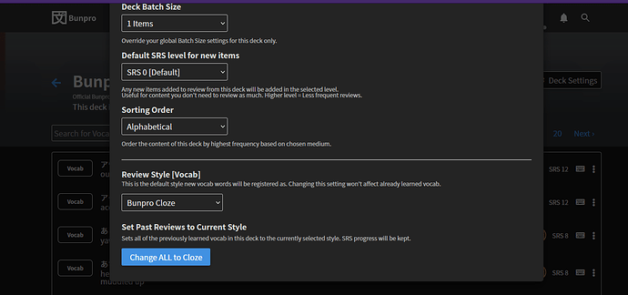
You can change the Review Type (previously called Manual Input/Cloze/Flashcard) inside of the Reviews 2.0 pages’ footer (or mass-update the Review Type in the Deck Settings)
I changed the settings shown below to “Bunpro Cloze” by going to the deck and clicking on deck settings some weeks ago, but nothing changed.
I’ve tried again after this update and have also pressed “Change ALL to Cloze” twice now.
However, all vocab reviews are the manual input type.
Should I be changing these settings somewhere else?

