With the JLPT behind us, and the new-year having just begun, it is the perfect time to unveil the new ‘Reviews 2.0’ feature! New Year, New You, New Bunpro!
This feature update includes much more than just a revamp to the Reviews system! Check it out:
How to Access
-
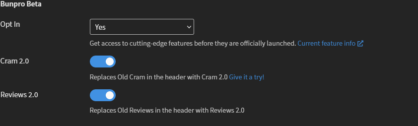
If you haven’t already, Opt In under “Bunpro Beta” settings.
-
Enable “Reviews 2.0” Beta.
(You can still access the old features at any time by using the buttons on the dashboard!)
Purpose
‘Reviews 1.0’ has been around since I signed up for Bunpro circa 2018. It is battle-hardened, and people know and love it.
However, with age, it has also become very difficult to update and improve. And even to this day, its still haunted by bugs that have evaded the team time and time again. It was overdue for a facelift!
Because Reviews is perhaps the most accessed feature of Bunpro, it covers a lot of functionality and is the single part of the site you interact with every day. Despite doing everything it needs to do, it never did it beautifully, or excelled in any one particular area.
The new Review system is faster, simpler, and more elegant than Reviews 1.0 was in almost every way.
Update Overview
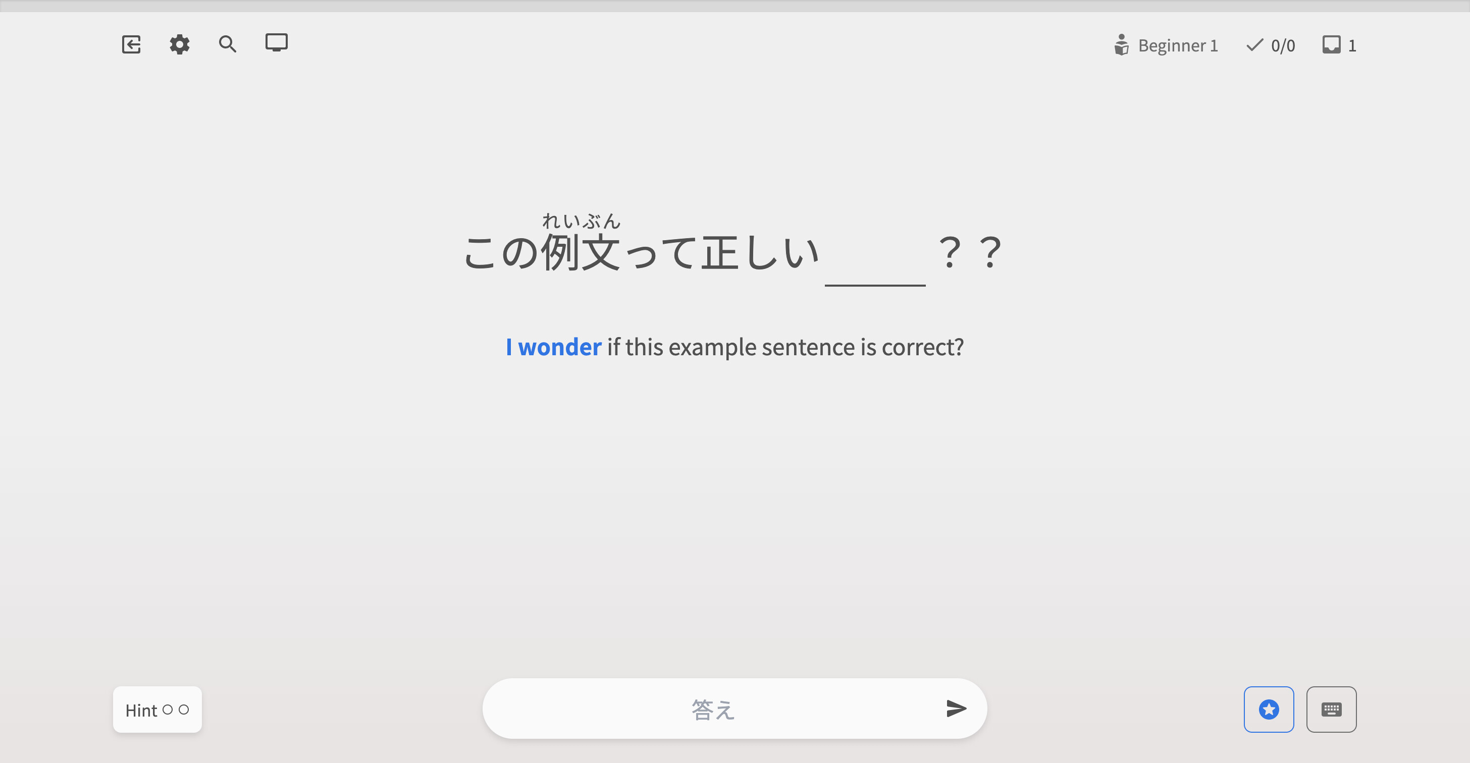
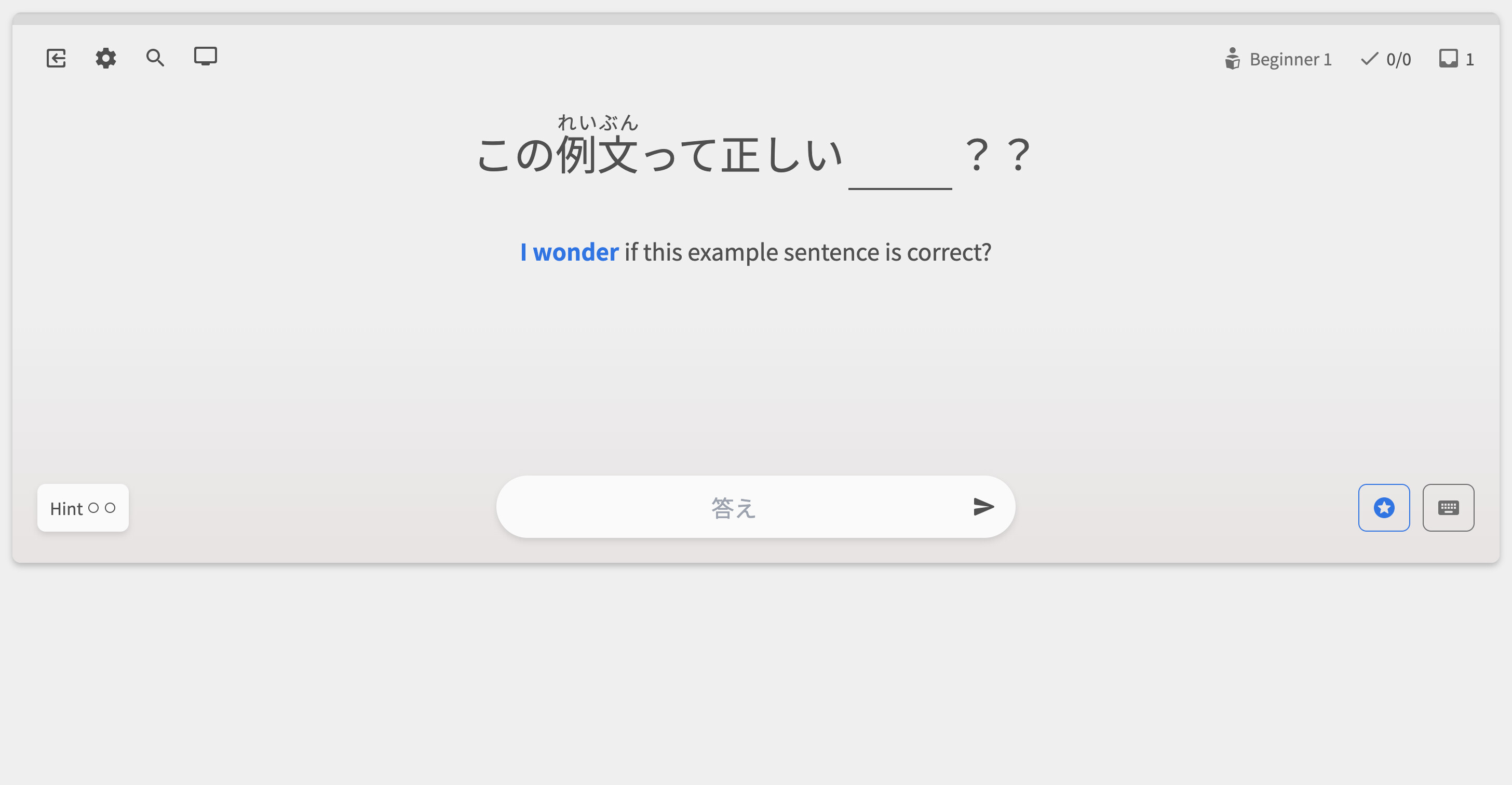
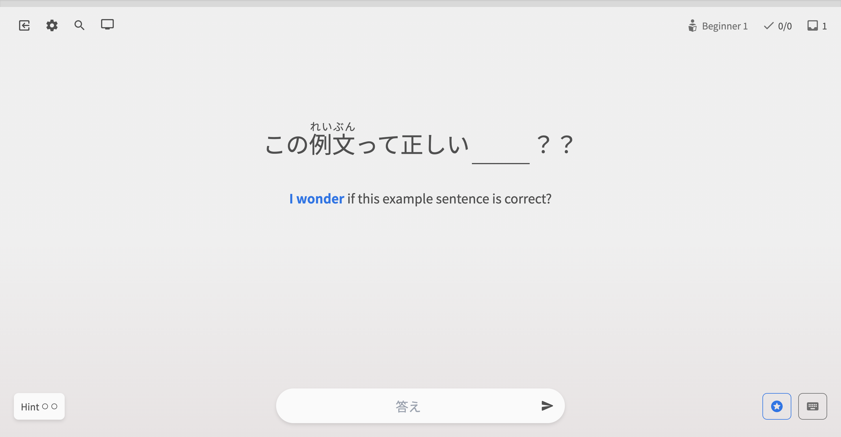
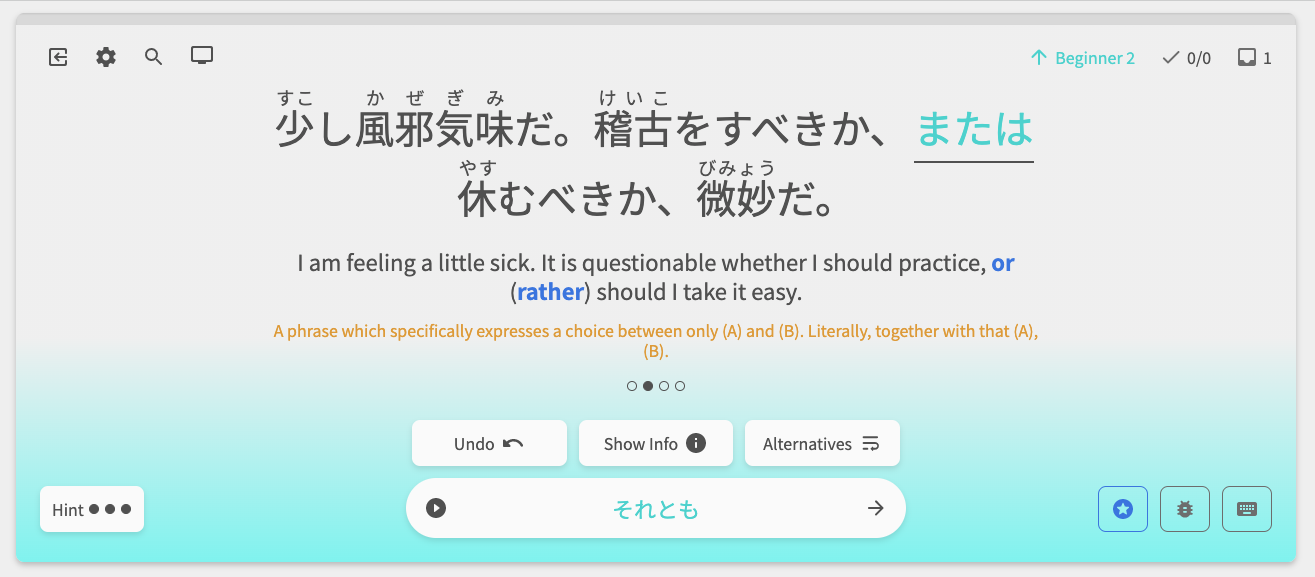
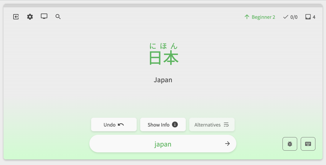
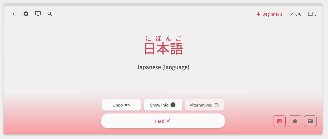
Reviews Page
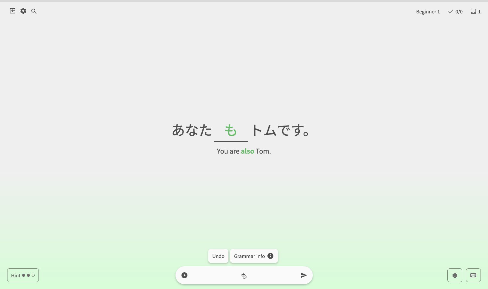
Reviews 2.0 was coded and designed from scratch. With a fresh start, we have implemented new and existing features!
- Major facelift and new layout!
- Improved “Focus Mode”
- A new keyboard shortcut tooltip for all those keyboard power users
- Access Grammar Search inmediatly with the Magnifying Glass icon! (this will be replaced by an in-reviews quick look for grammar in the future!)
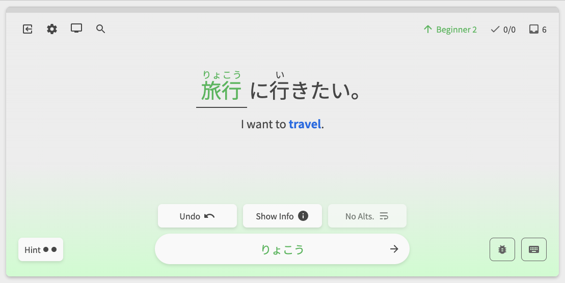
Reader
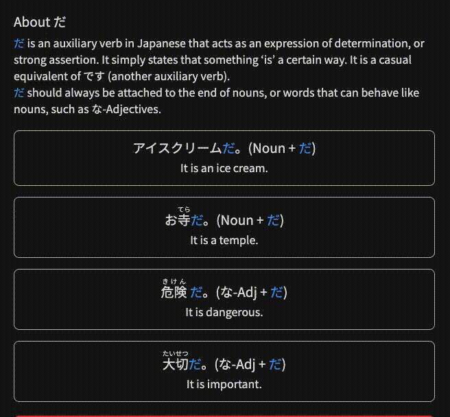
Previously, clicking on text with a Grammar/Vocab popout would simultaneously open the popout and toggle the furigana on/off. To address this, we’ve created a new furigana/grammar point pop-out tooltip (‘Reader’ is the working name – any ideas are welcome!)
- Allows for toggling furigana and opening Grammar Points / Vocab separately
- Displays all the possible readings for the selected word, and remembers your choice of whether or not you’d like to keep displaying that reading
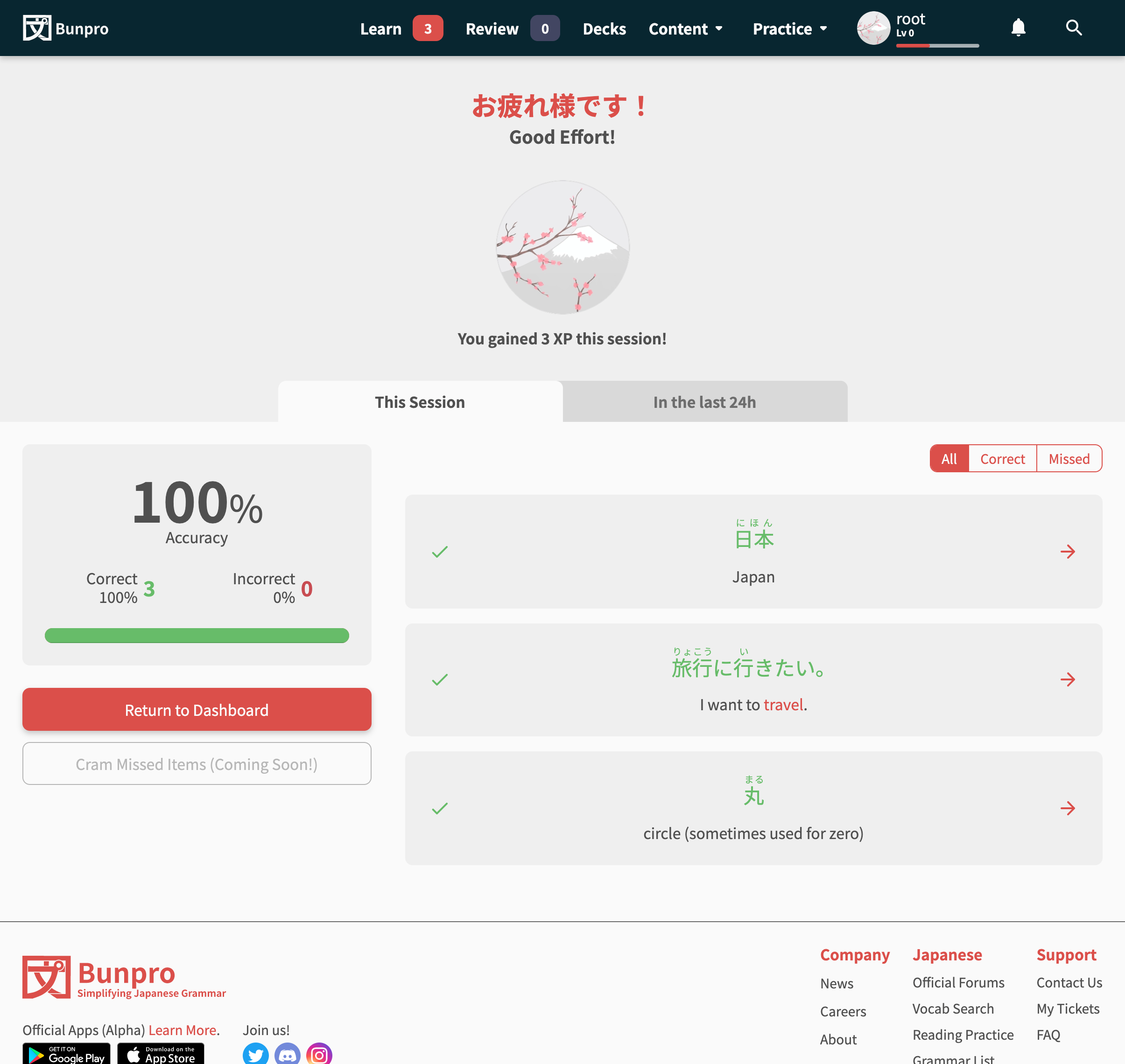
Summary Page
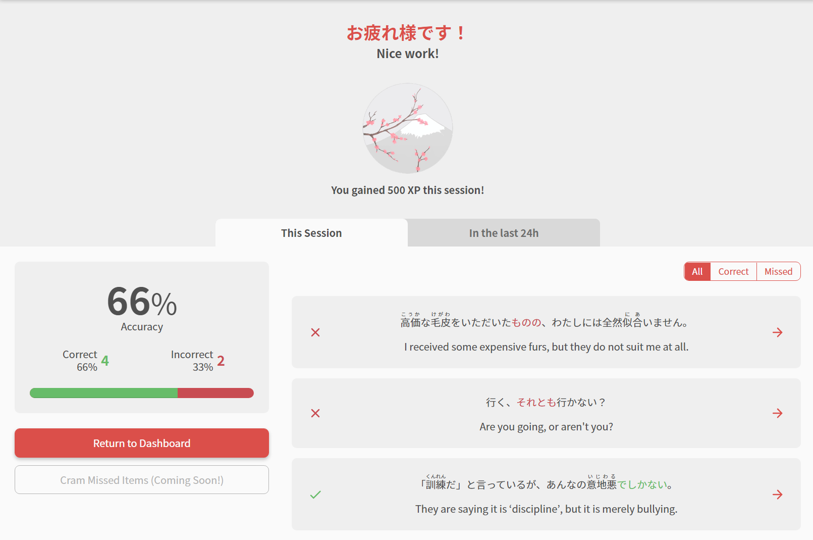
- Access any time to view the details for your last session
- You can also view all session data from the last 24 hours
- The new summary page now provides the details for the question you got wrong, by displaying the full sentence and providing a link to the relevant grammar point!
- Sort correct / incorrect answers using the selector on the right
New Grammar / Vocab pages
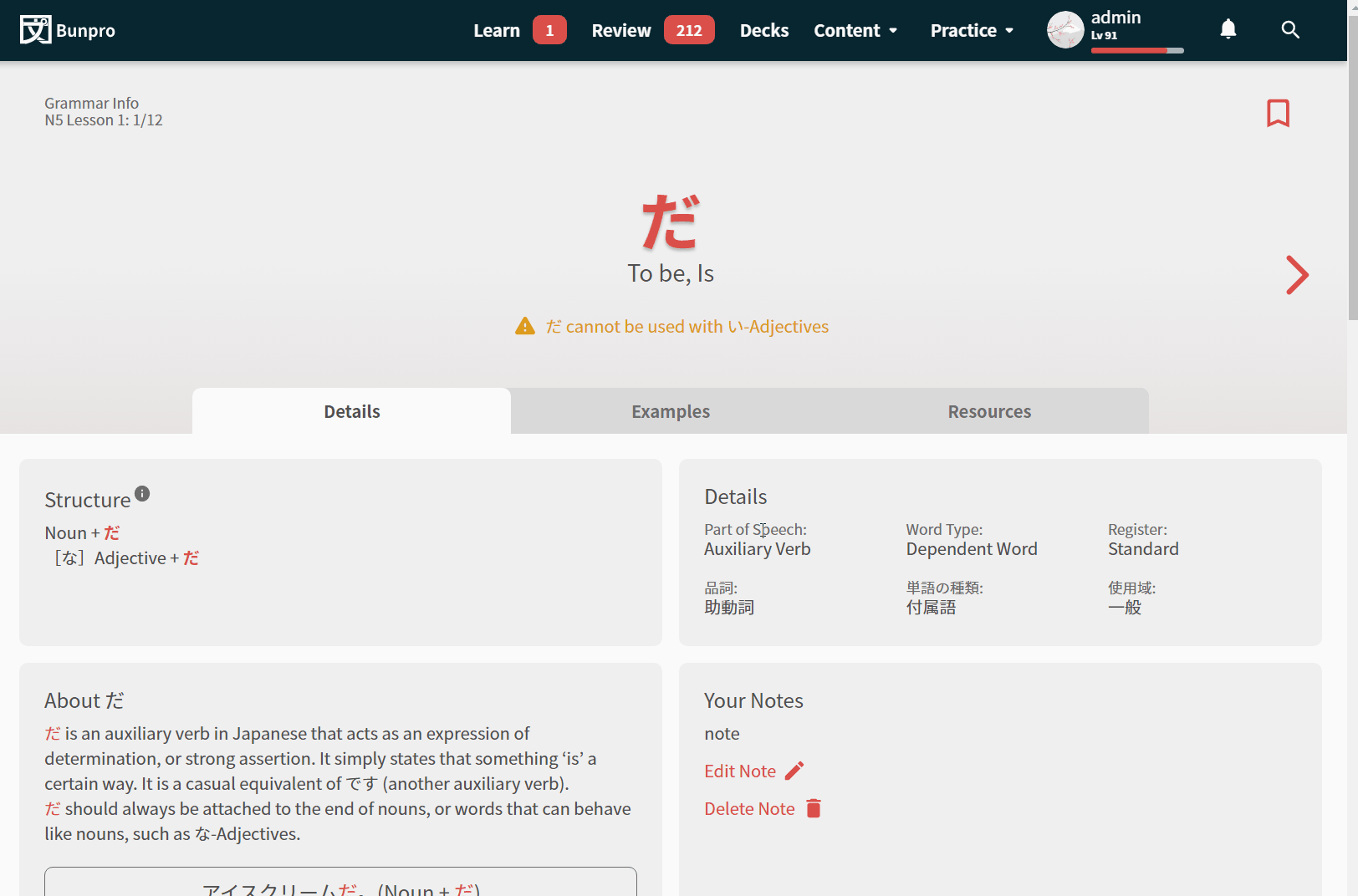
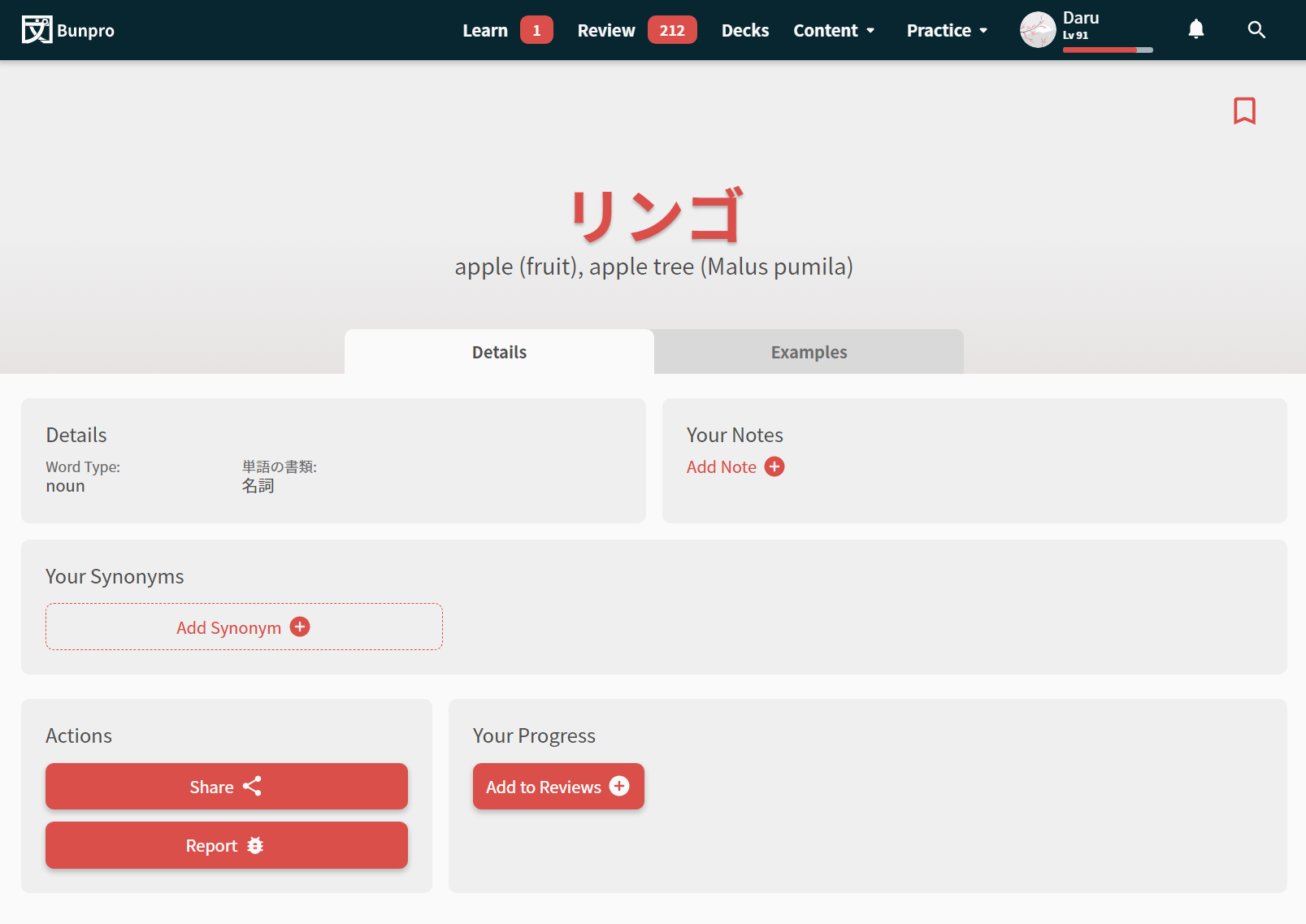
We’re on our way to a much more faster and modern look and feel for Bunpro. While well-known painpoints like the notes being too large will be addressed in a future update, we want to test this newer and more modern design for Bunpro.
- Not too much is new here in terms of functionality, but much like the theme for this update, interactions should be faster, and you should get much more feedback on if your actions have been successful or not
- Going between Grammar Points is much faster now
Caveats / Known Bugs
Please keep in mind this is a Beta, and we’re doing our best to provide the service you deserve. Here is what we aim to fix during the Beta period:
General issues:
-
VOCAB IS NOT REVIEWABLE
- Perhaps the biggest caveat with this update
- We have a big update coming for Vocab, and until this is done, you will not be able to Review vocab through the
/beta/URL!
- Audio is not scrubbable through the player (we’re working on it)
Routing issues:
- Back button to go from a one of the new pages to one of the old ones will not work.
- The URL will change in your browser, but the page won’t refresh. Manually refresh the page to re-load the URL
- This is unfortunately a bi-product of the cutover. As we switch more and more pages to the new system, this bug will be less and less noticeable
- Going between pages on the new system should feel much faster
- You will however, experience the same slow load when transitioning between old pages and new ones. Basically, the more pages we cover, the faster the web-app will feel
- Currently covered upgraded pages include the following:
/beta/reviews/beta/learn/beta/summary/beta/grammar_points/*id*/beta/vocabs/*id*
- We will be moving as quickly as possible to get more pages moved over to the new system
BTS updates & tech details for devs
Along with the noticeable features mentioned above, here are some more stuff we’ve implemented some other QoL/BTS changes while we were at it:
- SEO Improvements across the board
- New swanky OG image – share us and check it out!
- Dynamic OG images coming soon
- A range of accessibility improvements over the original site
Our stack:
- React /w NextJS
- Typescript
- Tailwind for styling
- Vitest for Unit Tests
- Hosting /w Vercel
- Legacy to new site cutover achieved with NextJS dynamic rewrite
Feedback
We have been working hard at this new version of the site, but like anything, things can always be improved.
As you use these new features, we would love to hear anything and everything about your experience. We intend to keep building and releasing updates to keep things moving in the right direction. So, as always, your feedback (what you like and don’t like, as well as features you would like to see) would be much appreciated! 
Feel free to DM me (veritas_nz) directly with any feedback, or reply directly in this thread. We want to make this a collaborative process as much as possible, so we will periodically ask for specific feedback on features and changes.
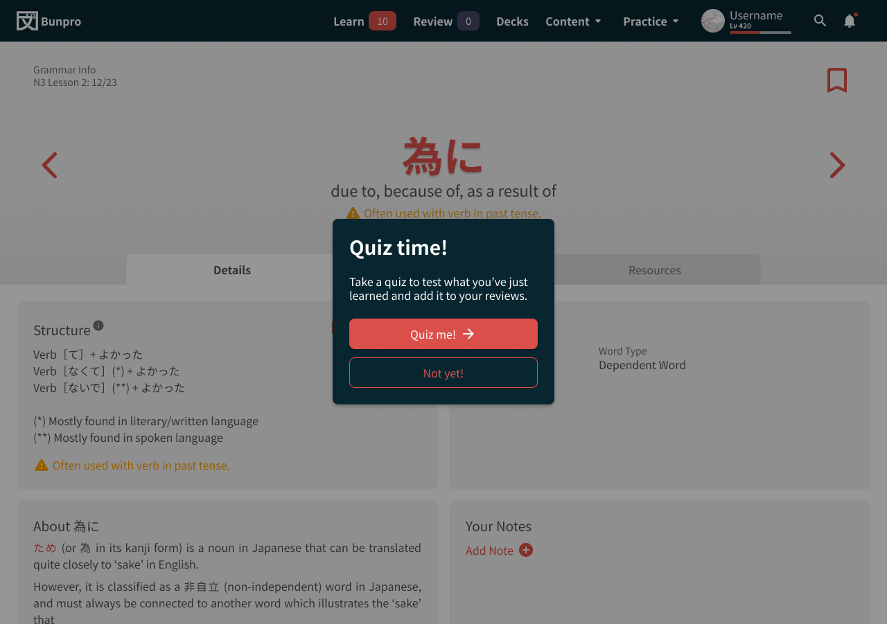
Tentative Additions
We want to make this a collaborate process with our community by sharing the ideas or upcoming changes we’d like to tackle next, and to get feedback at an earlier stage to be able to change course if they aren’t something that bring value.
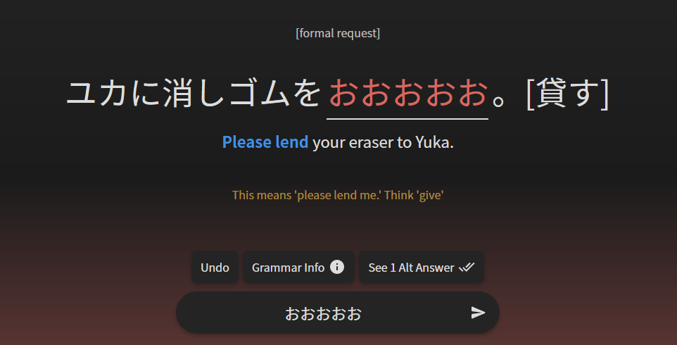
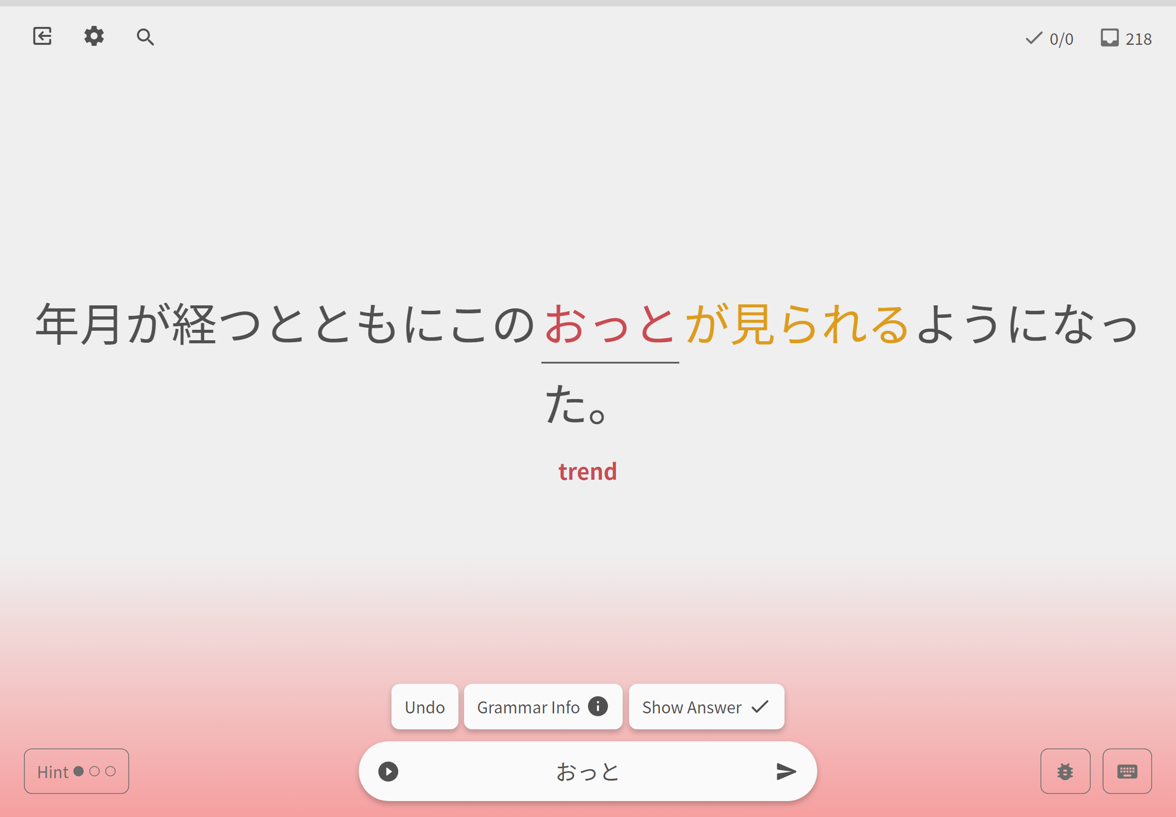
#1 - Show Grammar Info
In the current, older version, you’re able to see the sentence as well as the top of the grammar point explanation right below the Study Question since it’s not a full screen design.
The new beta is, which makes that method of displaying information less-than-ideal. We’ve discussed a few ideas and alternatives to this, and came up with what we like to call the Splitscreen Details. Check it out!
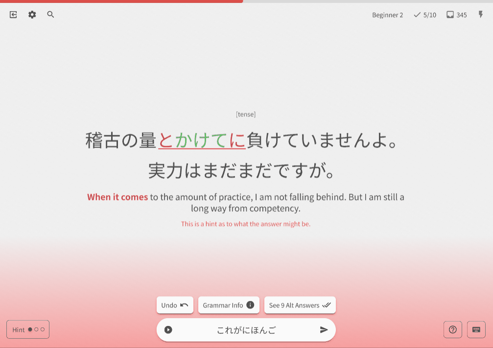
Strengths:
- Allows you to see content side by side to the sentence and what you answered
- No additional scrolling needed
- Looks cool
Weaknesses:
- Not possible for mobile (though you do get a drawer with less scroll too)
- Long example sentences can get a bit crunched up
- Can feel like a lot is going on
Questions for the Community:
- Do you think this new display method achieves the goal of getting information about your study subject?
- What key differences do you identify between this method and the previous one? Which one do you prefer, and why?
- Would you like to have this feature?
- What do you think is the best way for this to trigger?
Because reviews are a very important part of Bunpro and we create a system that is intuitive, simple and effective. Remember, there are no bad answers and your feedback will only help us improve.
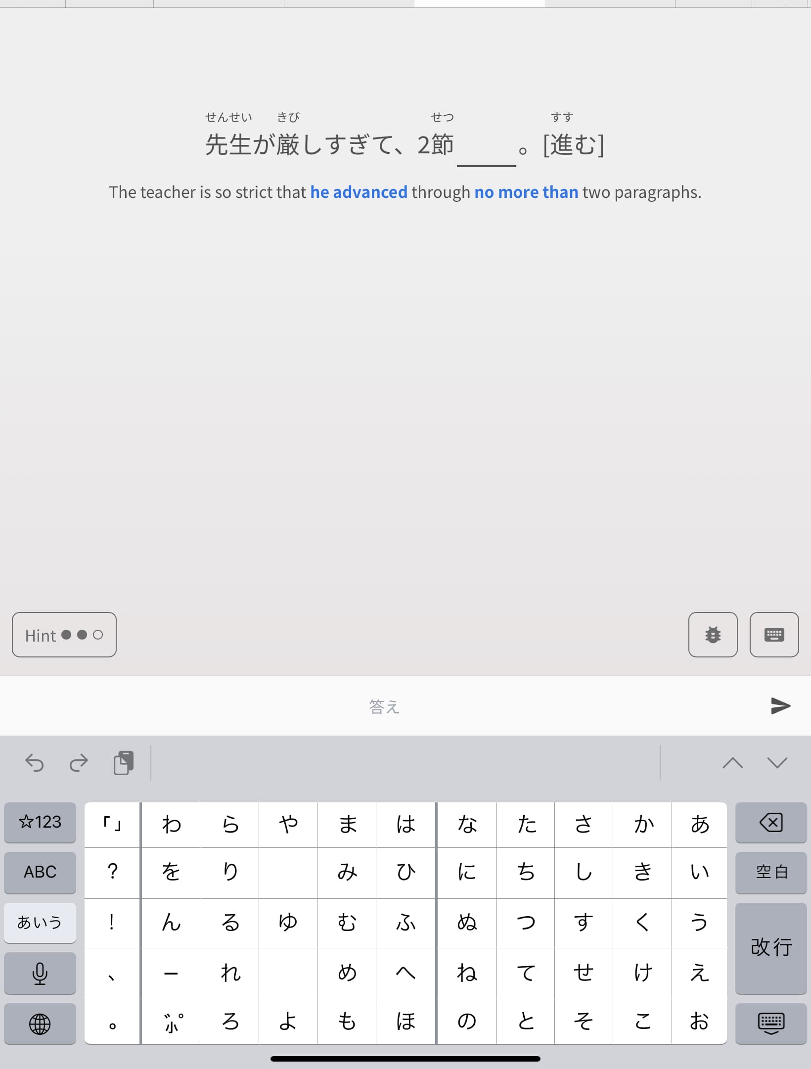
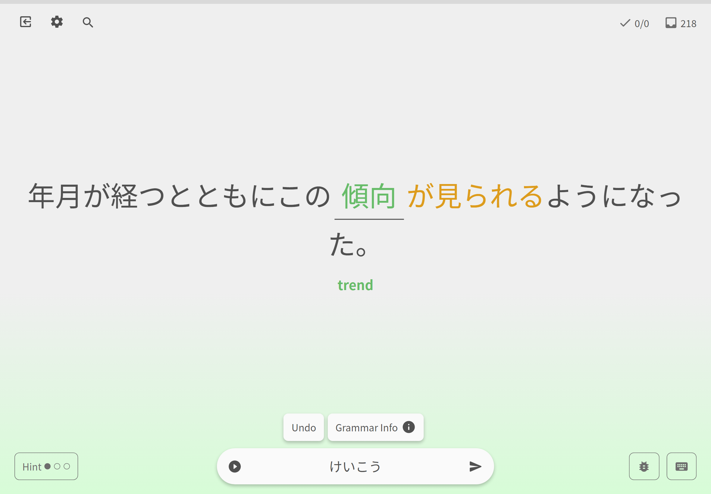
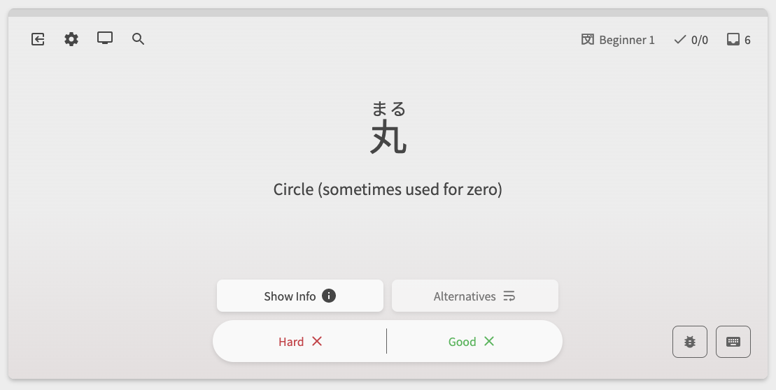
#2 - Reviews Backdrop Options
As shown in the screenshots, we have added a lot of color to the reviews.
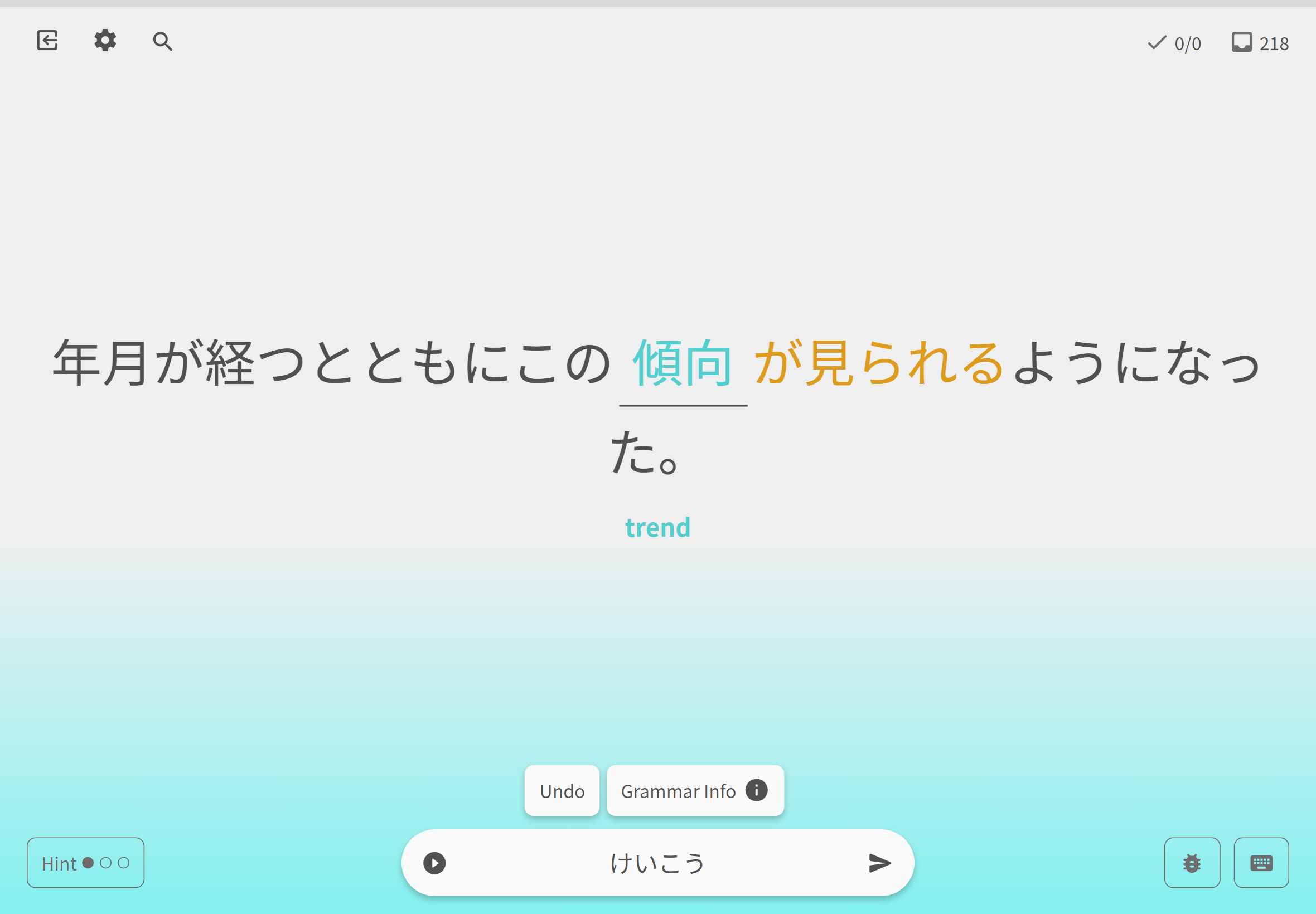

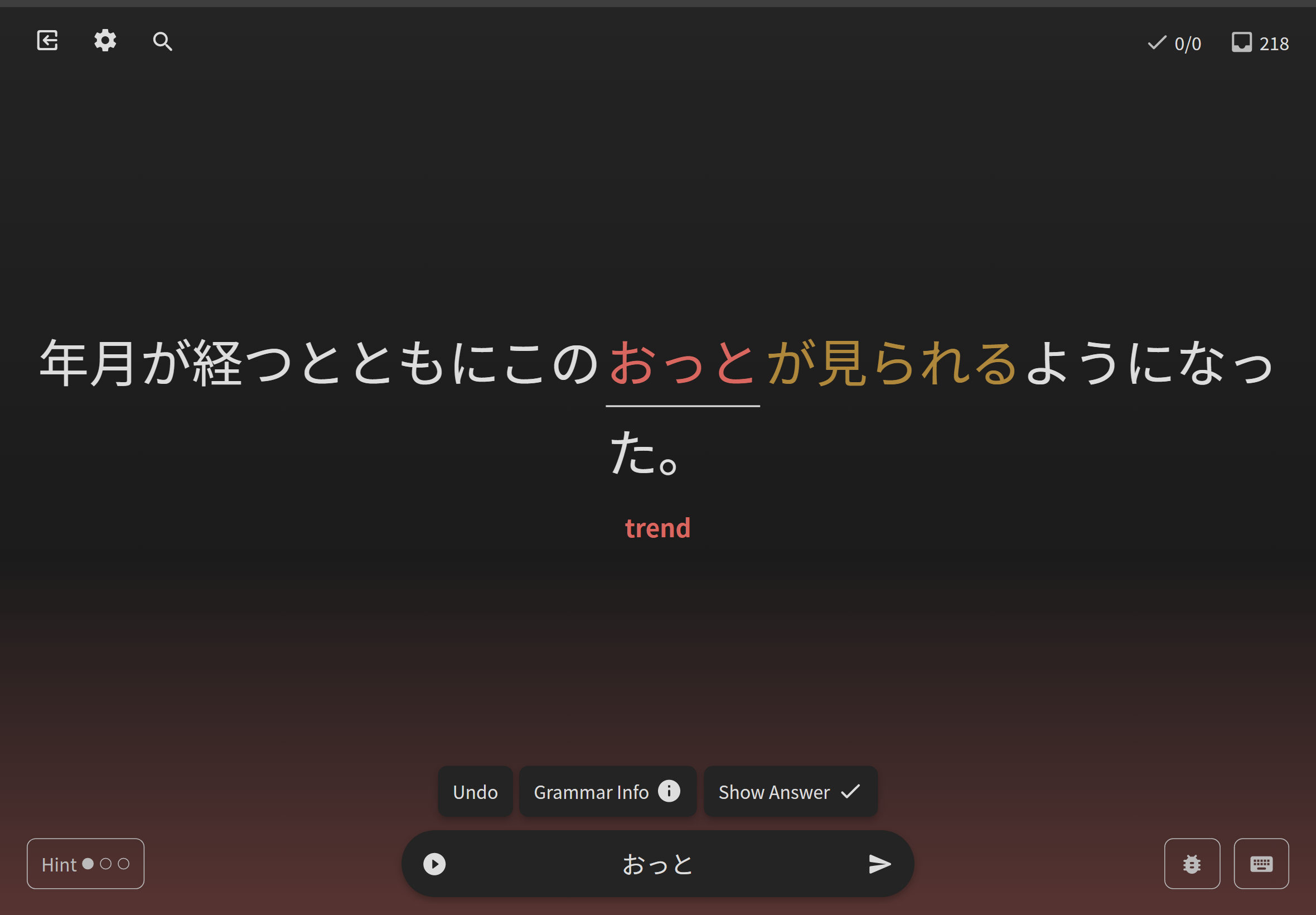
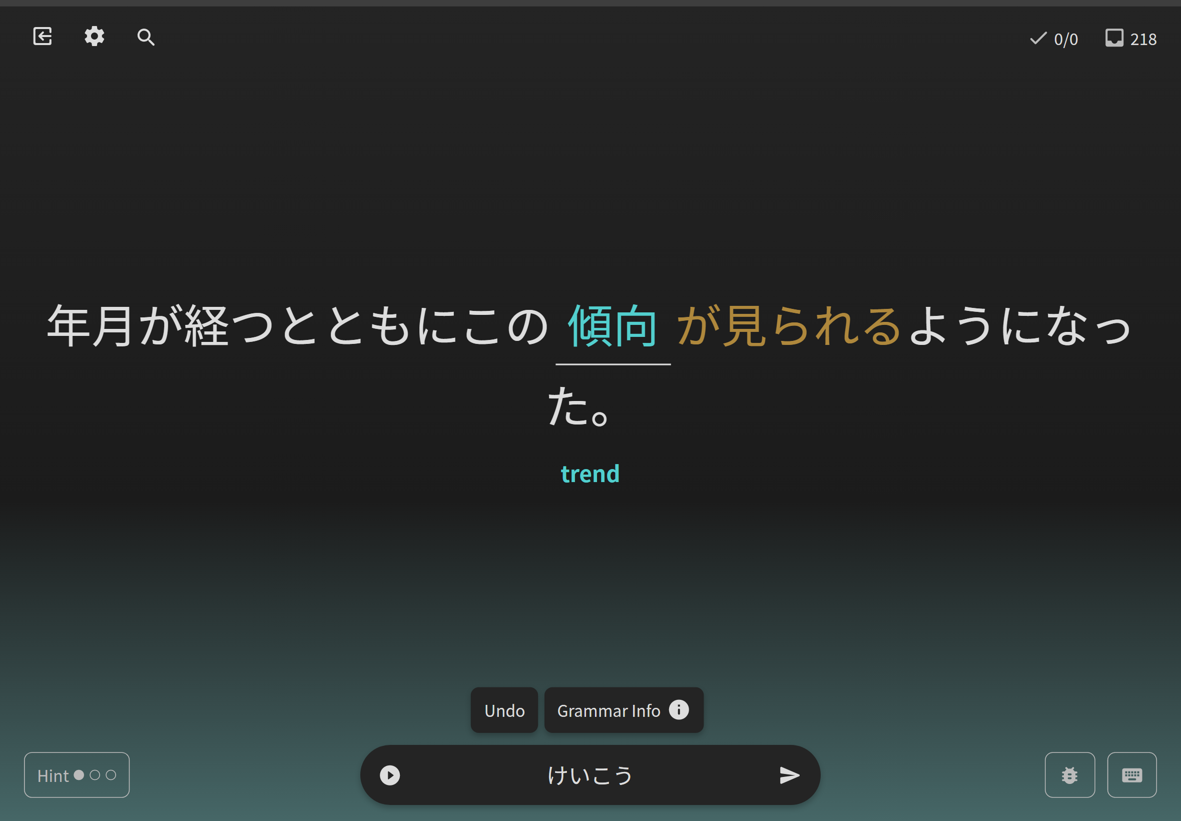
Questions for the Community:
- What are your thoughts on the overall readability of the new design?
- Do you find it easy to focus during your reviews with the current gradient background? Please provide details.
- What do you think could be an alternative?
We wanted to err on the side of caution with this and just triple-check that nothing is too hard to read now.
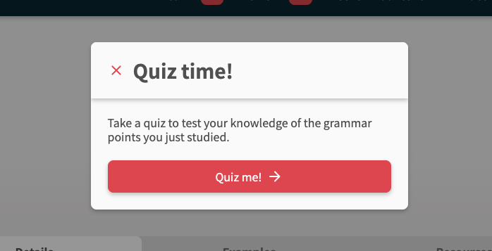
#3 - Start Quiz Placement
In this new iteration of the Learn page, we utilize the drawer which by default pops out from the left. Considering the next arrow is on the right hand side, this can result in needing to move your mouse across the page to access the “Quiz Me” button.
We have mitigated it to some degree by allowing for the [Right Arrow] key followed by [Enter] will start the quiz. Additionally the Quiz Me button is automatically focused when the drawer is entered.

Questions for the Community:
- Would you rather see the drawer on the right hand side?
- Would a modal popout be better than the drawer?
As always, thank you for all the support and feedback you provide. You push each and every one of us to work hard to help make your learning experience on Bunpro as great as it can possibly be. Stay tuned for a few more updates! Happy studying! 
EDIT: Patch Notes
Day 1 – 2023-1-6
Switched the method for implementing hotkeys:
- Alternative keyboards should now work as intended
Updated the “Show Grammar” button & how it interacts with the “Auto-Expand Info” setting:
- When auto show grammar is on:
- Load the grammar info below (no scroll)
- Have the f hotkey trigger a full scroll down
- When auto show grammar is off:
- Only load grammar on ‘F’ hotkey / ‘Show’ button press
- After it loads, trigger a full scroll down
@Fabniam @bunnypro @Melanthe @chicharron
For our Firefox users – we’re working on a fix for the BG gradient banding
For our tablet users – we’re working on quality-of-life features for ya’ll too!
As always, thanks for the feedback ya’ll! Stay tuned~
Day 2 – 2023-1-9
Thanks all for your feedback! Some more Day 2 bug fixes are here.
The fixes:
Fixed XP not displaying correctly in Summary
It would take a while for the changed XP to display correctly in the Summary page header.
Thanks those who noticed it and pointed it out!
Some answers not being answerable / endless suggestion loop
For those getting into endless loops with hints – this should be fixed now – let me know ASAP if it is not, and let me know which question you found the issue on and want you attempted to answer with.
Pressing the [ I ] hotkey now scrolls the page up
After scrolling the page down to interact with Grammar Points, pressing the “I” hotkey will now focus the input and scroll to the top. I was a bit late to the party with what should have been an obvious addition.
For those curious, we purposely shifted the ‘Enter’ key so that it only submitted the inputted text when the text-box was selected/focused.
This was an accessibility decision, and allows keyboard/screen-reader users to tab between buttons on the page and interact with them using the [ Enter ] key.
This new functionality might take some getting used to.
This also explains why we added the new [ I ] hotkey to re-focus the input.
Custom Study Question fixes
- “Show Grammar Info” functionality now added for Custom Study Questions
- This should’ve been in there from the start.
- Bug entering Custom Study Questions
- This should now be fixed! Let me know if you have any more issues
Cheers custom-question power-user @Marcus for the heads up
Other misc fixes:
- Fixed a typo in the Structure Legend – cheers @max99x for finding this!
- Added the strike-through text effect to writeups/structure details – cheers @Travioli for finding this!
Next fixes:
- Increase profile image size in Summary
- Work out what to do for wiiiiiiide screen users so that the Quiz screen is a bit more compact – discussing this internally so watch this space!
Apart from bug fixes, I’ve also implemented some fade-animations to Quiz to make the experience a bit smoother/nicer.
As an aside – if we have any users that preferred reduced motion on the web, please send me a DM to let me know how we’re doing with that part of accessibility on the site!
As always thanks for the feedback
Day 3 – 2023-1-10
Thanks all for your feedback! Some more Day 3 bug fixes are here.
The fixes:
Fixed more buggy sentences that were causing an infinite-hint loop
- This should be all of them. If anyone notices any more just let me know
Greatly decreased fade-in-out transition time between review sentences
Fixed the form Japanese filter to properly accept Japanese text
- There was another issue with validation and questions that had Furigana!
- This is now fixed
Fixed issue where Hints Button wasn’t clickable on mobile
- This bug was introduced after Reviews 2.0 Beta launch – sorry for the inconvenience
Made amendments to furigana sizing to stop weird Kanji spacing issues
- Reduced letter spacing and font-size of furigana rubies
Thanks again ya’ll for all the feedback!
Day 4 – 2023-1-11
The fixes:
Fix “Grammar Point Info” button not working
- There was a bug where internally the app got stuck in the loading state for Grammar Point Info. This should now be fixed
@chicharron @joesan13 @Slurpeedrink
Fix Summary stuck in endless loading state if accessing empty Review page
This should now be fixed – if you access the Reviews URL with no reviews, it should now properly show the ‘Last Session’ tab as empty
Nice catch on this bug Purple!
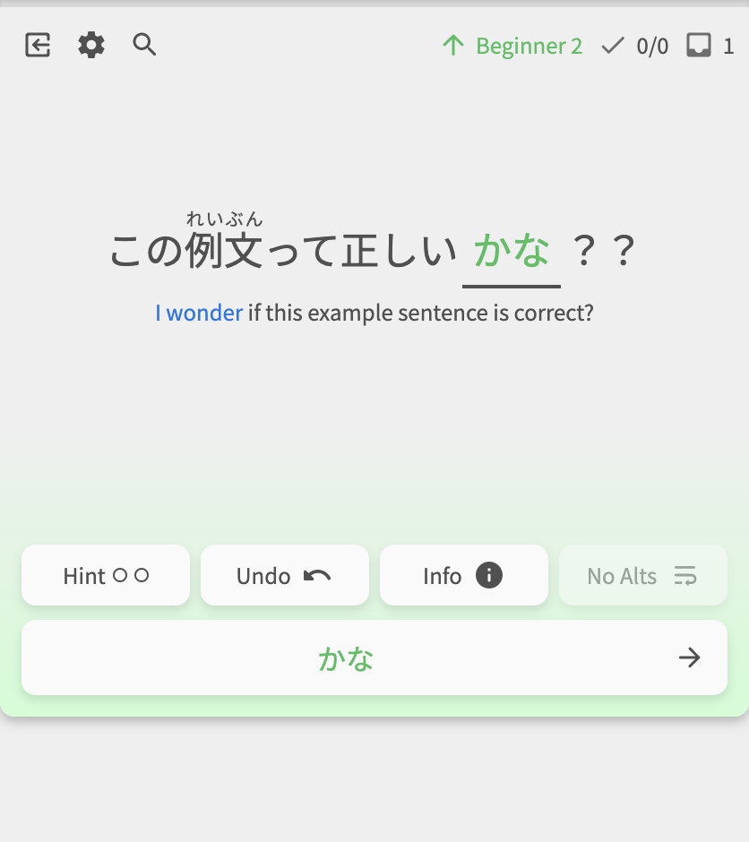
Automatic n → ん conversion
-
Automatically convert inputs ending with ‘n’ with ‘ん’
-
E.g. typing in
だんだnand hitting enter is the equivalent of enteringだんだんin its entirety
Other notes & stuff
LastPass showing icon in input field
I too am using LastPass (Edge on MacOS), but wasn’t getting this issue.
I renamed the text-input field’s name from user-input to manual-input – maybe the user part was making LastPass think it was a username input field or something? Let me know if this fixes it!
Question not displaying until interaction
I’m looking into the issue where the question will not display before interaction – the issue is indeed caused by the fade animations. If I can’t get this fixed soon, I’ll revert back to no animations until I can get it properly sussed.
Next on the list
-
Yomi-chan bug fixes
-
Store the preferred voice in the audio-player so it remembers the user’s choice across site visits
-
Better tablet support
-
Reviews gradient banding (visual bug) on Firefox
Day 5 – 2023-1-13
Day 5 bug fixes:
The fixes:
-
Add “wide-screen mode” to Reviews
- Lots of users had feedback about the content spreading out too far on larger screens during the Quiz
- We have added an option to restrict the width of content during quiz
- The button is only available past a certain width, and can be toggled on/off
- Gonna poke all the users that commented about preferring the compact style of the Legacy review page:
- Remove “Show More” button from Example Sentences
- Fixed bug where incorrect answers wouldn’t show up in Summary if they weren’t wrapped up
- Fixed bug where last question sometimes isn’t included in the summary
Other notes & stuff
-
Add wrapup icon and quesiton count to the Reviews header
- Now you can tell when you’re wrapping up, and how many questions are remaining.
- Temporarily removed Question transition animation
Next on the list
- Yomi-chan investigation & bug fixes
- Notes re-style
- Store the preferred voice in the audio-player so it remembers the user’s choice across site visits
- Better tablet support
- Reviews gradient banding (visual bug) on Firefox
- Altering existing input is buggy @andrewkfiedler
- Hide last question if Quiz is ending (about to go to Summary page)
- Increase resolution of profile image in Summary page
- Add SRS progress badges to the bottom of the Grammar Point page
Day 6 – 2023-1-18
Added Features
-
Added Finish Session/End Session hotkey
- Use the “0” (Zero) key to switch to wrap-up mode if you have unfinished items, or end the session instantly if you have nothing to wrap up
-
Save user’s preferred audio voice (male/female)
- Now your preferred voice is saved between sessions
- @BaconAndEggies
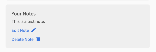
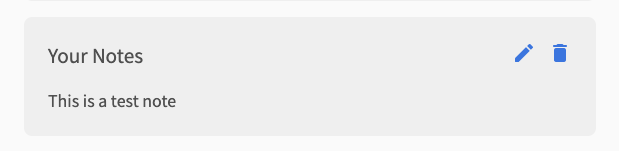
-
Redid how Notes looks when a note exists
- Before
- After
- Before
Bug fixes:
-
Fix styling and input issues on tablet
- Finally got around to fixing the issues around input on tablet
- @Marcus.W
-
Improve end-of-quiz experience
- Properly clear question content at end of Quiz
- Switch to loading spinner while loading the Summary page
-
Submitting a correct answer displays the main correct answer first
- When you submit a correct answer, it now shows the first/main correct answer
- This is to match the question audio
- @TobyOne & others
-
Always display form field description, even if there is an error
- Previously the description for the input field would dissappear if there was an error
- The description will now stay there permanently
- Increase duration of gradient animation during Reviews
-
Fix furigana by removing depcrecated
tag - Removed
tag from furigana rubies - Should behave much better with Yomichan now!
- @Mapletree @Terrylee
- Removed
-
Properly order Example Sentences (Vocab/Grammar)
- Orders GrammarPoints by internally decided order
- Orders Vocab by JLPT level
- ナイキャ @melisma!
-
Re-introduced fade-in-out animation between questions
- Let me know if you notice any bugs related to this again
- Other minor bug fixes and UX improvements
Next on the list
-
Fix bug that is causing Grammar Info to not show / Audio to be delayed
- This is the big one at large.
- If anyone has any information that could lead to the solving of this bug, please send me a DM with what happened before the bug occured (no reward)
- Reviews gradient banding (visual bug) on Firefox
- Increase resolution of profile image in Summary page
- Add SRS progress badges to the bottom of the Grammar Point page
Day 7 – 2023-1-26
Fixes & Changes
- Fixed Spacebar not working in Notes in Reviews
- Fixed Alt Answer showing second answer if incorrect
- Show session-ending spinner if exited through shortcut
- Add check to remove duplicate alternate-answers if DB data is incorrect
- Bumped the Japanese example sentences in the Writeups to be larger
- Increased User profile-picture size to properly match the size of the pic on the Summary page
- Might take a bit of time (a few days) for this to take effect
- @eclipse77x
- Added SRS indicator icon to Grammar Synonyms/Antonyms
- This was previously just text before
- Summary page now uses the Kanji answer for a question (if one exists)
- Previously just showed Hiragana
- Might take a bit of time (a few days) for this to take effect
- Fixed up the experience when finishing Learn
- Added custom text to the drawer that pops up if you end the quiz prematurely
- Fixed the functionality when you close the drawer (not clicking ‘Continue’ or ‘Summary’)
- @ThePurpleOrange thanks for the feedback!
- Fixed audio issue where if there is no audio, hitting ‘P’ played the audio from the last question that had audio
- I think this might be the fix for another issue – the “audio lagging behind by a review”
- Not guaranteed that this fixes it, so let me know if any of ya’ll still have audio issues
- @JandroSantiago @TobyOne
- I think this might be the fix for another issue – the “audio lagging behind by a review”
Day 8 – 2023-1-28
Layout Overhaul
Optional fixed height & widths
On larger devices, clicking the ‘screen’ icon in the top-left will open up the Display menu. Here you can switch between having a full-screen or fixed-height page layout.
- Previously, fixed-height mode was forced on users that had smaller screens or touch screens. This led to a bad user experience, especially for users that had physical keyboards attached to tablets
- We’ve now given you the choice on how you want the screen to display
- Fixed-height mode now fixes the Quiz screen to be set height (530px high)
- This also much more closely resembles the old Reviews layout – so hopefully users that are pining for that to be back will also find it satisfactory!
Also in the Display menu, you can also choose to toggle between having a fixed-width too.
- Note that, for devices where this setting would be irrelevant (sub-1280px devices), this option is not there, and is instead replaced by the ‘Use Fullscreen’ option
Here are all the possible layout combinations on desktop screens:
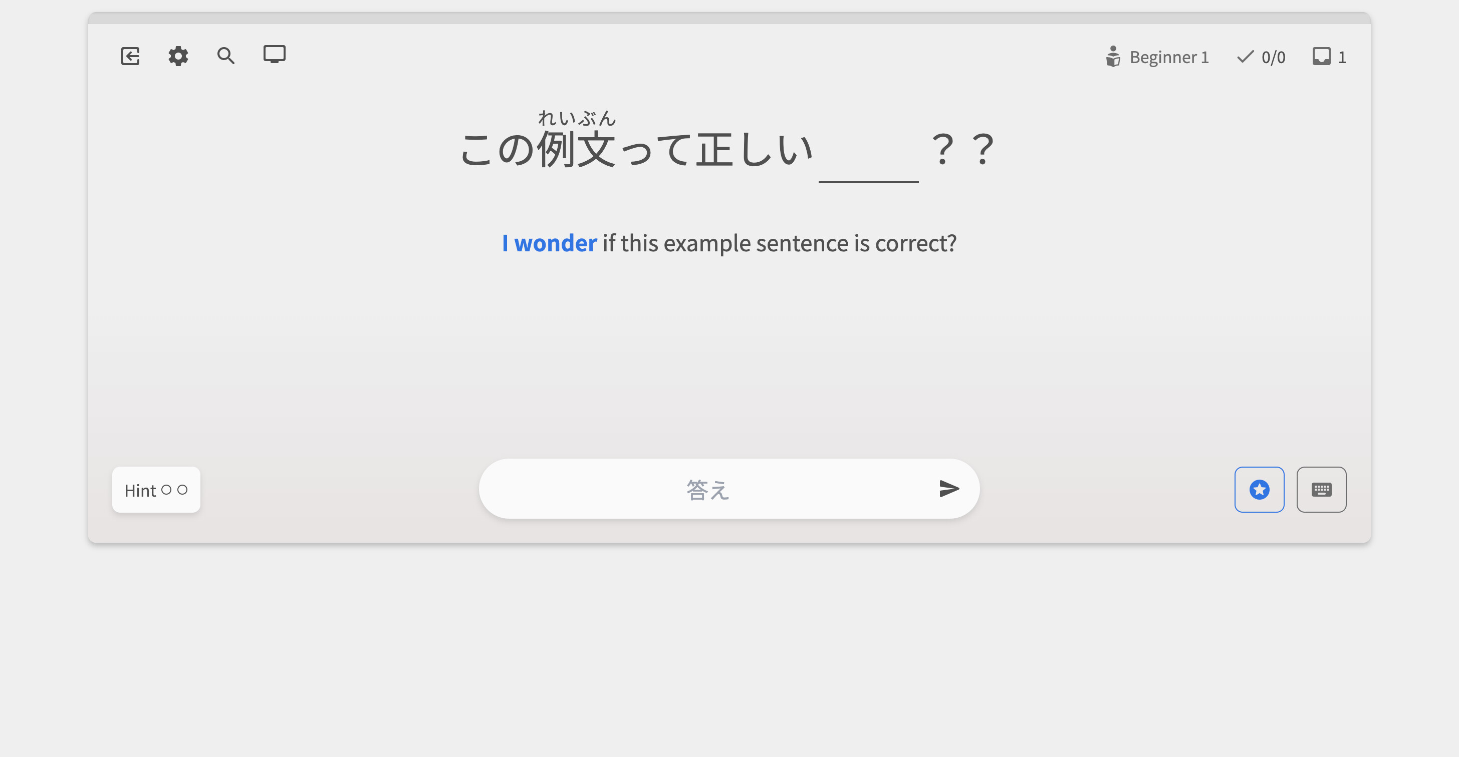
Fixed width fixed height – Full height fixed width
Fixed height, full width – Full height full width
On mobile, the Hint button now always is available – regardless of if you’ve answered the question or not
Alternate answer carousel is now beneath the question
The alternate-answer carousel has moved places. It used to be above the input, and would take over the post-attempt submenu (where the Undo, Show Info, and See Answer buttons are). This carousel stood out far too much and got in the way. Not good.
Now, it is much smaller and has been moved to where the ‘leading-hint’ gets displayed.
Grammar Info now always displays beneath the quiz
- We tried displaying the Grammar Info inside of the drawer on mobile, but this was a bit clunky.
- Now, the Grammar Points display directly beneath the quiz, as they do on desktop.
Updated SRS info
In the top right of the screen lies the SRS info. This has got a juicy update too!
- Now when you get a question right or wrong, it will change color and number to represent your new level.
- Also, the icon next to it will tell you what type of question it is – whether it is a custom study review, a Ghost review, or a regular review.


Anyway, thanks for the patience guys!
@Gunta @TobyOne @chicharron @severian @Kioshen @Marcus @Marcus.W @bunnypro @JamesBunpro
Other Fixes & Changes
- Hints should now properly reset after entering a correct answer/question change
- Scrollbar appearing in the alternate-answers carousel
- The carousel has been moved to below the question
- @melisma @JandroSantiago
Pre-Vocab update – 2023-2-25
Key New Features
-
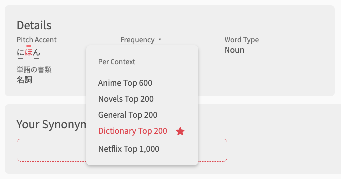
Add Frequency & Pitch-Accent Details for Vocab pages
-
Reworked the Grammar Point/Vocab footer
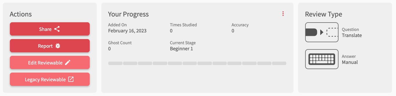
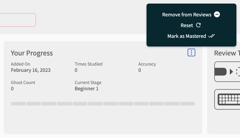
- In addition to the ‘Current Stage’ text, there is now an SRS Progress bar
- We added this as many people missed the 12-badge bar to show SRS progress
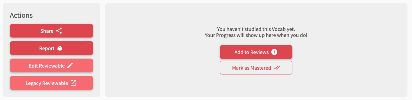
- Review actions (Reset, Remove, Mark as Mastered) have now been moved into a submenu (see the 3 vertical dots in the top right of the footer)
- In addition to the ‘Current Stage’ text, there is now an SRS Progress bar
-
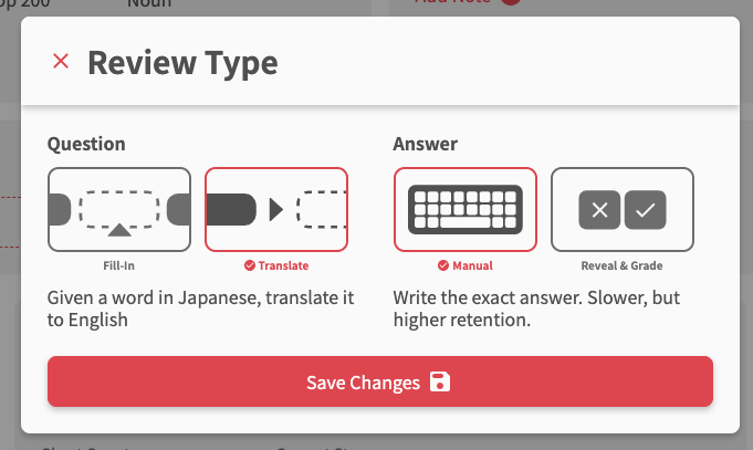
Added ‘Review Type’ menu for Vocab pages in the footer
- Now you can change the Review Type (previously called Manual Input/Cloze/Flashcard) inside of the Reviews 2.0 pages
- The formatting of this has changed a bit too
- Choose the Question and Answer type separately. The options are:
- Question
- Fill-In (previously Cloze)
- Translate (previously Manual Input)
- Answer
- Manual (text based)
- Reveal & Grade (flashcard)
- Question
-
Drawer now changed to a Modal on large screen devices (Desktop)
- This now adds a lot more space to work with on desktop
-
Drawer/Modal background color changed
- Changed to white for light-mode, black for dark-mode
- This is to aid in readability/consistency
Hotkey changes
- Toggle backwards through alt-answers
- For questions with multiple alt-answers, in addition to using
Ato toggle forward through the answers… - You can now use
Shift + Ato toggle backwards through the answers! - Another great suggestion by @JandroSantiago
- For questions with multiple alt-answers, in addition to using
- Added
Shift + Spacehotkey- The
Spacekey to toggle Hints is still there, however you can now use bothSpaceandShift + Space - This has been reflected in the Hotkey Guide (which has received an update by the way)
- We will eventually phase out Space-key by itself as a hotkey
- The
-
Enterkey during Quiz now be globally available again- If you are not focusing on anything (e.g. click outside of the input area) and hit enter, the default behaviour is to behave the exact same as if you were inside the input area.
- This reduces the amount you need to use the
Ihotkey to focus/scroll-to the input
Fixes
- Remove question from Quiz entirely if ‘Remove from Reviews’ is clicked in in the Grammar Point/Vocab footer’s Your Progress section
- Thanks to @JandroSantiago for pointing this out
- Add a tooltip for the Search button inside of Quiz
- Behind the scenes, we also added support for all the different custom Review queues:
- These will become available when we release Vocab. They include support for:
- GP index Learn queries, e.g.
/beta/learn?grammar_points=[1, 2, 3] - Review filters, e.g.
/beta/reviews?only_review=vocab - Deck filters, e.g.
/beta/learn?deck_id=8,/beta/reviews?deck_id=8
- GP index Learn queries, e.g.
- These will become available when we release Vocab. They include support for:
Vocab update – 2023-3-3
You can now practice with all 3 question types:
-
Reveal & Grade (previously Flashcard)
- We’ve preserved the
1&2hotkeys for answering No/Yes
- We’ve preserved the
-
Fill-in /w Manual input (previously Cloze)
-
Translate /w Manual input (previously Manual Input)
-
Answered questions will show up in your Summary like so:
Misc fixes/polishes
- Changed the related-grammar section (Synonyms/Antonyms) buttons to open in a new tab
Vocab Fixes #1 – 2023-3-7
First batch of Vocab fixes are here!
Fixes
- Always show furigana for Translate questions if revealing the answer
- Now if you are revealing the answer for Translation questions (post-attempt for manual-input, clicked “See Answer” for reveal-and-grade), it will always show you the furigana, regardless of your furigana settings
- @gapl
- Added a warning, letting users know that questions will default to Translate questions if Fill-in question data does not exist
- New Reviews created from a Deck not obeying Deck Settings, and defaulting to Cloze (fill-in) type
- When learning from a Deck, items learnt should now obey the Review Type set in the Deck Settings
- @kelth
- Removed user avatar from Summary header to save space
- Added the “Your Answer” (あなたの答え) section the the Feedback popout
- Added input-warning if Kana/Kanji detected where English is required
- Various either minor tweaks
Next on the List
- Add post-attempt phase to Flashcard (Reveal-and-grade)
- This in the old Reviews system but not in Reviews 2.0
- We are discussing internally how this could work in the new Reviews system
- @gapl
Vocab Fixes #2 – 2023-3-14
Features
-
Added a post-attempt phase to Flashcards
- Added the post-attempt phase (when the BG changes color and you can see the change in SRS)
- We felt having this would better fit in with the phases of the other question-types
- Next question can be reached by clicking the Hard/Good button again, or pressing the Enter key
- Thanks to @gapl for the suggestion
-
Added Undo to Flashcards
- This allows you to skip back to the pre-reveal state
- Hotkey is the usual
Backspace/Delete
- Hotkey is the usual
- This allows you to skip back to the pre-reveal state
-
Add more visual clues when focusing the text input-field when answering Manual questions
- Darkened shadow when focusing, arrow turns to the accent color
- This should help keyboard users visually know when they are able to input text


-
Added the hotkey “Mark as Good/Hard” (for Flashcards) to the Hotkey Guide
- Also changed the styling of the Hotkey Guide while we were at it

Fixes
- Use default browser scroll behaviour if prefers reduced motion
- Added JLPT/Part-of-speech info to the Vocab header
- Fixed Reviews not returning the correct data if you specify a Deck (from the
/deck/page) - Fixed the strange flash of the previous Grammar Points when Continuing after a Quiz in
/learn/- This was part of an overall refactor of the Learn system
- Changed the Flashcard “Good” button icon (was a cross) to a Check

Vocab Fixes #3 – 2023-3-22
- Replace all instances of Cloze placeholder inside of Summary sentences
- Fixed bugged display of some questions that had multiple instances of the answer inside the question (think とか、たり etc.)
- @amph1ptere
- Fixed how info displays when Auto-Expand is On for Flashcards
- Added check for explicit wrong answers before checking correctness
- There are instances where our typo detection will think an answer is correct, even when it definitely should be incorrect
- E.g. Typing “reserved seat” instead of the actual answer “unreserved seat” will lead to the system thinking you’re correct, but just made a typo
- Now we’ve added the ability to specifiy explicitly incorrect answers so this doesn’t happen
- If you see any more instances of this, please let us know in the Feedback and we’ll add in the explicitly incorrect answers
- Thanks to @Rukifellth for pointing this out
- There are instances where our typo detection will think an answer is correct, even when it definitely should be incorrect
- Fixed issue where words with Katakana input with the long vowel sound 「ー」were not able to be input in Katakana
- Learn batch size displaying incorrectly
- Fixed issue where going to Reviews with a Deck from the Decks screen returns items that haven’t been learnt yet
- Adding Custom Study Questions will now instantly update the review count in the navbar
- Fix issue where clicking Hard twice doesn’t go to the next question for Flashcard questions
- Various minor design tweaks and internal refactors
Vocab Fixes #4 – 2023-3-28
Features
- Integration with the Vocab ‘Hint’ update
- Original post can be found here.
- Adds Japanese translations for nuance Hints (currently only N5 is available)
- Switches ordering of Hints – now the order is:
- Hidden
- Japanese Hint (if available)
- English Hint (if available)
- Translation snippet (highlighted words)
- Full translation of sentence
Fixes
- Fixed Left-direction key breaking in Learn if on the first Grammar Point/Vocab
- Fixed Learn defaulting to Bunpro path if main deck has Vocab
- Redid how XP is calculated in the Summary
- Should be more accurate now
- @amph1ptere
- Reset the state of hidden/shown JA/EN on the Example Sentences tab
Vocab Fixes #5 – 2023-3-30
Features
- Add support for the new Grammar Hint Order / Vocab Hint Order settings
- As mentioned in this post by Jake in the Big Vocab Update thread
- We received lots of feedback about the change in ordering for Nuance/Translation, so we decided to give you the option to choose the order!
Fixes
- Changes to the new Hints lightbulb icon
- Hides the lightbulb if in Focus Mode
- Added classname
QuizNuanceLightbulbto the icon can so users can directly hide it using scripts that modify page CSS
- Added support BTS for Grammar Flashcard (Reveal & Grade) questions
- This is coming soon!
 Nonetheless, great work to everyone involved with this update! I feel like a broken record, but you all have helped transform this site so much. Night and day difference from when I first joined here as a user years ago, 2023 is going to be sublime.