
Try using this link:
2 Likes
That worked thanks.
3 Likes
- Issue : Split Review still redirecting to Old page.
This is the best approach IMO, just add a Keyboard shortcut to it & it will be great.
Colors feel great, It’s nice that they are softer gradients and just not solid colors in the face. Looks cool IMO.
I would say, depends on design that you guys are going with, But in general, Any extra informative text (like Grammar Info) looks good on a sidebar, but a CTA button might make more sense in center as a modal.
2 Likes
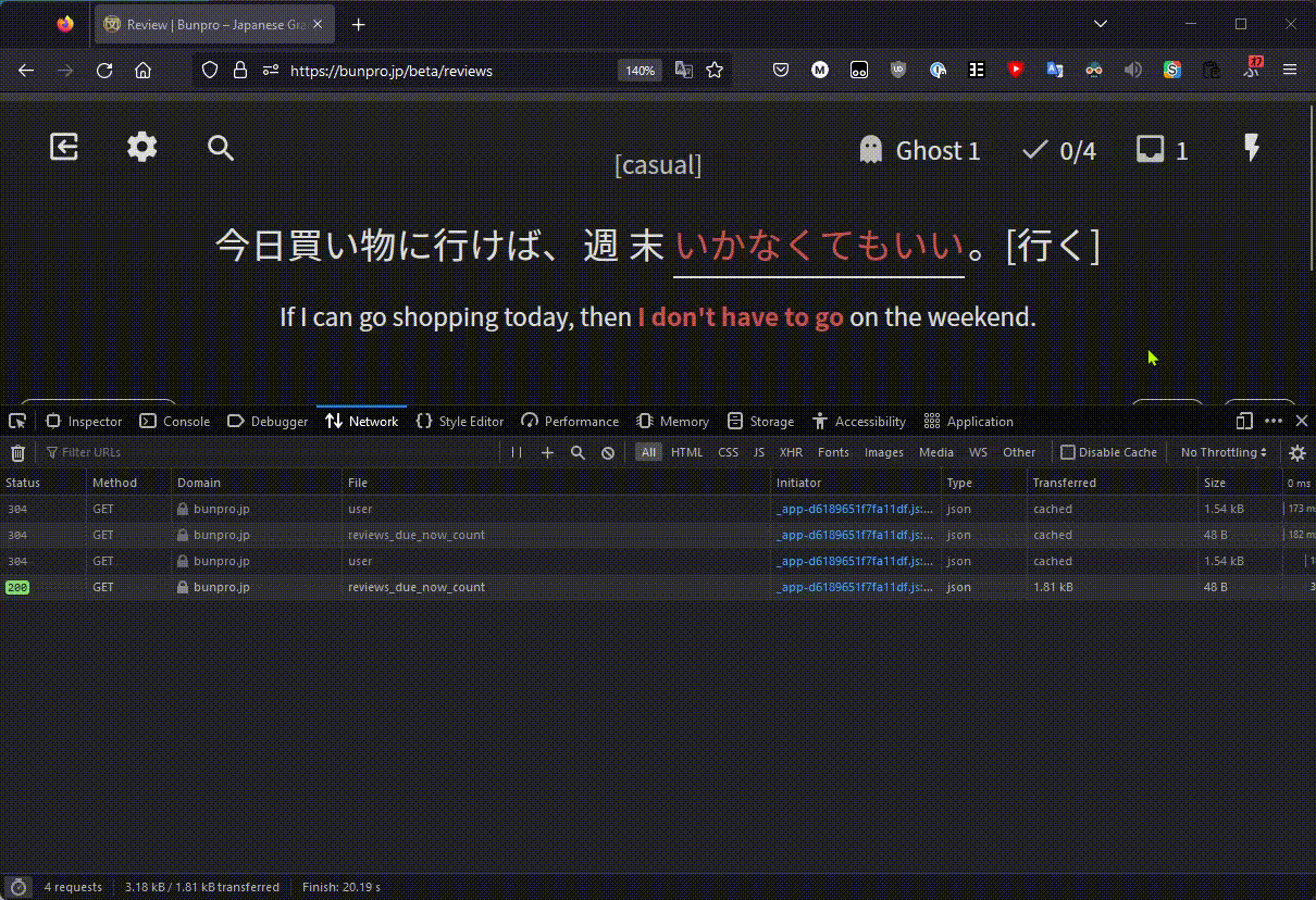
Gotta say, the new Reviews feature looks very slick!
One problem though:
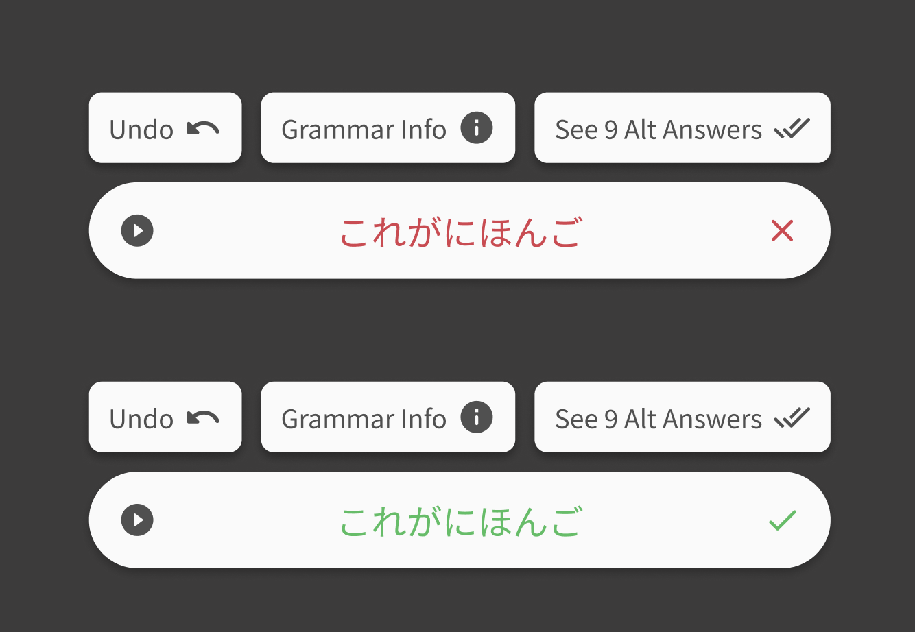
It appears that all my answers are rated incorrect, regardless if they actually were correct.
This is evident by only the right number next to the checkmark ever increasing.
Additionally, if I try to end the session, it asks me to wrap up pending items.
Doing so will then result in an endless loop, because the system thinks my answers are all wrong haha.
This happened on mobile in Chrome, not sure if that matters though.
EDIT: I just noticed that all my reviewed items also have had their SRS stage dropped by 1 because they were “wrong”, oof.
3 Likes
Unfortunately, the automatic conversion of a single “n” to ん at the end of a response no longer seems to work:
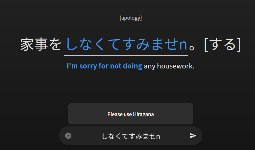
But I’m not sorry because I was doing my BunPro homework 
6 Likes
awesome! looking forward to futher improvements 
my first impressions:
the design was astounding but the sentences were a bit too big resulting to spliting senteces where in the old reviews it was just one sentence. keep up the good work mate 
2 Likes
I like the older UI more because everything nice and tightly in the center of my screen.
I have a big monitor so the new UI requires me to actually move my head to find out how many reviews I have left and then back down to type my answer (which for some reason is colored red until I send it, which is confusing since red answer = wrong answer).
Maybe there could be an option to have everything centered?
6 Likes
Same here, even after I deactivated Review 2.0, because I was stuck in an endless bunnymode –
SRS stage dropped here, too. 
Love the design, though.
(This happened on Safari for Mac)
3 Likes
I actually figured this one on my own. It’s cause I’m using an Azerty keyboard. I’ll just press Q instead of A. ^^
2 Likes
I cannot use the a shortcut for displaying the answer either. I’m using an alternate keyboard layout as well, but that wasn’t an issue in the previous version, so it would be great to have that fixed.
2 Likes
For accessibility, it would be great if the difference between a correct answer and an incorrect one would be indicated by something else in addition to the background color change (e.g. a maru/batsu symbol).
3 Likes
I’ve had the setting on to automatically show the full grammar after each review, but I very quickly turned that off when I saw how that works with Review 2.0. It is extremely jarring to me to for the screen to auto-scroll down, not just automatically, but even when I click the ‘grammar info’ button. I would much prefer your alternative, because it seems less disorienting. I’d just set it to auto-trigger after each review for myself. I think having a keyboard shortcut and that existing ‘grammar info’ button are sufficient for manual toggling.
2 Likes
@Fabniam Would you mind if I sent you a DM to pick your brain a lil’ bit regarding background options? Would love your thoughts on them!
@Liras348 Would you mind sending me an screenshot of your full resolution? Seems to me like you’ve got an ultrawide screen or something akin, would love to see that edge case!
@Bang One of our alternative designs for this was like this:
We just felt it was a bit awkward that you’re left without an explicit continue button. Curious to hear your thoughts on it, and anyone else who might want to pitch in!
1 Like
I just tested this, it looks awesome! However, I didn’t like at all how the screen auto-scrolls down to show the grammar point after submitting an answer. I’m not sure if this is how its supposed to be or if its a bug.
I like how this looks, but maybe you could add some kind of “check mark” box to each section of the grammar point so we can quickly show/hide what we want to see?
This look good to me.
I would prefer the popout. The drawer on the right side looks a little weird to me with all that unused space under it 
2 Likes
I’m not sure about that one either. I think the symbol would need to be placed more prominently. The input is maybe not the best place. My eyes are focused on the sentence in the center of the screen throughout the reviews, not on the input. I can’t think of a great solution right now, though.
As for the background color change itself, I think the colors (and gradients) need some tweaking. I wonder how it would look like if the background color would change a bit more dramatically to more saturated colors - maybe even only confined to the lower part of the screen.
I tested the new review page in dark mode, by the way, and since it’s late, f.lux was already on its most extreme setting (1900K). In comparison, the color contrasts on WaniKani are still very pronounced and the difference between correct and incorrect answers still pops out, while the beta looks pretty muddy.
I don’t think it’s all bad, by the way, I like the open feel of the new layout, I just think it needs some tweaking 
2 Likes
Just to mention, I really like the background gradient and think it looks very professional (dark mode user). Maybe could poll to see who agrees / not? 
2 Likes
Looks great! Thank you guys.
Small issue, but on iPad the 候補 bar blocks vision of the Bunpro answer bar.
3 Likes
After splitting my latest review session between the new and old layout, I have to say that I miss the fact that the old layout had all the information nicely centered so it is visible at a glance without any scrolling and moving the focus to any edge of the screen.
It would be nice to have such an option with the new and improved functionality as well.
I do all my Bunpro on my iPad in portrait mode, not on any computer.
4 Likes
Hey there! That’s mostly something on iOS’ end and we really can’t do a whole lot about it.
What I do on my own iPad is to just drag the bar to the right, like in this screenshot.
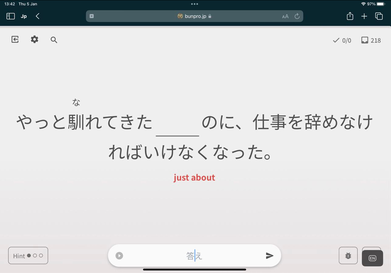
Granted, it still covers up the Keyboard Hotkeys button, but you can hide this bar entirely if you want.
It’s in general a nuisance of iPadOS.  Hope this helps alleviate that!
2 Likes
I just tested the beta review system again on my PC, and it too deems every review to be incorrect:
5 Likes