Reviews 2.0, and a whole lot more! [Beta]

@ThisIsntTheWay @Lucas-Emanuel

So sorry about this bug guys! This shouldn’t have slipped passed my testing.
The bug seemed to be for Bunny Mode (Lightning Mode) only! It should be fixed now.

@max99x
Sent you a message about this too! If you had bunny mode on during your lesson, this could be the cause of the bug too

9 Likes

Just wanted to hop in and say I appreciate my dear bunpro staff dividing the beta settings, so I can still enjoy my beautiful vocab decks.
Will hop onto Review 2.0 when that is resolved, so a ping or seperate post for the vocab update is highly appreciated.

6 Likes

I’m loving the new design, it feels so much more responsive.

Just for an idea on the tentative addition ‘1 - Show Grammar Info’.

Whilst I like the idea of a sidebar, I think the first initial click should show a popup summary of the core info of the grammar point. In the example it would show something like:

—————————
‘ にかけては’
When it comes to, regarding, concerning
Noun + にかけては
—————————

A second click could then provide more information on the sidebar.

I also think the sidebar could be expanded to be used as something to access content from the entire site, from anywhere on the site as a dictionary for both grammar and vocab. This way you don’t have to leave what your doing to view this content.

Loving the work by the Bunpro team!

3 Likes

Enjoying the new layout and love that it’s coming as a “fresh start” for the new year! I tend to cram grammar reviews in free time, even if it’s only a couple and I was wondering if moving the “wrap-up” to a single button on the front of the interface is feasible? It’s my only niggle with the new layout.

3 Likes

I really like this. Good job team.

5 Likes

Some more Day 1 bugfixes:


Switched the method for implementing hotkeys:

  • Alternative keyboards should now work as intended

@Arkeuse @Bang


Updated the “Show Grammar” button & how it interacts with the “Auto-Expand Info” setting:

  • When auto show grammar is on:
    • Load the grammar info below (no scroll)
    • Have the f hotkey trigger a full scroll down
  • When auto show grammar is off:
    • Only load grammar on ‘F’ hotkey / ‘Show’ button press
    • After it loads, trigger a full scroll down

@Fabniam @bunnypro @Melanthe @chicharron


For our Firefox users – we’re working on a fix for the BG gradient banding
For our tablet users – we’re working on quality-of-life features for ya’ll too!

As always, thanks for the feedback ya’ll! Stay tuned~

11 Likes

I will reiterate what someone else said and say it’s odd to see the input appear in the sentence as red as you type, makes it feel like it’s considering the answer wrong until you submit.

Overall, it seems a bit smoother and faster, which I like. It also seems to do a good job with the “clean modern” UI aesthetic. My only real problem is I kind of hate the “clean modern” aesthetic, so I don’t really like the look of this.

I suppose there won’t be an option to get back the old classic theme?

3 Likes

This is epic! I loved the changes to the mobile app, and this brings the clean and modern style to the desktop as well - but with so much more! I love it!

5 Likes

I really really love this!! Now for your questions…

My answers
  • Do you think this new display method achieves the goal of getting information about your study subject? Yes I do! I think this is preferable. But, I think we should be able to customize which sections of the grammar point show in the left hand bar with the rest auto-collapsed, and ideally the ability to order it. For example, I’d probably only keep the “Structure” and “About” box and hide the rest. Another example, since some people use “notes” a lot, maybe they’d want to see their notes box on top for example.
  • What key differences do you identify between this method and the previous one? Which one do you prefer, and why? I prefer the left bar, I really dislike scrolling and Id like to see the sentence and the grammar info on the same screen without scrolling needed
  • Would you like to have this feature? Yes I would, did I mention I hate scrolling Lol!
  • What do you think is the best way for this to trigger? Some ideas: Setting to auto open on correct or incorrect answer, “Info” icon on the top left with the “exit” and “settings” button, and the existing “Grammar Info” button you already have.
My answers
  • What are your thoughts on the overall readability of the new design? Personally i love the overall new review feature, literally everything is good, except I really don’t like the gradient in particular :neutral_face:
  • Do you find it easy to focus during your reviews with the current gradient background? Please provide details. Nope… I don’t like it lol. It’s hard to explain why… I’ll come back to this when I have more thoughts
  • What do you think could be an alternative? I think I’d prefer the answer box to highlight border in green/red and keep the background static.
My answers
  • Would you rather see the drawer on the right hand side? Left hand side to be consistent with the reviews (if you proceed with that feature).
  • Would a modal popout be better than the drawer? I think modal popup is better in this case but (just throwing ideas) I wonder about the idea of a progress bar at the top that clearly shows that the quiz is coming, with the ability to just go back to the grammar points to review again. That way no pop up is needed at all. The reason I mention this is because i personally hate popups lol. So for example if you have 5 new grammar points you’re reviewing, you could have 6 dots at the top, 5 for the lessons and 1 for the quiz (maybe with a special icon to denote its a quiz), highlight which dot you’re on as you progress… and have arrows on each side… (sorry I’m getting ahead of myself lol)
5 Likes

Same for me. Same settings as GrymSylver but only getting the old review page and not the fancy new one. Will try the link bunnypro sent on next reviews.

2 Likes

I’m a grumpy old git that hates change and haven’t yet seen how the new review format helps me, though I’m sure it must eventually as soon as I understand what I’m missing!

However, I did just notice this:

Screenshot 2023-01-06 3.34.47 PM

Is it really nice work to lose 100 XP? (Not quite sure what XPs are and why it’s a good or bad thing to lose them, but my instinct would say losing something is unfortunate rather than cause for congratulations!)

5 Likes

Never knew you could do that. Thank you :smiley:

After using it for a bit, I like the minimalistic design. But I wish these was an option to have grammar info always pop up as soon as you get an answer correct. Majority of the time, I take a look at the grammar just to refresh my mind, or just scroll down to the bottom to take another look at the nuance/fun fact box.

Maybe the grammar info should always be available, without having to press F to view it. The people who want to take a look at it would just have to scroll down as soon as they get an answer correct. Those who don’t can press enter and move on.

Or an option to have grammar info pop up as soon as you get an answer correct/incorrect?

This is the same reason I use the website rather than the app on iPad, because there’s an extra step to get to the grammar info and no shortcut key (if there is please let me know), compared to the website where it would be available immediately upon getting a correct/incorrect answer.

I sent a private bug report, but I thought id open it up to the community to see if other are seeing what I am seeing.

In any character that has a Digraph and another character is causing the kerning and spacing to be off. In this example the きょくis making the character have too much space between the characters. It’s minor but visually annoying.

If you change the text in the furigana the problem goes away. So there is some issue in that hide-furi class.

Here is another example and In this case there is also a lack of clean edge wrapping at my current font size. Not sure why.

@Daru: Sure, would love to express my thoughts on other options! :slight_smile:

This time I didn’t lose any XP, which is good I guess! How do I gain some?

Screenshot 2023-01-06 8.33.55 PM

1 Like

This is a great improvement! Finally I’m able to hide furigana consistently without knowing if I’ll toggle or get a popup for a word.

Just a few things:

  • Is it possible to display current streak / days studied and session time to the overview at the end? Based on the 年間まとめ, it seems like bunpro is recording this, so it would be nice to be displayed there.
  • The EXP seems to say 0, but when you click away, it briefly shows the actual amount.

Thanks for the hard work!

1 Like

I love the new design.

  • Very modern and clean looking. The gradient adds a nice splash of color while also being functional. I didn’t notice if there was or was not, but regardless of the color change for correct/incorrect answers there should be an indicator that does not rely solely on a color change for visually impaired/colorblind users.

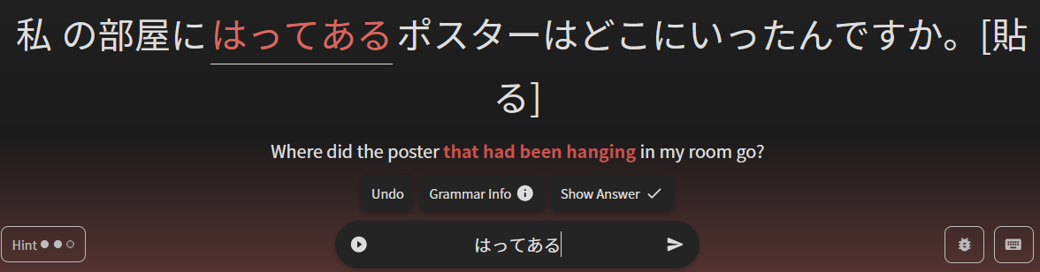
  • I like that the question/sentence is in the center of the page, but not really sure that I like the input field so far down on the page/at the bottom and I would prefer the buttons (undo, grammar info, show answer) to be under the input field. (Which would also line up nicely with the other three buttons (hint, bug report, keyboard). Come to think of it, would it make more sense to include the hint button as part of the undo/grammar info/show answer group (after show answer)?

  • Is there a toggle for focus mode during reviews?

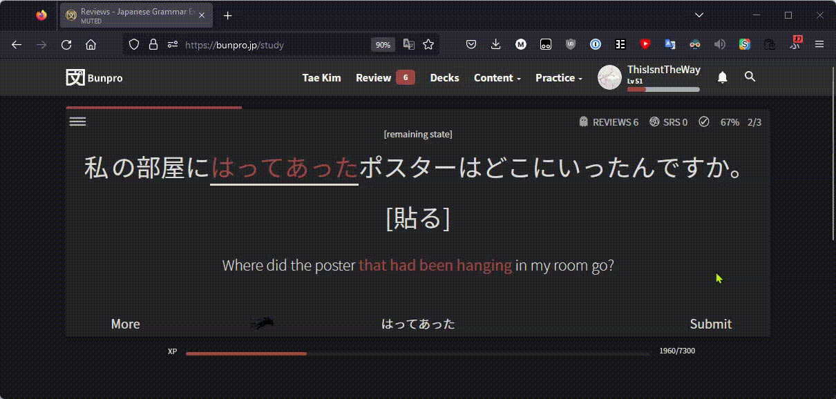
The addition of the actual sentences studied to the summary page is fantastic and makes it much easier to study up on the ones I had trouble with.

I really like how both the modal and drawer designs were implemented. I prefer the drawer for things like showing additional information (like clicking on “show more info” during reviews), but for prompts like “quiz me”, I like the modal. Users with screen readers may experience different behaviors depending on which is used.

Since the drawer is on the left, does pressing left arrow open it and right arrow close it? It says in the tentative additions that one of the strengths for the more info grammar drawer is no scrolling. Is that also true if the browser window is too small to display the information in its entirety?

I did notice some oddities:

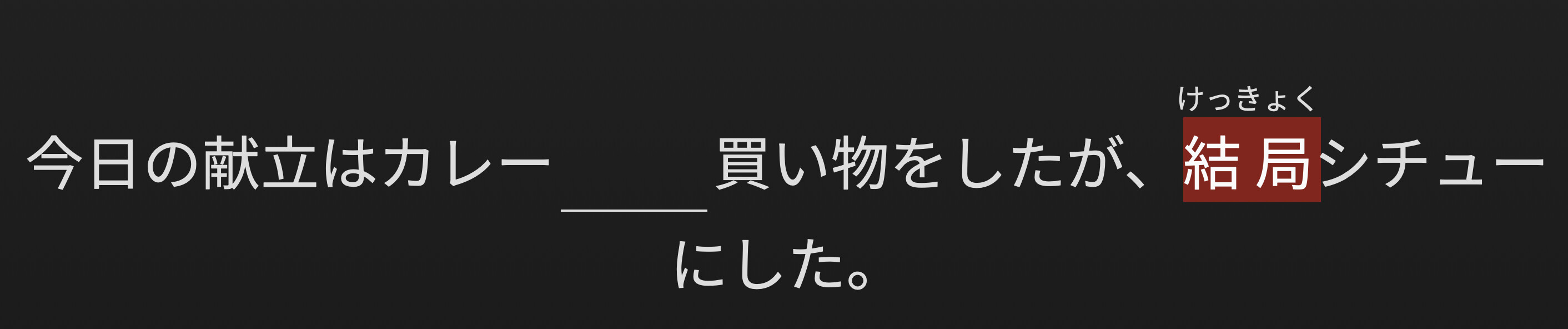
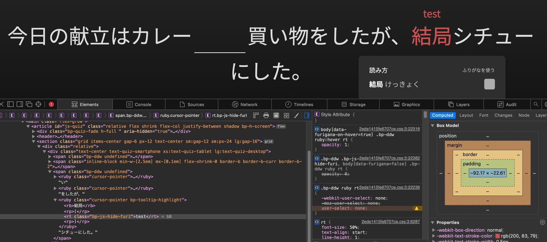
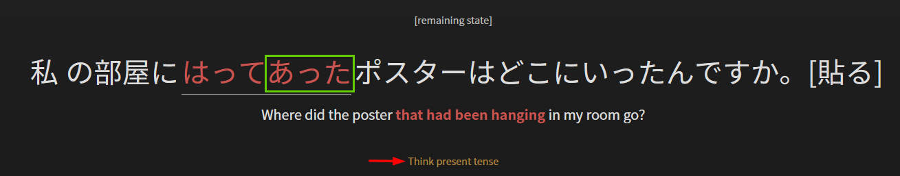
  • The furigana was always on. And when the sentence「すみませんが、正直に言えないんです。なぜなら、秘密だから。」 for the なぜなら grammar point came up, I kept getting the message “More polite.” even though the answer was correct. (When I toggled back to Reviews 1.0 it was fine.) There also wasn’t a button to report the bug, which might be because I use focus mode.

  • Another weird thing is that for vocabulary users, the review count still includes the vocabulary items even though there aren’t any reviews available unless you switch back.

  • The way the hints button is set up (with dots representing each available hint) seems as though you should be able to click on the dots to look at a particular hint, but that’s not the case.

  • Because the userpic is so prominent on the summary page I noticed that it’s rendering at 180x180 even though the actual image is 80x80 so it looks really blurry. On the rest of the site it renders at 120x120 and also looks blurry, except in the header, when its scaled down to 40x40. The forum userpics are (stored) at 240x240 and look fine when scaled down.

Regarding mobile: I think that if there’s eventually going to be an app, designing the site so it works for both desktop and mobile becomes less important because mobile users would/could use the app. Otherwise, the site should have the same/similar functionality on mobile (even if it’s not the exact same look and feel).

Lastly, and most importantly: You guys are doing a FANTASTIC job—always improving the site for us, always considering the needs of the users, and always kind, thoughtful, and responsive. I have several lifetime memberships with various language learning services, and this is BY FAR the best investment I’ve made in my language learning journey. (You can use this paragraph as a testimonial for advertising if you want. :wink: )

お疲れ様でした!

7 Likes

I think there’s a bug with a certain grammar point (~てある), but only in Reviews 2.0:

This answer will not be accepted and instead the hint below pops up.

Actually putting in the present tense will then be counted wrong:

はってあった will be accepted in the old Review system though:
firefox_IrZVHjn9lV

I think there might be a problem related to the streak count with reviews 2.0. My review activity has entries every day but somehow the streak was apparently broken. :woman_shrugging:

2 Likes