
Ah, so there was a button after all. Then it was just me who somehow missed it. Thank you for showing me where it is 
2 Likes
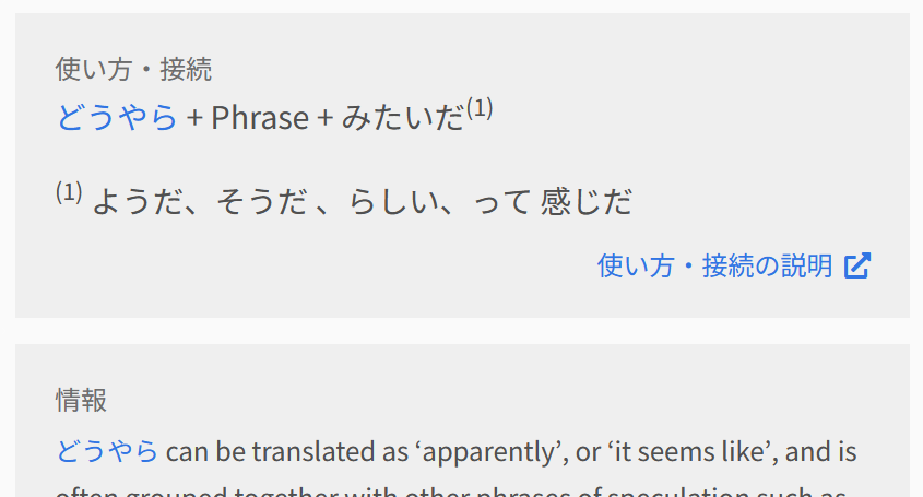
content display. There is only one setting under settings and it controls both reviews. I want furigana always on for grammar review because it doesn’t matter if I know readings when reviewing grammar, but I want furigana to be off for vocab reviews because it does matter if I know readings there.
3 Likes
Not quite sure which one of the two disappearing issues you’re asking to reproduce, so here’s both of them:
1 Like
Hahaha I actually meant neither of those!
Sorry for being vague… I meant this one:
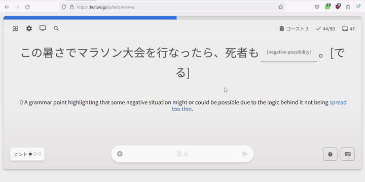
If I enter wrong answer, the yellow hint from the previous semi-correct answer doesn’t disappear.
Some good news – both of those two you mentioned in your reply will be fixed on the next update anyway.
2 Likes
あっ、分かった
If the answer was correct, the hint disappears properly:
3 Likes
And one more thing
Sometimes the bottom bar with text input shifts up and down despite having 高さを固定する turned on.
3 Likes
To avoid the mess that wanikani just went through I recommend temporarily allowing a way to return to the old version while the final kinks are ironed out. I 100% understand not wanting to support two frontends in the long term, but it will make the transition smoother and prevent some frustration.
That being said I expect that the transition here won’t be as bad because bunpro doesn’t rely on third party scripts to implement basic SRS functionality…
5 Likes
This already exists. You could use the new version by opting in or stay with the old version.
2 Likes
Yes but I’m talking about opting out of the new version because I’m sure that a good chunk of the userbase (I’d wager the majority) won’t bother opting-in before the redesign is made the default.
Again, that’s exactly what happened with WaniKani. The changes were in opt-in beta for a little while, a few people tested it. Then it was made the default without opt-out and it broke a ton of things that made many people frustrated.
That’s why I propose continuing with both versions a little longer, but make the new version the default to force people to use and and report issues.
3 Likes
The wanikani change preview was 2 weeks. This has been available for public test for months. Also, the only thing the wanikani change broke was userscripts. This site doesn’t have that issue.
5 Likes
It wasn’t just the user scripts but I agree that it’s less likely to be an issue here.
I still feel like since there’s already a toggle, it wouldn’t be very difficult for bunpro to make the transition smoother and avoid potential frustration from some users if some unexpected breakage happens.
3 Likes
Hey actually the vocab system is full of errors and has one major bug is that the “Quiz” section (after new learning) is only presented in Cloze style, not the decks’ selected study style.
The other common error I find is that during review answers often are not found in the “word info” area. Where the accepted answer for a translation doesn’t even match what is supplied during studying. It is a random guess most of the time.
I think there are also size formatting and and poor responsive display issues - which are just front end issues however do not really take away from studying but could be considered for UX pleasing.
2 Likes
this!!!
2 Likes
newish here, but I like that the old style of the learn page would float the player bar near the top after it would otherwise be scrolled off the screen. I missed that on the beta learn page.
2 Likes
Closing grammar legend modal box results in scrolling page to the top for some reason.
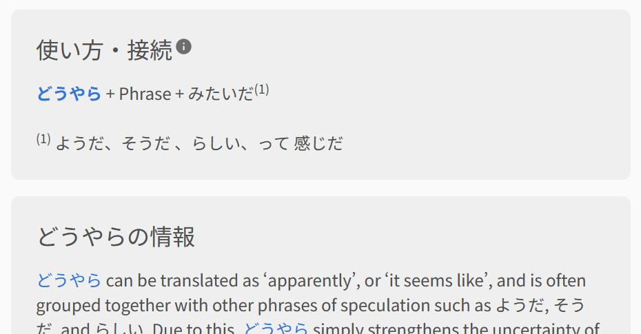
Could you please make the grammar breakdown font bigger as it was before?
It’s the most important part of the grammar point card and now it’s kinda hard to read.
Now:
Before:
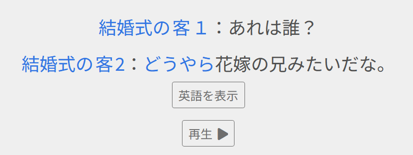
The English translation have too small font size here. Japanese and English are equally important here I’d say. Even Japanese font size is smaller than it was before.
Also “Play” button became too small, I have to precisely move my mouse in order to hit it. Also why did you move it to the left? Maybe it looks nice, but using it is kinda pain. It was much convenient before, when relatively big buttons were stacked one under another without having to move cursor that much.
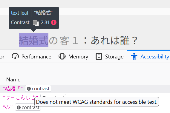
Highlighting names starting from the second is broken:
And please stop using gray on grayish

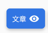
It seems 文章 visibility setting doesn’t save its state. I have to turn it off every time I open 例文 tab.
Even more it resets while I read the sentences! Every 文章 becomes visible suddenly. Looks like refreshing some data in the header bar causes it. For example, when I got a notification “Chihiro Joins the Team”, all Japanese suddenly became visible. The same happens when lesson and review counters in the header are refreshed.
2 Likes
Good conversation, we appreciate all the feedback.
We’ll keep this in Beta as long as it takes us to iron out the kinks. The OP states we’ll release it in early May, but we’ll definitely extend this if necessary.
All the posts here get a read and tickets are created internally to fix them, so keep the feedback coming!
1 Like
This shifting is there when the question/hint text is longer, and is to protect things from overlapping.
I’ll have a think about what can be done about it.
2 Likes
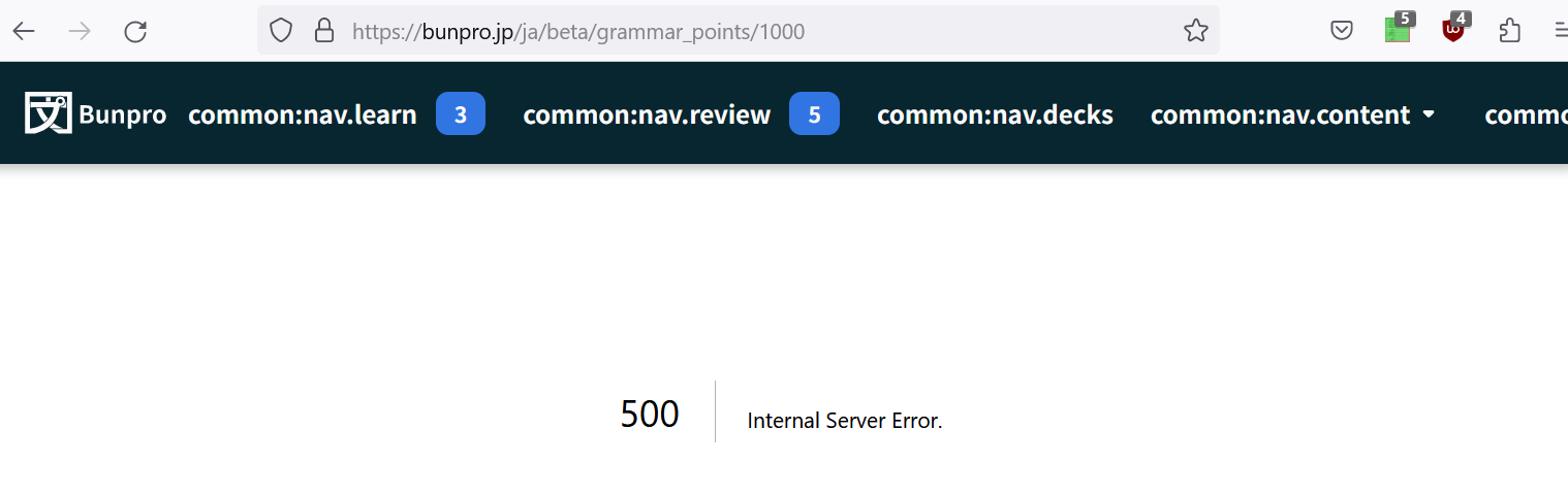
Oh boy, this is what I got instead of 404 page
In some grammar points furigana isn’t displayed properly.
When it works properly, there’s あやしい
undefined there: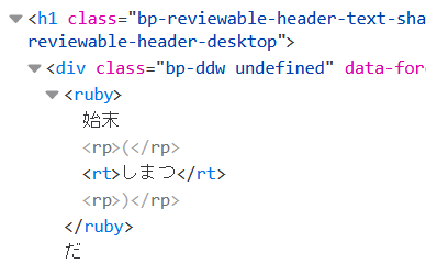
1 Like
Wow, I just want to say right out the gate that, as I loaded the Beta page for the first time, I had only two complaints:
- Everything seemed a little too far apart on my large screen.
- While it may or may not have been there before, I found the review item’s level being displayed to be attention drawing, and I didn’t like how the “age” of a point could possibly give me a hint as to what it was.
And then, within about 10 seconds of opening the settings menu, I found exactly the tweaks I wanted.
Incredibly well done, Bunpro team. It’s clear that you’ve thought hard about your users needs and listened to their feedback. (The folks making changes over at WaniKani could stand to learn a lot from you these days.)
–
My only minor feedback right now:
I was a little confused by the Display Menu icon at first. (It looked a little more like a “full screen” button.) It was only my desire to actively poke around that made me realize it hid some additional settings.
I might suggest either a slightly different icon (like a screen with a cog inside it, if that’s not too visually “busy”), or maybe just some sort of cross-reference between the regular settings menu and that menu. Like a note, or a link indicating that display settings are available in the other sub-menu, so uninitiated users know to go look there.
Again, I’m really impressed so far guys, thanks for being such an amazing resource, both in functionality and in depth of information.
Edit: Damn, the session wrap-up is beautiful too. すごいですよ!
5 Likes
on the answer page, pressing F scrolls down and shows the information page. I’ve got enough space on my screen to show both, like the original design. Maybe its just a matter of getting used to it, but as it is now it would be useful to have the F key then scroll back up to the answer page. i.e. it toggles between the two.
2 Likes