Reviews 2.0 is coming out of Beta! (Soon)

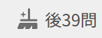
In case you’re unaware of the Reviews 2.0 Beta, the original thread discussing the changes and how to activate the Beta can be found here.


We’re excited to announce that Reviews 2.0 Beta will exit Beta at the start of May 2023. The affected pages on the website will all be replaced with their Reviews 2.0 counterparts. This change won’t impact the mobile app.

The affected pages/features are:

  • Reviews (bunpro.jp/reviews)
  • Learn (bunpro.jp/learn)
  • Summary (bunpro.jp/summary)
  • Grammar pages (e.g. bunpro.jp/grammar_points/です)
  • Vocab pages (e.g. bunpro.jp/vocabs/日本)

Why announce ahead of time?

We want to give users that haven’t tried out the Beta a chance to do so before it launches.

The dust has settled, the new Reviews system is now in a stable and bug-free state.
In the original post about the beta, there was a tonne of great feedback and ideas. With all of your help, we managed to sculpt the new Reviews system into something really great :sparkles:

We’re committed to improving the Reviews experience and welcome your feedback. This is your last chance to speak up before it goes live!


TLDR:
Basically, this is a “speak now or forever hold your peace”-type moment for the Reviews 2.0 Beta!
If you have any final feedback, post it below :cowboy_hat_face:

31 Likes

Thank you guys for constantly improving Bunpro!
I’ll give it another try now.

Would you mind to increase the hint contrast? It was gray on white, but now it’s gray on gray :confounded:
It’s really hard to read it for me.

え?ちょっと待って
Where’s XP progress bar? Why did you remove such encouraging and motivating thing? :fearful:

9 Likes

Will there be any option to keep the current Review UI and not switch?

6 Likes

Good question. No there won’t be an option to keep the old UI.
Maintaining the two completely different systems would be too much work as we add more and more features.

We’ve made a lot of changes since the initial release to make the switch between the two interfaces as seamless as possible, including the ability to set the width/height of the reviews screen (from this update here).

This however is another big reason why your feedback now matters more than ever!

6 Likes

This hint still disappears too fast. I wasn’t able to read it to the end.


Also looks like this hint and the 別解表示 one in the vocab reviews are conflicting. When I hover over 別解表示 button, あなたの答え… disappears immediately, but 他の答え方 doesn’t appear unless I hover the button again.
At the same time, あなたの答え… doesn’t disappear right after I move to the next review:

It’s a bummer I can’t copy anything from the 他の答え方 box: it disappears when I move cursor away from the 別解表示 button. I think it would be better to show it while I move my cursor over the 他の答え方 box too, not the button only.


If I enter wrong answer, the yellow hint from the previous semi-correct answer doesn’t disappear.


And would you add a feature to check for internet connection while sending progress info to the server and show a verbose error? Now I’m able to “do” my reviews even my wi-fi is dead, sending the progress info to Bunpro just fails silently. In the previous UI I immediately realized I have no internet by freezing my XP progress bar. But now I have no clue.


If I go to next review hovering the 別解表示 button, 他の答え方 box doesn’t disappear at all until I’ll have a chance to move the cursor over the 別解表示 button again.


I love this little detail btw

4 Likes

A button to change light/dark mode within reviews or anywhere on the site would much appreciated

9 Likes

In the old UI there’s a feature to automatically add reviews that just became available in the queue without reloading the page, just in the moment you’re reviewing your current batch.
Looks like it’s the missing feature in the new UI.

2 Likes

It is really just a cosmetic preference, but personally I am not a fan of the reddish and greenish gradients appearing when an answer is correct or wrong. I am not a graphic designer so it’s hard for me to say what would work better, maybe a solid colour?

5 Likes

I’d prefer if there was just a legacy mode added for the old reviews. I don’t really like the reviews 2.0 after trying it for a while. Mainly just the look of it.

4 Likes

Issue 01: The settings screen is transparent, which makes it difficult to read because it overlaps with the review screen.

Issue 02: Clicking on 設定画面へ replaces the review tab with the settings tab, IMO it would be a better idea to open the settings in a new tab instead.

3 Likes

せっかくに古いUIに戻ったユーザーメニューのXPプログレスバーはまた新しいUIに消えた :cry:

1 Like

I’ve said it before in the other thread. But the settings for the split reviews really need to be their own settings and not joint settings. I really need to be able to individually control how they display as I use vocab and grammar reviews differently.

2 Likes

The display of characters like ěščřžýáíé is still broken in the notes while doing reviews.

4 Likes

I’ve been using 2.0 for a while and the main thing that’s bugging me is that there’s no audio button I can click on screen (could be I’ve missed it somehow). The only option I know of for me to hear the sentence is to click p on the keyboard and even then there’s not much indication what’s going on if nothing happens. I know it’s because not all sentences have audio yet, but I still wonder at times if I just misclicked the button or the audio just isn’t loading or something.

4 Likes

Just tried Reviews 2.0 for the first time. Issues I ran into in the course of my first session with it:

  1. no furigana on hover for the word-I’m-supposed-to-use-in-my-answer on the right, which leaves me with a trial-and-error step of “invent a reading for the word, do an answer with that made-up reading, and then after it fails and I see the right answer hit undo in order to submit the equivalent answer except with the right reading”. (This is true despite my having had furigana-on-hover turned on in settings.
  2. Reduced convenience of checking the grammar writeups after answering, since the writeups can only be accessed by scrolling down rather than showing up directly onscreen upon pressing enter.

(Of the two, 1 strikes me as more a bug, whereas 2 strikes me as more a deliberate-design-decision-I-happen-to-be-inconvenienced-by.)

Hello and thanks for the update,
I really like the “clean” feel of review 2.0 but I just have one minor suggestion:


Being able to deactivate the green gradient on the bottom of the page because I feel it’s much cleaner without

This is really minor so if it can’t be done I’ll just go with it,

Thank you !

6 Likes

I don’t know how to activate it, but in batches of reviews, sometimes I can’t click on the “Show Info” button or F. At times it seems to load indefinitely or just stay grayed out.

If I’m able to get a screenshot, I’ll edit my comment.

I can highlight the button, but I can’t click here or press F. I have no clue what’s causing this. I did notice the the icon on this Show Info is different from others where it shows a down arrow. Don’t know if it’s related but figured I should point it out.

1 Like

Thanks for all the feedback!

  • Hint Contrast issue
    • We’re looking into options for theme contrast issues at the moment
  • XP Bar missing
    • Also in discussion at the moment
  • Hint still disappears too fast
    • We’ve shortened the Japanese by quite a bit. Should make it slightly faster to read
  • Alts. buttons conflicting with the tooltips above the input bar
    • Will take a look into it! Good find
  • Hint not disappearing
    • Let me know if you can replicate this again, and how you did it. I’m currently not able to reproduce the bug!
  • There will be a Hard error popup for connection issues in the next big update
  • Automatically add reviews that just became available
    • We’ll add this at some point in time after the bigger bugs have been fixed
  • Will add XP details to the nav-menu bar again!
5 Likes

Hi there!
Are you able to describe the issue a bit more at all? Trying to figure out if there is a bug.
If there is no audio for a question, there will be no play button on the input.
If there is audio, the play button should be there (and the P hotkey should work)

2 Likes

Out of interest, what settings would you like split?

1 Like