Reviews 2.0 is coming out of Beta! (Soon)

Thanks for the great feedback! Comments like this really make my day :relaxed:

As for the Full-screen icon, you’re right.
We’re going to add some more stuff into there in the future (as a few people have requested, a light/dark toggle) so will make more sense to be a different icon.
Will discuss this internally.

3 Likes

I believe what you mentioned is how we had it before.
This has kinda been replaced by the new I hotkey, that will focus the input and take you back to the top of the page.
Between a combination of F and I, you can scroll down and up the page.

The I hotkey is new so not many people know about it.
If you or anyone else has feedback on this decision please let me know here!

1 Like

The server 404/500 issue will be fixed by the next update.
The furigana title being broken was a DB data issue! Fixed that specific item now. Thanks for the find.

2 Likes

Just tested Reviews 2.0 on my mobile phone (Firefox 112.1)
It works nice and smooth, thank you for your hard work!

Sometimes button captions overflow the button:


It would be nice to have a closing button in the top right corner of the settings window. I had a hard time guessing how I can close it. Fennec slightly zooms the page after interaction with the answer input field, so the settings window fills the screen entirely and I didn’t see that shadow margins I can tap to close the window.

And a cosmetic thing on the login screen
“Remember me” checkbox weirdly aligned.

2 Likes

A huge thank you for all the work you’ve put into Bunpro and improving it - it really is brilliant and I like the new look! Just one feedback from me: I know it’s been said above but I too would really prefer if there was a setting to deactivate the green/red gradient on the bottom of the page if possible please. When I am running through the reviews it is almost like the screen is flashing. I do like the new, clean look and the green/red coloured text on the answers though. Thanks again!

2 Likes

Hey again!

  1. With the smooshed text, what phone are you on?
    • With that I can work out what pixel-width your screen is
  2. With the close button in the drawer
    • that’s something I can speak to the designer about. We have a close button in the Modal version of the settings menu, so maybe we could add it in there too
  3. Will get the checkbox fixed too!

As always thanks for all the feedback :v:

1 Like

Pre-release Review changes #3

First batch of updates since the first post! Sorry for the wait.


Features

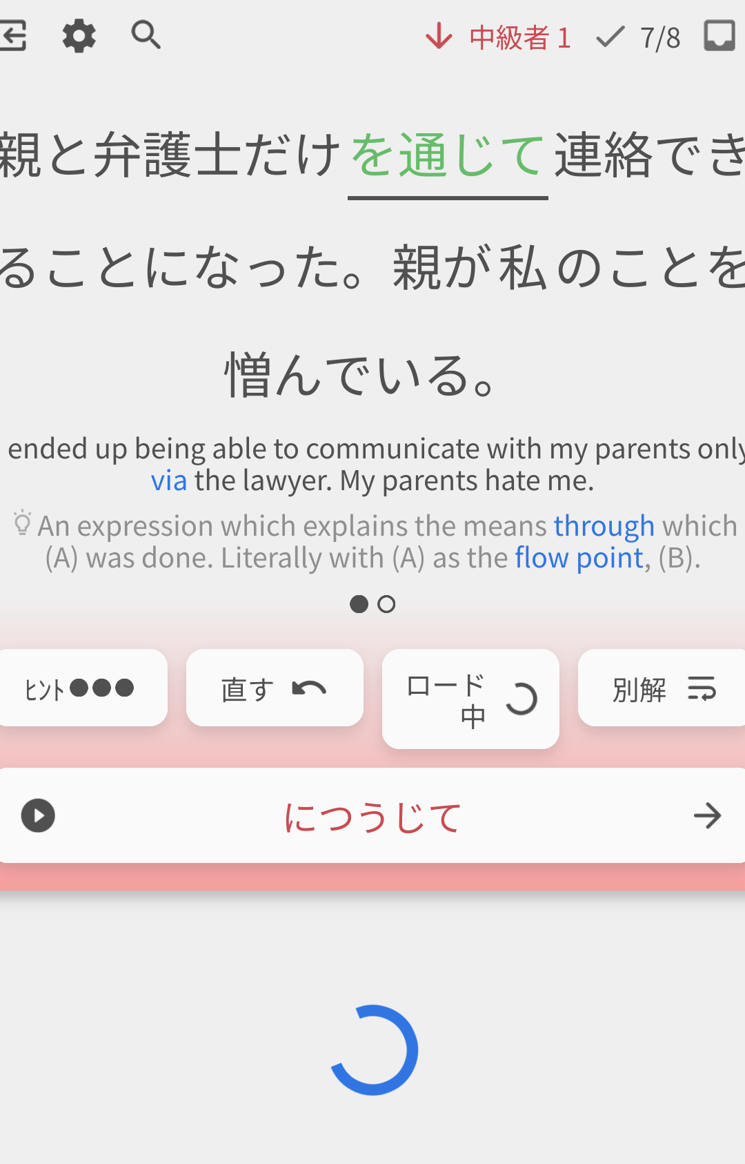
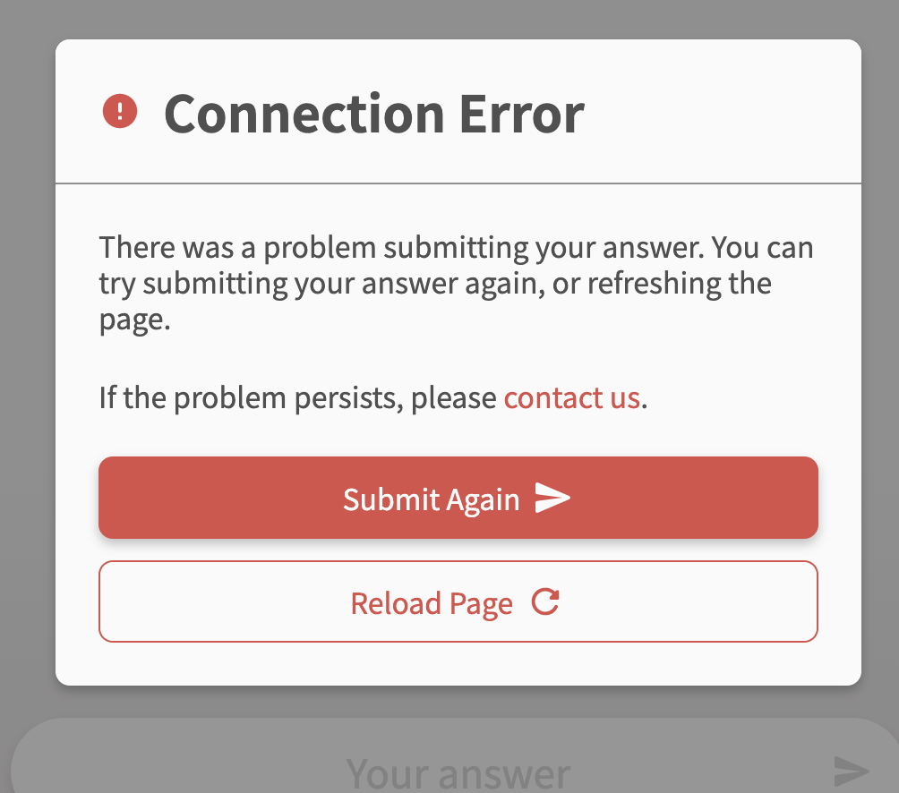
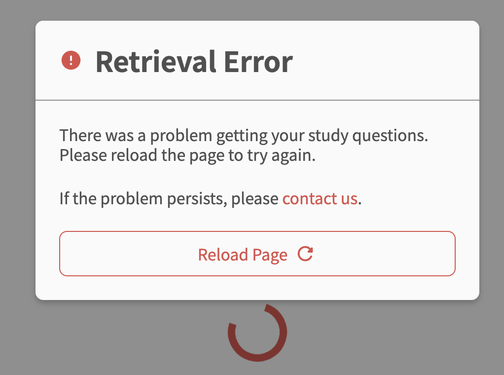
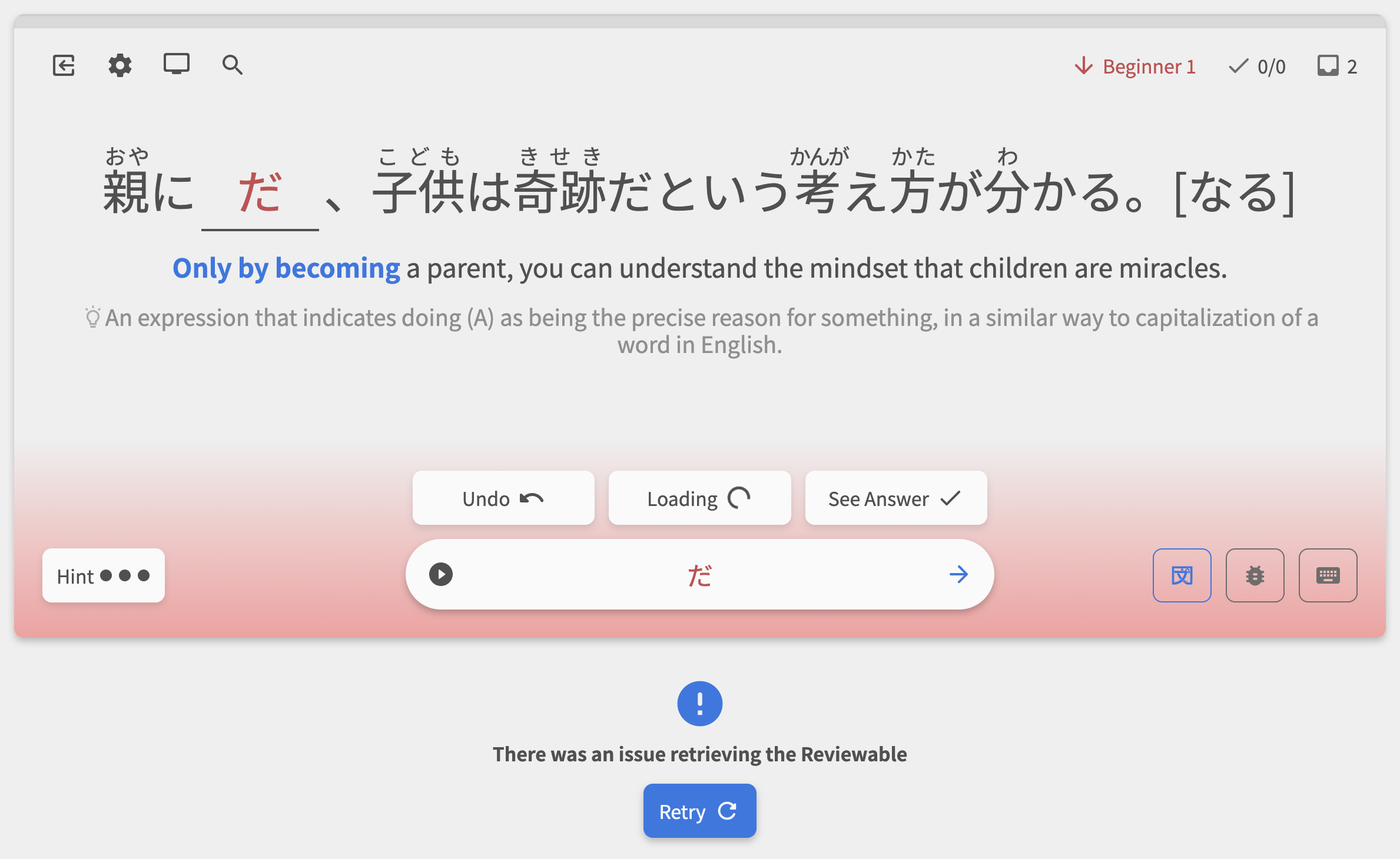
1. Hard-handling of Errors in Reviews

Before this update, errors when submitting your answers to the database would happen silently, so you wouldn’t know if something went wrong (e.g. your internet connection dropped). This has been amended, and now you’ll be alerted if the DB submission failed.

You’ll receive an alert and given options (retry request, refresh page) for the following error types:

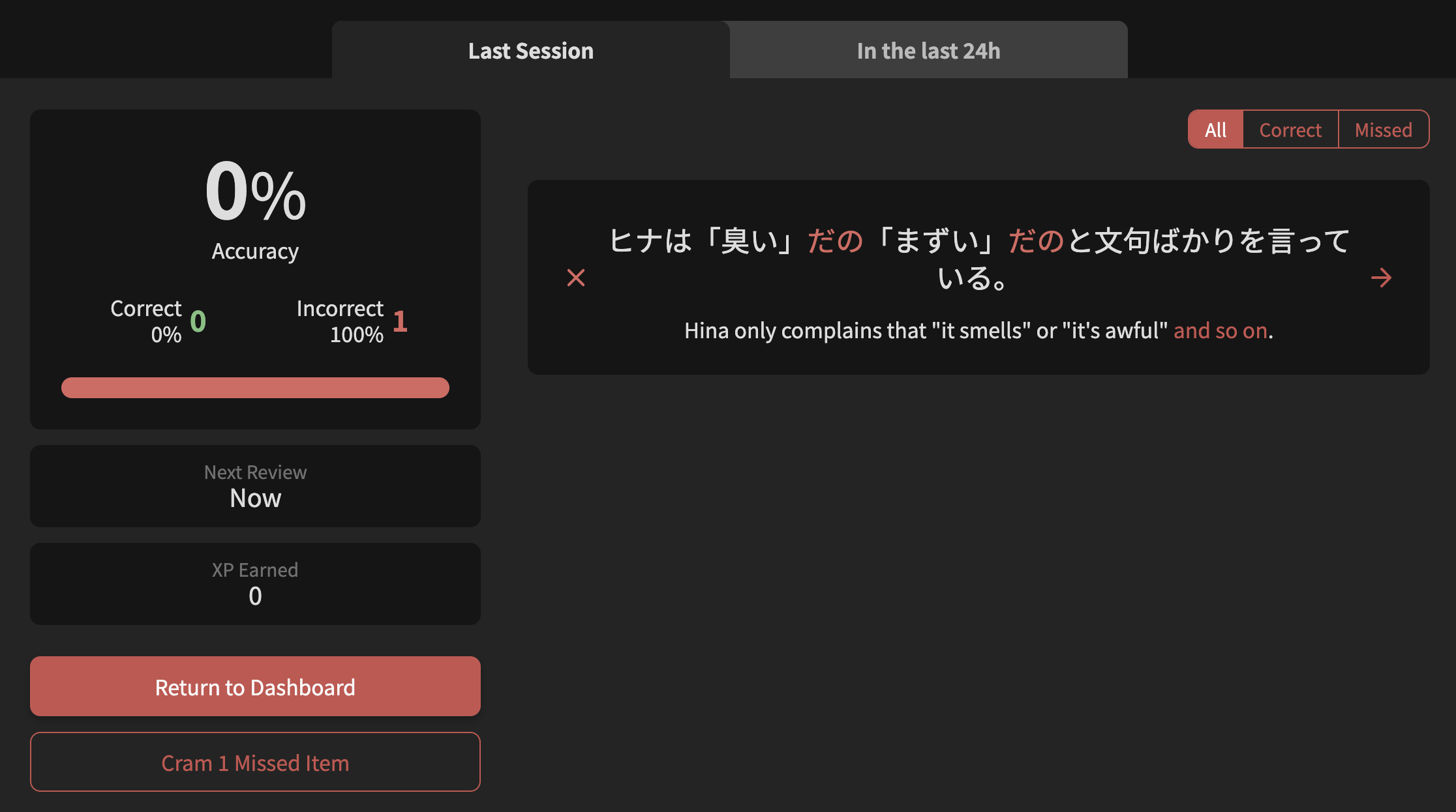
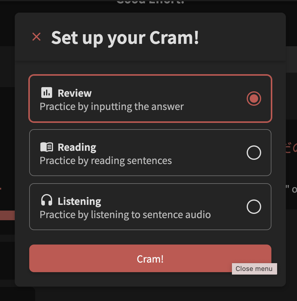
2. “Crammed Missed Items” button added to Summary

The button has now been activated! Choose a question-style and start the Cram session right from the Summary screen.

  • Note that Cram is limited to Grammar Points right now (no Vocab), so this feature also is limited to Grammar Points for now
  • The Summary page also received a little bit of a makeover

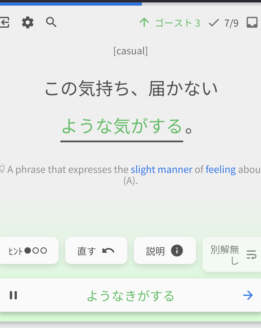
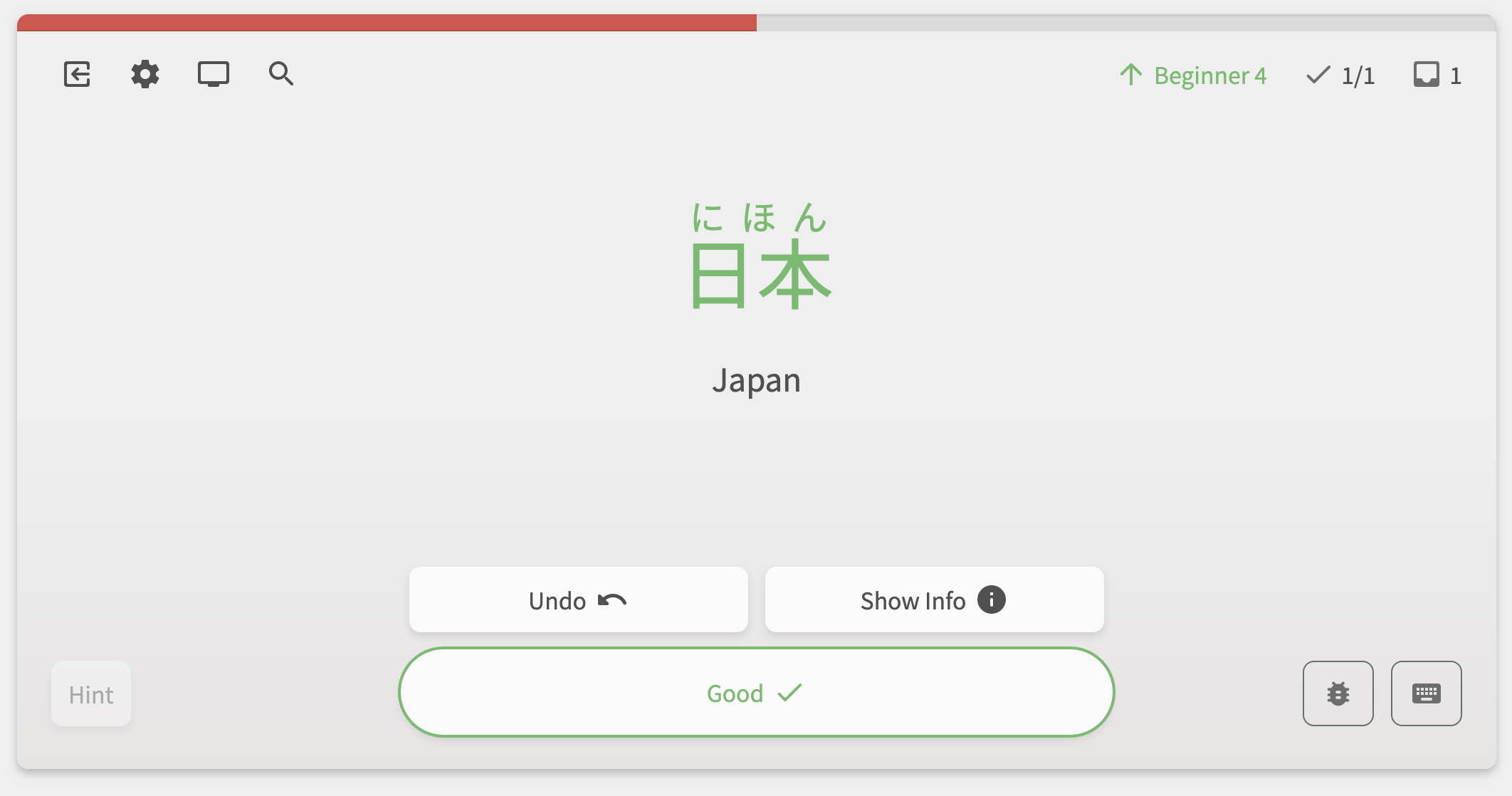
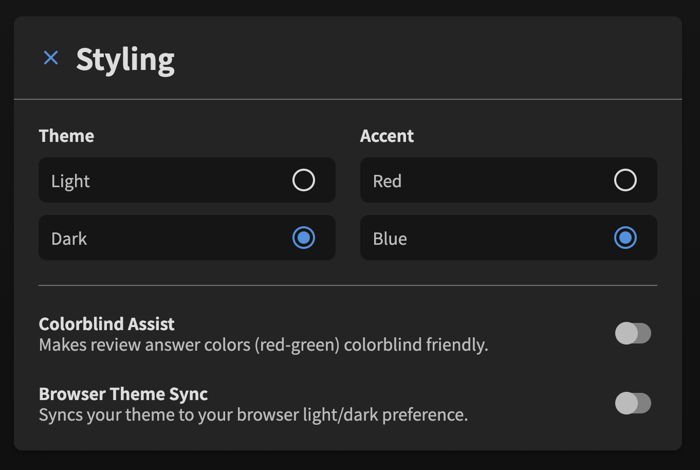
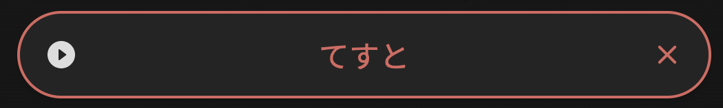
3. Removed the colored background gradient when post attempt

This one might be controversial, but we removed the colored background gradient after submitting an answer attempt. A colored ring around the input field will now replace it.

We received a lot of mixed feedback about this, so we’re still not sure about it. But on the bright side it will make it easier to add custom backgrounds in the future :smirk:

Tags for those that gave feedback: @Superpnut @Asriel @if_at_first

Minor Features

  1. Added the Scroll To Top button to the Grammar Point/Vocab details page
    • Used to just be inside Quiz

Fixes

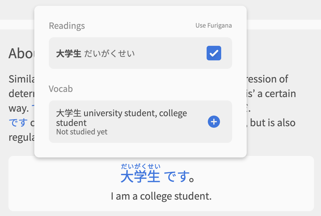
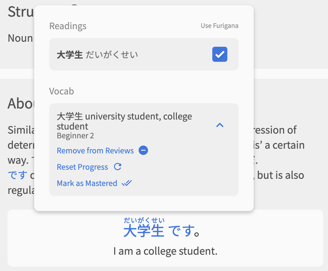
  • Adding/Removing a Vocab’s Synonyms in a Quiz will now be reflected immediately
  • Fixed a weird flashing of the Progress footer when the Synonyms are updated
  • Increased Synonym word limit from 20 to 38
  • Fixed a bug where removing the Grammar/Vocab from your Reviews (via the Progress footer) wouldn’t work if it was the last question
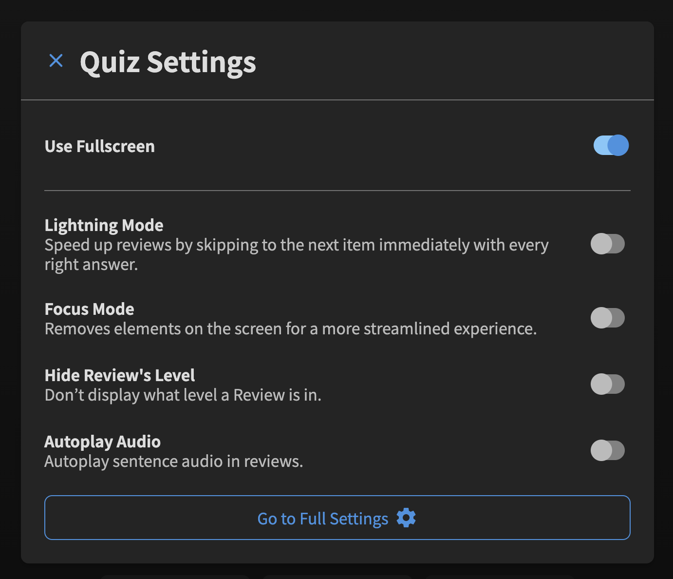
  • Make the “Go to Full Settings” button in the Review Settings modal open in a new tab
  • Fixed a bug where if the first example sentence if a Grammar Point/Vocab had no audio, the audio-player wouldn’t display / no sentence would be selected

↓Fixes from @HotAirGun feedback

  • Shortened the Japanese version of “Your answer differs slightly from what we have. Check to make sure you were correct.” so it can be read faster before dissappearing
  • Fix Grammar Legend closing causing page to scroll to top during Review
  • Tooltip now always closes when the question changes
  • Leading hint (the orange one) dissappears on incorrect answer as well as correct
  • Fixed coloration issue in questions/example sentences that are Aさん-Bさん style
  • Added a custom 404 Page for the new system for Grammar Point/Vocab pages
  • Fixed the Hide/Show text states getting reset incorrectly in the Example Sentence section
    • They will now only automatically change if you change your Listening Mode or Hide English settings on the Settings page

Other Changes

  • Minor Modal title styling changes
  • Minor Audio-player Setting tooltip style changes
  • Updated the Hotkey Guide visuals (again :sweat_smile:)

Up Next

We’re hoping to complete/fix the following before release:

  • Fix Learn Quiz step locks questions to Cloze-type regardless of Deck settings
  • Add the XP/level-progress details back to the profile-dropdown in the navbar
  • Add theme/accent settings directly into the Display menu in the Quiz
  • Contrast improvements
  • Implement the “More Reviews have become available!” popup during Quiz
  • Fix broken text accents displaying in Notes
  • Update the Display Menu icon
  • “Add Furigana” right within the Furigana tooltip

That’s all folks! As always, let us know your feedback and we’ll get right onto it.

16 Likes

Wow, you guys are amazing, keep up the great work!

5 Likes

Just wanted to say, I LOVE Bunpro, and recently I started grinding vocab in it because it’s so convenient to keep all grammar and vocab progress in one place + WK sync is great.

I really hope you will keep expanding vocab sections because it’s a great pipeline and I like using it as my main vocab SRS really.
Making your frequency lists available for a study would also be mind blowing of course, and adding more vocab and polishing what’s already there.

Anyway, thanks for making Bunpro better, really looking forward to everything you will do! :monkey_face:

6 Likes

I am happy the gradients are gone, and the green/red border on the input field seem like a reasonable solution. I am looking forward to these custom backgrounds :blush:

5 Likes

Thank you for the update! You definitely works really hard :muscle:

Colored ring is better than colored background, it looks neat and tidy now.

But now looks like single-name phrases coloration is broken :sweat_smile:


As far as I remember, 警察官 was highlighted in the old UI.

Wow, just noticed there’s a shortcut to switch alternate answers backwards (Shift+A). You’re amazing!

2 Likes

Looks good!

In terms of accessibility, if possible it would be good to add a corresponding icon to the input box when a user answers incorrectly, similar to how a checkmark appears in the input field when the question is answered correctly. Maybe a exclamation mark or x? Or, it’s bad UX practice to rely solely on colour, especially since red-green colourblindness is pretty common.

2 Likes

Is there a button to change every grammar point from manual to fill & grade? I believe now the only option is doing it 1 by 1, which often bugs

1 Like

Gave the beta another review session.
The removal of the gradient is something I personally enjoy, not that it didn’t look good but because it was distracting to me. Its been a few months since I last tried the beta and this version now seems a lot more polished to me. It mostly just looks like a bunpro that was designed around a phone, which is fine.
One issue that I found was the undo button has changed sides, it is on the right hand side in traditional review mode, but the left hand side on beta mode. While I am not going to pretend that is a problem in anyway, it might be a bit of an annoyance to people who spent time using the traditional reviews to find the buttons in different spots.

Also the summary at the end of a review session. That is just a direct upgrade to the old version as far as I am concerned.
So that is my two cents.

2 Likes

Huge thank you for all of this!

2 Likes

There’s no indication in the new UI that there’s new feedback from Bunpro team.
Old UI:

New UI:

1 Like

You can do so using the Deck system, choosing a Deck (e.g. this one) and changing the Deck Settings in the top right!

I’m more concerned about the bugs.
What bugs are you seeing?

There’s no indication in the new UI that there’s new feedback from Bunpro team.

Nice spotting! Will implement in the next-next update :nerd_face:

1 Like

Pre-release Review changes #4


Features

Updates to the Quiz menus

  • Add theme/accent settings directly into the Styling menu in Quiz
  • Created the Stylings options menu, which includes options for changing to Light/Dark-mode, as well as some other things
  • Move all the screen width/height locking settings into the main Quiz Settings menu
  • Update the Styling Menu icon
  • @Kaune

styling-1

Manage Reviews for Grammar/Vocab right within the Furigana (Reader) tooltip

From within the Reader tooltip, you can now Add, Reset, Remove and Master Reviews, just like you can within the Progress footer of the Grammar/Vocab pages themselves. @Sidgr

Minor changes


Next up

  • Fix Learn Quiz step locks questions to Cloze-type regardless of Deck settings
  • Fix broken text accents displaying in Notes

@HotAirGun:

  • Add the XP/level-progress details back to the profile-dropdown in the navbar
  • Contrast improvements
  • Add the “New Feedback!” notification text next to Your Feedback in the Profile dropdown
  • Implement the “More Reviews have become available!” popup during Quiz
8 Likes


Just got this thing hanging forever during 切り上げ phase. Is it that infamous bug with grammar point info loading? Have nothing in the browser console except “Failed to load https://bunpro.jp/_next/static/chunks/700-f6ed2581f6d444cf.js
(and this link actually returns 404 and then redirects to 500 Interval Server Error page).

1 Like