Separated Grammar vs. Vocab *Default Hint* level setting

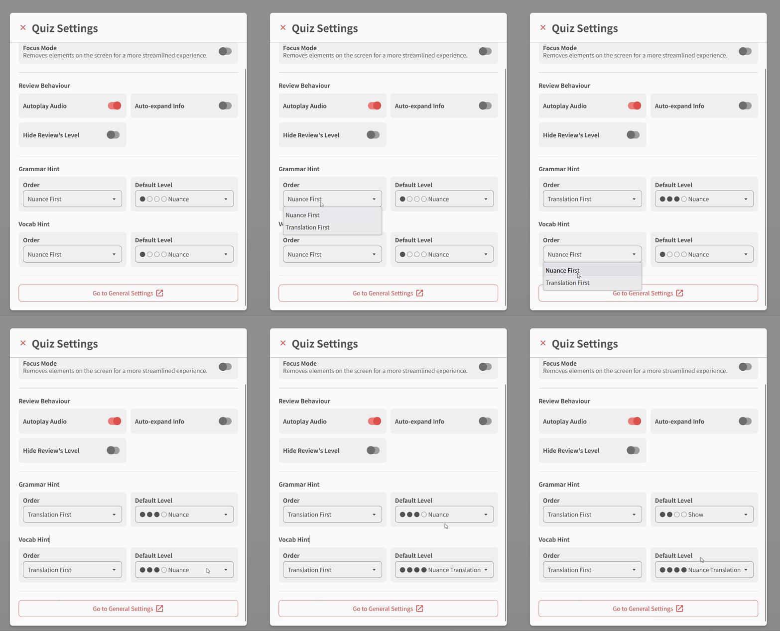
We’ve decided to separate the default Hint Level between Vocab and Grammar, so now you can set separate Hint Orders and Levels depending on the question type.

This setting can be set in two different locations:


In Quiz Settings (Best)

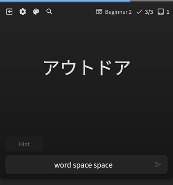
  • Clicking the cog icon :gear: in the top left of the screen will take you to the Quiz Settings
  • Scrolling down in the popout will take you to the Grammar/Vocab Hint settings
  • Here you can switch up the default Order and Level settings of your hints
  • The Default Level dots and wording will automatically change when you set the Order, so you can see exactly the effect that Order has on the corresponding ordering of the Hint Levels
  • Hopefully now you won’t need a PHD to understand how our Hint system works! :mortar_board:

nuance


In Review Settings

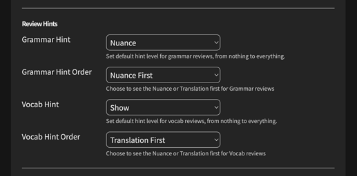
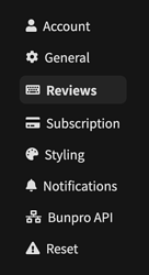
Nothing too special here – another location to set the same settings but under Settings > Reviews > Review Hints.
This menu is not interactive, hence I suggest using the one directly inside of Quiz!

One thing maybe worth is that we’ve separated out the Review-specific settings into their own section, they now belong in Settings > Reviews as opposed to Setting > General.


Anyway, that’s all for this update!
Happy studying~

27 Likes

I was thinking about tangential matters quite a bit. A disclaimer: I am a permanent member of the website, so it’s basically against my self-interest to say what I am going to say now, not to mention that it will most probably annoy literally everyone, but I will say it anyway.

I have come to realise that the decision to add Vocabulary reviews to the website might have been a mistake. And this update shows why do I think so — this functionality is out of scope of the original project’s scope, makes the website more complex (not only for users, but most importantly for developers working on it), makes it more difficult to maintain and takes the developers’ time and content creators’ time away from their work on the main functionality of the website.

I am not an unconditional proponent of the philosophy of making each program do one thing well, but I believe it applies here.

The Vocabulary reviews functionality might be useful (it is definitely useful for me), but with the hidden costs of it becoming more apparent, I am now inclined to believe that a separate spin-off website might have been a better option.

8 Likes

I appreciate you reaching out. I can definitely see your perspective and it is one some other’s have raised in the past. A lot of the disconnect comes from not being able to see how having the vocab impacts our ability to implement certain features we are working on or plan to implement in the future. Our decision to implement it was based on what having it allows us to do/achieve versus what limitations we face/suboptimal implementations we have to settle for without it.

One prime example is the current implementation of hiding/showing known furigana. While it is a solution that works reasonably, our implementation of vocab, the new frontend we have been building as well as backend algorithms we are working on that wouldn’t work without the vocab data will allow us to have a much much better solution that will be more flexible and accurate.

That is just one of the many behind the scenes/in progress things we are able to work on/aim for because we chose to implement vocab.

Regarding your point about a spin off. While I know other services are doing or have done just that, our philosophy and values are more aligned with offering value to our users and doing so at a low cost so that as many people as possible can learn Japanese, rather than being aligned with making more money by building out separate but related services so we can charge people for both.

22 Likes

I like the vocab! I think it is a net positive!
Don’t ask for a lighter load, ask for a stronger back!

I would prefer there to be too much here for me to handle then for me to out grow this website.

11 Likes

BunPro team, please keep working on vocabulary as you have. I think it is a valuable asset because it aids in the understanding of the grammar example sentences (especially once it is fully implemented). Sure, this could be achieved with 3rd party apps, but I think it’s way better when things are streamlined.

What people need to realize is that the full vision is not complete and that, since the vocabulary is still a work in progress, it looks rough around the edges. However, once the BunPro team gets to finalize this feature (combining the vocabulary section to the grammar), I think the perception on this will completely change for the better.

My 2 cents.

5 Likes

I appreciate your perspective, and in general, I do strongly agree that there is great risk in so-called ‘scope creep’. It is the bane of software development, IMO.

However, it is not a universal law, and there are also many cases where increasing scope is beneficial (or in some cases even necessary, but I don’t think Vocab counts as necessary in this case).

And, personally, I was also initially very skeptical of vocab being scope creep. I even made a comment about it somewhere, I’m pretty sure. However, I ended up trying it out after a while of avoiding it. And, much to my surprise, I changed my mind, as I started to see how Vocab can synergize very well with Grammar, and likewise how Grammar can synergize with Vocab. And, importantly, how they are not so dissimilar that they can’t utilize the same basic framework that BP already had in place for Grammar reviews.

One example, off the top of my head, and which they’ve already said is on their radar, is to be able to add Vocab items while browsing or reviewing Grammar points, and vice versa, being able to add Grammar points while (for example) reviewing Vocab example sentences.

This is already helpful even if you are here almost entirely just for Grammar:

Suppose you come across a word or expression in a review sentence for a particular grammar point. If the word is unfamiliar/unknown, then it makes it more difficult to read the Japanese sentence cloze to figure out what grammar point is expected by context, rather than having to resort to expanding the hints. If you could add that vocab word to your studies on BP, then you could fill in that small gap in your vocab knowledge, and thus when re-answering that sentence (such as in Ghost reviews) or in future sentences with the same word/phrase, then you’ll be able to more-completely understand things in Japanese, bringing you a little bit closer to what a full-immersion experience might be like.

After diving into BP’s vocab, especially using the Cloze form of vocab reviews with their example sentences, I’ve absorbed so much more experience reading Japanese, and I’ve noticed a large increase in my ability to do so. I know many folks would say that just jumping into reading Japanese in the wild (or in graded readers, or whatever) is better than using SRS to practice reading. But, personally, I’m glad to be able to use SRS in addition to Japanese-in-the-wild.

And again, this improvement in my reading has also improved my experience with studying grammar on BP. Hence why I now believe that adding Vocab as they have (in a slow, steady, methodical pace, and listening to user feedback), has enhanced the BP Grammar SRS experience as well. That’s what I meant by ‘synergy’.

TL;DR: Feature/scope creep is bad. Features need to have a good reason to exist, and to be worth the time/energy put into them. In the case of BP adding Vocab, I believe it to be worth it, and hence not a case of actual feature creep.

That being said, I can still appreciate if/when others will disagree. Hopefully time will prove Vocab to have been worth it. But you never know. There’s always a risk when adding new features!

7 Likes

Any chances making this setting more granular? I’d prefer to see Japanese nuance first, then sentence hint, sentence translation, and only then English nuance.
It depends if I understood the Japanese nuance though. Maybe some keyboard shortcuts to toggle all those four things independently could be a nice idea? Like any modifier key + Space.

2 Likes

Thanks for the update!

I had a quick suggestion.

With the new Japanese hints, it would be nice if there were a shortcut that would go backwards through the hint options, as it would be nice to peek at a hint, but then go back to Japanese only without having to cycle through all the other hints and potentially “spoil” the card, making it too easy.

This would also allow someone to use the English part of the hint for some reviews, but then switch back to Japanese only hints for the next review, again, without having to cycle through all the hints.

This request is a bit similar to how you can use ‘A’ to cycle forwards through the alternate answers, but using ‘Shift + A’ lets you cycle backwards through.

These shortcuts were introduced here by @veritas_nz . Perhaps a more simple shortcut would be ‘Space’ to go forward through the hints and ‘Shift + Space’ to go backwards through the hints.

2 Likes

The issue here is that the Space key must be reserved for Translate + Manual questions, where some questions require spaces (e.g. 一号車 is “first_car”).

So for this question type, Hint is now Shift + Space.
We could maybe make it Ctrl + Space to go backwards, but that’s kinda weird too!

Will think about it some more…

1 Like

I understand why Shift + Space is bound up, thanks for explaining.

But maybe Ctrl + Space isn’t too bad.

After all, you use Ctrl + Tab to go forward through your tabs and Ctrl + Shift + Tab goes backwards.

Thanks for considering!

1 Like

Could we get Tooltips on hover (perhaps simply using the basic HTML/CSS attributes) that explain briefly what the different ‘Levels’ mean? Especially for what ‘Hint’ and ‘Nuance’ mean?

[Actually, as a general ‘good to have’ feature, for usability’s sake, I’d recommend (eventually! maybe not all at once) putting in Tooltips for most/all features, particularly for settings, particularly for things which use kind-of ‘code words’ that mean something specific but are not necessarily obvious on first reading.]


Using Crtl + Z (Undo) and Ctrl + Shift + Z (Redo) as a paradigm, then perhaps on these question-types, you could have Ctrl + Space be for showing the next hint in the sequence, and Ctrl + Shift + Space for going back in the hint sequence? [I.e. Leaving Shift + Space doing nothing in particular (just whatever the default action/character is for it in the basic editor), unless you have some other purpose in mind for it.]

There is precedent for Ctrl + Space being some ‘suggestion’ feature and Ctrl + Shift + Space for going ‘back’ through the suggestions. It is used on at least a couple of editors / IDEs I’ve used in the past. So, although perhaps using Ctrl is a little less natural for the average person, it does work nicely with the Shift-means-reverse-feature paradigm.

Also, in keeping with my earlier point about Tooltips (and pop-up tips in general), since the shortcut for hint is different in Translate + Manual questions, I suggest that when a user presses plain-old Space in such questions, that a small, unobtrusive text appears briefly above the input box reading something like “Press Ctrl + Space or Cmd + Space to show hints”. This way, folks who are expecting Space to show hints (from other kinds of questions) will not get frustrated that they ‘can’t find the hint feature’, or ‘hints aren’t working for some questions’.

And lastly, since making this change would make Ctrl + Space a ‘default’ for Translate + Manual questions, then I’d also suggest making Ctrl (+ Shift) + Space working identically for Cloze-type questions. (In other words, both Space and Ctrl + Space would show next hint on these questions.)

[Potentially, you could make ‘show hint’ universally as Ctrl + Space, for all types of questions, so that it’s uniform across all question types, and remove the current Space method, while also putting the “Press Ctrl + Space for hints” notification message whenever someone presses Space during any question type. At least this would make the interface uniform for all question types.

Though it would probably annoy some folks who only care about the (arguably) easier Space shortcut. In my experience, though, one quickly adapts to whatever shortcut is required for very-commonly-used features such as ‘suggestion’ or ‘hint’ features. Various games and applications have variations on different key combos, so there’s always going to be some adaptation required. After a short time, people just get used to it, and it’s rare that one particular combo is drastically better than all others.]

2 Likes

Thanks for the feedback!

We can add these tooltips – maybe even a description below the dropdown too
Can hopefully reuse the descriptions elsewhere too.

As for the hotkey thing, I’ll give it some thought.
Ideally we have some sort of standardized system for these hotkeys first.

2 Likes

Nice idea! :+1:

2 Likes