Yes that’s the one I meant. I already signaled it early on but since it was among other feedback I figured it got lost between items that needed to be fixed with a higher priority.
Yeah sorry about that!
Bumping it was the right call. Would’ve missed it otherwise 
Hi it’s me again. Seems like the ghost counter is broken this morning and audio auto-play hasn’t gotten out of bed either. Didn’t even answer one question but was already telling me that the ghost was slayed. As for the audio, I have to press P to have the sentence told back to me now instead of auto-playing on a correct answer which it was doing before. Not sure when it started but possibly since yesterday evening just was in a hurry doing my reviews that it didn’t register that something was wrong.
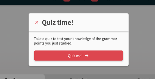
Seems like on desktop the dialog for quizzes is now centered which is a welcomed change. Would be nice to use the arrows to select the buttons but it’s less disruptive than it was before thank you. Only thing left for me would be slimming down the header on the end session screen.
Hello. Same bugs here for ghosts and audio autoPlay.
Thanks for the feedback.
Silently pushed an update last night. Will fix these bugs ASAP!
EDIT: Both bugs should be fixed 
Vocab-prep update
To prepare for the release of Vocab with Reviews 2.0, we’ve made a bunch of changes/fixes to Reviews 2.0!
Key New Features
-
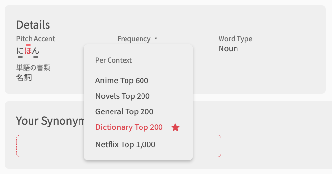
Add Frequency & Pitch-Accent Details for Vocab pages
-
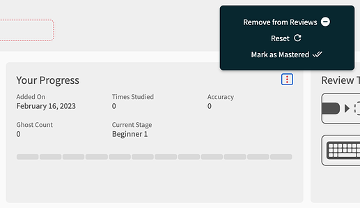
Reworked the Grammar Point/Vocab footer
- In addition to the ‘Current Stage’ text, there is now an SRS Progress bar
- We added this as many people missed the 12-badge bar to show SRS progress
- Review actions (Reset, Remove, Mark as Mastered) have now been moved into a submenu (see the 3 vertical dots in the top right of the footer)
- In addition to the ‘Current Stage’ text, there is now an SRS Progress bar
-
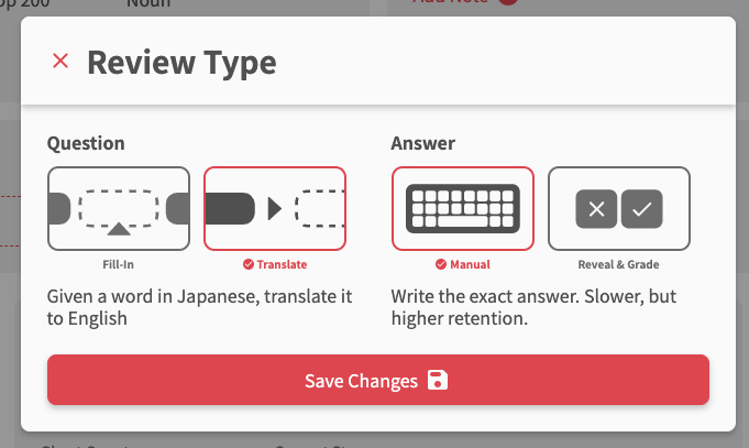
Added ‘Review Type’ menu for Vocab pages in the footer
- Now you can change the Review Type (previously called Manual Input/Cloze/Flashcard) inside of the Reviews 2.0 pages
- The formatting of this has changed a bit too
- Choose the Question and Answer type separately. The options are:
- Question
- Fill-In (previously Cloze)
- Translate (previously Manual Input)
- Answer
- Manual (text based)
- Reveal & Grade (flashcard)
- Question
-
Drawer now changed to a Modal on large screen devices (Desktop)
- This now adds a lot more space to work with on desktop
-
Drawer/Modal background color changed
- Changed to white for light-mode, black for dark-mode
- This is to aid in readability/consistency
Hotkey changes
- Toggle backwards through alt-answers
- For questions with multiple alt-answers, in addition to using
Ato toggle forward through the answers… - You can now use
Shift + Ato toggle backwards through the answers! - Another great suggestion by @JandroSantiago
- For questions with multiple alt-answers, in addition to using
- Added
Shift + Spacehotkey- The
Spacekey to toggle Hints is still there, however you can now use bothSpaceandShift + Space - This has been reflected in the Hotkey Guide (which has received an update by the way)
- We will eventually phase out Space-key by itself as a hotkey
- The
-
Enterkey during Quiz now be globally available again- If you are not focusing on anything (e.g. click outside of the input area) and hit enter, the default behaviour is to behave the exact same as if you were inside the input area.
- This reduces the amount you need to use the
Ihotkey to focus/scroll-to the input
Fixes
- Remove question from Quiz entirely if ‘Remove from Reviews’ is clicked in in the Grammar Point/Vocab footer’s Your Progress section
- Thanks to @JandroSantiago for pointing this out
- Add a tooltip for the Search button inside of Quiz
- Behind the scenes, we also added support for all the different custom Review queues:
- These will become available when we release Vocab. They include support for:
- GP index Learn queries, e.g.
/beta/learn?grammar_points=[1, 2, 3] - Review filters, e.g.
/beta/reviews?only_review=vocab - Deck filters, e.g.
/beta/learn?deck_id=8,/beta/reviews?deck_id=8
- GP index Learn queries, e.g.
- These will become available when we release Vocab. They include support for:
There has been another overhaul to the Quiz system (Reviews/Learn), so as always, we look forward to hearing all of your feedback!
Happy studying~
You guys are AWESOME! So cool to see all the new things coming out! Not only that, you guys are doing it with polish, it’s looking really sleek!
Just to confirm that I also have the same problem this morning.
Same problem with 2 reviews in queue
Some quick feedback after playing with it for a few minutes.
- Pressing ‘f’ should toggle the grammar info view. I shouldn’t need to reach my mouse to move back to the top.
- There should be an option to disable animations. Additionally, it should respect the OS’s Reduce Motion option.
- The success/fail status should not be dependent solely on color. I see there is a colorblind setting, but this just adjusts colors to pass WCAG contrast ratios. There should be an icon or some other indicator for success/fail.
- The scroll bar keeps popping in and out changing the width of the viewport slightly.
Otherwise, it looks and feels pretty snappy! Can’t wait for it to roll out of beta!
This should be fixed. Was related to the “Ghost Slain” bug.
There was a bug where Ghost Reviews were going beyond the SRS level where they should’ve been marked as slain. We fixed the logic to mark them as slain when they were submitted, but there were a few left over that were due but also slain, so they weren’t returned, leading to the mismatched count.
Never mind
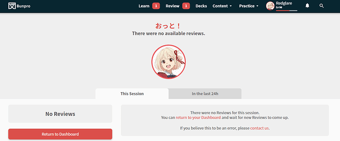
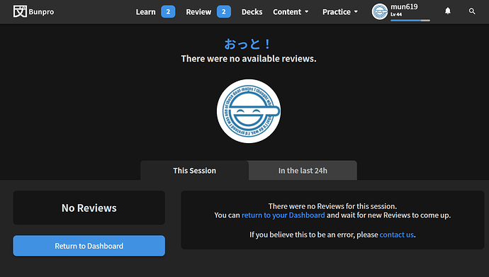
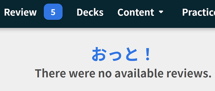
Ghost slain counter during the reviews seems to behave correctly after the fix but now after tonight’s session I’m being told that I have 3 reviews left to do in queue but then no available reviews. I don’t know about the status that I had for the 4pm reviews because I used the mobile app since I was on the go.
Seems like it fixed itself when the next hour rolled around.
Glad it’s fixed! 
Had no idea what was causing it, but thankfully Jake worked his magic BTS 
I had this same issue since last night, thought it was just a visual bug or something, but it jumped to 5 this evening:
I switched back to old reviews and was able to do them.
I occasionally use the Android app when I can’t get to PC, but primarily use the web app.
yes, they were all ghosts. I switched back to the old review system and was able to do them, like ianegg
Third time lucky!
This Ghost issue should now be Ghostbusted 
Sorry again for the inconvenience
I think the colors are being reused too much and hurting messaging.
Red being used for highlight, progress bar, and incorrect is confusing.
I would recommend something like:
Green for correct
Red for incorrent
Yellow for highlight
Yellow for progress bar


