Hello,
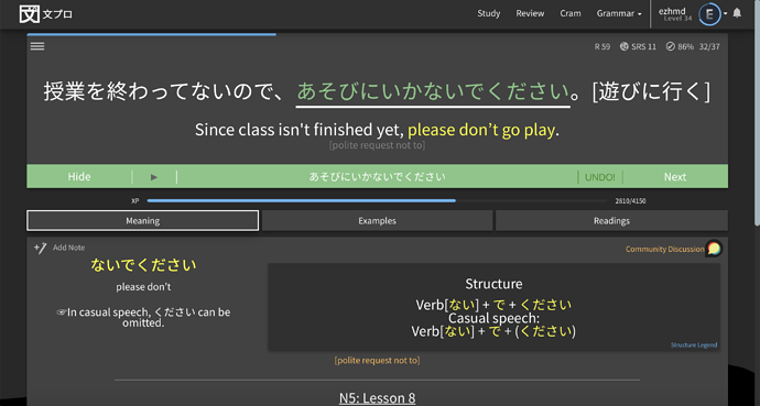
In the current app. When we answered a question correctly, the app shows the answered part in green color.
But for me, the problem is that the text is still in hiragana, and somehow it’s hard to read. Especially if it’s very long.
My suggestion is:
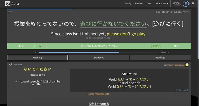
If we answered the question correctly, it should show the answer in kanji, like the following mockup:
Which is much easier to read.
By the way, this suggestion is different from the kanji input support suggestion. This suggestion only suggests to show the correct answer in kanji, but the input is still in hiragana as usual.
What do you think?
Cheers.


