Update - Jan 4, 2021

Now the profile link disappeared from the menu :frowning:

Could there be a setting to replace the dashboard with only the profile? I don’t like having to scroll on the landing page and I also generally want to look at the profile after a session (I used to click the logo to return).

I’m impressed!! Very nice!

1 Like

FWIW, the https://bunpro.jp/users/profile link still works, although it would be nice to be able to set it as the default page (maybe via user settings?), or at least be able to navigate to it via the new dashboard/interface.

1 Like

There is already a link on the dashboard. On the profile tile there is a link that says “View Profile” which will take you to that page.

1 Like

You can also view all badges, and then click profile at the top left

I guess this point is no longer relevant, not because the community posts got removed from the dashboard, but because the community link got removed from the nav bar :sweat: This seems even more of a regression, now I have to scroll down and click to go to the community, whereas before it was just a click.

1 Like

Would be nice to get the Community link back to the navigation bar.

3 Likes

The link to Profile is back in the dropdown. Down the line (probably later this year) all of the profile, stats, badges pages etc will be overhauled so they don’t feel as dated and have more functionality and performance. The profile page itself will probably be replaced with the dashboard when that happens.

@Melanthe @Marcus.W There is the community link in the dropdown still. On certain device screen sizes the navbar overflows. The community link may return if another work around can be found to fix the overflow issue.

3 Likes

Ok, then I can just use that link instead but it would make more sense for it to open in a new tab like the community link at the bottom of the dashboard.

1 Like

I don’t want a landing page with more functionality, I want one that loads quickly and doesn’t make me scroll. Like the profile, and unlike the dashboard, in both ways.

Well I am enjoying the new dashboard. One thing I’d like to suggest if I can, the name of the Toggle Weekly switch might make more sense to be named Toggle Daily since that’s the granularity on the graph when you switch to it.

Cheers

3 Likes

Seems to be fixed, thanks @Jake :slight_smile:

I mostly agree with this, more information does not necessarily mean better usability or increased function. The “old” landing page gives an easy overview of relevant stats and info, if I want more, the stats page can be loaded up. Super simple.

However, Im gonna take a wild guess and say that the new dashboard will see a couple of iterations and improve going forward, so even though I have some issues with the current version, you (devs) might know about some of them already. With that in mind, here is my rant and a few suggestions:

The dashboard feels very cluttered, but this might be mainly to a lot of info being posted twice, such as level, review count and text such as “Learn a new batch of grammar!”, which doesnt add anything but demands user attention. Remove some of the text and move review and lessons info count up to the top right, highlight with blue background (?).

image

I guess recent badges is a nice thing to see, but it is going to be static (for me) mostly. It doesnt need to be in prime central screen space, maybe move it off to the side or near the profile name.

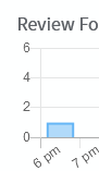
Review forecast is probably going to be accurate for the same day and tomorrow, anything after that might be overkill seeing as the numbers should change a lot if you miss new reviews and ghost reviews build up… Maybe shorten it to only a couple of days in order to increase space?

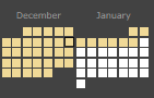
Consider readability for the Review activity. My current activity spans 2 months time. The review count Y-axis on the left is not usable if I want to visually estimate values further to the right, I need to mouse over for each point. It could be more readable if the background lines had a lighter shade so contrast increases, or that you add another value axis on the right hand side.

Then again, having the graphics as visible on the stats page would also be good, so I can easily see if Ive done the 20+ reviews that day just by checking that the box is yellow and it can present info for two whole months without having to look from right to left across the entire screen.

image

/rant

Giving constructive criticism is hard, so sorry in advance if I´m being too assumptious and on the nose about things.

6 Likes

@Jake Looks like something is wrong with review forecasting
It’s 6:11 pm now for me.
Review forecast shows a review in this hour:
%D0%B8%D0%B7%D0%BE%D0%B1%D1%80%D0%B0%D0%B6%D0%B5%D0%BD%D0%B8%D0%B5
But the old profile page tells it will be in about 2 hours. (And the good old profile page never lied to me!)
%D0%B8%D0%B7%D0%BE%D0%B1%D1%80%D0%B0%D0%B6%D0%B5%D0%BD%D0%B8%D0%B5

2 Likes

I don’t understand the issue. What information is on the profile that isn’t also on the dashboard that requires scrolling?

If it’s that much of a ball ache for you why don’t you replace your bookmark with the profile link?

That way you can stop being so aggressive with your “feedback”.

1 Like

Developers of this website are adult people. No need to defend them against harsh comments even if rudely worded. I am sure they will manage to extract important for them informations without crying. Knowing rage lvl of you costumers is useful as well.

Actually angry costumers that call you to yell at you are best friends of any business. The alternative is they will not voice their frustration to you, you will not get feedback because somebody will be worry to be rude, and slowly you will lose that costumers with all their money and knowledge on how to improve your product.

From what I have seen admins here are very professional and are doing their best to not take an offence and even say thank you for harsh word. Kudos to them for that

5 Likes

FYI, looks like the BP planner script is incompatible (and not necessary) and JLPT percentage script is giving a funny error. Any chance a percentage # N level (along with total) could be native? A ghost count would be great too.

I don’t spend a lot of time looking at the dashboard but looks great to me!

3 Likes

Just got it: can it be that Review Forecast shows also reviews that I already did in the current hour?

Thanks for all the info! I have found the error and will get it patched. Looks like the data mapping to group by hour ignores day but since it gets 24 hours worth of data that includes two 6pms resulting in the false count.

2 Likes

Spot on. I would rather have angry feedback than no feedback!

3 Likes