Update - Jan 4, 2021

あけましておめでとうございます。Happy New Year!
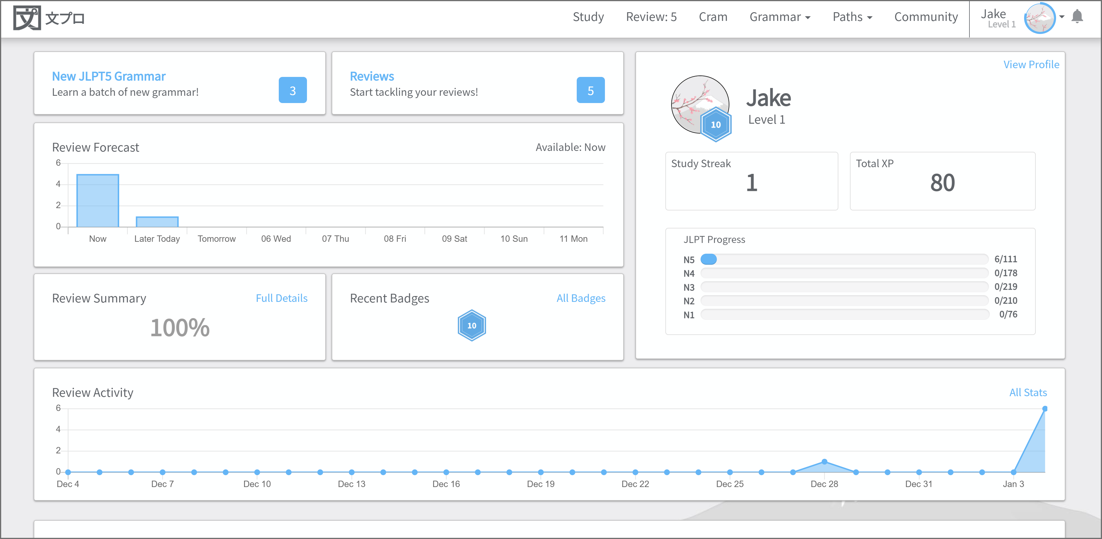
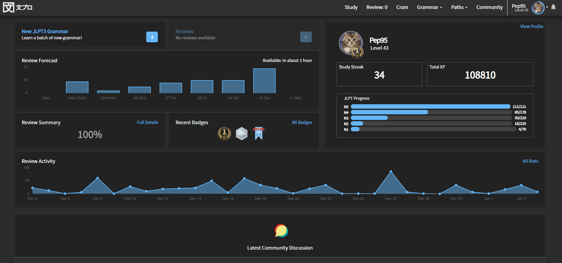
 :partying_face:

New Dashboard

The default route after logging in or navigating home with the link in the upper left has been changed to the new User Dashboard. The old link showing your Profile is still available.
The new dashboard gives you access to a high-level view of your progress:

  • Review Summary
  • Recent Badges
  • JLPT Progress
  • Review Activity
  • A new Review Forecast chart to help you visualize your review load over the week ahead.
    – and–
  • A list of recent community posts so you can easily stay apprised of forum activity.


Bugs

The update also includes small changes here and there to fix a few minor bugs, increase performance in a few bottlenecks.

  • The bug preventing Badges from being earned has been fixed. You may get blasted with rapid-fire new badge unlocks :bowing_man:
  • The issue with www and non-www links to Bunpro being treated as separate login sessions has been fixed.

As always, please don’t hesitate to share any thoughts or suggestions you have to improve Bunpro!

52 Likes

Looks great!

5 Likes

I love the new Dashboard

8 Likes

Thanks! This looks very slick :+1:

7 Likes

I think the Review Summary tile is a little confusing. I have no clue what it is supposed to be. The value seems to be a couple percentage points off of 1 - the percentage correct when clicking the full details link.

1 Like

This is such a mess.

The margin at the top is too small on Mobile Safari, the first button starts directly at the bottom of the menu so I immediately want to scroll. (Affects some other pages too, so might be related to the other recent thread about layout issues).

The study button shows three new items even though none are available.

The review button correctly shows zero, but leads to the old profile for some reason.

The results initially showed 20% and lead to a results page showing 83%, in the meantime both have changed to different results without me doing anything. (The new numbers are consistent though, maybe it was a cache thing.)

The streak and xp numbers are huge for completely useless figures.

The profile progress bars are not equal size anymore, the N1 one is longer presumably because the numbers require less space (affects the old profile too).

Sometimes the progress bars loaded twice for me, sometimes they don’t load at all or take forever (the review history too). With bunpro already having performance problems maybe loading 500 components from js on the start page was not a good idea.

I’m disappointed you spent time on this. This page is useless. It’s completely overloaded with random info for a start page that really only needs to tell me how many reviews and lessons I can do (the latter of which it currently doesn’t even get right), and when I can do more.

And on top of that I’m mad that I lost my streak again with no recollection of skipping a day or any memory of it not being there yesterday. Bunpro is literally the first thing I do every morning…

4 Likes

@nekoyama
I think it looks good, at least on PC, but it definitely needs some more work, as most of the bugs/issues you pointed out are also present for me.

Let’s give BP team a few weeks to iron out the issues and judge then :slight_smile:

2 Likes

looks good! but why is my review summary at 300% xD

1 Like

Looks great on Chrome on Galaxy note 10. My only suggestion would be to reorder the positioning, and put the username along with the streak and study progress at the top, followed by the upcoming grammar, reviews and review forecast. Perhaps making the boxes with Exp and Study streak a bit smaller, allowing the profile picture to be a bit bigger. At the moment those boxes are massive (Pic attached).

To be honest I am happy that I don’t have to click a bunch of different pages to see an overview of my progress, and upcoming reviews. The forecast is especially useful. As I am using a different account to power through earlier grammar again and search for mistakes etc, I have been doing minimum 10 grammar points a day. This makes tracking awesome!

Great stuff!

6 Likes

The first impression is that it looks good on my iPad in Safari. I like the review forecast.

2 Likes

Wow, what a difference this update has made. Looks fantastic, thanks for all your hard work!

3 Likes

Not sure if it is related or not but the header navigation now covers the top line when doing reviews on iPad Safari.

1 Like

Give it a few days. Probably takes a little bit of ironing out on their end. I don’t think it’s a waste of time though. Any small lifestyle changes like this can help the site in the long run. Ideally this would mean there is less need for people to click on random pages all the time when they can get a pretty decent summary on their dashboard. The less people need to click on random things, the less overall load there will be on the website.

Please note that I am not a tech guy, and my sever load comment may actually just be imaginary hahah

4 Likes

Looks great!

But why is my Review Summary “Infinity%”? x) (should be 0% according to the detail page; which is weird because I did not fail the review before last oO I never really understood this page anyway 🤷)
Also, I would like an hour by hour forecast, at least for the current day, please :3

No, it’s correct :slight_smile:

2 Likes

Lucky guess haha. Considering how consistently people complain about the load speed on Bunpro, anything they can do to streamline the experience and reduce congestion I think is a good idea.

2 Likes

It goes both ways. I never click on most of these and certainly not on all of them, but I often visit the start page. So in my case this means there is more load because all this stuff I don’t look at gets loaded anyway. And since it’s all individual requests from a web app it’s probably not even that much less load for people who do want it (but that’s hard to say without knowing the details of the implementation).

2 Likes

True, well like I said, I am no expert. So I won’t assume any further than my initial guess. But for my individual case I do think some of the additions are useful (mainly the forecast). I don’t pay too much attention to badges/streaks, as I don’t need the gamify aspect of learning.

2 Likes

Oh my god I thought I had been in love before until I saw this new GUI. :star_struck:

It looks absolute amazing!!!

7 Likes

Thank you for the update, the new dashboard is looking pretty sweet

4 Likes

Well, this was a surprise when logging in this morning :smile: It looks fantastic! I really like the new look of the site, thank you very much!

5 Likes