Welcome to the first of five major updates planned between now and the end of the year. There will be two more visual changes and two (major) content additions!
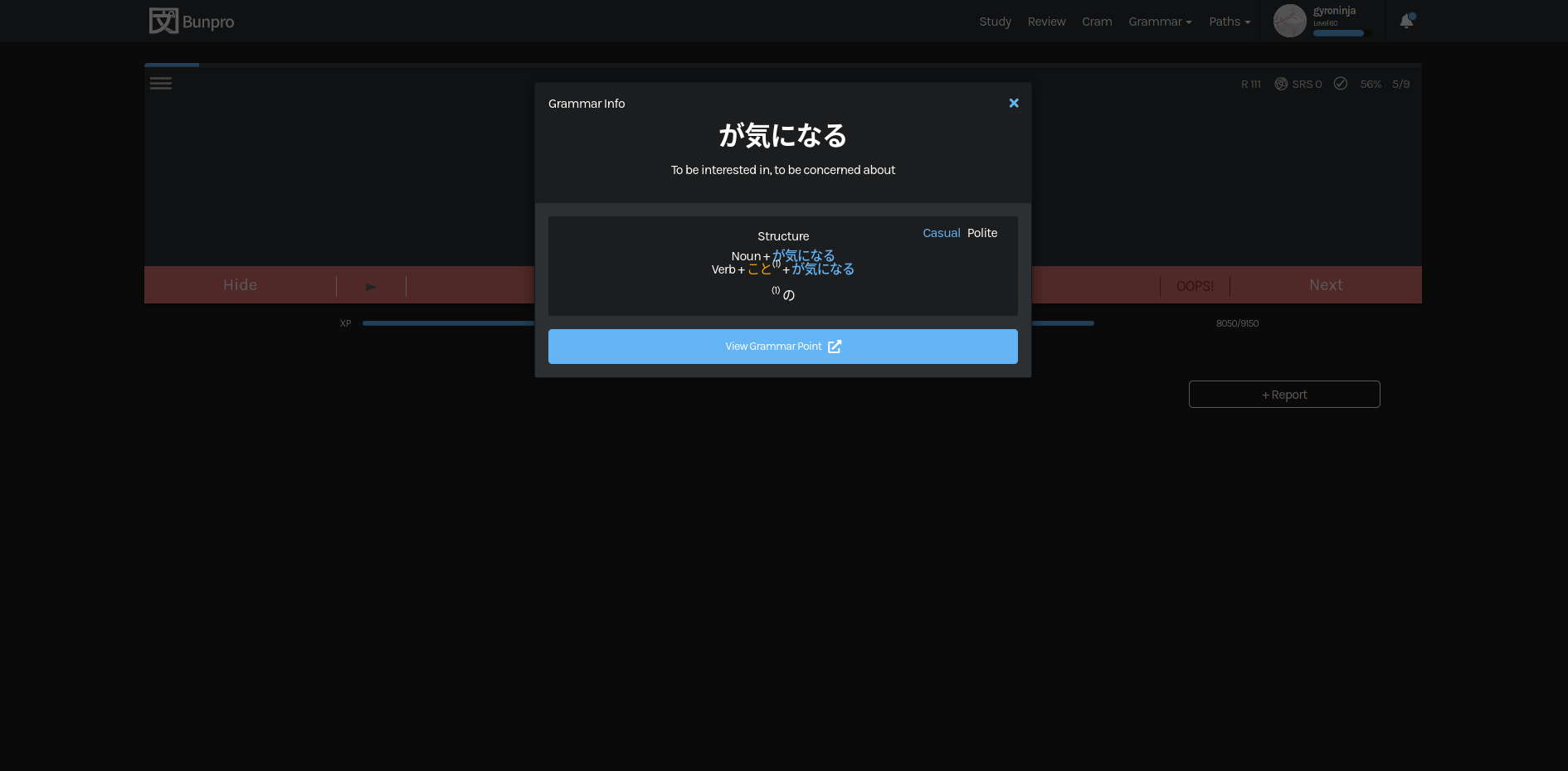
New Grammar Point Page
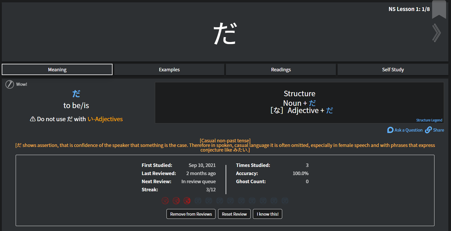
Meaning
Examples

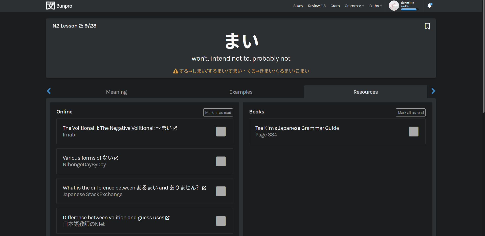
Resources
Overview
-
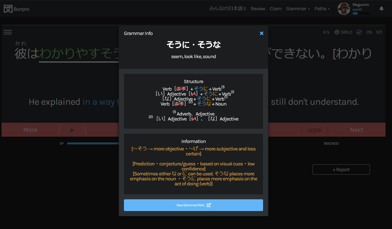
Details [NEW]
- We have added/are in the process of adding more information to each grammar point. This information is minimally useful on it’s own, but will become much more so very soon.

Register Info
- タメ語 - Casual language or grammar points that are fine to use in both daily speech, and in writing. You will see words that have a です or ます form in this category, and while they are technically 敬語, they are still perfectly normal in daily conversation.
- 敬語 - Words that come from one of three categories. 丁寧語 (like です and ます), 尊敬語 (like に~なる and なさる), and 謙譲語 (like お~する and いたす). Many of these words are used in daily speech, but have special usage rules that you will need to pay attention to.
- 文語 - These words/grammar points may sound a little bit strange if you use them in daily conversation. They are mostly used in books, literature, or may be quite old. They can be used in speech occasionally, but more natural equivalents exist.
- We have added/are in the process of adding more information to each grammar point. This information is minimally useful on it’s own, but will become much more so very soon.
-
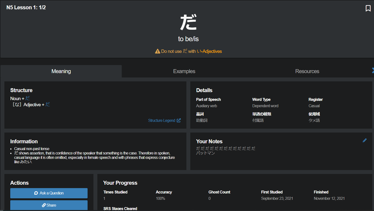
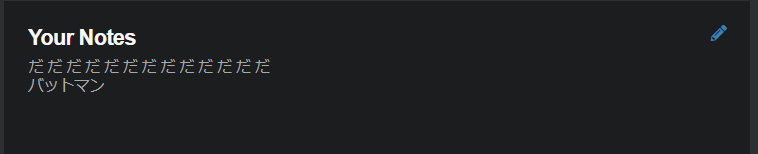
Notes
- Notes now expand indefinitely allowing you to see all of the information you have saved.
-
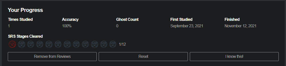
Progress Info
- Previously part of the Opt-in Beta, everyone now has more info and stats about their progress on any given grammar point.
-
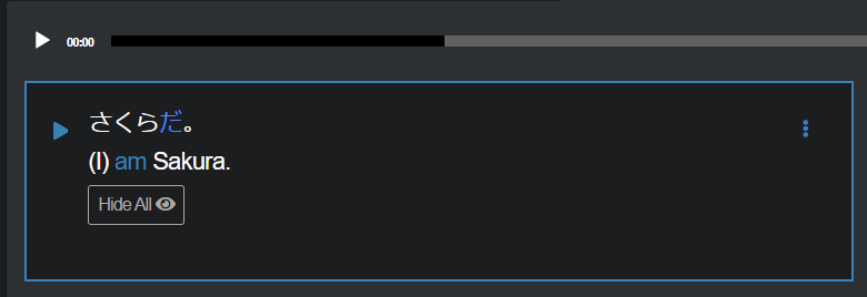
Example Sentences
- Beyond a visual update, there is now a single audio player and the active sentence is highlighted in blue. You can use the audio player play button to play the first sentence by default or the play button on the example itself to play the audio.
-
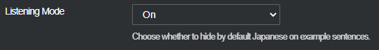
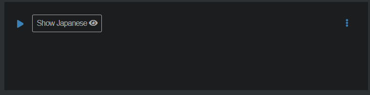
Listening Mode [NEW]
-
This changes the way example sentences are displayed, hiding the Japanese as well as the English. This will enable you to listen to the sentence without spoilers.
-
Listening mode settings are located under Settings > General > Content Display
-
-
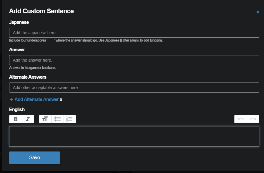
Self Study
- Self study sentences now show up below the other example sentences. New custom sentences can be added with the “Add Custom Sentence” button.
-
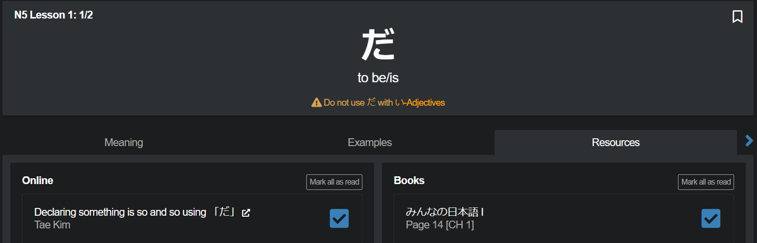
Resources
- Added the ability to “Mark All Read”

These changes apply to the grammar point page as well as the new grammar point study route.
As always, thank you for all of your feedback and suggestions. We take them to heart and will continue to do our best to make Bunpro your most reliable partner in your Japanese learning journey.
Nov 17th Update
Update: 11/17
First of all, thank you to everyone who gave feedback here, through the onsite feedback and via email. We really appreciate hearing not only the positive feedback about the changes but also the criticism and suggestions as well.
This was the first big visual change we have made in a long time and while the old layout worked as it was. It was, in essence, new stuff added on top of other new stuff over the years without much though given to the inevitable roadblock we would run into at some point in the future.
In exploring how we would add our own official Bunpro writeups to each grammar point (something we will be releasing very soon) we found there wasn’t really a great place to put them. A new tab wasn’t a good solution, and just putting them somewhere on the main meaning tab also didn’t work well with the old layout. So, we decided to redesign the whole page with an emphasis on keeping not only the writeups, but also all of the future information and features we have lined up in mind.
On top of the size and scale of the change, it was also the first big project as a new and expanded team. Needless to say we are still ironing things out on our end. At the end of the day, even though the update didn’t off go anywhere as smoothly as we would have hoped, we are using it as an opportunity to learn and improve, not just how we work together, but also how we go about making big but ultimately necessary changes going forward.
So of those changes are, but not limited to:
- Putting big changes and features, especially those that change how you use Bunpro into the Opt-in Beta before releasing so they can be toggled off in the event they are less than stellar *cough* show grammar popout in reviews *cough* Sorry

- Exploring implementing a feature freeze window (thanks @monkeytunes for the suggestion) where we don’t push any breaking changes or features before things like the summer/winter JLPT
- Improving our overall QA testing process before release.
- Avoiding large changes all at once, by breaking them down into smaller releases.
We apologize for bungling the update and appreciate the feedback you gave to point us in the right direction. As always, we will continue to do our best to add to and improve upon Bunpro.
Changes
- Section arrows are back up on the Grammar Header.
- Slimmed down the navigation tabs - This is one of the many fixes applied to reduce total vertical scroll.
- Changed from “Meaning” to “Details” - The meaning is now in the header
- Section titles have less priority - With lower visual priority, the actual information stands out more now.
- Made examples show as a single column list - If it ain’t broke, don’t fix it.
- Changed from a cycle toggle for showing/hiding Japanese and English to a button for each
- Added global “Show/Hide” for All, Japanese and English
- Changed resources section’s design to be less vertical - Changed the overall design per-resource so that it wouldn’t take up so much space.
- Bug fixes for audio playback
- Bug fixes for content display html errors
- Optimizations for slow loading pages.