Any chance you could add a “revert to previous” mode so those that those who prefer it can use the old mode? It was much faster, less cumbersome, the grammar point doesn’t get in the way of the sentence, and used a font that seemed fine. Been cramming hard for the JLPT that is in a few weeks, as I am sure others are too, and changing up the whole mix messes with the daily study rhythm. I am doing my nightly reviews right now and it is certainly decreasing efficiency drastically. Please help!
yeah, doing an update with the JLPT so near was not the way to go…
For next time, I’d suggest to put this on a beta channel.
I feel like some of them would have been detected/ironed out before pushing to production.
Or do a limited run like it was recently done with another upcoming update with volunteers.
I have beta always enabled by default, so I wasn’t aware that the only thing in that channel that was pushed to general public was the Progress Info
Thanks everyone for all of the honest feedback so far! The best way for us to make changes quickly, with as little impact on your regular study routine as possible, is through comments like this.
The guys on the development side are putting a lot of work into the updates, and naturally are trying to find the best way to marry ‘looks great’ with ‘works great’. Keep all of feedback coming, as that will be the quickest way for us to determine problems, and solve them.
Think of this change as a bit like the famous book ‘Grandpas Slippers’. We aren’t trying to force you to use something you don’t like, just trying to move forward in a way that will support future growth. 
Also pushing updates that are not only content on weekends or Friday is weird. It’s usually when people have most time to spend, and if there are problems it’s a bit annoying.
The convention is not to push important updates on Fridays or Weekends, I understand this is because usually the tech/support teams don’t work on Weekends, and are only there for emergencies, and if with Bunpro case they are working days shouldn’t be a big deal, but for the users it might be.
Edit: While I don’t have access to any sort of statistics myself to back it up, I’m guessing here that maybe weekends is not the less usage the website has. So I might be wrong.
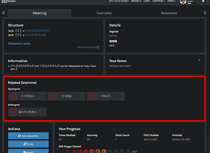
How do I find related grammar points with the new layout?
Hello,
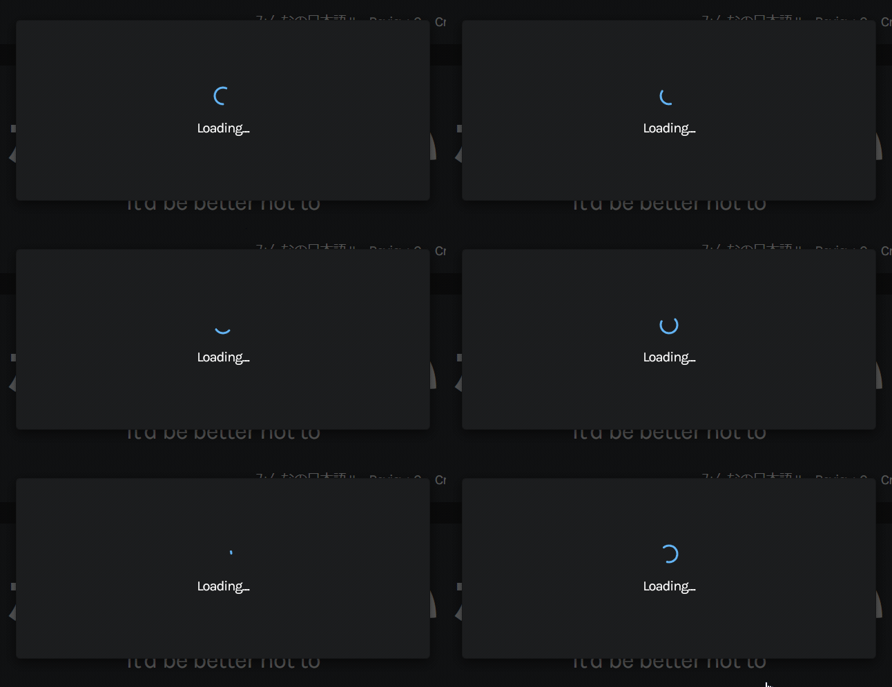
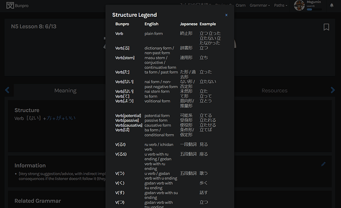
When I click on structure legend on the study part of “にくい” it just goes grey without the pop up and I have to refresh. That is the only structure legend I’ve clicked since the update. This makes me nervous. 
I do like the old version better so far. I hope this grows on me. Especially due to the game-changing nature of this site.
I think he meant on the “show info”, because it used to be displayed there.
The “Your Progress” section has some issues. All the accuracy percentages are 0%, and it shows total ghost reviews, but not vanquished ghosts. I was using this to determine which grammar points to keep going with vs. which to reset. Hope this gets fixed soon…
Might as well post what I referenced in the bug reports here, since it’s something that was added from beta to production in the last update. The Progress Info is not behaving correctly:
Also the progress info misbehaves if you miss click I know this and then reset it, and makes the dates weird:
Also the Accuracy always displays 0% seems, and the Finished date should be in blank if you haven’t completed the SRS:
No, not that, when you click “Structure Legend” above that. sometimes it comes up and sometimes the screen goes slightly grey as if something should be there but nothing is, and I have to refresh.
Ah yeah, not working here either, a popup appears on the top part of the page but nothing loads.

If I reload the page as @foulboi says and then click again then it loads:
After trying to study some more grammar and doing reviews to give the update a chance, I had to stop.
No offense to anyone involved in the changes, and I know that the monthly subscription is not a superexpensive price dollarwise, but I’m from a place where that’s close to the daily minimal wage, and I was paying for something that I had tried, and was comfortable with. The changes are enough to make it feel like a different product.
Like, now everytime I close the “show info” pop up I have to manually put my cursor back into the typing box, and having this automated is the most basic feature of all the SRS websites that emulate wanikani.
Some of these changes honestly feel like they were randomly chosen by people who don’t even actively use or have used the website to learn, and the fact that they were apparently not even beta tested with real users doesn’t seem very pro…
Two times I lost about a day of studying because my paypal account was different from my bunpro account, because of the fact that you have to email support if this is the case is not a warning displayed before doing the payment, and now, it’s like I can’t use the system because all of these new annoyances.
It’s clear from all the feedback that users are not happy with this, hopefully we get a better solution than a random “hold on kids” post with a picture of a scholastic book no one knows, cus if you are “not trying to force you to use something you don’t like” , then… we should be able to use the product we payed for, the way we payed for it…
I like the new grammar page, it looks nice!
Especially appreciate the listening mode.
I haven’t really tried reviewing yet, but I think I might agree that a pop up for the grammar point works less well than just displaying it in a field below like it was before.
Was about to mention the accuracy thing on the progress panel as well (though someone else already did), except I don’t think it’s always 0% - it’s either 0 or 100, but never anything in between.
Nitpick:
The furigana use in the ‘Information’ panel is a bit inconsistant/messy, like
here there's weird spaces in between,

Personally, I’d prefer the usual furigana ruby notation with the furigana on top (or none at all), because that makes it easier to look up the words if necessary. But I’m not sure how many grammar points have words like that in the info section anyway, so it might not be a big deal.
This feels very true, and each user uses the website differently, so there’s that too.
My main thoughts are “It’s OK” after doing my daily reviews, though I think the real test will come when I try to use it tomorrow on my school laptop’s outdated Internet Explorer 
I do think the fonts are a bit harder to read, but also it may just be a case of needing to get used to them since I became accustomed to the other fonts. I like the new grammar page, it feels a bit sleeker somehow.
Otherwise I’m pretty OK with the changes so far. No strong feelings one way or the other.
That’s really cool and the change is is a big leap! Good job!
I would love to see the possibility to identify which vocabulary point is in which SRS by just clicking the icons on the main page :))
(This one)
-All the love, thank you guys for the update
First of all, thank you for all of your feedback on this new update! Bunpro’s lifeblood is its users and their feedback, it would be foolish of us to ignore that and shoehorn in what we think is best.
Please rest assured we’re working hard on fixing all the aforementioned shortcomings.
I’d like to provide some context as to why some of these changes came to be. This update had two objectives:
- Create a more structured, responsive and expandable design for the Grammar Point Page.
- Update Bunpro’s general interface with the styles developed after this update.
Bunpro’s codebase is extremely interconnected. So while the Grammar Point Page itself (what you access through the Search or Learn pages) works and looks great, we accidentally made some of its internal references wonky.
A great example of this, like @Hurleyh and many of you have already noted, is that during reviews Grammar info is now a Modal rather than just displaying the information right below the Grammar Point. This was not intentional, and we will update it to work as fluently as it did.
As for an example to what broke with the new, more solid structure is the inconsistent furigana notation @Scytaerie pointed out along with the broken links many of you have noticed. This will be ironed out and we will fix it. But this is also a side effect of creating a new, stronger structure for us to build upon. I think the way these feel so easily highlighted is at its core proof that the new structured approach is already a stronger foundation.
There was also a ton of work to make the Grammar Point Page more mobile friendly, so some design patterns HAD to change.
That said, please keep commenting on what you like and what you don’t!
We keep user feedback close to us. We want to make Japanese learning simple for everyone.
First of all, I love a lot of these new changes! Things definitely looked more organized, easier to read, etc.
I didn’t go through them much, as I just logged in to do my morning reviews, and that’s when I noticed the pop-up when I got a review wrong. I’m not a fan of that. The old way allowed me to sit there and think about what I answered and gave me the chance to reconsider. This new feature immediately gives me the answer, which takes away that critical thinking time I could’ve had. (And like other people have mentioned, the pop-up + covering the sentence, doesn’t work for me either.)
I’ll need to take some time to explore the rest, but I’m looking forward to it. 


