
The hitbox for the vertical ellipsis at the end of each example sentence is massive and prevents you toggling furigana nearby.
1 Like
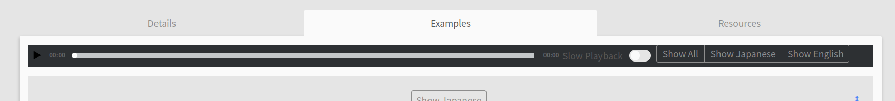
@monkeytunes We have implemented a change that makes the audio player, slow playback toggle and buttons “stick” to the top of the page when you scroll past it so that it will always be visible. Let us know what you think!
4 Likes
@Jake It works, thank you.
Really minor thing but you might want to tweak the margins to make the position tooltip visible and to avoid the thin line of text fragments showing through above it.

3 Likes
Looks like the player doesn’t respect the theme setting now, it’s always dark.
(Firefox, I cleared the browser cache.)
1 Like
I just noticed that I can’t see the JLPT level of a grammar point anymore when i look at the points from the tobira path 
I am slowly adding the tobira grammar to my reviews, but I leave out the points that are N2 for now. Understanding the N3 example sentences is challenging enough ^^’
I believe before the change I could see the JLPT level of a grammar point, but I can’t find it anymore…
1 Like
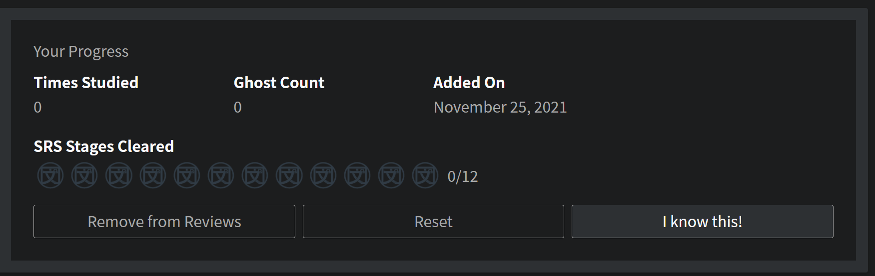
I’m noticing that it looks like a few of the N5 grammar points have been split into two or more. Did the team make sure to retroactively add experience to users who have already completed those grammar points? My N5 count went from 116 to 120, but there was no change to my experience.
2 Likes
@Neko
Noted, thanks for the heads up!
@Humin
Hey there! We recently added our own explanations to N5’s Grammar Points and reordered them.
This includes being more granular about some uses, hence the split and increase of points you’re describing. Since it’s technically a new Grammar Point, they don’t get marked as studied automatically. Here’s the full post with all the details.
You can always mark these extra Grammar Points as studied with the “I know this!”, accessible on each Grammar Point’s Page all the way to the bottom.
2 Likes
Nice work - that’s a really clever implementation. I like how it’s working now, no scrolling needed. Probably a big ask for something that isn’t necessarily prime functionality, but: any chance of having keystrokes for flipping between speeds and/or triggering the play button? Space bar works, but only for where your context is - it will flip between speeds, if you’ve clicked on the speeds first. It will start/stop playing sound, if you’ve clicked on the play button first. So you’re still moving around the screen a lot; not a big deal though, having the sticky audio controls is a huge improvement over scrolling everywhere. Arigatou!
1 Like
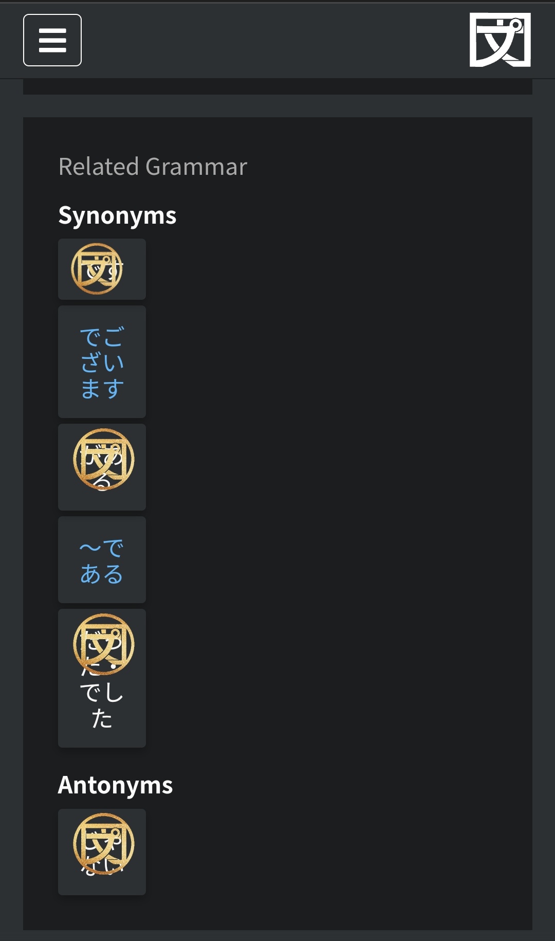
The “related grammar” area, on smartphone seems to have a wrong layout (see picture). I don’t know if this has already been noticed or not.
One other thing : on smartphone, the “details” area appears just afer the “structure” but before the “informations”. The order could be better with the informations before details, even more considering the recent update with the new content in this area. This would avoid to scroll past the details to begin to see the informations.
On the opposite, the details area occupy some space on the screen with few informations displayed.
1 Like
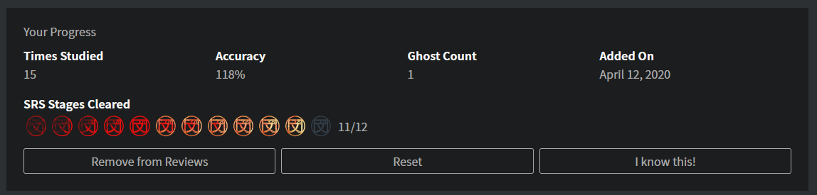
So, I’ve found more over 100% aside from negative accuracy numbers, so the progression thing is clearly not working, or it got broken again.
1 Like
What grammar point is that for?
1 Like
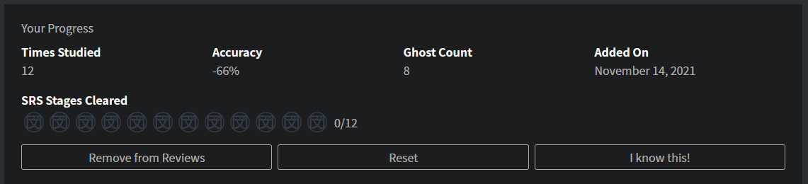
#71 N5 Lesson 2: 3/12 (ね ) is currently at 118% on my account (as seen above)
#728 N4 Lesson 3: 17/18 ( ~にする・~くする ) is currently at -66% on my account, for an example of a point being in negative numbers as I reported earlier.
1 Like
Something went wrong
2 Likes
noticed it this morning. Already have a patch for it that will go out a bit later 
4 Likes
I liked the new Resources page and having the option to check what I read. The Examples page seems fine too and the listening mode is very helpful.
My main issue is with the “Meaning”/“Details” page. I’m a very visual person and the old version was just perfect for me, the different font sizes and colors really helped me focus on the information presented. I find the new visual less functional, it is too homogeneous and has a lot of empty spaces or less relevant information occupying a lot of space. Additionally, I would like to check the JLPT level without having to switch tabs and search.
As others suggested, I would very much appreciate an option to choose the old visual, as this greatly impacts my study. Pleaase? 
4 Likes
I think the problem with keeping old visuals is that it increases the amount of work they have to do for any new items, unless you’re ok with any additions from now on to not have the option of the old page.
I think an option for more color play would be more useful 
3 Likes
You’re right, I don’t think there is a need to keep both visuals for new items. The structure I guess I’ll get used to it eventually, no big deal. The colors could really make a difference.
I know I’m nitpicking here, but I use dark mode and some colors have poor contrast and they’re not the same for all grammar points.
For comparison (the blue color):
Better contrast:
With light mode this difference is not really noticeable.
3 Likes
I agree, some extra colors would be really useful, and for them to be more eyecatching
2 Likes
The “add to reviews” button being all the way at the bottom of the page is kinda annoying ya know
3 Likes
I agree. @Jake.
Also, any chance the color of the Report bug and two other buttons at the bottom can change a little? The bright blue contrasts quite a lot in light mode.
2 Likes