
@tomtomtom @Jake It works like a charm, thank you guys!
4 Likes
Fortunately with basic HTML knowledge you can still hack it in by using Inspect the element and changing option’s value to Classic
c00lhaxx1ŋ

e.g. if you have Modern theme, change value= attribute of Modern Dark, then change the option in popup to Modern Dark, so browser definitely will send to server “please use value of Modern Dark theme” (which is now Classic) and switch to another tab like “General”. And now you’ll have the lovely background back.
And with the latest updates there is even no white on white text in Classic UI, which makes it even better.
2 Likes
Awesome, thanks for the workaround! It worked for me 
2 Likes
Sorry for the delayed response, I waiting for a chance to use it in the sun.
So they’re definitely easier to see when viewing inside but still almost impossible to see when outside.
I threw this together real quick in word and it drastically improved the visibility outside:
Basically just adding a 3px white glow to the outside of the shape. Thoughts?
1 Like
The image has to be reworked if they going to add the glow, because it looks bad specially on this side:

1 Like
Those artifacts are just due to the “remove background” tool in Word. I didn’t try and make it super accurate. Just enough to demonstrate my idea.
1 Like
Ideally we want to redesign the SRS Progress seal, and I’m already considering what you guys mentioned here for the future update.
For now though, I’d like to hear your thoughts on a fix like this? Temporary of course.
It’s just a white cirlce rather than an outline, and an option without as much white because it might look a bit tacky to have 100% white all around.

3 Likes
I use light mode, but for options you showed, the ‘less white’ one looks best. Something more subtle against the darker background both fits the darker theme and is softer on my eyes.
1 Like
The white background version definitely works better outside. So this could be a good solution.
Another idea I thought up was what if we combined this visual change with the idea @Megumin brought up about showing the SRS level. Where the symbol would start white for high contrast with the dark background (this could be inverted for light mode) and as the SRS level went up it would gradually fill with the gold (sorta following stroke order). Like so:

Starting with level 0 in the top left and increasing to 12 from left to right top to bottom. Of course if we wanted to keep gold as a visual indicator of level 12 the symbol could fill with an intermediate color and then switch to gold when fully completed.
3 Likes
Having no idea whether this is programatically feasible or not… ^This!!!
2 Likes
If we did go this route, I think that would be a good idea, since the small まる being white, as the second to last one, is difficult to differentiate between fully completed or not.
Though to be honest, I never bothered to look at the visual representation of the progress, since it was difficult to tell just from that anyway. I think numbers would be better. Or a mix of both visuals + numbers.
2 Likes

How about changing the colour of the stamp to match the SRS groups on the home page? Like with WaniKani? Use the same colours maybe? I’m sure a lot of people use both websites and would immediately recognise the levels and colours.
2 Likes
I guess this is relevant for this thread: the [Casual | Formal] buttons for e.g. verb conjugations are broken for me. They only toggle the casual/formal of the first item in the batch I’m studying instead of the one I’m on. The structure legend is also broken after the first item. Happens for me in both Firefox and Chrome.
2 Likes
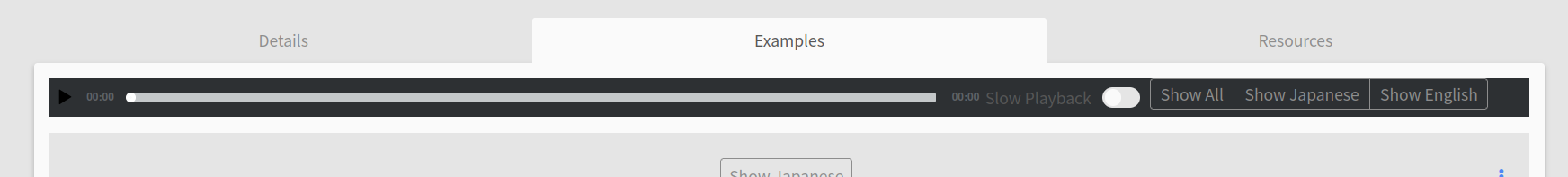
Sorry if this was discussed already, I didn’t have time to read through the topic. I find the new audio player layout weird, mainly because as I scroll down to read all sentences, the audio progress bar goes out of view. Trying to actually use it would require jumping back and forth on the page. So I only ever use the individual play buttons and treat the seeking feature as lost since it’s too inconvenient.
Otherwise the other changes look neat and the grammar page looks visually much cleaner, so thank you for the update in general!
2 Likes
The hitbox for the vertical ellipsis at the end of each example sentence is massive and prevents you toggling furigana nearby.
1 Like
@monkeytunes We have implemented a change that makes the audio player, slow playback toggle and buttons “stick” to the top of the page when you scroll past it so that it will always be visible. Let us know what you think!
4 Likes
@Jake It works, thank you.
Really minor thing but you might want to tweak the margins to make the position tooltip visible and to avoid the thin line of text fragments showing through above it.

3 Likes
Looks like the player doesn’t respect the theme setting now, it’s always dark.
(Firefox, I cleared the browser cache.)
1 Like
I just noticed that I can’t see the JLPT level of a grammar point anymore when i look at the points from the tobira path 
I am slowly adding the tobira grammar to my reviews, but I leave out the points that are N2 for now. Understanding the N3 example sentences is challenging enough ^^’
I believe before the change I could see the JLPT level of a grammar point, but I can’t find it anymore…
1 Like