
For this grammar point Japanese Grammar SRS
The examples tab is not hidden when I switch to the resource tab. For me, it reproduces on both Firefox and Chrome on windows.
3 Likes
Personally, I like the new wrong answer popup. Don’t know why but it helps me.
3 Likes
-
Links appear to be broken in sentence example exlanations
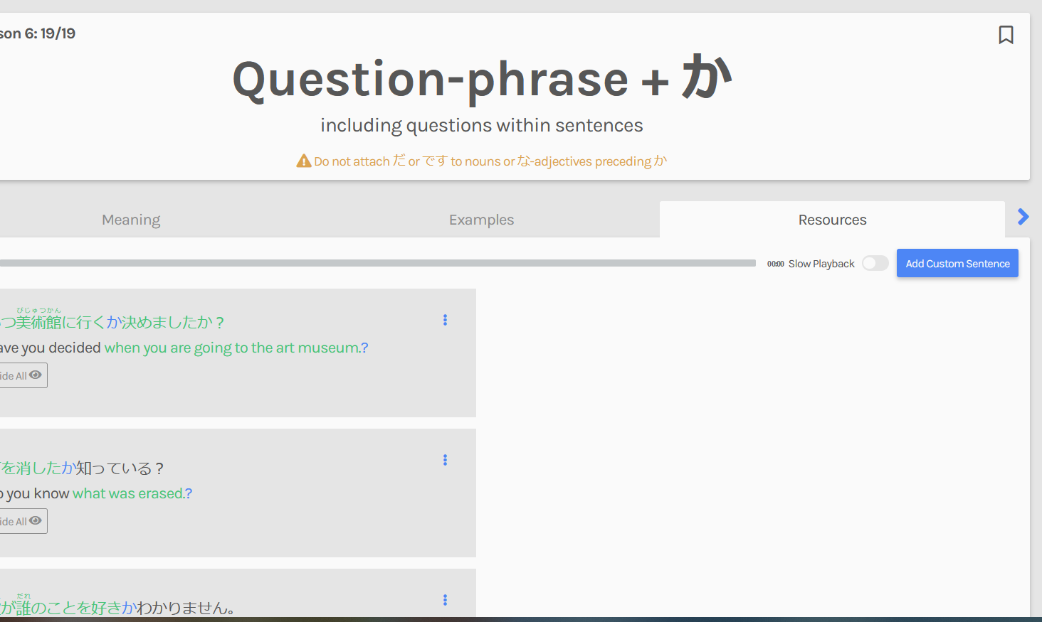
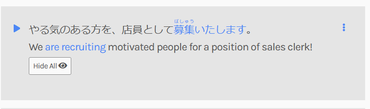
Screenshot is from this one Japanese Grammar SRS
-
While pressing the hide all button and then unhiding stuff, the yellow hint doesn’t come back. It’s less of a problem but I believe it’s unintended
As a side note yellow text by itself is hard to read on the gray background
-
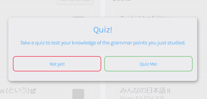
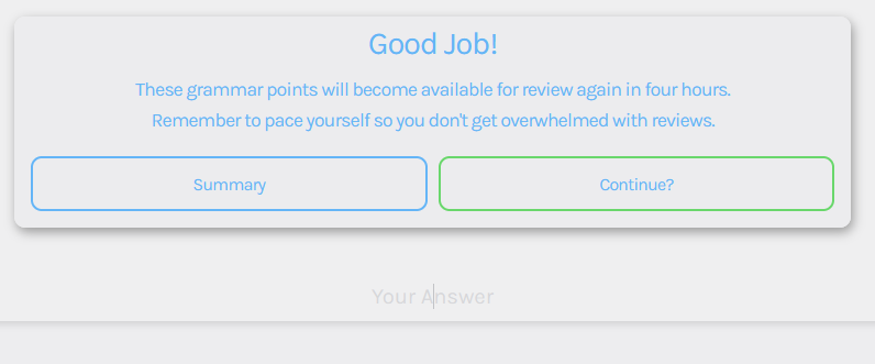
Was the quiz popup always weirdly blueish?
-
Also the footer under learn page, for example Log in | Japanese Grammar SRS is blue, but on the main page it’s not.
3 Likes
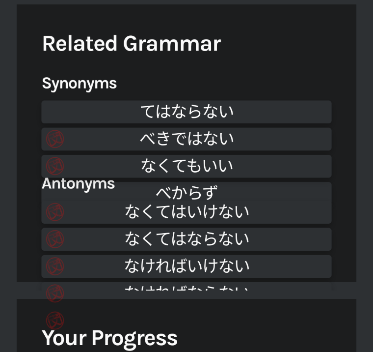
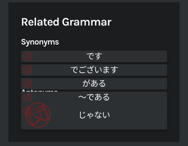
Okay it does exist, but I feel like it’s missing from a lot of pages after being changed to synonyms and antonyms (it doesn’t render properly on mobile btw). Like was だろう not related to でしょう or と and って? I could of sworn like every grammar point had a related one, but now there just seems to be a few groups.
5 Likes
Also in new grammar info popup font size is really small.
As someone who doesn’t have perfect vision or giant monitor, I like old mode with huge font much better.
6 Likes
Thanks for the update!
I definitely love the Listening Mode!
A few suggestions and bugs:
I found it inconvenient that “Slow Playback” switch is moved to the top. When I used this feature in the past, I used it only for some sentences, not for all of them. Now I’d have to scroll up and down, up and down, up and down in order to toggle it. I think it would better to make two play buttons next to every sentence: a normal speed one and a slow one.
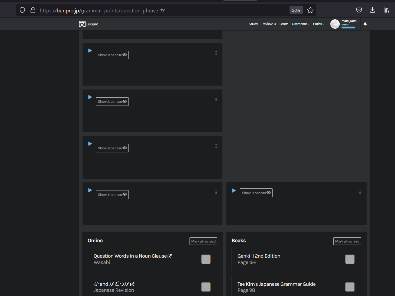
Navigation arrows for a previous and next grammar point looks like it’s some kind of tabs carousel and there are more tabs to the left and right, and not like they are leading to another grammar points. I think I would be better to move them in the header, in a similar way it was before.
I find it strange that “Show Japanese / Show English / Hide All” button constantly runs away from my cursor after clicking on it. Probably it should be in one fixed place.
The first use of “Listening Mode” setting is broken: I had it “On” by default, but Japanese phrases were displayed. I had to toggle it “On”>“Off”>“On” to make it work.
As an advanced mouse wheel user  , I really miss links to another grammar points in the “Related Grammar” sections. They used to be
 <a> and I could open a grammar point in a new tab by clicking it with a mouse wheel, but they are <div>s now, and I have to click it with LMB and click “View Grammar Point” instead.
Also I’m able to click a mouse wheel a dummy link under “Report” buttons under grammar itself and in Example Sentences section. It looks like https://bunpro.jp/get_feedback_form?example_sentence_id=864&grammar_point_id=282&source=example_sentence and leads to あらま! PAGE NOT FOUND
“Structure Legend” link leads to the same page if it was clicked with a mouse wheel.
Generally speaking, I do agree there probably should be some beta-test to iron such things out before rolling out such big changes. Something like beta.bunpro.jp I think.
7 Likes
As someone not too up on programming stuff… This sounds bad, but is it actually bad? What should I avoid posting in links/images?
2 Likes
Hidden link
(Content removed by a mod due to privacy concerns)
4 Likes
I see! Thanks for the quick reply 
3 Likes
I completely agree that you should get the product you paid for, and something that is constantly evolving to become better. I am not actually involved in that side of the website, but just wanted to assure you that those guys are reading all of these comments and will make the changes needed as quickly as possible.
Apologies on behalf of the team for inconveniencing you and your regular routine. I hope that this turns out to be a change that you love (after fine tuning on our part), rather than something that leaves a poor taste in your mouth.
5 Likes
I feel like a lot of those changes should have been toggable to avoid turning people off and get feedbacks to improve them before rolling them out to the whole website.
My two biggest complaints currently :
- The grammar popup when failing a review. I can’t see my mistake nor the correction, and it forces me to use an extra click and the mouse to close it and resume my reviews, it messes with the flow and it’s really annoying. If anything, I’d love to just have the grammar below the reviews to expand. I would still see my review, be able to read the grammar, and going to the next review or retry the review without interruption my flow.
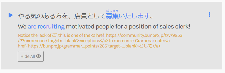
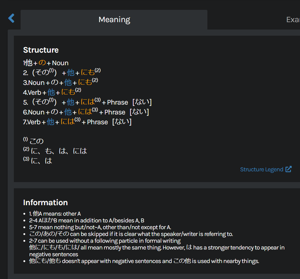
- The formatting on some grammar points is really messed up. I really like that they were concise and readable, but some of the grammar points just don’t translate well at all in the new format. One example with ‘hokani(mo)’:
6 Likes
Nevermind, I just managed to softlock myself in a lesson.
Specifically in lessons (as in bunpro.jp/learn*) input field allows you to delete the text you’ve typed, but doesn’t allow you to type smth back and refuses to continue without something in the answer field. Effectively fixed by reloading the page resetting your progress and starting the session from the beginning. Not a crucial thing, but it’s funny that it’s possible to do such a thing to yourself.
4 Likes
The new fonts are tiny with an excess of empty space around everything. If you increase font size in settings then everything still looks bad, only magnified.
4 Likes
I preferred the old review style more…
Now if I press “F”, a popup opens and covers my screen. I have to move my mouse to close it.
Previously I could toggle it on and off with ‘F’. And I could see much more information such as the example sentence.
Everything is also quite small now.
6 Likes
“Remove from Reviews” button adds a cool “NEW! +0” badge to my “Reviews” link 

(Looks like it was supposed to reset my reviews count to zero, because that one review was the one I’ve reset.)
6 Likes
Some great changes here but I am not a fan of the grammar pop up during reviews. Covering the sentence is not a good design, and it slows down the review process considerably. This is not a matter of not being used to it, it is simply less efficient. Please add a setting to turn these off.
6 Likes
Actually, it is possible to close this pop-up by pressing the escape key. This may be a way to wait until this feature is corrected (and it will probably be, since Daru said this pop-up was not intended, as I understand it).
5 Likes
Overall design - I concur with everyone that the font seems pretty small in places, and in contrast items take up way too much space. I really would appreciate for the resources page to revert back as it takes up so much space and requires scrolling now. A simple list was perfect rather than a whole ‘widget’ for just an external link. Previously, I could quickly click to open all items to review. I don’t mind most of the other changes, but you should re-think your “looking good vs working well” philosophy, as a quick and efficient workflow will always be superior to any form of visual paint.
Reviewing New Grammar: I would like it if the arrow to move to the next grammar was moved back to the grammar point section rather than below on the level with the tabs for meaning/example/readings. This is because the arrow is much smaller and more importantly, it does not stay in a consistent place on the page as it is variable depending on the size of the grammar point. So, if you are clicking next through several grammar points it jumps around a lot. This really tanks usability as I am flipping through grammar to study as it’s like a tiny moving target to get to the next grammar.
Kanji Readings: Where are the readings for the grammar points that are in kanji? Previously, hovering over the point would flip between the kanji and all hiragana variant. That appears to be gone, and I can’t find where the reading now is. Again, this is really inconvenient and slows down studying.
For example: Japanese Grammar SRS
I think this should have been put to beta test as several others have mentioned. There are some really small changes that have really impacted the workflow and, if adjusted, would not have impeded the visual overhaul. I agree that it seems some of these changes were made by people who are not actually using this product.
7 Likes