[Updated] Major Update - Grammar Page Changes

Thanks for the quick update and the upfront communication. I think it’s been a frustrating time for a lot of us, but is kinda expected as they are usual growing pains.

Just a quick thing I’ve noticed so far:

The progress info is still broken showing accuracy over 100%

4 Likes

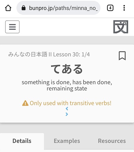
It’s great to see the quick communication going on here and I’m happy with the new changes. I think, however, that the section arrows might still have an issue on mobile. I’m guessing they aren’t supposed to have their own lines.

5 Likes

Hey @Evueimeimei,

Thanks for the screenshot and feedback! I just made a fix for this and it should be live soon!

5 Likes

Thank you for making the update for the update. It already looks much better!

I think it would look better if the sentences in the examples section of a grammar point would be centered, as there is a lot of space unused in many sentence. :slight_smile:

Can’t wait to see what other changes you guys have in store.

6 Likes

Thanks for the update!

Could you please return the feature to click with a mouse wheel on a Related Grammar point in order to open it in a new tab too?
All you need is to change

<div class="grammar-point__card--related-grammar-new gp-popout" data-gp-id="604">
...
</div>

to

<a href="/grammar_points/604" onclick="return false;"
  class="grammar-point__card--related-grammar-new gp-popout" data-gp-id="604">
...
</a>

and add these CSS properties:

.grammar-point__card--related-grammar-new {
  ...
  color: #5f6368;
  text-decoration: none;
}
.grammar-point__card--related-grammar-new:hover {
  ...
  color: inherit;
  text-decoration: none;
}

It’d be lovely if you could do it! I’m kinda suffering, because my usual one-click way doesn’t work anymore :frowning:

11 Likes

Could you emphasize the “Add to Reviews” button? It’s harder to find it now especially since it is no longer at the Resources tab - when you would be done studying it

4 Likes

Can we restore the structures to multiple lines? This makes it very confusing.

5 Likes

That’s a really great idea! :+1:

5 Likes

Thank you guys SO much! I can do Bunpro at work again :partying_face:

5 Likes

Not sure if it came with this particular update but I noticed that there is now a color blindness setting for the review colors. While this isn’t necessary for my particular color blindness. The studied grammar point markers are still an issue.

Now while I am able to see the symbols on the left it takes significant staring to do so. And is practically impossible if outdoors.

Since you guys are already doing a number of graphical changes I would like to request that this particular symbol be modified. I don’t know what would work best for most people: maybe something like changing the color or placing a contrastive glow around the symbol might work?

I tried playing with the filters on my phone real quick and found two combinations that significantly improved my personal ability to see the symbols.

Both seem to achieve better visibility through higher contrast with the background. Based on that I think adding a glow effect like those available in Word would be the best option to improve visibility.

Thank you for all your hard work and effort to continue to improve Bunpro. よろしくお願いします!

2 Likes

Or they could just display the SRS level interval on the top right corner if you have colorblind enabled in settings.

3 Likes

To be fair, this is hard for me (not colorblind) to see too. The values are really close to the background.

4 Likes

Displaying the SRS interval on the point actual sounds like a feature in and of itself.

2 Likes

This isn’t just a colour blindness issue. I don’t think it is particularly accessible for most people and one of the reasons I hesitated changing to the dark theme from the classic one.

4 Likes

I’m glad some other people are having this issue as well. I guess I assumed it was a color blind issue cause I’ve had a similar problem with red chalk on grey blackboards before. Hopefully since more people are having this issue it’ll be addressed sooner.

3 Likes

Hey @HotAirGun !

@Samu and I just pushed a fix for this, and it should be live pretty soon!

5 Likes

I have not had new lessons for a few days so have not seen some of the changes. I like the layout but I am not sure whether anyone found the following inconvenient: Normally my English sentences are hidden but sometimes I will view them and then hide them again (so that my eye is not drawn to it anymore). Now after showing the English, I have to scroll up to the top to hide it. It would be really good to have the option of “hide English” on the sentence level, next to the sentence. (Before the changes, if I clicked on the English sentence, it was hidden and I quite liked that option.)

4 Likes

@conan @Ambo100 The hanko on the tiles have been updated to stand out more. Any thoughts?

@JoaoPLF We moved the actions and progress info out of the tab so it is visible across all tabs now.

@HotAirGun Mouse wheel click works again :bowing_man:

@Megumin how does the accuracy show now?

6 Likes

Much better, thank you! :slight_smile:

4 Likes

Looks like it’s working.

It’s hard to validate the numbers because I lack information on that panel, but at least is not going over 100%, so I think it’s fixed.

Thanks

4 Likes