10/16 Major Update - Grammar/Vocab Page 3.0

I am not talking about whether or something is on the left or right, my point is on the basis of Bunpro overreacting to feedback without letting the dust settle.

To make it expressly clear what my point is: I am not focused about the specific UI change itself that Bunpro made 24 hours after launch, but rather on Bunpro’s decision-making process is what I am having fault with. If you re-read my comments of concern that was posted today with that context, I hope it becomes clearer the point i am trying to make.

I personally think the update looks good, but it’s inherently subjective and I think it would be best to wait until there’s more feedback and to not react the way they did. This could be about anything related to this update, not just the placement of boxes.

I hope my point isn’t rendered as idiotic because of misconception as I noticed this is an ongoing issue Bunpro as a company has done, in which they emphasize on reaction than proaction.

For example this comment is absolutely ridiculous and does nothing to address the core of what I am saying.

I deeply care about Bunpro and the product served and I have worked at two startups (one that has been successful, one that flopped in a big way), it’s not like I am working from a place of ignorance. The issues Bunpro is showing from the over-emphasis on being too knee jerky and the long-term ramifications it can have.

1 Like

I really don’t see what you’re seeing. If Bunpro had a bad track record of releasing changes that break everything and cause a lot of dissension within the user base I would probably have a different opinion but this hasn’t been the case so far IMO.

The devs do react quickly but generally reasonably, there’s clearly a coherent vision behind all of this, it’s not like they implement every tiny feature requested on these forums. Not having to wait for a month to have a widget move to the other side of the page is in no way a negative as far as I’m concerned, nor is it indicative of a faulty process.

Well there is one faulty process here: the fact that this change couldn’t go through a beta period to fix these small blemishes and get user feedback before it’s made available to the general population, but hopefully that won’t become the norm.

Even removing my software dev cap, just from the perspective of an end-user, I think the website improved tremendously over the past year. Because of this I trust the team to do what’s right and keep making the website better and I don’t think doomsaying is warranted just because somebody in this thread said “hey I think it would be better to move this to the right side” and the devs said “oh yeah that makes sense”.

In the end the results speak for themselves I guess. As long as I think that the website is improving I don’t really care how the sausage is made.

6 Likes

Thank you for the thoughtful reply,

My point is this: when Bunpro released the UI update, just leave it as is, for at least a period of 1-2 weeks. Let people take time to digest the update, and let the feedback roll in after a reasonable period of time. I don’t find it reasonable that they issued an update, however minor it may be in 24 hours.

The reason why I think it is unreasonable, is that it undermines the original planning put into it, and makes me question how much planning was put into it in the first place if they are willing to change that fast.

Agreed. I am not sure what the technical reasons @veritas_nz mentioned, and I would love to know specifically why, as it could impact future Bunpro updates.

Agreed. @Daru @veritas_nz @Jake and whoever was directly responsible for the updates for Bunpro should be praised as it’s so much of an improvement since I started the service.

I don’t want to have a potential misconception, but I am not doomsaying, I am saying this as a very careful observer of the forums and as someone who has paid attention to what the developers have done in the past two years when it comes to updates. It’s a huge benefit to be agile, and I think they just crossed the line.

To put it in an analogy, they are putting out the fires, but they aren’t doing anything to stop the fires from existing in the first place.

That proactive VS. reactive theme is big, as the startup I worked at that failed suffered from that and left the customer base confused and overall less willing to trust because of how they quickly maneuvered. The reality is that the failed startup had zero long-term vision. They had a product that was unique, and just left it as-is until competitors ate them alive.

I don’t want to say that is what Bunpro is doing, as I am not privy to what their plans are, but the parallels should be used as it least a helpful air of caution for reactivity being a supplement for lack of a long-term vision.

1 Like

I get what you’re saying.
However, it seems to me that Bunpro has a long-term vision and is implementing appropriate changes in an effort to achieve that, so we can all sleep easy and carry on learning grammar and vocabulary :slight_smile:

3 Likes

You both make a lot of good points. I think part of the concern may come from not knowing what our work environment is like, which is totally fine. What may seem like a knee-jerk reaction from the outside was actually a very short, very calm discussion within the team. Pretty much the equivalent of this -

Remember that all of the staff are users too, so we also want to use the best version of the site.

We didn’t see this as putting out a fire at all, we saw it as a guest walking into our house and saying ‘Doesn’t that couch block your window a bit? Why not put it on the other side of the lounge room?’, to which we replied ‘You know what, yeah, we’d get more morning sun that way.’ It all happened in a very calm manner on our end.

We’re all super happy that you both care about the product this much, and appreciate the debate. But as to allow as many opinions as possible, let’s make sure to also not to turn this into a back and forth.

5 Likes

Hello again!

I have a small suggestion to make that I believe will enhance this great update. For those words that have a related grammar lesson (*), could there be a link to the lesson somewhere in the 詳細 section?

Thank you in advance for considering this proposal. 良い一日を

(*) For example:

  • N4 Conjunction すると and N3 lesson 1: 18/22
  • N4 Interjection そうだ and N3 lesson 1: 17/22
  • N4 Expression その為 and N3 lesson 3: 21/22
  • N4 Pre-noun Adjectival そんな and N4 lesson 5: 4/20
  • N4 Expression その頃 and N4 lesson 2: 8/17
  • N4 Conjuction それで and N4 lesson 10: 11/18
4 Likes

Thank you for reaching out,

That’s absolutely valid, but it’s incredibly important to have a list of priority. For example, I log in and the very first thing I see on Bunpro is a glitch:

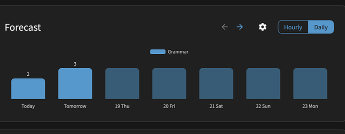
Tomorrow, at least in the East coast of the US as of now, is the 19th, then the 19th is displayed. This is the first thing I see and it’s a problem. I know you guys are aware and have a fix planned, but to me that should be much higher on the priority list as that’s something the customer sees immediately.

The argument can be made that focusing on the minor change, no matter how easy it was to fix, isn’t the best allocation of focus.

If you have 50,000 guests come in and you only listen to four, maybe hear the others out first would be better? As that is the point I am trying to make, it may not represent the best course of action when considered within the broader user experience. Sure the conclusion could be the same, but getting a wide enough net of a response is ultimately a better way to determine if the choice was the right call.

In interest on keeping the thread focused about feedback, this will be my last response on this thread. If anyone, user or developer wants to have a meaningful conversation about the topic, they can feel free to DM me.

Btw, when I scroll down to the Details/Examples/Resources, go to another tab or window and then back the tab with the reviews, the page automatically scrolls up to the top. Is that intended behaviour? Can I turn it off?

Thanks for the feedback!

Not intended! Definitely a bug.
I can’t replicate it on my end though, even in stinky 'ol Firefox.
Just to confirm, this is on the regular /reviews page right? When you’re checking the information underneath the Quiz page?
Are you wrapping up? Does it happen for both Grammar/Vocab?

Any details would be appreciated!
Also from @rdennison7 if you have any too :sunglasses:

2 Likes

Yes, the regular /reviews page.

I enter my answer, press F to open the details, go to another tab, go back to reviews, auto-scroll happens.
It does not happen if I click the “Show info” button on the screen. Neither when I click around on the screen and then press F or scroll down to the details.

So only while this typing bar is in focus. Happens in wrap-up too.
image

I use Chrome. I don’t do vocab reviews, so haven’t tested there.

2 Likes

Them fighting words

6 Likes

I might be in the minority, but so far I haven’t added notes while studying. Just a thought, but maybe you can poll users before making another big change?

3 Likes

I kinda agree with the polls thing but only because I like taking polls♪⁠~⁠(⁠´⁠ε⁠`⁠ ⁠)

not sure what your note taking has to do with it tho, you can’t even see that section if there’s no notes right?

3 Likes

Overall a fan of the update (especially now that the example sentences have been moved to the left side of the page).

One thing I did notice though that I’m not loving is the new “See More” option that hides some of the example sentences. I can understand this being useful (especially in terms of loading content quickly) if there are dozens of example sentences. However, currently on vocab pages six example sentences are shown, with only two being hidden under the see more option. I personally always read every example sentence, regardless of the JLPT level, so having to hit “See More” for every vocab word I learn is a bit of a pain.

If the idea is to add a lot more example sentences in the future, I can see the argument for keeping that functionality, but would it be possible to have a user setting that allows pages to show all content as a default? Having a setting like that would save me hundreds (if not thousands) of extra clicks over my lifetime usage of Bunpro. Thanks! :relaxed:

4 Likes

You’re right about that. I guess I meant that if not that many people actually use the notes section, maybe there’s no need to devote a lot of time to changing it?

2 Likes

I mean they don’t need a poll to know who is using notes, they have access to the raw data.

3 Likes

I stand corrected!

2 Likes

Still can’t replicate this…
You don’t have any scripts running or anything like that?
I tried with Lightning/Focus mode, Autoplay audio on/off, Auto-show Info on/off etc. but couldn’t get it to trigger

1 Like

I agree with this! :grinning_face_with_smiling_eyes:
At first, I thought, where have half of the example sentences gone?
Now I see you have to click a button to see the other half of the example sentences every time.
I’m thinking, you guys have created all this great stuff, so why hide it? :rofl:

I wish stuff like the synonyms (which I refer to and add/amend frequently) could be moved to the top of the page and the example sentences be moved to the bottom of the page (for these, I’ve only usually once gone/thought through thoroughly though).

2 Likes

Yeah, that could be it, actually. I can’t test it for a while, my laptop is undergoing repairs. @rdennison7, you mentioned experiencing the same issue – do you use scripts too?

Btw, currently using a different laptop with no scripts and I haven’t encountered the auto-scroll.

2 Likes

Just about the auto-scroll, this has happened to me sometimes when creating synonyms, especially when starting to create synonyms and then being swiftly whisked to a totally different part of the page, and also when pressing “space” when entering a new synonym (in general, there seem to be some weird behaviors after some letters pressed when entering synonyms).

2 Likes