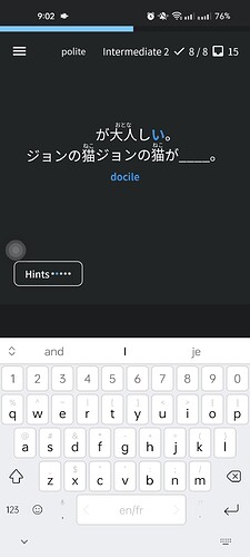
“アボカド” is an example. For me, the biggest problem is that I’m not a native English speaker, and since I use Bunpro to review vocabulary, it’s a little difficult to remember the Japanese word and how it’s spelled in English. therefore, I was using the vocabulary as a flashcard, but now I am not able to do it anymore, because with the “Native review” they are all to be included manually
Looks great! A couple of minor things …
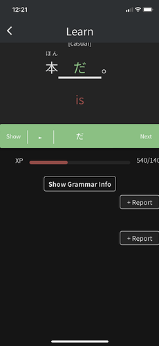
1 - The “+Report” button appears twice after a correct answer.
2 - The app hung when I tried to submit a change to my email address. The change wasn’t made.
##New app Version 0.3.3++39
Japanese language support:
Just like the website, the app has been localised in Japanese. You can change the app language in settings. On default it syncs with the language used on the website, but it is possible to use the device language instead.
Color accent support
The support of the blue light and dark mode has been added.
Native reviews
Native reviews are now the default reviewing functionality, replacing the old webview.
Male voice support
It is now possible to choose between a male and female speaker in settings or during reviews.
Other changes and bug fixes
- native reviews: fixed a bug when some reviews persisted despite doing them before
- native reviews: fixed a bug when one review remained unfinished no matter what
- fixed the font scaling bug, now the font scales according to the system setting
- fixed the overflowing furigana, which increased spacing between kanji and other letters
- fixed some typos
- fixed some performance issues
- added scrolling indicators
Thanks to your feedback that we received in emails and comments we were able to fix some bugs and add new features. Thank you so much!.
The app is still a work in progress, but we are giving our best to improve it according to your needs, we will also do our best to update more often from now on.
Feel free to write as much feedback as you want, we look at all of it, and are using it to make the app more user-friendly by the day!
@mrnoone The new version is not using the WaniKani api correctly. I have the right address in the app, but all furigana are showing despite the correct settings.
Shouldn’t “Native Reviews” in the hamburger menu just be called “Reviews” now?
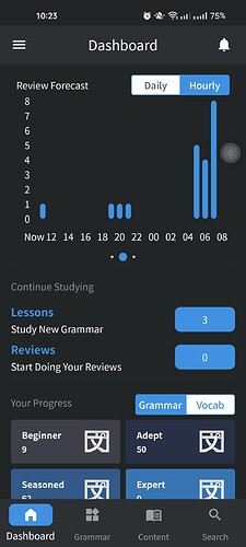
Also, the progress bar at the top is full even though all the reviews are not finished yet.
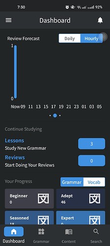
Also, I have zero reviews available, and yet…
Also, I’ve done over 25 reviews today, and yet…
Minor niggle since the update (which is overall great, btw!) - if I make a typo for a character, it doesn’t change when I correct it like it used to. Tricky to explain, so here’s an example:
- I accidentally type ひとんど for ほとんど
- I tap after ひ and type “ho”
- Before the update this would have automatically update to ほとんど, now it just stays as hoとんど
- Now I have to delete the whole erroneous string and type again.
Hopefully that explanation makes sense!
A minor thing, but annoying with long text strings, and I’m prone to clumsy mistyping on my phone…
Keep up the good work! 
Hello. I’ve begun using native reviews for grammar with the latest update (Android 0.3.3+39) and I am enjoying using it over the webview interface. I ran into a couple of inconveniences that dampened my fun, though:
- The hint level does not reset for each review. My default is to hide all hints and nuance and to manually add the hint if I need it. On browser, after completing a single review, the next review would appear without any hints, but in native reviews on the app, the hint level from the previous review is carried over into the next, so I have to tap the Hint button multiple times until the hints and nuance are gone.
- The review session automatically moves to the summary after successfully answering the final review. There does not appear to be any opportunity to view alternate answers, or undo and mark yourself wrong if you feel so inclined.
Hi guys, I just saw the new update (been doing reviews on desktop mainly) and I think it looks great!
The only thing is I think colorblind mode is broken now - before I used to see wrong answers in red and correct ones in blue, but now it’s red and green which makes it hard for me to tell at a glance if I got it correct.
One other thing - I don’t think it’s possible to hide the review level (beginner, adept, etc.) on mobile.
Thanks for the work!
I was confused by this as well, but I think it looked very similar in the previous version. I don’t think there was much of a indication as to what you are expected to do there, albeit it’s probably even worse now (I don’t remember being confused by it before).
I love the update! It made the app so much nicer to use (I had one big issue with scrolling going kinda whack) and it just looks so nice.
One complaint/suggestion from me - I liked the “hint” system better before.
My settings: Review English: Hint and Bunny mode: Off
My usecase: I try to translate the sentence, and then fill in the missing words and if I’m correct I want to display the translation to check that I didn’t just get lucky (or perhaps I know what to fill in, but I’m not certain of the translation anyway).
My issue now is that the “hint” button is basically just the Review English setting and on top of that, I can only move forward trough it. So if I¨m not sure about the meaning of the sentence, I click the Hint, read the translation, finish the review, move onto the next one, but I don’t want to see the full English translation again. And then when I correctly do the review, there is no way to display the full English translation again.
Ideally I would like the “Hint” to revert back to the original settings (as it’s set in Settings/General) after each review.
I second this. But it would also be nice to have an option to anyway have the translation be visible after a correct answer if we want it. Perhaps a button, once the review is answered, that’s labeled “View Translation” in the same pane as the “Continue” button?
Completely agree with this. I like to try and get an idea of what the sentence means as I fill in the word, the hit the hint button to see if I was correct. It’s very strange for me that it vanishes, when it doesn’t do so on web.
Additionally, I really don’t like how the last review in the batch automatically jumps to the result screen if you get it right. With the other sentences I can analyse the text and try to understand the full function of the grammar points, but then you hit the last one and it gives you whiplash with how sudden it moves to the results screen…
@mrnoone
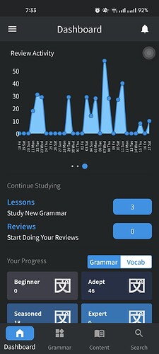
I think the reviews not showing up on the third graph is due to a timezone problem. I’m not sure though.
For instance, the reviews I did yesterday (30/12) are appearing on the 3rd graph for x=31/12. I haven’t done any reviews today yet…
Yep, I have done no reviews today, but the graph shows like 50, which is what I did yesterday.
Additionally, I really don’t like how the last review in the batch automatically jumps to the result screen if you get it right. With the other sentences I can analyse the text and try to understand the full function of the grammar points, but then you hit the last one and it gives you whiplash with how sudden it moves to the results screen…
Fix for this will be released in the new update 
@VegasVed
The graph fix is ready, I am testing it, and it should be released with update 
@mrnoone
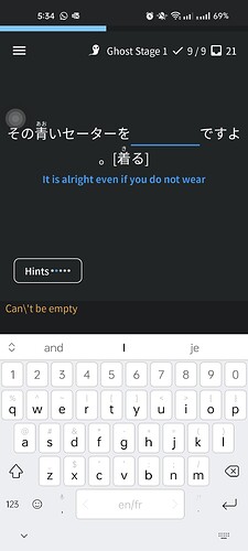
Stray escape character in the app when enter is pressed when the input field is empty.
Hey @VegasVed
This is already fixed, and will be released with the new version of the app 
Cheers!
@mrnoone
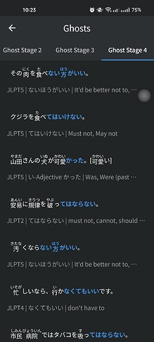
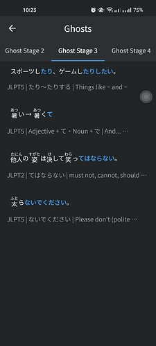
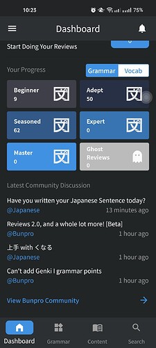
The app shows zero ghosts when I have many. Not sure what’s going on there.
The review chart on the dashboard shows me one review now but I have none.
When you click on Grammar, it defaults to opening the Grammar list on the N5 tab. I think the default tab should be based on the JLPT level the user sets in their settings.
So if a user has set their study level as N4, the Grammar page would open on the N4 tab.

