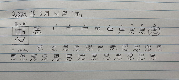
2024年3月14日「木」
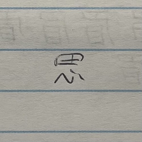
漢字:思
訓読み:おも.う、おもえら.く、おぼ.ず
音読み:シ
Jisho Page
メモ:How about I do it too?
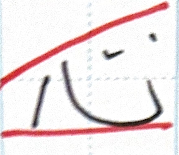
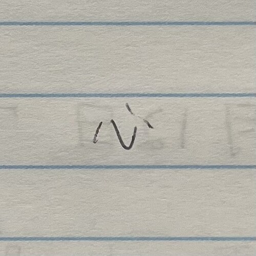
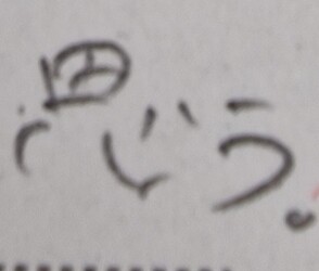
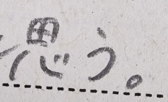
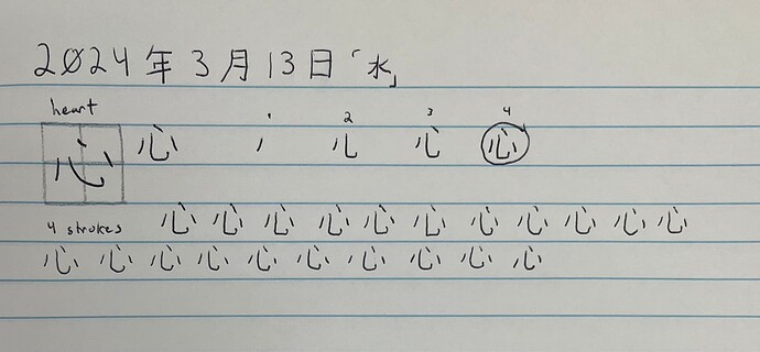
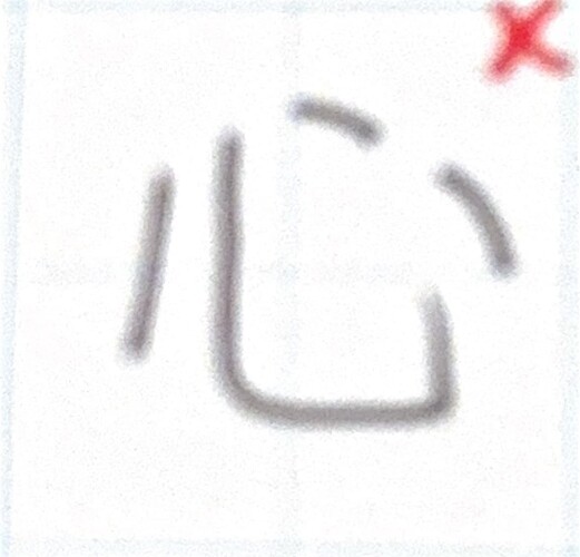
I may have tried to be a bit too close to digital for a lot of my practice 心’s, but if I were to scribble it:
This is about what I come up with.
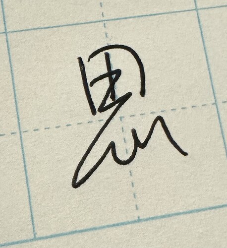
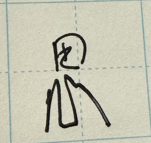
One of the things I’m confused about is your mention that the top of the 心 character should rise, and the bottom should be flat. In a majority of the resources I have for handwritten fonts and such, The fourth stroke is both longer and lower than the third, but in your examples it almost seems that the opposite is the case.
Is this a calligraphy thing, or does every native write in this way? I’d love more examples, time permitting and folks permitting, of course.
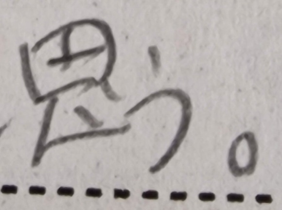
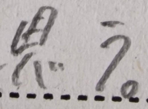
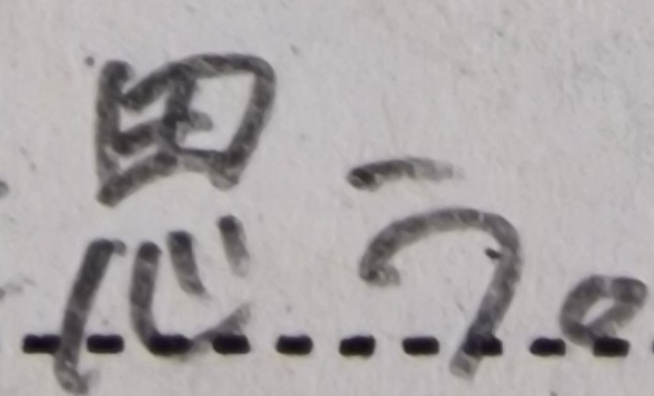
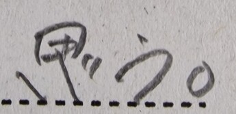
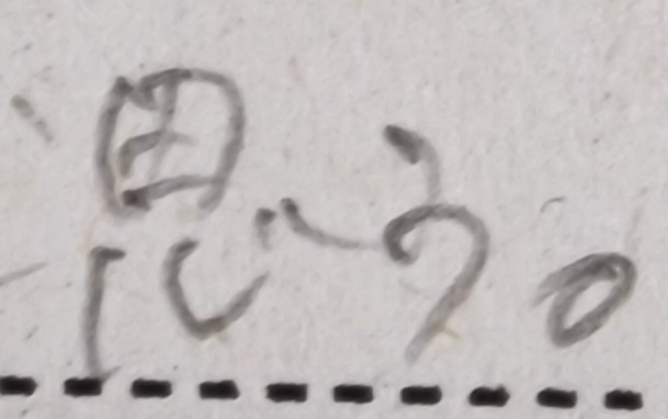
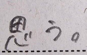
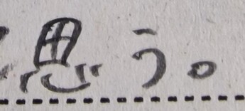
At the risk of sounding dumb, I don’t write radicals the same way when they’re in their various different forms. Obviously I strive to follow stroke order to the T, but as you can see previously from when I wrote out 憶 earlier in the thread, It didn’t come out anywhere close to your prediction. For a majority of my 思 practice today, I tried to scribble it as though I was writing a note, and maybe it’s just because I’m new, but no matter how fast I go I don’t think I’ll ever drag my pen like you do in some of your examples.
A more isolated scribbled out 思 for reference
If with this added context and these examples you still think my handwriting could end up being a problem, I’ll heavily consider working on it, but for the life of me I don’t see it being a big issue for me personally. Whenever I write something out for someone, English or otherwise, I prefer to make it as readable as possible, and would only really be scrawling to myself as a note for something. Maybe all the months of time I’ll lose for doing this will catch up to me someday, but I’m okay with that.
All in all I do enjoy conversations like this, and any more notes/commentary is welcome. If anyone else wants to chime in I’d love to see more of the handwriting cases for 心 and 思 from the rest of the community too!

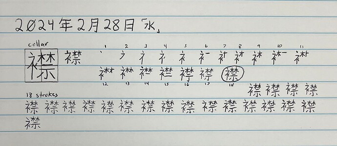
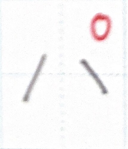
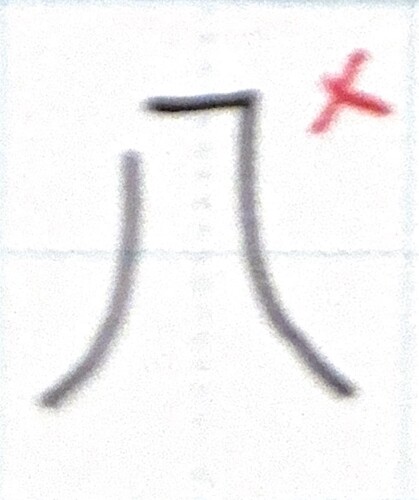
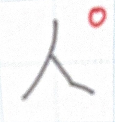
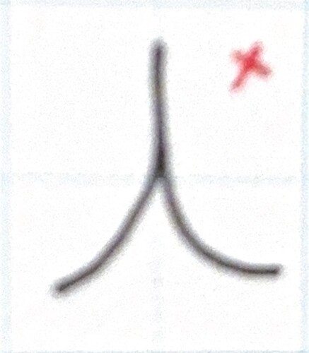
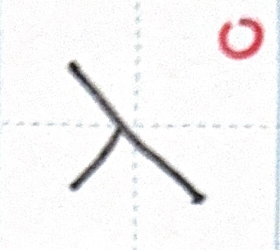
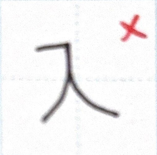
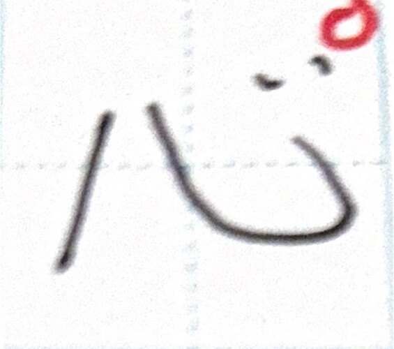
 on the versions that would come out of a computer, implying that the way they are written is incorrect. That is not the case, and any Japanese person who saw your writing would absolutely understand it, so please don’t think of it as a mistake. However, it’s true that people don’t really write like that.