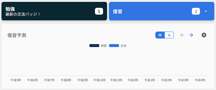
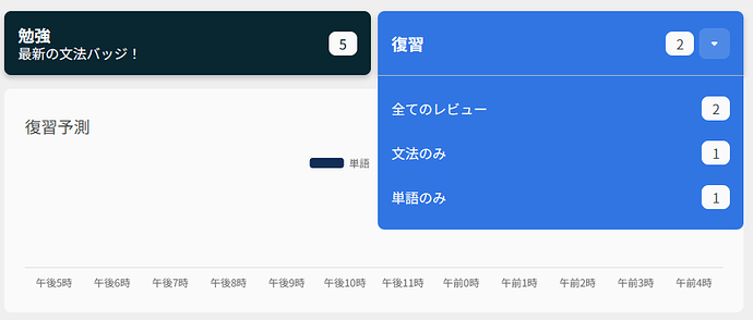
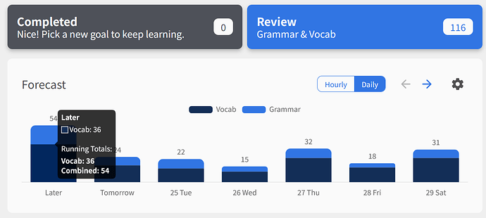
I like the new review button with its drop-down options. It works well for my personal workflow.
I will just add that prior to this change, when I would view the Dashboard in a half-window browser (which I often do, on my laptop, so I can have two browser windows visible at a time; on Windows BTW), which dynamically adjusts the view to be more like a mobile phone (I imagine, since I don’t have a mobile phone  ), then the button(s) at the top used to be “Review Grammar” and “Review Vocab”, and the single “Review” button had to be accessed by the hamburger-button menu. But now with this change, the single button at the top is “Review”, with the drop-down option to choose vocab or grammar.
I liked the split buttons previously, but I actually didn’t use them that much, so having to access the Review button from the menu was annoying when using half-width browser view. But it’s much better now. Although, when viewing with a full-width browser window, the split buttons are now nestled inside the Review button-dropdown ( ); but again, I rarely use them, so it’s not a big deal (
 ).
).

 ) are marked with a stamp, indicating they’ve been studied already.