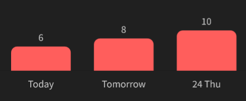
this is still happening, and it’s still very annoying!
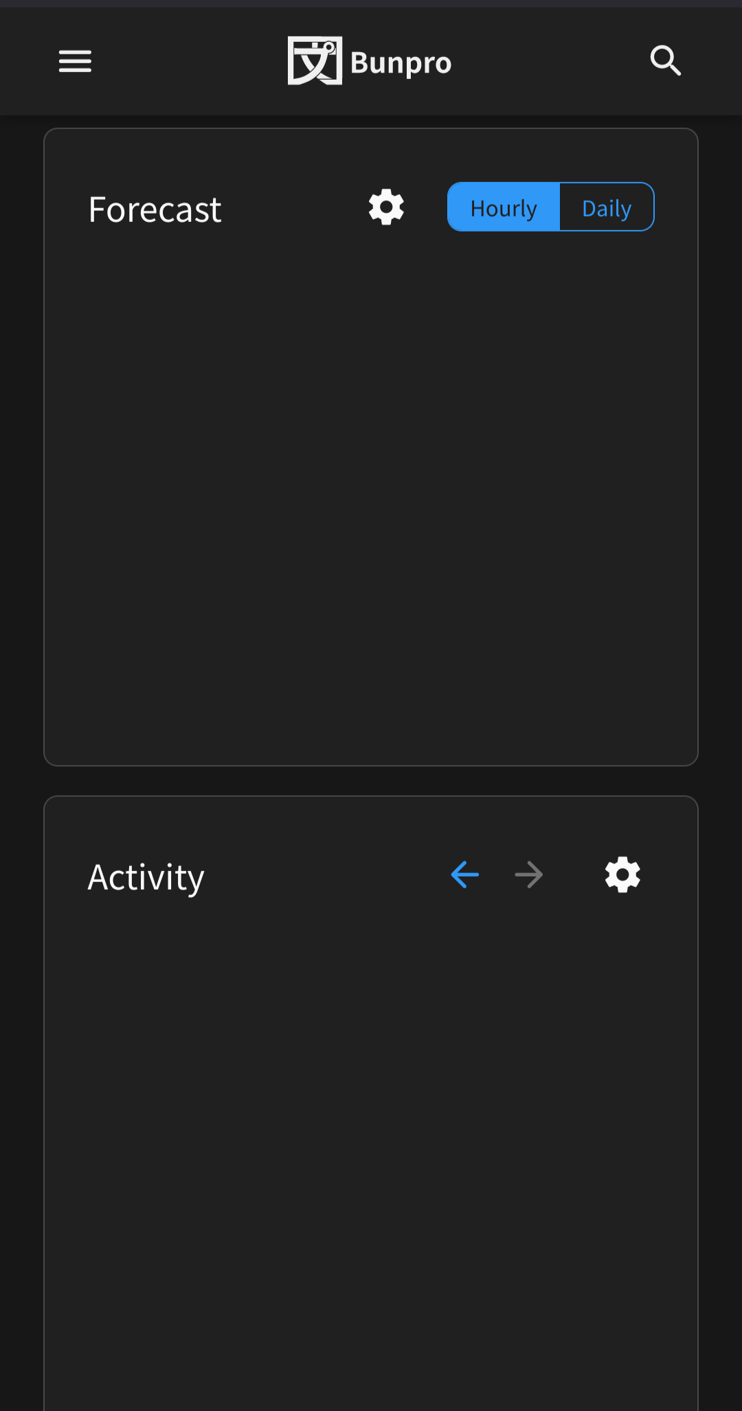
Unfortunately, the two graphs/charts don’t seem to be appearing at the moment. Tried refreshing but still blank:
In the Caution box of まるで ~ようだ a word seems to be missing after ‘either’ in the first sentence. I guess it is ようだ.
The ‘as if’ or ‘as though’ nuance of まるで~ようだ comes primarily from either , or みたいだ, with まるで simply meaning ‘entirely’, or ‘completely’ in almost all situations.
I can’t find 並み (JLPT N1) | Bunpro – Japanese Grammar Explained grammar point with query “nami” through the search Grammar Points - Japanese Grammar Explained | Bunpro
Is that because ‘nami’ is romaji rather than kana? (Or, does search actually work with romaji?  ?)
?)
I just posted two ‘bug reports’ on a grammar point’s discussion topic, but I’m not sure if the BP team keeps track of activity on grammar point discussion topics (for bug reports), so I’m just going to post links to those reports here, just in case they don’t:
Yep, search handles romaji as well
Just to mention that I really liked the previous way of adding synonyms.
It seemed easy to use and professional.
The changes I’ve just noticed seem to be a bit of a step back and in particular it’s difficult to actually add the synonym because the input box goes over the top of almost all of the “Add Synonym +” button:
Perhaps this is just a step along the way to something different though?
Yeah this seems to just be a straight up bug!
The input should definitely not be spreading out over the top of the Add Synonym button.
What OS/browser version are you using might I ask?
EDIT: Nevermind – I already know. It’s Firefox! 
Forgot to test Firefox with this update. It should be fixed now!
Seems to be sorted, thanks!
Just to mention, it might just be me who thinks this, but I would really appreciate if the “synonyms” section could come first on mobile browsers, before “notes”, because I keep almost entering synonyms in the “notes” section, which of course wouldn’t work 
We actually have a big update coming really soon that will change the layout of these pages quite a bit!
Watch this space 
Great! I’m watching this space 
Hi,
Would it be possible to have the same behavior for the furigana between the website and the app ? I have set disable all furigana, but something I find very useful on the website is that after entering an answer, it shows the furigana. That is not the case on the app.
I find this behavior useful because it helps me to learn the pronunciation for vocabulary words. If I got the pronunciation wrong, I set my answer as wrong, because I want to know both meaning and reading. With the app, I have to click on each word one time to switch on furigana, and once again to disable it, or else it will always show up again (setting is memorized per word).
Thanks !
Hi! Are you referring to the situation where you get a single Japanese word and have to translate it and enter the answer in English?
yes exactly, sorry I didn’t said that I was talking about vocabulary reviews.
No worries!
I’ll inquire with our mobile dev abd get them synced up for you 
On the app (android, latest version), when looking at grammar info, no furigana will appear on the kanji in either the title or the meaning tab when you click on it when it is hidden by default.
Steps to recreate
0. Have furigana hidden by default
- Do reviews on android app
- Get answer wrong for review where the grammar info title has kanji in it e.g. 折角 (JLPT N3) | Bunpro – Japanese Grammar Explained
- Click on info
- Click on the kanji in the title, or any on the kanji in the meaning tab - no furigana will appear.
- Switch to ‘examples’ tab and click on kanji - furigana will appear.
- Switch back to meaning tab or the main title, clicking will not make furigana appear.
Apologies if issue already raised, I’ve not looked through the thread.
Just shout if can’t recreate and need more info.
edit: clarification
Today is Wednesday and my time zone is properly set.

On the dashboard, if you select to show neither grammar not vocab, a blank panel appears. Shouldn’t the panel just disappear? This is for both activity and forecast.
Nothing important but a small inconsistency perhaps?
I’ve just finished all N3 grammar points (hooray). On the main page I see these very satisfying numbers:
![]()
But if I navigate to basically any other page, I see:

Clicking ‘Learn’ takes me to a congratulations page, which was actually very helpful as I hadn’t yet re-worked out how to change my study level.
(I also notice now that a different colour grey is used in each case… but it would be very pedantic of me to point that out).
I am using Microsoft Edge on a desktop.


