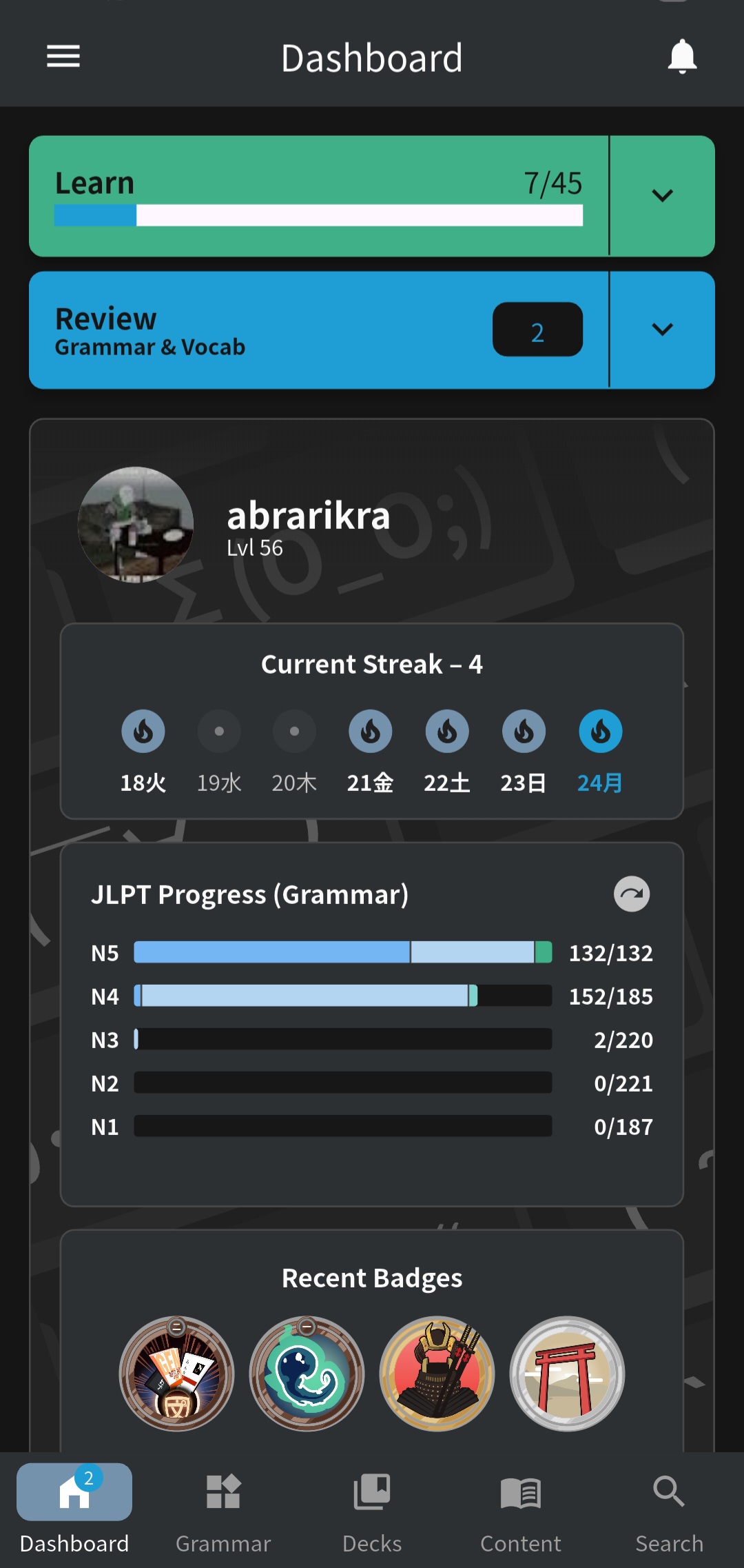
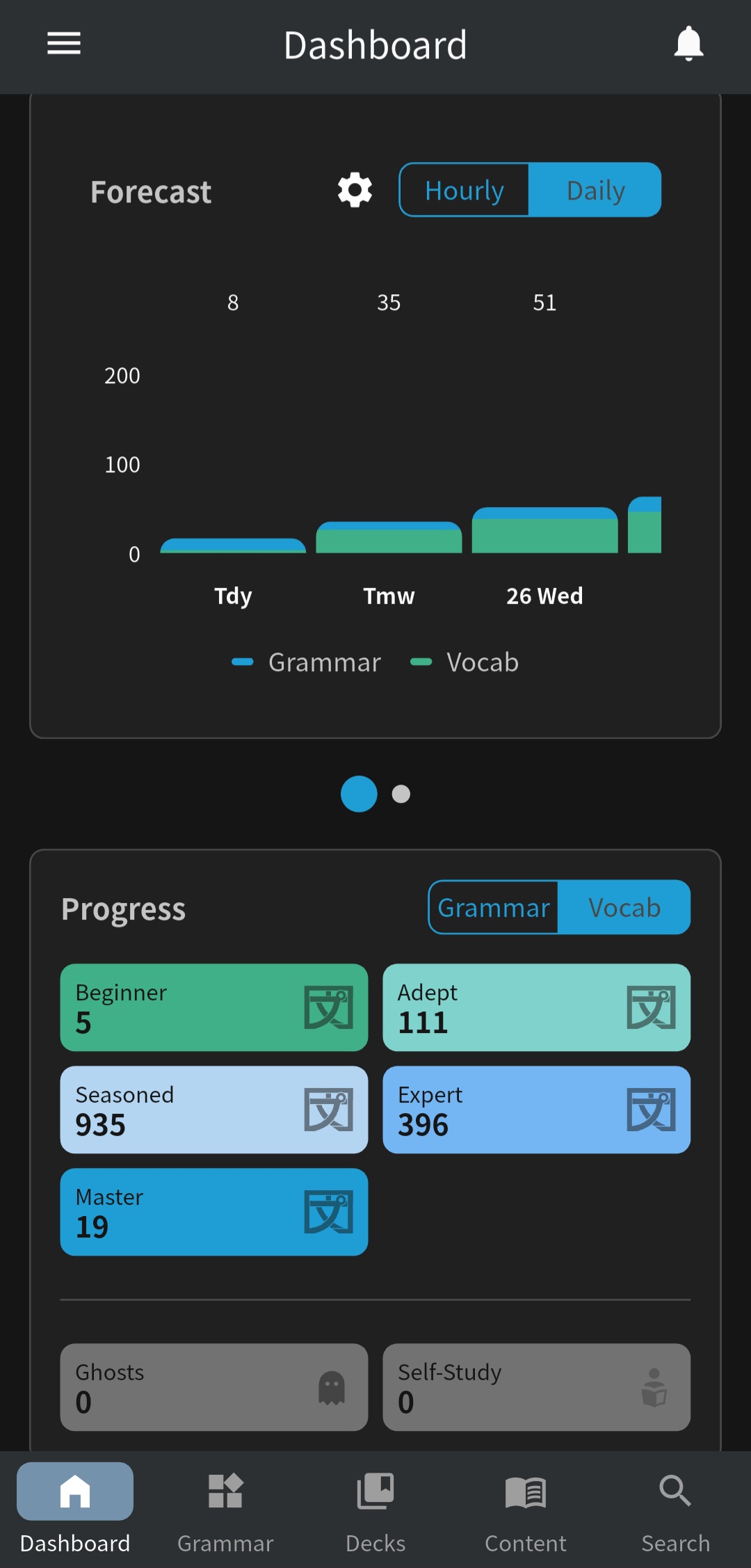
i’m wondering if it’s a bug or is it how it is. i subscribed to a monthly plan from around august to december 2025, and stopped. i resubscribed currently august 2026
, and i was expecting i got a stockpile of reviews and i actually got none. I learned 10 to 15 words per day and everyday the reviews are only about the most recent things i’ve learned. i wonder will i get the reviews about the things i’ve learned last year?
Thank you so much! I primarily use the website as I prefer to study with my laptop, but the mobile app has been helpful in this interval, as I was able to continue learning.
Welcome to the forums!
If our system worked correctly, then your Reviews should trickle in as if you didn’t take any break at all (as if you activated Vacation Mode for the entire year).
I’m poking around your account now, but can’t seem to find any items that have had their due-date extended beyond what should be possible.
Do you have any example items that should be due, but aren’t?
Or that are showing extremely long due times?
(E.g. Beginner items due in a month, or some other bugged value)
I have ghosts enabled for grammar and vocab. I’ve been getting ghosts for grammar but not any for vocab for around 1 month (since I enabled the setting). I’ve been getting certain vocab words wrong multiple times in reviews and still no ghosts.
I’m not sure if something isn’t working or if there is a setting I need to change that I’m just not aware of?
I believe it might be because you’re using Manual Translation instead of Cloze / Reading Mode (the Review Types with sentences) for Vocab.
Currently Ghosts are only available with the sentence-based types!
Oh I see
Thank you!
here i have quite some progress last year, and i was expecting like hundreds of reviews? yet here i only see reviews from which i learned from 2 or 3 days agk
Guys, to be honest, the user interface for Bunpro is a bit of a trainwreck. I love WaniKani and really wanted Bunpro to be just as good, but I constantly find myself getting lost in the interface or going around in circles. Very frustrating. My impression is that you keep trying tack on features and add-ons without keeping the user interface clean and straightforward. It’s a mess.
DMed you!
Welcome to the forums!
Thanks for the feedback.
Is there any part of the website / app that stuck out to you most as needing improvement?
We have our own ideas internally about where we need work, but its always good to hear directly from users.
TLDR, I think there’s just too much going on.
I’m not a UI expert, but I’ve been using personal computers since 1980, so while I’m older, I’m also experienced. I keep getting lost in the settings menus, and I don’t understand what half of the terminology means.
In the main (learning/review) parts of the website, I find myself going in circles. From any given point in the interface, there are multiple pathways you can take, and half the time you end up back where you started, even if you didn’t intend to go back, or you end up somewhere you didn’t mean to go. I just don’t have a clear sense of where I am and where to go next.
I also find the reviews very confusing. Half the time, I can’t figure out what I’m being prompted for, or what the question is. There will be a blank with some vocabulary around it, but the prompt doesn’t give me enough information about what kind of grammar or usage is suppose to fill in the blank.
Maybe that’s because I’m just getting started with Japanese grammar and it’s inherently confusing for a native English speaker, but I feel like the interface should help me along a bit more than it does.
Adding: Do you guys have a dedicated UI person? Or at the least, someone who understands how typical users navigate through websites.
It feels like this website is made for 20-year-olds who are used to confusing interfaces and who may be coders themselves. For an average person who doesn’t fall into that category, all the options, terminology, and bells and whistles feel overwhelming.
Take a look at the WaniKani interface. It’s comparatively clean and simple. I feel comfortable on the website, and I always know where I am.
i am 32 year old and for me is no confusing
Hm… Well, I guess opinions can sure vary. I’m mid-30’s and I think Bunpro’s interface is very helpful and user-friendly, while I think Wanikani’s is okay but has some hindrances and unhelpful elements.
@Sean as per my reply here, is it possible not to remove this great feature from mobile, and instead just polish it and add to web?
Hi, this is still an issue, and it seems like it could be a similar problem to what abrarikra is dealing with.
If it’s relevant, my subscription lapsed while on vacation and I had to resubscribe when I turned off vacation mode.
Thanks for any help, really looking to get back into my reviews.
In the Android app, there seems to be a minor bug (with IMO serious effects) with sorting reviews by level. I’m guessing it might not be limited to Android, since I’d imagine sorting happens on the server (but I only use the Android client, so I can’t confirm it’s happening in other clients). I’ve observed this several times recently. Here’s an example of how it might shake out.
- My review queue is empty, so I tackle 5 new lessons.
- Several hours later, I note that I have 6 reviews. I already know instinctively that 5 of these are my new beginner items, and the 6th is probably some higher level item.
- I do the first 3 reviews, and they are beginner items as expected (3 reviews remaining).
- I open up the 4th review, and it is a higher level item! (this is unexpected and wrong since I know there are still 2 beginner items in the queue)
- I immediately exit the review session.
- I immediately start a new review session (3 reviews remaining).
- The first review is a beginner item, as expected (2 reviews remaining).
- The next review is… that higher level item again!
- I immediately exit the review.
- I immediately start a new review session (2 reviews remaining).
- The first review is a beginner item, as expected (1 review remaining).
- The final review is that pesky higher level item that TWICE now managed to cut the queue (rebooting my review task fixed the queue order both times).
I’ve seen it happen in many other ways, not just with beginner items. I will be iterating through e.g. a large review queue if I’ve fallen behind, and I’ll tackle a few beginner items, a few adept items, and then jump straight to an expert item. And I’ll think to myself: wait were there really no seasonal reviews? And sure enough, if I exit and immediately restart… there were indeed seasonal reviews.
tl;dr the deeper you get in a review session (and it doesn’t even have to be that deep… usually around 3 or 4 reviews in), the higher your chances of hitting an improperly sorted item that is floating up the queue for some reason. This is a pretty bad bug, since it kind of messes with the core feature of SRS (review intervals).
Lost the ability to mark a card “mastered”?
I’m trying to figure out if this feature disappears only under certain circumstances, or if it’s a global bug.
I am in the process of “learning” a ton of words I already learned years ago. When I introduce them, I tend to let them run once or twice for a quick refresh, but then want them gone. I try to click the info button or whatever it is that brings up the entry in its entirety, and I’m not seeing the ability to mark it mastered anymore. I wasn’t sure if this was only when I’ve introduced a card that very same day, but it seems to be the case for older cards too.
I may or may not have seen the ability to mark it mastered when clicking the info button the first time it’s exposed as part of the learning cycle (not review cycle) and seen it there, but I don’t want to have to mark it mastered just because I’m afraid if I don’t I’ll have to put up with it forever. I still want the ability to confirm that I know it after 1 or 2 chances to recall it and immediately get it.
Can someone look into this and ensure the ability to mark a card mastered is retained no matter the context?
(Also, a side note, this is more of an improvement suggestion but I don’t want to have to go through the process again of making a new post — it takes the user too long to post in this thread. I had to make clicks in the double digits. Launch forum, find thread, click thread, scroll down, click scrolling icon, scroll that down, click reply, prompted to login (password not working, click forgot password, go to email, login, fail to be redirected to thread, start the process all over again), make post. This should be frictionless. One prominent button that user clicks to report or suggest something. User is asked if it’s a bug or improvement. User clicks. Types message. Hits post. Done. 4 clicks). And the user shouldn’t have to log in if they are logged in through the app.

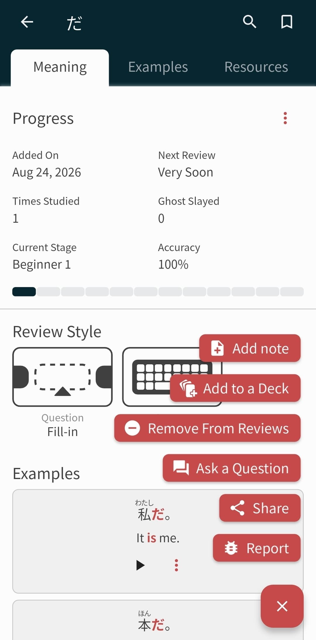
It sounds like you’re using the Bunpro App so I’ll explain it with that context, please correct me if I’m wrong. This image below is what you’re referring to when the Mark As Mastered button disappears correct?
If so, to mark something as Mastered after you’ve already learned it, you’d need to scroll to the Progress section (like shown above) then click the 3 dots to the right of the title and there you should find the action.
We have plans to adjust these designs in the future, but hopefully this answers your question for now. If I’m talking about something else entirely let me know! Happy to help with anything.
I think so, it used to appear in the main page as a giant button, similar to “Add synonym”. Now I know it’s hidden by the three dots. Thanks.
Ability to adjust progress status / labels in the main feed would probably be more useful to users than adding a synonym. I’d be curious to know how many people are manually adding those enough to warrant their placement there (though I get the rationale behind putting them before “progress”), but I’m happy to know there’s a way to mark them mastered still.