Feedback - Suggested Improvements/Feature Request

How about some kind of visualization/tabular overview of the grammar in Bunpro?
E.g. for each grammar entry the synonyms sections could show this for the displayed grammar point.
The visualization could enable you to compare the formal register and on what kind of words the grammar can be applied to (adjectives, verbs,…) at a glance.
This would allow deepening the understanding of grammar points, especially what is the right context to use them.

Additionally there could be an overview page that groups somewhat connected grammar roughly and links to pages containing the same kind of information as above.

This would be another Unique Selling Point for Bunpro, at least I don’t know any other tool doing hat.
Maybe this could even be based on existing data that is already in your database.

3 Likes

Could there be an option for the to copy Both english and japanese to clipboard? I often like to pop the example sentences into my own SRS. The Japanese works fine, but when I copy both at the same time I get weird formatting errors.

(Same goes for the grammar definitions under “Details” in the “Information” panel)

2 Likes

stop billing in USD. My last renewal was a few yen short of 700. This is starting to get expensive.

2 Likes

Hey,

it would be great if I could set a sort of “time-zone delay”, so that I have longer to complete my streak. For example I could set something to let the day “end” at 2 am, so i don’t break my streak if I only manage to do my reviews at 12:15 am (because exactly that happend to me today and I lost my 120 day streak).

Thanks for reading!

6 Likes

Echoing this! I don’t wish to change my timezone because that causes all sorts of complications, but I would really love to be able to set when my day ends and the next begins in terms of Bunpro. I’m a night owl (on weekends where I have room to be!) and so being able to do reviews comfortably at a later time would be lovely.

3 Likes

I would like to suggest getting the 命令形 (imperative) form added. I know we have なさい (polite imperative) and 禁止形 (negative imperative) but unless its hidden I can’t find the main imperative form. :pleading_face:

4 Likes

Is there scope to have another window drop down after you get a review correct/incorrect (like the grammar windows) that shows the vocabulary used in the example sentence during reviews?

Cheers!

2 Likes

When learning new grammars, if you enter the wrong answer, you automatically go to the next question and won’t be able to edit your input. However, in the reviews, if you enter the wrong answer you do not automatically go to the next question and you are able to re-try and still get the question correct. Is there a way to make the review format same as the one when you are learning new grammar?

1 Like

I don’t think they have that option, there is bunny mode that automatically continues when you get it correct.

I believe there is a script already made that does in effect what you are looking for if you really do want that feature

It’s on this forum post but in precise it would be this script that they have available

But I’m not sure it’s a good idea to use because I don’t think that’ll help you learn. But it’s do able

2 Likes

This has bugged me literally everyday since starting but its minor enough that I just ignored it.
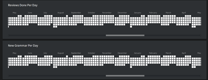
The default “Reviews/new grammar done per day” starts in the middle date from April 1’st 2018 to the present, meaning that it doesn’t show your own start date unless you happen to have been going for however many years. It would be better if it culled all days prior to when you started, and preferably showed you your current month, by default.

8 Likes

Hi, i apologise if this has been suggested before, but here goes:
I’m thinking it would be neat to have a button to mark something as known during the lesson process, especially in regards to vocab. I know I can go and do it after, but sometimes I like to do bigger chunks of vocab and it can get tedious to have to go through them individually afterwards to mark them as known.

edit: changed “review” to “lesson”

i would like to manually order example sentences so i can put easy ones to the bottom and hard ones to the top.

1 Like

Also, auto ranging colours for the data would be preferable. The present colour scheme conveys next to no information to me whatsoever as I routinely do at least 50 reviews a day, higher than the highest colour option of 20.


For comparison here’s a screenshot from the Wanikani’s heatmap script with autoranging colours.

4 Likes

I like that you can see what you have under each srs level when clicking it now. Is there something that you could add to that like have a cram button for all srs in the beginner and/or adept stages? It is kind of cumbersome to have to goto the cram button then select the ones you want to review.

5 Likes

I just finished a bunch of reviews, and I thought it would be nice to have on that summary page a button to cram all the grammar points I just missed in that review session. I don’t know how hard it would be to program that, but I thought I’d suggest it in case it’s not too difficult. Thanks!

7 Likes

I see something along this line was attempted. Thanks.
If I may be picky…Here is what my stats looks like upon loading in, with the scroll bar almost entirely to the right. If you could just make it literally 1 more click to the right it would be perfect, as it stands it cuts off the current month’s data.

3 Likes

Not sure how feasible this is, but it would be great to be able to add grammar points to a private deck or collection, or even to tag grammar points with our own custom tags, and then be able to cram the private deck, collection, or tag.

4 Likes

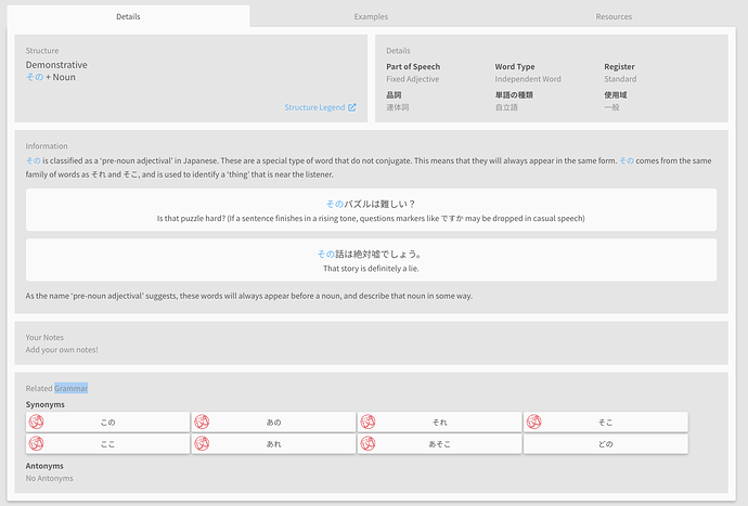
I have a couple of design suggestions that may improve readability. On the grammar pages, what if the “Information” and “Your Notes” sections/boxes took up the full width. I think the empty column is distracting. Something like this:

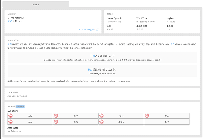
I like the gray and white, it might improve readability to have the border portions in gray and the parts with the text in white. Something like this quick and dirty mockup. And maybe there could be 2-3 more different themes so people could pick the version they liked best?

Could there be some indication during the reviews (perhaps by using color) to indicate whether the item is a vocabulary point or a grammar one? I’m spoiled by the way WaniKani has their radicals in blue, kanji in pink, and vocabulary in purple. They also have a black bar if the question is looking for a Japanese response and a white one for English.

2 Likes

I would love if I could create a custom curriculum for myself. Currently I am going to a Japanese school in Japan and would love if I could setup my own structure of the order of grammar so it can align with the schools textbook. It would the be nice if I could then practice content based on my custom organization in the cram section of the website so I can prepare before tests in addition to the spaced repetition.

Not sure if this has already been requested as there are more requests than I can read through in a reasonable amount of time.

Is there an easier way to add or study vocabulary? The only way I could find was searching google for “bunpro vocab”, landing on this page and choosing one of the decks to study from. I could not find any way to find vocabulary from the dashboard or the top navigation.

1 Like