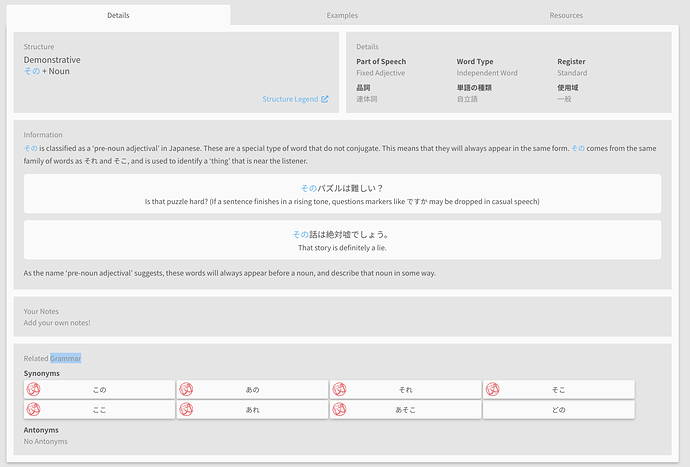
I have a couple of design suggestions that may improve readability. On the grammar pages, what if the “Information” and “Your Notes” sections/boxes took up the full width. I think the empty column is distracting. Something like this:
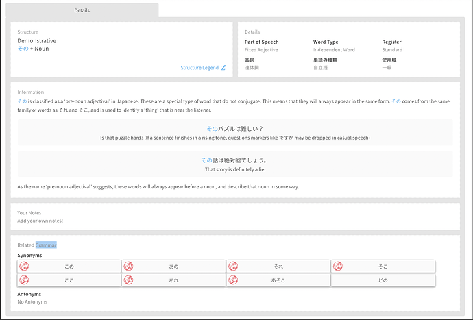
I like the gray and white, it might improve readability to have the border portions in gray and the parts with the text in white. Something like this quick and dirty mockup. And maybe there could be 2-3 more different themes so people could pick the version they liked best?
Could there be some indication during the reviews (perhaps by using color) to indicate whether the item is a vocabulary point or a grammar one? I’m spoiled by the way WaniKani has their radicals in blue, kanji in pink, and vocabulary in purple. They also have a black bar if the question is looking for a Japanese response and a white one for English.


