I only do reviews once per day (often spaced apart by a few hours) and it’s very frustrating that I can get the same stuff to review even when I’ve already done that this day.
Can we have an option to have smallest SRS interval as 1 day and check if it’s a new day not by 24h interval from the last item but by calendar days?
I am trying to learn 5 items per day (except weekends), but reviews grow very fast and it’s about 130 per day now
In case it might help, here’s some unsolicited advice… 
- You may want to go into settings and (maybe only temporarily) set “Ghost Reviews” either to “minimal” or “off”
- I’d recommend picking a cutoff number for reviews each day (maybe ~50-60?) to A) ease your workload, and B) to make your reviews come in more gradually/steadily, instead of in large bursts all at once (which happens when a batch of same-level SRS items all return at the same time)
5 per day is very ambitious. You might want to cut back a bit until reviews settle down. Instead of having a set number you want to learn per day, I would rather try to figure out how many reviews you are comfortable with and only learn new points when below that.
Thanks for suggestions, but let me point to the core of the problem (probably it was not obvious)
I am actually mostly OK with high amount of reviews, but it’s often something like this:
I see I have 100 items to review. I complete the reviews. I take a couple hours break, return back to study 5 new grammar items and see I need 40 more items to review.
I can’t plan my study time well this way. It would be better if I had known from the start that I need to review 140 items for that day. This is even worse when the number of items changes mid-review!
While I love the space shortcut to toggle the English, I would also like a shortcut option to toggle furigana. When it’s there it’s hard to ignore and focus/practice on the kanji, but there are times where I am unfamiliar with the kanji and want the furigana.
If you’re on a PC, you can install the Planner userscript that’s linked at the end of the first post there. It’ll let you see upcoming reviews by the hour (although I think it doesn’t include Ghost Reviews because the current API doesn’t see them for some reason).
Maybe I’m misunderstanding what you’re asking for, but you can click individual words to toggle their furigana on/off.
I’d recommend picking a cutoff number for reviews each day (maybe ~50-60?) to A) ease your workload, and B) to make your reviews come in more gradually/steadily, instead of in large bursts all at once (which happens when a batch of same-level SRS items all return at the same time)
Can this be implemented within Bunpro?
A vocab list of all the words whose furigana I have already omitted.
I can tell the site already tracks the furigana I have chosen to omit. A simple vocab list of the words whose readings I’ve chosen to omit would do wonders for me!
Come to think of it, Anki has a setting like this to impose a daily limit (two, actually; one for new items, one for reviews).
Maybe I’m misunderstanding what you’re asking for, but you can click individual words to toggle their furigana on/off.
Ah yeah I know you can turn them off and click individually to show the furigana. It’s just when I’m going through my reviews I like to keep my hands on the keyboard and it’s just a bit annoying to have to move over to the mouse each time. Sorry I should have been more clear.
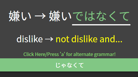
Just a suggestion. Many early learners of Japanese don’t realise 嫌い is a な adjective, since it ends in an い. I therefore think it would be a good idea to ask the learner to type the full answer, since I think the current way already shows half of what you’re trying to teach.

@matt_in_mito We actually had this review question (with answers that throw hints/warnings, etc.) all set up to do just that, but I forgot to remove the “嫌い” after the “→”…  Thanks for letting me know! Cheers.
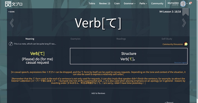
Hi! I’ve been using Bunpro for a few months now (and love it), but the information hierarchy on the “meaning” tab makes it hard to digest the information without referring to a text book – even when most of the essential information is right there:
- the “nuance” often contains important information that both explains and contextualises the grammar point (not only nuances). But this information is super tiny and positioned at the bottom of the tab after almost everything else…
- the “structure” box is positioned more prominently than the important information often included in the “nuance”, and also becomes unreadable for grammar points that contain a lot of variations…
- related grammar points are linked at the very bottom, but the differences between them aren’t explicit, and they’re sometimes confusingly linked. At some point I found myself in an endless loop going through them to find the real nuances (I think it was all the looks like/seems like stuff).
Some ideas:
- maybe the more introductory/contextual “nuances” could be separated from the real nuances, and positioned closer to the “meaning” information
- a table might be better suited for the “structure” information
- clearly laid-out differences between related grammar points would be

@skymaiden Thank you so much for your kind words and for these awesome suggestions. Both the introductory/contextual notes on each grammar page and the differences between related grammar points are some of the things that we are actively working on improving. We will see what we can do about making the layout more intuitive. Cheers!
@Pushindawood Thank you, looking forward to the improvements! 
Totally unsolicited
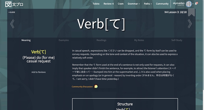
Sorry if I’m overstepping – here’s an example of how rearranging things could maybe make it a little bit easier to digest  (this grammar point probably doesn’t even need the structure box, but I left it there anyway)
Current layout:
Rearranged layout:
EDIT: me and Discourse are not friends, I never seem to click the right Reply button 
As for me, I only read the contextual notes when I’m studying new grammar. And after that the structure is the more important information to me since I tend to mix it up with other grammar points. So I like it that the structure has a prominent place right below the meaning. Especially since I’m on mobile it would be a struggle having to scroll down every time I want to see the structure.
Fair enough!  I read the “nuance” section both when learning new grammar, and during reviews when I’ve got things wrong (mixing up similar points). Maybe because the structure box is often either almost empty or overloaded and hard to read…
I do think the whole layout on mobile also needs some love though!
Are there plans to even out the volume of all the voice lines? Some are really loud.
Edit: I just saw this thread and kind of answers the question
Feature request: Could we get an option to select what time a new day starts (for the purpose of study streaks and reviews/day)?
Due to work schedules, I tend to stay up at night and sleep during the day. This has lead to some odd issues where things won’t count as separate days even though I slept in between when I chose to do reviews. Most sites offer this feature, so I already have most everything set to reset at 9am EST, which just makes it harder to remember that this site doesn’t.
It’s not a super important thing to have, but it would be nice.
An example of the problem I mentioned in my previous post:
来週(らいしゅう)までに漢字(かんじ)を30字(じ) おぼえておかなく てはいけない 。
This is a review for ておく , but requires knowing なくてはいけない, that is not teached at all in the Genki paths.


