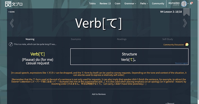
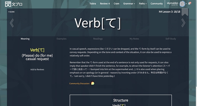
Hi! I’ve been using Bunpro for a few months now (and love it), but the information hierarchy on the “meaning” tab makes it hard to digest the information without referring to a text book – even when most of the essential information is right there:
- the “nuance” often contains important information that both explains and contextualises the grammar point (not only nuances). But this information is super tiny and positioned at the bottom of the tab after almost everything else…
- the “structure” box is positioned more prominently than the important information often included in the “nuance”, and also becomes unreadable for grammar points that contain a lot of variations…
- related grammar points are linked at the very bottom, but the differences between them aren’t explicit, and they’re sometimes confusingly linked. At some point I found myself in an endless loop going through them to find the real nuances (I think it was all the looks like/seems like stuff).
Some ideas:
- maybe the more introductory/contextual “nuances” could be separated from the real nuances, and positioned closer to the “meaning” information
- a table might be better suited for the “structure” information
- clearly laid-out differences between related grammar points would be


