regarding the color templates choices, I think they could be easily improved.
Do you have stats regarding users choices? I imagine there is a massive blue on dark choice preference?
Mainly You’d want a coherent and progressive gradient in the progression bars to show progress, some of the templates seem incoherent and unusable to me, either by having way too distant values (blue on light for example), or incoherent ones (mulberry has a dark value in the middle of the levels?)
I personally use the dark blue template because it is the only one that feels right to me.
Some of the proposed color schemes have a coherence, like purple or green on dark but they are super agressive and radical color choices. I wish I could have other hues, something soft and relaxing would be suited IMO but that is just a design choice. (how about a sandish theme? or just overall softer hues)


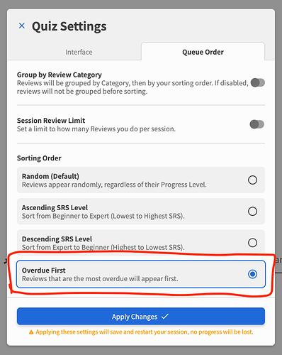
 update- couldn’t find that setting in mobile anymore 🤷
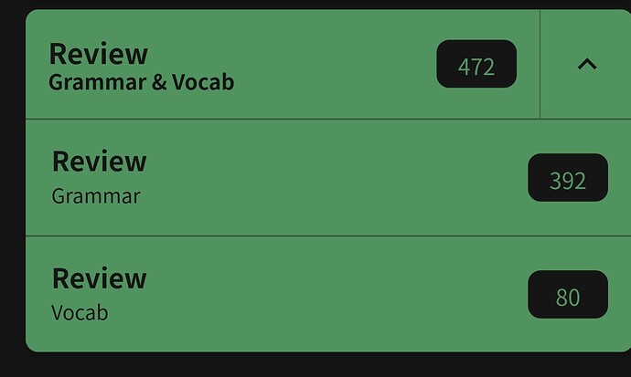
 so of course I went to learn vocab instead of tackling them obvi