Doing your reviews decreases your workload (unless you get a really low success rate, but then arguably the items in your review queue are still new to you), while doing lessons increases your workload. if you’re having trouble keeping up with your workload, it seems to be inadvisable for the tool to push you towards increasing the workload further.
Yes that’s a completely fair point. If a tool only allows 1 way to complete a review and decrease the load (through SRS, not through immersion/reading), then it probably should encourage doing the reviews first.
For what’s it worth, after writing that post I’ve realized I can actually approximate what I wanted on JPDB. It has a setting for “review interval length”.
I now set it to “shorter intervals” while reading with JPDBReader plugin active. That marks ~1.3k items for review, that would normally be due in a couple of weeks. I can proactively review them inline if they come up during reading.
And then for daily SRS I set it back to “longer intervals” which pushes them into the future and leaves only the urgent reviews to SRS.
I’m not suggesting Bunpro should do it, just some food for thought on different kinds of reviews.
-
vocab deck reset option(EDIT: noticed this already exists!)
-
mass select to set to a specific level
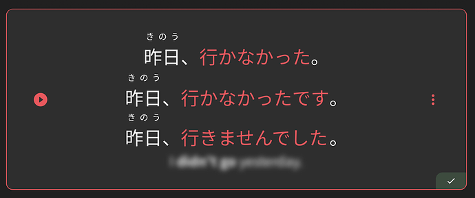
The blurred answers are readable to me through the blur.
It’s obvious to me that the answer to this is “I didn’t go yesterday”. These answers keep catching my eye and I feel like I’m not truly practising my recall.
Ideally I would like to “turn up” the blur. (Edit: I’d even be happy with a complete blackout of the word, but I appreciate some folks might like the hints that come from blur, like word count and length)
My device specs:
iPad Pro 19.5 inch
BunPro “installed” to Home Screen
I can read the blurred words as well on my laptop and I also submitted feedback through the homepage. I want the translation to be totally invisible like it was before. Even if the blur is increased, it’s kind of distracting and unsightly.
I feel like the blur is just worse, it was better before.
Now I can’t even mark and copy sentences (the translations) I wish to learn more into my Anki deck and have to type everything manually, which is just a bother. Thats my only real complain right now.
Plus the blurred stuff just looks less visually appealing.
As someone already mentioned, the new blur is incredibly distracting and unsightly. I do not like it at all.
Is there any legitimate reason for this change? I don’t want to rant about the modern trend of changing things purely for the sake of it, but…
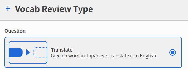
Would it be possible to have the reverse version of this review type?
Meaning, that the word would be given in English, and we would have to translate it to Japanese?
Would it be possible to have a rough idea of when custom vocab decks will be available?
I think I saw a couple of old references that say this year, but those were pretty old.
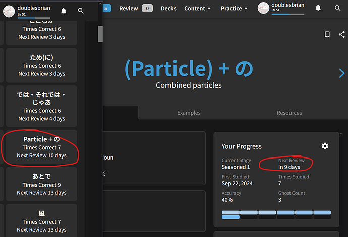
Would it be possible to add the exact time of next review when you mouse hover over the ‘Next Review’ time on the grammar point page or on the ‘Show Upcoming Reviews’ part of the profile page?
It’s a very minor thing but on those pages it can sometimes show 2 different days. I assume this is because of rounding the hours up on one page and rounding down on another page?
I think how it only displays the days now is best, but wasn’t sure if a tooltip could pop up that says the exact time like ‘October 26 - 9am’, or even just a more accurate time ‘9 days 22 hours’ when hovering over the circled areas in the image above so it’s easier to visualize when exactly the review will occur next.
Again, very minor thing, but when I get newer grammar points wrong I think they fall on a different srs than when you get them correct, so seeing exactly when they’ll pop up after a review would be helpful for me as I try to study at set times every day.
Thanks for the awesome site and the constant improvements!!
I’d love to have dark mode for the forum.
When you hide both grammar and vocab on the activity, and forecast panels, could you make the div disappear, instead of leaving a blank space?
Also, can we hide badges please?
Something that would help me (and I imagine many other ADHDers out there) would be a setting somewhere that prevents you from adding new grammar points when you have a certain amount (read: user defined) of amateur/whatever items already in rotation.
I am often WAY too overzealous and add everything too quickly even when I know I shouldn’t. People like me crash and burn fast. Then I end up taking a huge break and forgetting a ton.
Bonus points if there’s an option when you initially turn on the setting which stipulates that reversing the setting requires extra effort - e.g. indicating that you want to reverse the setting one day, then having to come back and reconfirm the next day. This prevents the user from just turning it off and adding a crapton of grammar without stopping and really thinking about it first. It could be user-defined too - maybe they have to wait 7 days before they can turn the feature off, if they so choose!
I know it’s a little odd, but you’d be doing me a real solid if you added this one.
In forum Preferences → Interface you can select from 2 variants of dark theme. I like Dark Blue.
Thank you, that worked.
Follow-up feature request: Dark based on phone settings.
I often switch between light and dark mode, and it works so well in the app. I’d love for it to be the case for the forums as well.
Will update this so it shows like this on hover:
While I know the current search page is a stop gap, I’d love to see an option to sort results by frequency.
Additionally, when sorting by for instance lowest SRS level, it would be nice if the results that fall outside of that (i.e. the ones listed after the ones that actually have SRS levels) would fall back to relevance sorting.
Please can we get a “Casual” option in the “Sort by” for the grammar decks? Or if it’s possible, have a grammar deck that uses the casual points only, mainly found in casual spoken conversation / text messaging?
that looks perfect!! Thank you so much!!
Edit: Looks like it’s already implemented too. Double Thanks!
In Anki, if you hit spacebar, it counts as show answer and mark as good. Would it be possible to make enter mark as good as well? It’s easier to press two buttons than three