
Double tap already works 
1 Like
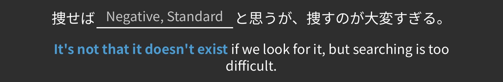
Might it be possible to use the same gray hints over the blanks in self-study sentences? Like the ones that say “Negative, Standard” here?
You can set the translation as hint. That’s what I do. It’s a few more clicks, though. Hope that helps.
1 Like
I use “reading type” reviews for listening practice sometimes, simply by running play without looking at the sentence. It takes some getting used to but it also gives you the translation at the same time as the “raté yourself” prompt
1 Like
I would really like a way to review vocab (and maybe even also grammar) both JP-EN and EN-JP. From what I’ve gathered, there’s the option to do reviews in 1 way, and it’s either JP-EN (Translate Question) or EN-JP (Fill-in Question) but not a way to do BOTH?
I could clone the deck, and use Translate Question for one and Fill-in Question for the other, but I think a “reverse” option for every card would be really nice.
2 Likes
I know, but could there be an option to single tap to reveal the answer 
1 Like


This does help a lot, thanks!
1 Like
While using the iOS app - when I mark a new word as “mastered” it is included in my daily batch for learning new words, however when using the website when I “master” a new word, it provides me with a new one, so I can actually learn 3 new words, is this a bug?
1 Like
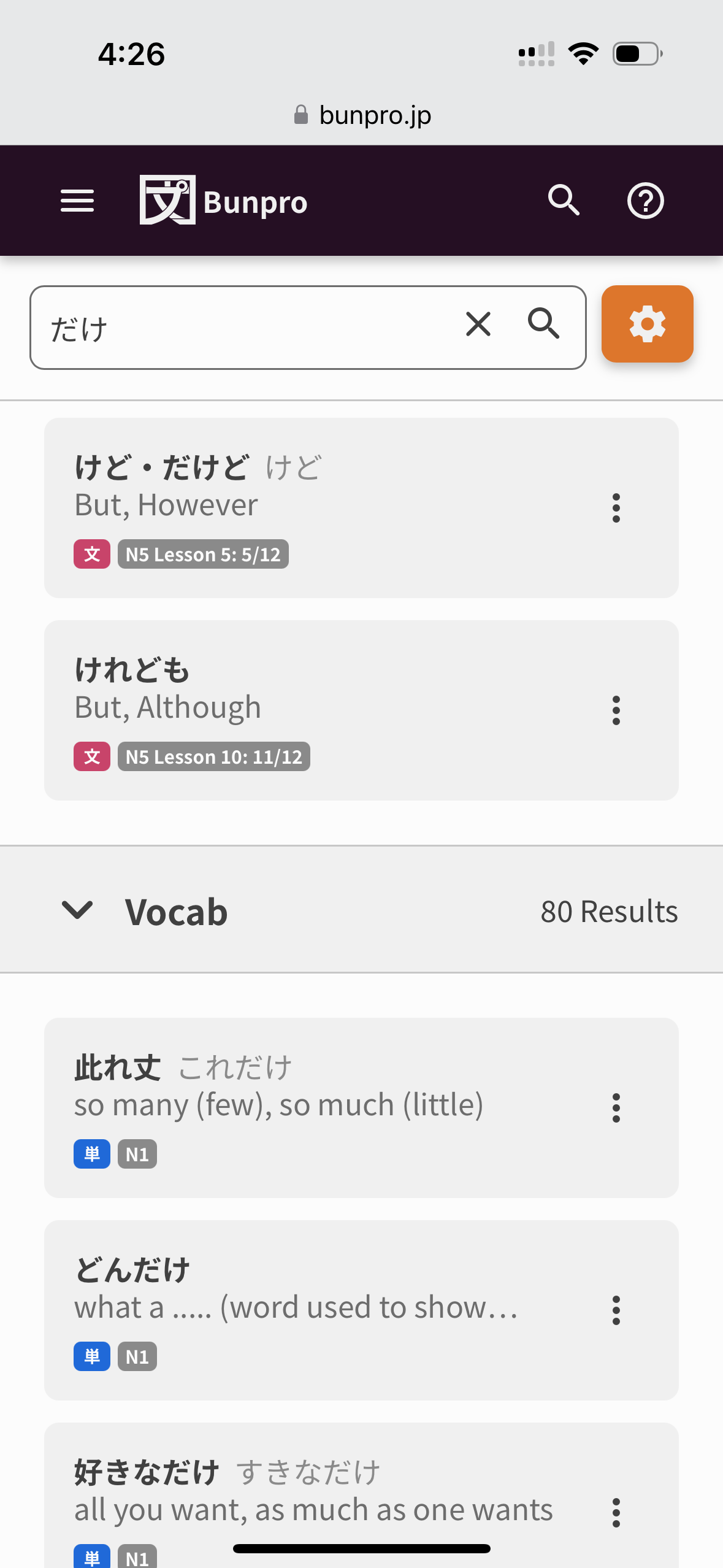
Is there any function to temporarily hide the english translations in example sentences that are embedded in grammar lessons?
My eyes always end up jumping straight to the english and its hard to focus on the Japanese. I want to try reading and interpreting first and then looking at the answer when I am learning about a grammar point.
2 Likes
Settings → General → Hide English

Result is:

And the English is revealed on hover/click:

Just be careful to reveal the English as sometimes the translation has an important usage note (including if a sentence is unnatural!).
4 Likes
Bless, thank you so much!
1 Like
Would it be possible to add the Button “Return to Decks” to the Page that appears after we are done with a reviewsession?
Not sure if it’s been mentioned yet, but I’ve been finding the new icons denoting whether an item is Vocab/Grammar very distracting.
Since it’s the brightest item on the screen, my eye is continually drawn to it, instead of the information I actually care about (word, translation, JLPT Level/Classification).
It also seems highly unnecessary since the search page already has separate Grammar and Vocab sections.
Additional Thoughts About Search
My guess is that this is part of the Search overhaul. . . Just saying in advance I’ll be very sad if Vocab and Grammar results end up getting collated and we lose the ability to separate them, as nine times out of ten when I’m searching, I’m specifically looking for vocab and have the grammar section collapsed. This is because if I’m searching for grammar, I use the dedicated grammar page.
As a side note, when I worked as a UX Designer and Researcher at my past company, it was best practice to use brighter colours sparingly and was usually reserved for calls to action. For example, buttons, notifications, or other elements that were interactive. In the case of the new 文/単 icons, in addition to having my eye consistently drawn to them, my first thought seeing them is that it’s something I should be trying to click or that the item has received an update or something. (NN/G for example, which is the leading UX research organisation in North America, also echoes this practice in their guidelines for Applying Color to Designs - see the “Use the 60-30-10 rule.” section, in articles/studies about Visual Hierarchy, etc).
While I fundamentally feel like the icons are not needed in the current Search, I think if they absolutely need to be there that they should be in a more muted colour, ideally in the same grey as the JLPT/classification icon.
This ended up being really long, so thanks for reading!
4 Likes
I would really love to see a game about counting. Bunpro doesn’t really teach numbers or counting at all, and there are lots of permutations in Japanese. I think something like a Kaijugation-style game where it shows you a number and a context and you have to type out the reading. Things like 5:15 AM on a clock or March 20th or 7 days or 2,100 yen.
Seems like something that there aren’t a lot of good resources for practicing out there, given how important it is.
16 Likes
Looking into this!
2 Likes
Would it be possible to have an option to remove furigana on all numbers?
Not the largest issue but when reading sentences where i can read everything then having a random furigana on 20… kind of takes me out of it for a sec
Also I repeatedly turn off the furigana but it seems to come back every now and then?
Not sure if this has been asked for yet but I would love an “I was right” button on a wrong answer similar to Quizlet’s “Learn” interface. Sometimes I get a typo on mobile but it’s always really time-intensive to erase my answer completely and write it back again.
1 Like
So there is obviously a link to the Bunpro Community forums from the Bunpro Dashboard, but there doesn’t seem to be a link back to the Dashboard from the Community pages? Am I missing something? Is there a technical/UI reason why the Community is a cul-de-sac?
3 Likes
+1
Please more simple games/study tools for things like this! :3 Money, time, days, counters, and such. That’s what I struggle with the most honestly.
1 Like