Yeah. Or even just a differently colored m&m indicator thingy for each item on /grammar_points, or for when selecting what to cram on /cram, or something. Just to make it easy to figure out which ones go together, or not… is what I think.
Don’t know if there’s any way of doing this, but I can’t ever remember it ever being suggested before.
I was just looking at my medals, badges, achievements, streak etc. and realised that I’m actually the only one that can see them. Being the attention-seeking showoff that I am, I thought it would be nice to be able to attach a badge of your choice to your forum posts (like next to my name it says ‘regular’, which is a bit boring) it would be cool if I could attach my 365 day streak badge or level 80 badge instead.
This would also get the community talking about various achievements and give everyone something to aim towards.
What you you think? Honestly?
Please excuse if this has been asked before…
A feature update I’d like would be for the quizzes around verb conjugations.
Right now, for example -nai, or -ta, both only quiz for Taberu, which is a simple Ichidan verb.
I think it would be great if it would quiz on the various more complicated Godan suffixes as well.
So -nai would quiz on Taberu (ichidan) like it does now, but then also quiz on the Godan u-tsu-ru-nu-bu-mu-su and irregular etc.
Thanks!
This video should be added to the 〜した〜 grammar point:
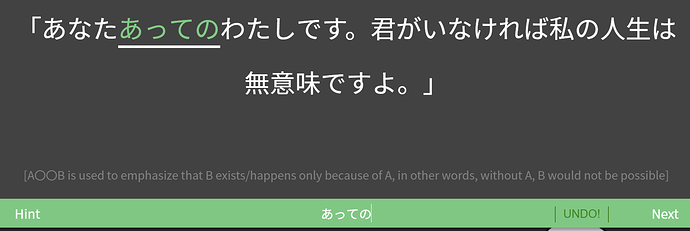
First review for あっての. What’s up with あなた and 君 being used back-to-back?? 
私 also strikes me as an unusual pronoun choice for someone using 君, unless we’re looking at song lyrics here. Is it not? (Then we’ve also got です here…)
It would be great if there was a ‘bunny mode’ that skipped to the next sentence only after the audio of the sentence that you just got correct is finished.
Gonna bump this up again, it’s both useful and motivating (could be like a ghostbuster badge sign or something that pops up).

But we really don’t have any data that tracks ghosts at all, either for individual items or total. I’d like to use ghost reviews # to dictate how many lessons I can add, sort of like an apprentice count ceiling (not a leech count)…except I don’t know what it is, just a feeling of failing a lot recently. The reviews number is quite deceiving without this. I’ve been slow to add lessons lately so would like to manage this a bit better in parallel with other studies.
Not sure if it has been suggested before, but I think it would be nice to be able to turn off the orange colored hints that highlights parts of the sentence, in the settings. Sometimes I can tell immediately without reading the entire sentence which grammar point is being quizzed, just from seeing the highlighted part. Just thought about how those kind of highlights certainly would NOT appear on jlpt exam, haha.
You can hide them with the “review english” setting
Not sure if this has been mentioned before:
It would be nice to have a custom “known kanji” function like SatoriReader has: something like a text field in the settings that you can paste a list of kanji into, and then that will be used to hide furigana on all words that only consist of those Kanji.
(That way, you could easily copy paste your known Kanji over from Anki or something).
I know the WaniKani setting is a thing, but I think it’d be nice to have an alternative for people who don’t use WaniKani (I cant be the only one here who doesn’t, right…?).
This may have been mentioned elsewhere (I tried searching but didn’t find it).
I’m on a mac and normally “alt+click” will open up a new link in a new tab. But this doesn’t work with links on bunpro. It would be nice if it did.
Right-click and select “open in new window” does however work.
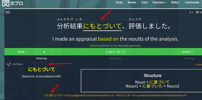
I would really like it if grammar points which are commonly expressed in kanji can be displayed in kanji after the correct answer has been entered.
And also when revealing the grammar point being tested (refer to screenshot).
After using BP for awhile, I realized I am unable to recognize some of the grammar points in the wild when they are expressed in kanji; because I have been so used to seeing it purely in hiragana.
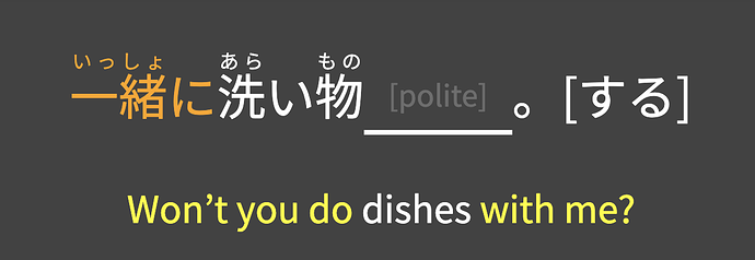
In this example, 一緒に relates to “with me”, both of which are highlighted, but with different colors. “Won’t you do” is the target grammar for this exercise. It seems like it would be a good idea to coordinate the colors of supporting grammar (in this case, 一緒に and “with me”), and make them both the orange color, signifying that they are indeed related to one another, while at the same time distinguishing the supporting grammar from the target grammar.
You may be able to use the Auto-show Info script and change it to auto-show when the answer is correct only (or keep as is for wrong answers too, depending what you want). This way the structure box would at least display the kanji reading.
Auto-show Info by @Kumi: Automatically expands the full grammar info when you get a review wrong.
Holy cow. Some of the audio in N4 is really fast. 
I know it’s been brought up before, and some people like having natural speed audio to listen to, but some of these are fast even for natives, and I would argue that proper enunciation is more important at N5/N4 level.
(That said, this audio would be great for doing shadowing practice, to speed up your listening and speaking skills. Maybe create a site for shadowing?)
My two cents. 
Thanks for the suggestion; but I guess the kanji is still not right smack in my face since I tend to focus on the sentence/grammar point header (which are in hiragana) more especially when I am clearing reviews quickly.
I guess from a UI/UX POV, the user’s attention tend to gravitate towards the fonts which are bigger; which in this case are the sentence itself, and the header of the grammar point (which are all in hiragana). That is why I tend to overlook the actual kanji itself which is not so obvious to me, especially when I have gotten the grammar point correct.
Not a dealbreaker but just a suggestion! 
Custom Readings
I think it would be nice to be able to add custom entries to the “Readings” section when learning a grammar item. You could add a name and a link which could then show up under the normal readings.
The existing entries are great, but sometimes you might find one that you like which helps you with that grammar item that you’d like saved.
I know there is the notes field, but this would be more prominently placed and formatted nicely below the existing readings.
When using the “Show Grammar Info” feature during reviews, it should show the grammar point with respect to your currently selected Path, not just default to the JLPT level path.
For example, right now I am following the Genki path, so when I view the grammar info, it should show me which book / lesson that grammar point is from, not “N<X>: Lesson <Y>”

