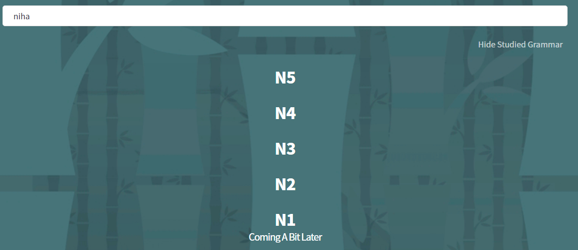
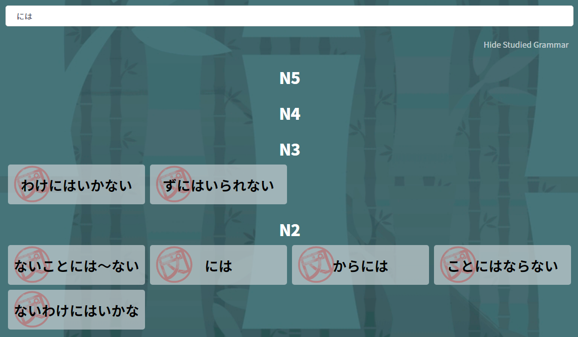
Suggestion:
Search the grammar point names too when searching in romaji.
IE give the same results for these searches

Suggestion:
Search the grammar point names too when searching in romaji.
IE give the same results for these searches
Also, please keep the previous search results when clicking back after selecting a grammar point from the page.
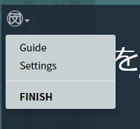
I don’t really like the new menu during reviews. It was simpler when the FINISH button was front and center. And I don’t like the Settings button there because it navigates to another page in the middle of the review session. I don’t think anything within the review box should make you leave the page.
Another thing. I don’t want to know what SRS level my reviews are. It gives me a “hint” by telling me roughly how long ago I started learning a particular item. This feels like cheating to me, and I don’t think I’ll learn as well this way.
I’m kind of mixed on whether to even indicate if reviews are Ghost reviews or not.
would like to see this discussion section option pop up when an error is made during review. this way i can contribute to, and read people’s study rules and solutions made while learning how to remember the rule.
@Jake For what it’s worth, I preferred when the number of reviews remaining was front and center during a review session.
Thanks for the feedback. The main reason we moved it was to free up design space for the future. As it was, we were already having to shrink text to fit stuff to the right of the counter on mobile.
It will now be easier in the future, to add more information up top (if we choose to do so).
When studying a new grammar point, perhaps the Enter key should navigate from the Meaning tab to the Examples tab, and so on? I like to navigate using the keyboard.
Also it would be nice to able to focus on the tab headers by repeatedly pressing Tab (right now focus skips right to the footer)
At this point you guys can probably remove the “New” label from the grammar points that were added months ago.
@Pushindawood Can you add some kind of visual indicator on the review summary page when an item will no longer be reviewed? This would eventually be relevant for items that have been burned, but for the next several months it would only be relevant for when you are done with a particular Ghost review sentence.
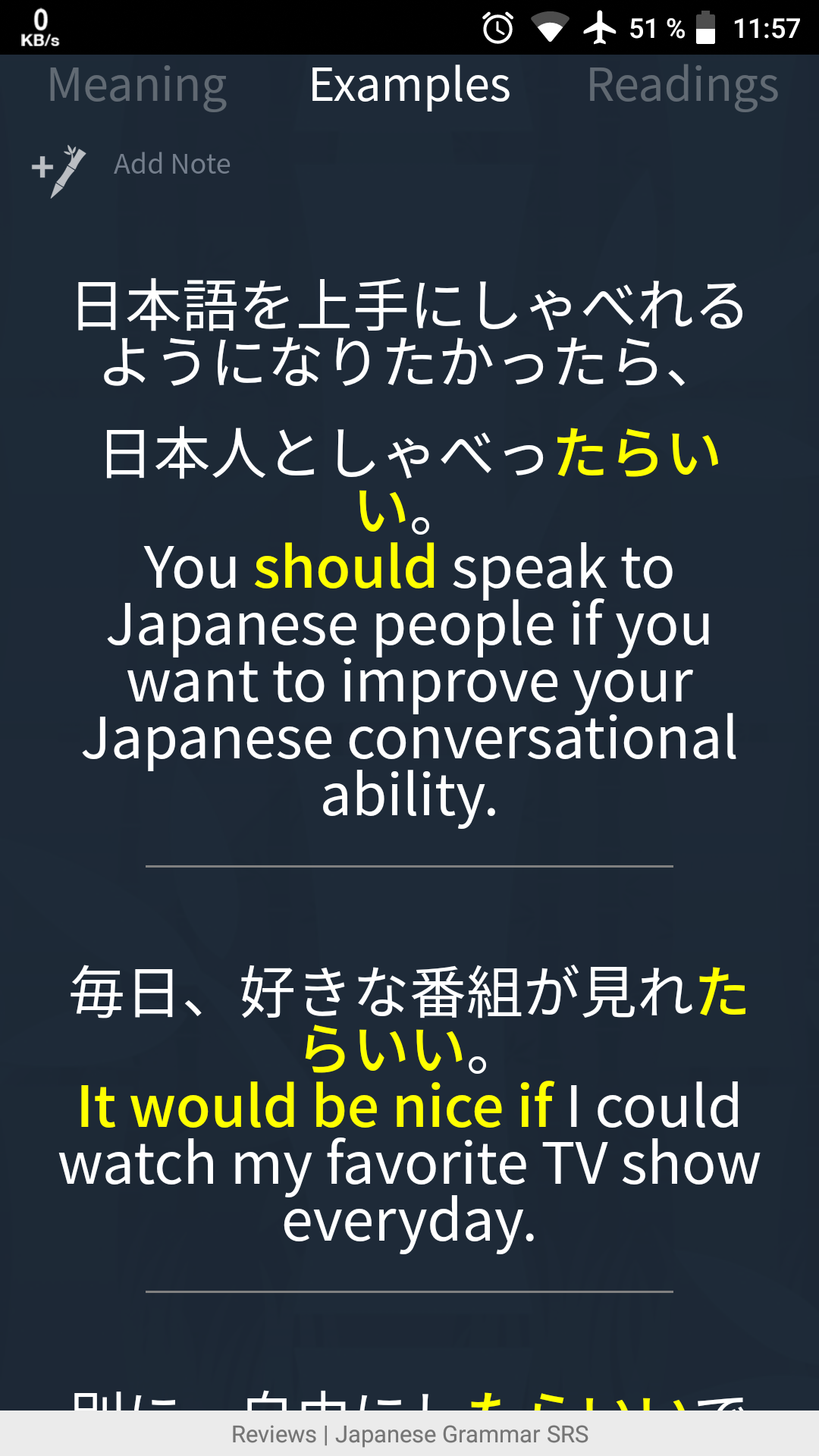
The font size for the example sentences is way too big when opening the tab during reviews. Just two sentences are filling the whole screen:
Please reduce the font size about 60%
Interval tooltips of some form on all hankos everywhere.
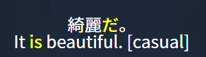
Example:

Refocus input field after user clicks a kanji to show or hide furigana
Good suggestion!
Any plans to create some way of reviewing/drilling similar grammar points together?
Font size issues are definitely something we want to tackle. The ideal option will be a font size setting where we have everything uniform by font-size percent and you can scale it up or down to your preference.
@Kumi That is a great suggestion to add a tooltip to the hankos. We will see what we can do. I can throw some code into refocus after hiding/showing the furigana.
@seanblue That would be pretty cool. No idea what form it would take. If you have any suggestions, please let us know!
No specific suggestions at the moment, but I’ll be sure to let you know if I think of something.
For とみえる the first three sentences give you the と instead of requiring that you input it. I think that is way too many that don’t require you to input it.
On the summary page, it would be nice if you could use the left and right arrow keys to switch between the different sections.
Have you considered putting the tags underneath the example sentences, as in reviews, instead of in them?
E.G. like this

instead of this
The former looks way more professional.