Thanks for the update! After having used the browser for the reading review style for a few days, I just did a review session on the app.
I had two issues:
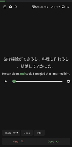
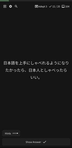
Some of the reviews didn’t have the grammar point highlighted, so it was all white text and sometimes hard to tell what was being tested.
And one of the reviews asked me to fill in the blank, even though I hadn’t had that happen to me in the browser (I changed all the review types from the decks page). EDIT: I think this one was my bad and I think I resolved it.
And I had a few suggestions:
In the browser you choose Good or Hard twice to mark an answer. In the app it’s only once. Might be a good idea to have the behaviors match, or even better, let it be in the options for users to decide to require one click or two clicks.
I mentioned this in another thread, but I’d love for the Good and Hard buttons to be mappable to the volume buttons on the side of my phone.
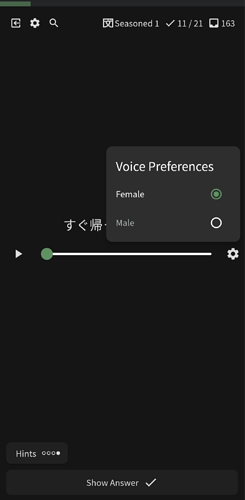
I like the inclusion of the audio in the app for the front side of the card. Can an option be added that makes it so the audio auto-plays?
Thank you again for making the Bunpro experience better and better!

 inside the box where you input your answer that seems to do nothing. The only useful play button


