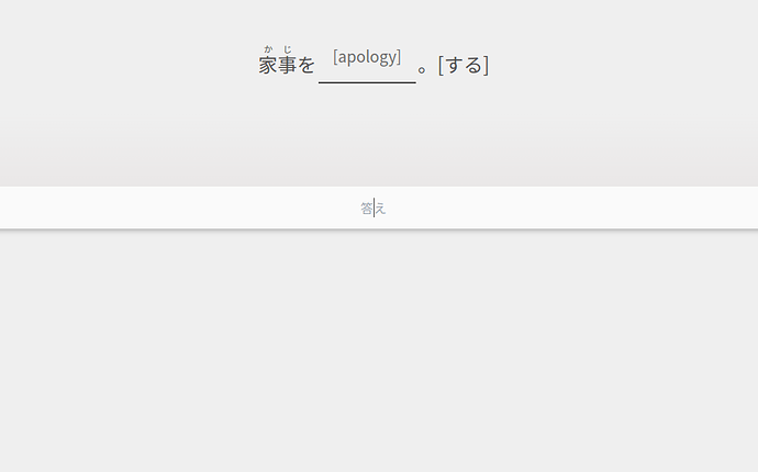
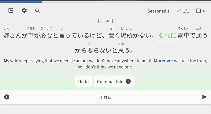
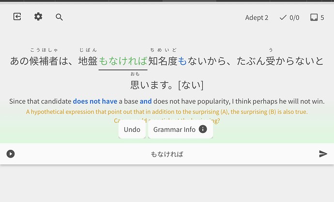
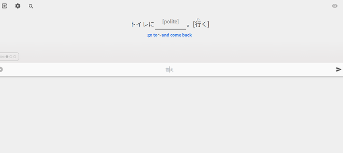
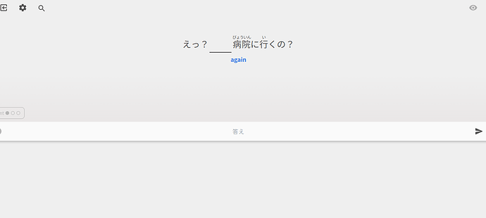
Not only is the text too small to read, only half the screen is being used!
Phew, thank goodness for that! I was thinking this was the end of Bunpro for me! I simply can’t see the writing!
@Sean Now the scrolling issue when using an iPad in portrait mode is gone. Thanks a lot, now I can use the new review tool.
I noticed three small issues:
- The buttons are shown on top of the hint texts after answering.
- The bottom corners of the buttons have some strange effect.
- The font size when entering the answer is a bit too small.
Love the new more compact layout but there’s no more button for keyboard shortcuts reminders and when you answer a question, you can’t adjust the hint system either with an interface button nor with the keyboard shortcut to cycle through it in case I want to confirm the translation and such.
Just thought I’d shed some light on what the changes were for mobile, and the new screen sizing.
Basically, I set the whole Reviews screen to not take up the whole page if:
- You are using a touch screen device OR
- The useable screen space (accounting for the browser URL bar etc.) is below a certain width or height.
This fixed height is there to give room for virtual keyboards on mobile devices, and what happens when these open (they auto scroll so that the input is at the top of the page – unfortunately not a lot I can do about this)
The font-size changes are only based on screen size. Sounds like they need some readjustments too. The reason they feel small is likely because we have to factor in some really long sentences. Some sentences (usually ones with multiple parties involved in a convo – Aさん Bさん ones) get reaaaaaally long.
Again, all this will require adjustment. Nothing should have changed for desktop users on large screens.
That being said – are ya’ll (tagged in this post) able to tell me what devices you are using? I’ll try make sure the font sizes and everything scales cleanly.
@Marcus.W @bunnypro
The buttons covering up the hints should not be like this – I’ll get this fixed ASAP
Sorry for the inconveniences ya’ll! It’s been a learning curve trying to get sizing and stuff working for different devices, especially when it’s based on width, height and touch-enabled-devices.
Hey! What device are you using? My gut says iPad but I wanted to confirm.
Surface Pro 6 with keyboard attached. 2736 x 1824 at 200% scale. Font size in styling is set at 20px.
Is it just me or did the text become much smaller on PC? (笑)It is a bit small now. I can read it just fine but it looks a little strange to me. On some old fujitsu laptop at work, screen size is 15inches or something, not sure. Maybe I am imagining things. I can test it on my laptop at home when I finish work.
Surface Pro 6 with keyboard attached. 2736 x 1824 at 200% scale. Font size in styling is set at 20px.
Damn you are like the final boss for me 
Ahhh so it’s picking your device up as touch, and giving you the mobile layout, which hides the hint after you answer.
Weird that Spacebar on a physical keyboard isn’t working to cycle hints though… Will look into it!
Nah you’re probably correct.
It’s shrinking the text a bit too small.
Going to roll out an update later today once I’ve fidgeted how the font-sizes are tied with screen sizes
Looks good on my end, thank you!
Chrome, on an Asus Chromebook.
This morning, the writing is a little larger, but it is still uncomfortably small and difficult to read. I can’t do reviews if the writing is this small. And it seems so unnecessary seeing as most of the screen isn’t even being used.
I’m ditching beta and going back to the old reviews for now (which were always just fine) because I can’t study otherwise.
I’ve done a quick review while hooked up to my ultra wide display (2560 x 1080, 100% scale) and it also serves me the mobile interface. Let me know if you need logs and/or dev console information. Still on Firefox, I didn’t try any other browsers for now.
Regarding Tentative Addition 1: I personally think this would be a great addition, as it lets us review the information while also cross-referencing what we got wrong in the original sentence all in one go.
プチ mobile update:
- Adjusted sizes of Quiz text – made larger text size show up on smaller devices
- For anyone interested, I’ll post the current breakpoint sizing below
- @JamesBunpro
- Add Keyboard Legend and Report button to settings menu on tablet-sized devices
- Reduce desktop text size slightly
- Apply max width to question content (question, translation hint etc.) to stop it spreading fully across the page, and keep it more centered
- Fixed post-attempt-menu overlapping with hints
- Show Hint button if there is space on mobile (even if is post-question-attempt)
- Fix ‘tense’ sizing
- Only focus input after toggling the hint if it’s not mobile
Breakpoints and sizing for the Japanese question text
- Note that all font sizes are at
16pxfont-size setting
Default
18px

@media (min-width: 550px) and (min-height: 550px)
24px

@media (min-width: 1000px) and (min-height: 685px)
36.8px
@bunnypro Should fix your squashed-screen issue
@Marcus This is the ‘morning’ update
For everyone getting the mobile interface on large devices:
- After a fair bit of research, there is unfortunately there is just no way to detect if a device is using a physical keyboard or not
- The current check that is implemented will detect if you have any touch screen functionality
- If there is, it will show the vertically-squished mobile display
- The current implementation seems to be the best way to support touch devices – although I understand it’s ugly / undesirable to have a large section of your page unused if you’re on a tablet /w keyboard
- This is just one of the drawbacks/hindrances with web-apps
- Now might be the time to switch to the mobile app.
- If anyone has any technical solutions for device detection on web, flick me a DM
- Until browser support is better, It’ll have to remain as is. Sorry for the confusion ya’ll!
- We may have a future design that will make the half screen less ugly tho… watch this space
Okay, just re-tried. Opted back into beta, refreshed everything, and got this:
I’m sorry, but it’s horrible.
We had great reviews to begin with, then they changed, I disliked them because I dislike change, but I got used to them, and now they’ve changed again and it’s the worst of the three.
Don’t get me wrong, I love and adore Bunpro, it’s making all the difference in my Japanese progress, but this new look is awful.
I might be missing something obvious but isn’t what the user agent string is used for in those scenarios ? Why would you present a mobile version of a web site to a desktop OS just because it’s touch capable ? I didn’t try it myself but I suppose people that use “request desktop version” from their mobile web browser get the same behavior ? If that’s the case then it’s also not correct behavior since the user specifically asked for it.
I do appreciate the return of the Legend and Report button however there’s a massive amount of touch screen enabled Windows laptop with detachable keyboard or not out there in the wild. I should not be getting a mobile interface on a 34" ultra wide display.

